Цвет в Крито-минойском искусстве как культурный код: восприятие цвета через поколения
Navigation:
I. Concept II. Color Schemes in Frescoes III. Color and Space IV. Vibrant Images of Crete V. The Influence of the Cretan Color Palette on Other Cultures VI. Conclusion
I. Concept
The topic of color theory in Minoan art is highly interesting and multifaceted. Throughout human history, this civilization’s frescoes and pottery have drawn attention on numerous occasions. Like many others, I have been captivated by the color palette, uniqueness, and recognizability of these works. In my view, Cretan culture is distinctly different from all others dated to approximately the same centuries, both in its compositions and in the vibrant imagery it contains. Among the distinctive characteristics of Cretan art, color holds a significant place—far from being an afterthought. When we examine Minoan works, we see that the color palette here is not merely a decorative element, but a system of meanings that was important to the Minoans.
I want to demonstrate that color contributed to the formation of the Minoan people’s unique cultural code, which exerted a strong influence both on the inhabitants of Crete in the past and on people viewing this art across the ages.
The Minoans placed great importance on the use of specific colors in a sacred context [1]. Naturally, the topic of how people perceived color in antiquity cannot be fully studied due to the limited number of surviving textual sources from that era, but nevertheless, there are facts that allow us to infer how the people inhabiting Crete viewed color. For example, studies of structures in Martos (Furnu Korifi) have shown that multiple layers of paint were applied to the surface of the wall plaster [1]. This suggests that at that time, people’s goal was not only decoration itself but also the maintenance of color. The Minoans may have also produced many more colors than they primarily used, which could imply that in most instances, color was imbued with a specific meaning rather than being used strictly to accurately represent reality [1]. All these facts confirm that color was a significant element in their art.
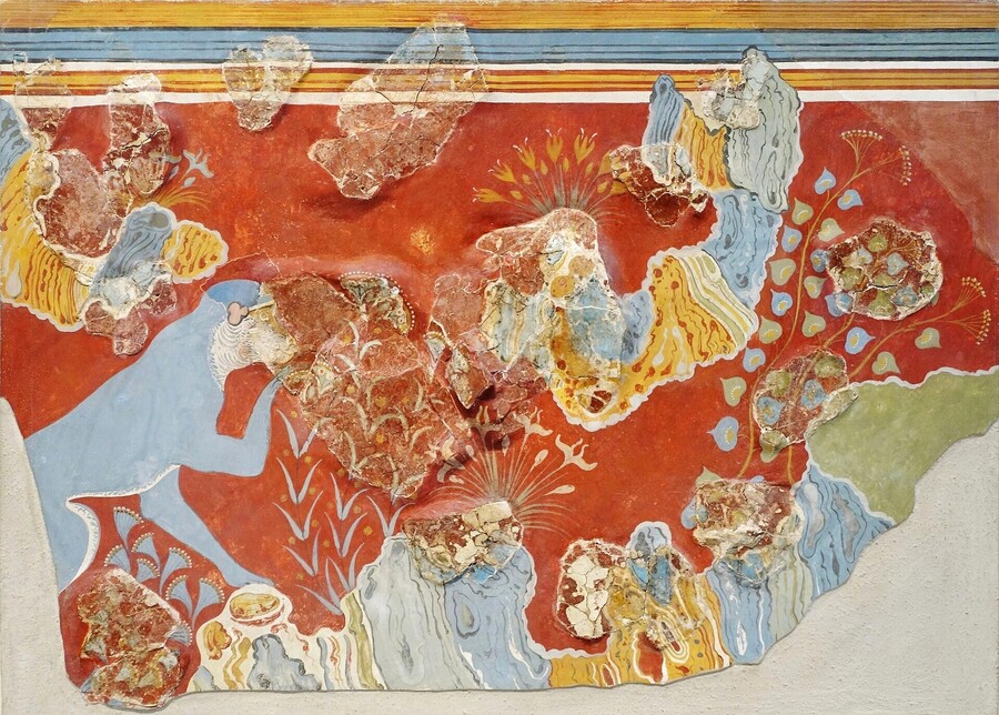
«Blue Monkey» Knossos Palace (1600–1500 BCE)
Colors in Minoan culture were often associated with specific objects. For example, animals and plants were primarily depicted in yellow and blue, while people were shown in white or red with black hair. Soon, these colors began to be closely associated with the Cretan culture.Humans tend to analyze historical sources regarding the ancient civilizations' perception of color by categorizing and conceptualizing colors according to modern understandings, which ultimately creates a subjective picture of the subject in almost any case. The restoration of the frescoes in the Knossos Palace serves as an example of this phenomenon. During the restoration work, the Art Nouveau movement, popular in the early 20th century, greatly influenced the artists [3]. Even though the artists did not intend to «modernize» the frescoes, later research suggests that the colors were sometimes distorted and did not accurately reproduce the images on the ancient frescoes reconstructed through pigment analysis of the walls [2]. Paradoxically, the cultural code is interesting to study not only in relation to the contemporaries of a certain culture but also in relation to people who will view that culture years later and perceive it differently. People became interested in ancient art not only within the context of archaeology but also found it reflecting more contemporary ideas about art.
II. Color Solutions in Frescoes
In Kritas’s works, color is certainly one of the first things that catches the eye. In many ways, this is because the colors here are not used as they appear in nature. The Minoans often imbued colors with a certain attribute and used them according to a system or their spiritual perception of reality at the time [1]. The most frequently used colors included white, red, ochre-yellow, and blue.
«Sacred Grove and Dance» Knossos Palace (1600–1500 BCE)
«Parisian Woman» Knossos Palace (1400–1350/1300 BCE) / «Fragment of Leopard Head» Knossos Palace (1450–1375 BCE)
«Boy Collecting Saffron» Knossos Palace (1800–1700 BCE)
Red was often used as a background to convey the depth of a painting through the vibrancy and tonal richness inherent in fresco hues. It was frequently employed to designate main figures or details, serving to establish visual emphasis.
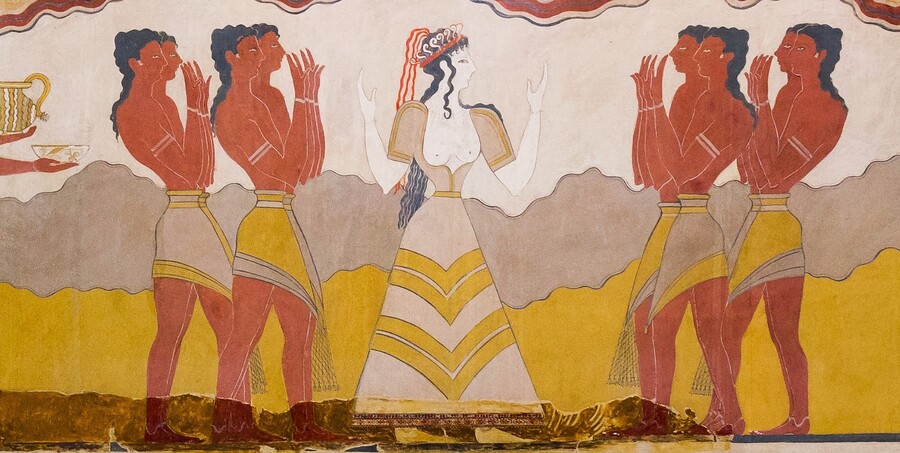
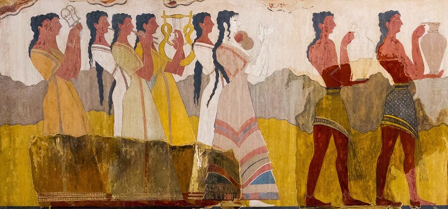
«Sacred Procession» Knossos Palace (9160–1450 BCE)
Another objective of using the color red was to indicate the figure’s gender. A distinctive feature of Kritios sculpture is the differentiation of human figures by gender through color: women were depicted in white, and men in red (or reddish-orange) [1].
«Fresco with a Griffin» Knossos Palace (c. 1700–1450 BCE)
«Sacred Procession» Knossos Palace (1600–1450 BCE)
Yellow and blue were primarily used for backgrounds, details, and clothing patterns, or on animal or plant figures. While there are no particularly outstanding theories about the symbolism of these colors yet, it is likely they were imbued with some kind of sacred meaning.
«The Dancer» or «Woman with Developing Hair, ” Knossos Palace (1700–1600 BCE)
The Crito-Minyaic culture also sometimes used black, but much more rarely—primarily as an outline for figures or for depicting hair.
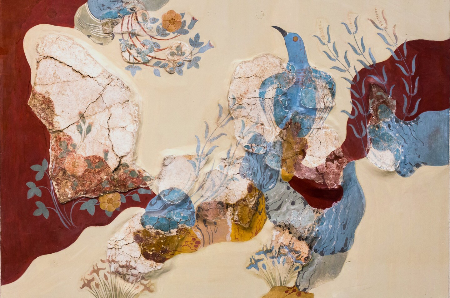
«Blue Bird» Knossos Palace (1600–1500 BCE)
«Fresco with Lilies» Amnis (c. 1600 BCE) / «Fragment of Fresco with White Lilies» Knossos Palace (1700–1450 BCE)
Color carried an additional layer of meaning, conveying something specific to the viewer. These symbolic designations were only understood by contemporaries; in our time, most of the meanings embedded in the frescoes have been lost [1]. However, it can be confidently assumed that «hidden messages» encoded in the colors existed—the green hue serves as an example. This specific shade was used in a very small number of works, and even when employed, it appeared in naturalistic drawings, whereas in other works, colors were used more as symbols. There is also an opinion that green is frequently absent from the works because the pigment simply disintegrated over time [1].
In ancient Greek, several terms denoting color etymologically originated from the names of the materials from which the pigment was made. [1]
Purple is not used or is used very sparingly in the frescoes; it is hypothesized that this is due to the fact that at the time, it was strongly associated with the clothing of members of high social status society [1]. This logic may have extended not only to textiles but also to architecture, frescoes, and ceramics, consequently allowing the use of purple only in clothing.
III. Color and Space
When constructing the Knossos palace, the Minoans paid close attention to the design of the spaces, meticulously planning the arrangement of rooms and the lighting system, because the palace was a ritual center for them. They created the space comprehensively, calculating how the palace would appear at different times of the day—and consequently, how the painting would look depending on that light [4]. Artists, when choosing colors, considered not only what color an object would be depicted in but also how visible each fresco would be depending on the illumination [7].
Throne Hall of the Knossos Palace, 1700–1450 BCE
The Minoans also skillfully utilized light sources; they positioned windows, light wells, and stone lamps so that the sacred meaning of the spaces was preserved both day and night.