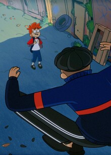
The branding for KID: napped is a blend of childlike innocence and manufacturability of the modern world, capturing the essence of the brand’s handcrafted products in a way that is fresh, dynamic, and visually striking. The use of AI-generated images adds a high-tech touch to the branding, while the unique font created specifically for the brand adds a personal, handmade feel. The juxtaposition of bold, dynamic forms with naive, organic shapes creates a compelling tension that draws the eye and captures the imagination. This reflects the brand’s commitment to using the latest technology to create traditional handcrafted goods, resulting in a branding that is both authentic and innovative. Overall, this branding set the company apart in a crowded marketplace and position it for success.

Original size 4000x2250
Loading...
Original size 4001x2250

Customized font «KID: napped Regular»

Original size 4001x2250

Instagram posts

Original size 4000x2251

Instagram profile

Original size 4001x2251

Instagram stories

Original size 4001x2251

Concept for a website

Original size 4001x2251

Concept for a website

Original size 4000x2251

Outdoor advertising (bus station)

Original size 4001x2251

Indoor advertising (subway station)

Original size 4001x2251

Outdoor advertising

Original size 4001x2251

Indoor advertising

Original size 4000x2801

Printed materials

Original size 4001x2251

Notebook

Original size 4001x2251

Packaging box

Brand ID for KID: napped
Kirill Merkushev создал бренд-айдентику для KID:napped, объединяющую детскую невинность и современные технологии в визуальной концепции. Проект включает уникальный шрифт и AI-изображения, подчёркивающие ручную работу и инновационный подход бренда.
Project description created with AI
Project created at 19.09.2024
More projects in advertising
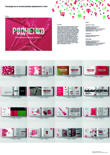
Мария Николаенко создала брендбук для международного проекта «Форма=Ракурс». Логотип сочетает зелёный и красный цвета, отражающие название проекта и фамилию Александра Родченко.
«Сам себе волшебник» — рекламный концепт для банка Ренессанс
16
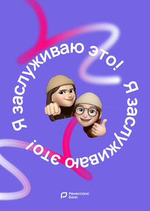
Софья Кулакова и Алиса Бабаева создали рекламный концепт «Сам себе волшебник» для банка Ренессанс. Проект включает в себя интерактивные истории, персонализированные аффирмации и возможность создания индивидуальной карты с аватаром пользователя.
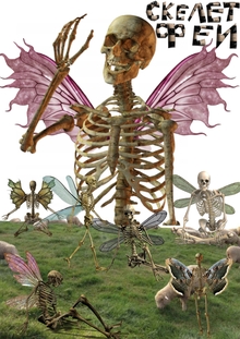
Лилия Сафаргалина создала проект "Скелет Феи", включающий в себя различные продукты и дизайн-объекты. Один из элементов проекта — крем от мешков и морщин, который называют "печальным" из-за связи с усталостью и нервами.
Кейсы с вариатива «Современные методы и креативные технологии в рекламе»
12
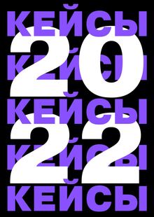
Авторы Дмитрий Андрияшкин и Александр Алексеев подготовили лонгрид с кейсами по современным методам и креативным технологиям в рекламе. Проект включает конкретные примеры продвижения брендов и личных проектов с детализацией стратегий и результатов в социальных сетях.
adcr.dafes
The Art Directors Club of Russia sets the benchmark for creative excellence in design and advertising, serving as a central hub where industry professionals connect. Since 2004, the Club has hosted the ADCR Awards—a premier national competition celebrating creativity, design, and advertising. The core mission of the awards is to champion agencies and independent creators making their mark in the local market. By presenting this honor on behalf of the professional community, the Club reaffirms its endur... Show more
adcr advertising
adcr design
adcr students and young creators