Concept
Hanging arrangement—the method of placing artworks on a wall relative to one another, the architecture of the space, and the viewer. It belongs to the least noticeable, yet most effective, tools for designing museum exhibitions. The height of the display line, the width of the gaps, the wall color, lighting, seating, and labeling establish the viewing mode.
The choice of theme is dictated by the unique position of the Museum of Modern Art (MoMA) in New York. In its galleries during the 1930s, a model of single-row hanging on a light, neutral wall emerged, which Brian O’Doherty described as the ideology of the «white cube» [1]. This model became the global standard for displaying 20th-century art, after which MoMA itself re-evaluated this concept for nearly a century. Research by Mary Ann Staniszewski and Charlotte Clonk showed that exhibition design shaped the perception of modern art as actively as the collection’s composition [6; 9].
Visual materials are selected based on the principle of documentary authenticity. The basis of the visual sequence consists of photographs of exhibitions from MoMA’s public exhibition history archive [5], which illustrate the parameters of the hanging arrangement. Comparative images from 18th–19th-century salon hangings, the 1913 New York exhibition, the 1939 architectural model of the building, and the 1936 catalog cover are also used.
The work is structured into three thematic chapters, each covering a period during which the museum employed a specific hanging model. The first chapter, «The Birth of the Line» (1929–1940), illustrates how the founding director, Alfred Barr Jr., developed the single-line hanging system. The second chapter, «The Wall Canon» (1950s–1980s), is dedicated to the permanent collection exhibition. The third chapter, «Multiple Narratives» (1999–2021), examines thematic exhibitions, the temporary museum in Queens, the building by Yoshio Taniguchi, and the interdisciplinary hanging design from 2019.The selection of textual sources was based on their relevance to the research topic, the scholarly authority of the authors, and the timeliness of their publications. The bibliography includes documents from MoMA, studies of exhibition design history, and theoretical works on the ideological construction of display.The objective of this visual study is to analyze the changes in painting display at MoMA from 1929 to 2021. The work aims to demonstrate how exhibitions evolved throughout the examined period.The central hypothesis of this research is that the single-line hanging system on a white wall, adopted by MoMA in the 1930s, became a stable visual standard for the museum and has changed very little over a century. The primary changes concerned how paintings were grouped together and the sequence in which visitors moved through the halls.
1. Hangings from 1929–1940
In its first decade, while it did not yet have its own building, MoMA developed an exhibition language that would later become perceived as the standard for presenting contemporary art. Alfred Barr Jr. rejected the dense hangings of academic salons and placed paintings in a single row, slightly below eye level, with generous spacing on a neutral wall [8].
Unknown photographer. Hall H, Arsenal exhibition, New York. 1913.
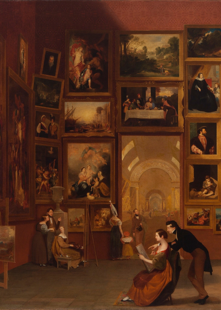
Initially, MoMA utilized a wallpaper display technique: paintings covered the wall from floor to cornice, with the frames flush against each other. The first major modernist exhibition in New York preserved the festive framing of the 19th century—drapery on the partitions, garlands, and ceiling swags.
Pietro Antonio Martini. Exhibition at the Louvre Salon in 1787. 1787
Samuel F.B. Morse. Louvre Museum. 1831–1833
At the first MoMA exhibition held in rented office spaces, the paintings were displayed in a single row, with the spacing between them comparable to the width of the paintings themselves. The walls were draped with a natural beige fabric, which Philip Johnson described as «the most neutral color available» [8].
Piter A. Juli. View of the exhibition «Cezanne, Gauguin, Schöler, Van Gogh.» 1929
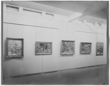
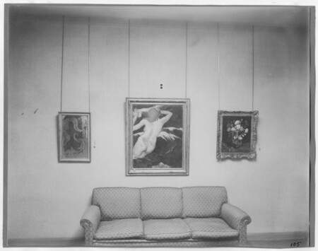
Piter A. Julie. Exhibition view of «Cézanne, Gauguin, Schöler, Van Gogh.» 1929
In the city mansion, a single-line gallery hangs alongside a wrought-iron balustrade (architectural railing) and door/window casings. The line of the paintings, however, remains unchanged.
Beaumont Newhall. Exhibition view of «Vincent van Gogh.» 1935
The hung pieces create neutral modules inside the manor, and section labels and tags appear over the paintings. The display demonstrates the evolution of art history.
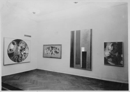
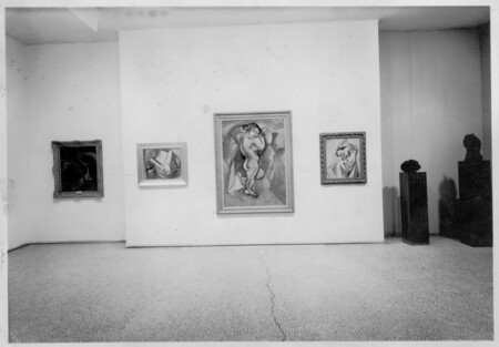
Pomona College. View of the exhibition «Cubism and Abstract Art.» 1936