Navigation:
1. Concept
2. The Birth of a Superhero
3. Humanizing the Superhero
4. The Crisis of the Heroic Ideal
5. The Era of the Anti-Hero
6. The Superhero as a Subject of Satire
7. Conclusion
Concept
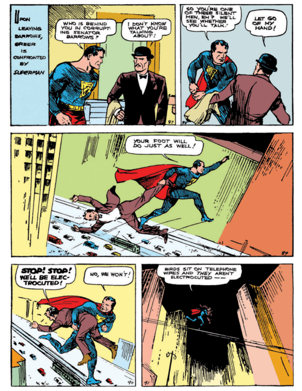
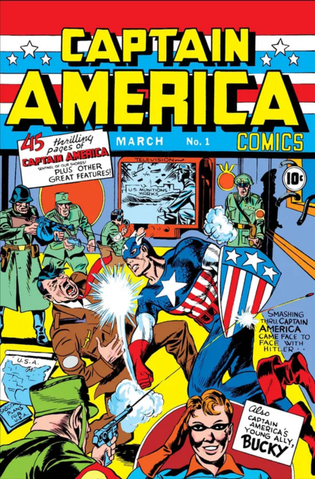
Superheroes emerged in the late 1930s as an archetype readers could recognize at a glance. In Action Comics #1 (1938), Jerry Siegel and Joe Shuster established its visual foundation: a tight suit, a cape, a chest emblem, and an athletic physique. During World War II, this visual language became a tool of propaganda: on the cover of Captain America Comics #1 (1941), Joe Simon and Jack Kirby depicted the hero striking Hitler, and the costume—built upon the colors of the national flag—made him an embodiment of the country. The ideal is conveyed here through a visual formula: strength, confidence, and moral superiority are readable through posture, angle, and color.
Action Comics (1938) #1 — Jerry Siegel, Joe Shuster
Captain America Comics (1941) #1 — Jack Kirby, Joe Simon
Starting in the mid-20th century, this formula began to change, but not in a straight line. After the introduction of the Comics Code in 1954, the industry restricted violence and moral ambiguity. Against this backdrop, Marvel offered characters with personal problems in the 1960s: Fantastic Four (1961), and Spider-Man by Stan Lee and Steve Ditko (1962). In the 1970s, Dennis O’Neil and Neal Adams’ Green Lantern/Green Arrow brought racism, poverty, and drug addiction into the genre.
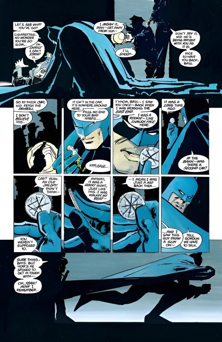
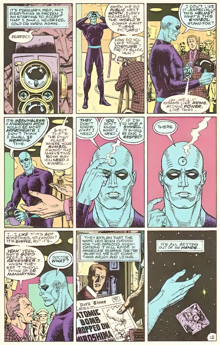
In the 1980s, what I call the deconstruction of genre begins: authors maintain the recognizable conventions of the superhero comic (the hero’s mission, his abilities, his identity, his costume), but they push them to their logical conclusions, exposing the underlying assumptions. Jeff Clarke’s approach comes closest to this, where he described the «revisionist superhero narrative,» in which the works of the 1980s become a reflection on the history of the genre itself. Clarke himself avoids the term «deconstruction,» so I use it as a working designation for the trend, not as a philosophical reference. In 1986–1987, Frank Miller’s «The Dark Knight Returns» and Alan Moore and Dave Gibbons' «Watchmen» questioned the right of heroes to administer justice: Miller made Batman heavy, hardened, and physically overwhelming, while Gibbons constructed «Watchmen» upon a rigid nine-panel grid where familiar symbols of heroism sound unsettling.
Batman The Dark Knight Returns (1986) — Frank Miller
Watchmen # 4 (1986), page 12. — Alan Moore, Dave Gibbons
In the 1990s, criticism gave way to the exploitation of brutality. With the founding of Image Comics in 1992, Todd McFarlane’s «Spawn» and the work of other artists from the publishing house solidified an aesthetic characterized by hypertrophied anatomy, massive weaponry, and aggressive silhouettes. Concurrently, works began to comment on this aesthetic: Mark Waid’s «Kingdom Come» (1996) and Alex Ross’s work juxtaposed the painterly monumentality of classic heroes against the chaotic design of the new generation, while Warren Ellis’s «Power» (1999) and Brian Hitch’s work transformed characters into a force intervening in world events, visualizing this through widescreen, cinematic compositions.
In the 21st century, deconstruction continues to evolve. Grant Ennis and Darick Robertson’s «Boys» (2006–2012) transforms protagonists into brands whose public appeal contradicts their actions. Mark Millar and Jon Romita Jr.'s «Pitbull» (2008–2010) illustrates the physical consequences of violence for a non-superpowered hero. Robert Kirkman, Cory Walker, and Ryan Ottley’s «Invincible» (2003–2018) begins with a vivid, traditional aesthetic, gradually juxtaposing it with a naturalistic depiction of destruction.
However, deconstruction has not displaced the classic archetype. For instance, Greg Morrison and Frank Quitely’s «All-Star Superman» (2005–2008) reintroduces the ideal, but does so consciously, leaning on the genre’s memory. Therefore, I view the sequence of eras not as a linear progression, but as an expansion of a set of parallel visual strategies.
The Birth of a Superhero
Superman in Action Comics #1 (1938) immediately establishes the genre’s basic conventions, which Peter Hogan describes as mission, abilities, and an identity solidified by name and costume. According to Erwin Panofsky’s schema, the costume is read on three levels: what is depicted (the form-fitting suit, cape, and chest emblem), what conventional meaning it holds (a sign of strength and a protector, recognizable without explanation), and the cultural significance of the image, which emerged in the United States in the late 1930s. On the cover of the first issue, the hero lifts a car overhead; the figure of Superman dominates the frame and is larger than the secondary characters, making strength the central message of the image.
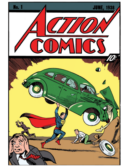
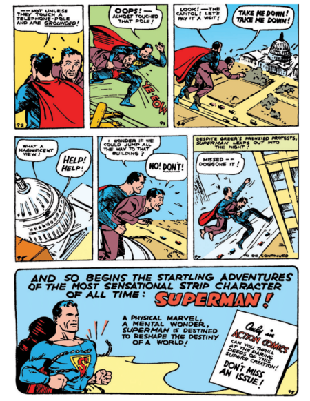
Action Comics #1 (1938) — Jerry Siegel, Joe Shustler
During the Second World War, the costume transforms into a political symbol. Joe Simon and Jack Kirby’s Captain America (Captain America Comics #1, 1941) wears the colors of the flag, and on the cover, Hitler is depicted; the image immediately identifies the enemy and the reader’s stance. Cress and Van Leven link the viewer’s perspective to the power dynamic between the depicted figure and the observer. Common to the early heroes is a set of conventions: developed musculature, open and confident poses, resolute faces, and dynamic composition. The ideal is conveyed not through the plot, but through a visual formula—a formula that subsequent eras will reinterpret.
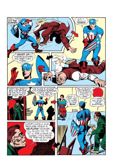
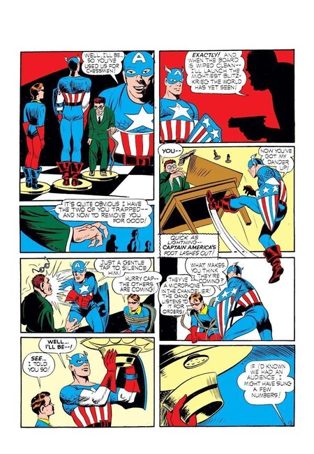
Captain America Comics #1 (1941) — Jack Kirby, Joe Simon
Humanizing the Superhero
Changes during the 1960s and 1970s begin against the backdrop of the 1954 Comics Code restrictions and relate to how a hero’s vulnerability is depicted. Stan Lee and Steve Ditko’s Spider-Man (Amazing Fantasy #15, 1962) is built upon a duality that can be read visually: the dynamic figure in a full-face costume, contrasted with the hunched-over teenager in glasses. The full mask is also important because, according to Scott McCloud, a simplified, stylized face allows the reader to more easily identify with the character.
Amazing Fantasy #15 (1962) — Stan Lee, Steve Ditko
The costume ceases to be merely a symbol of power and becomes a screen onto which the reader projects themselves. Fear, fatigue, and insecurity are conveyed through close-ups, posture, and facial expressions.
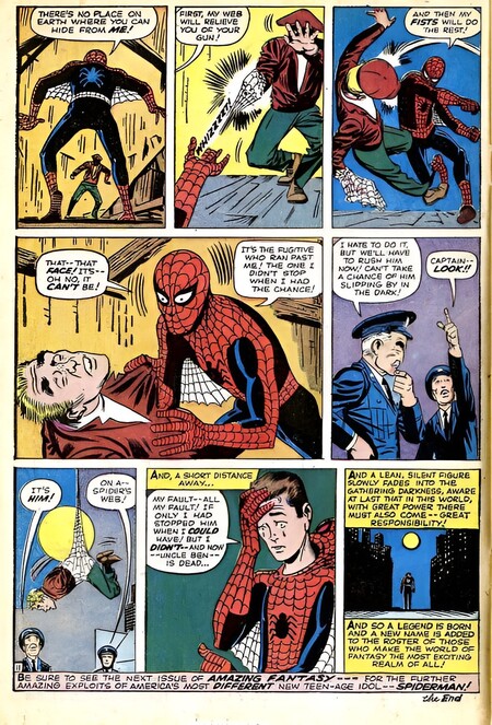
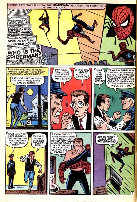
Amazing Fantasy #15 (1962) — Stan Lee, Steve Ditko
In the 1970s, Dennis O’Neil and Neal Adams' Green Lantern/Green Arrow brought race, poverty, and drug addiction into the genre. Graphically, this was supported by Adams' more realistic style and urban settings instead of fantastical backdrops. The antagonist also changed: instead of a supervillain, the heroes faced social ills, and the convention of the supervillain established by Kugan was weakened.
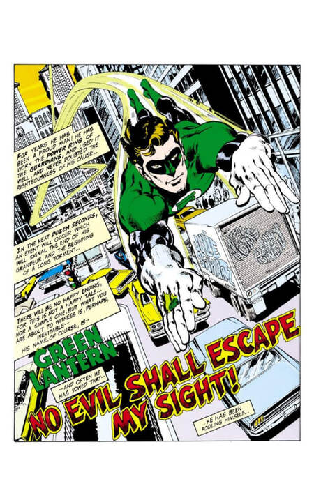
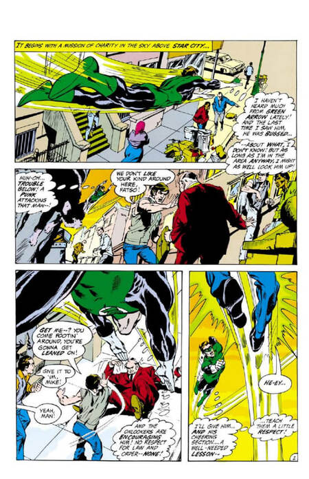
Green Lantern Vol 2 #76 (1970) — Dennis O’Neil, Neal Adams
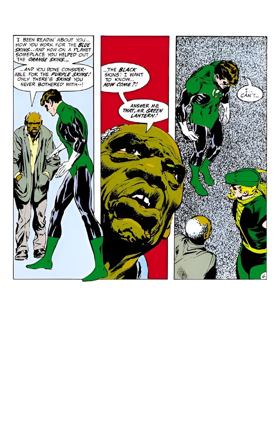
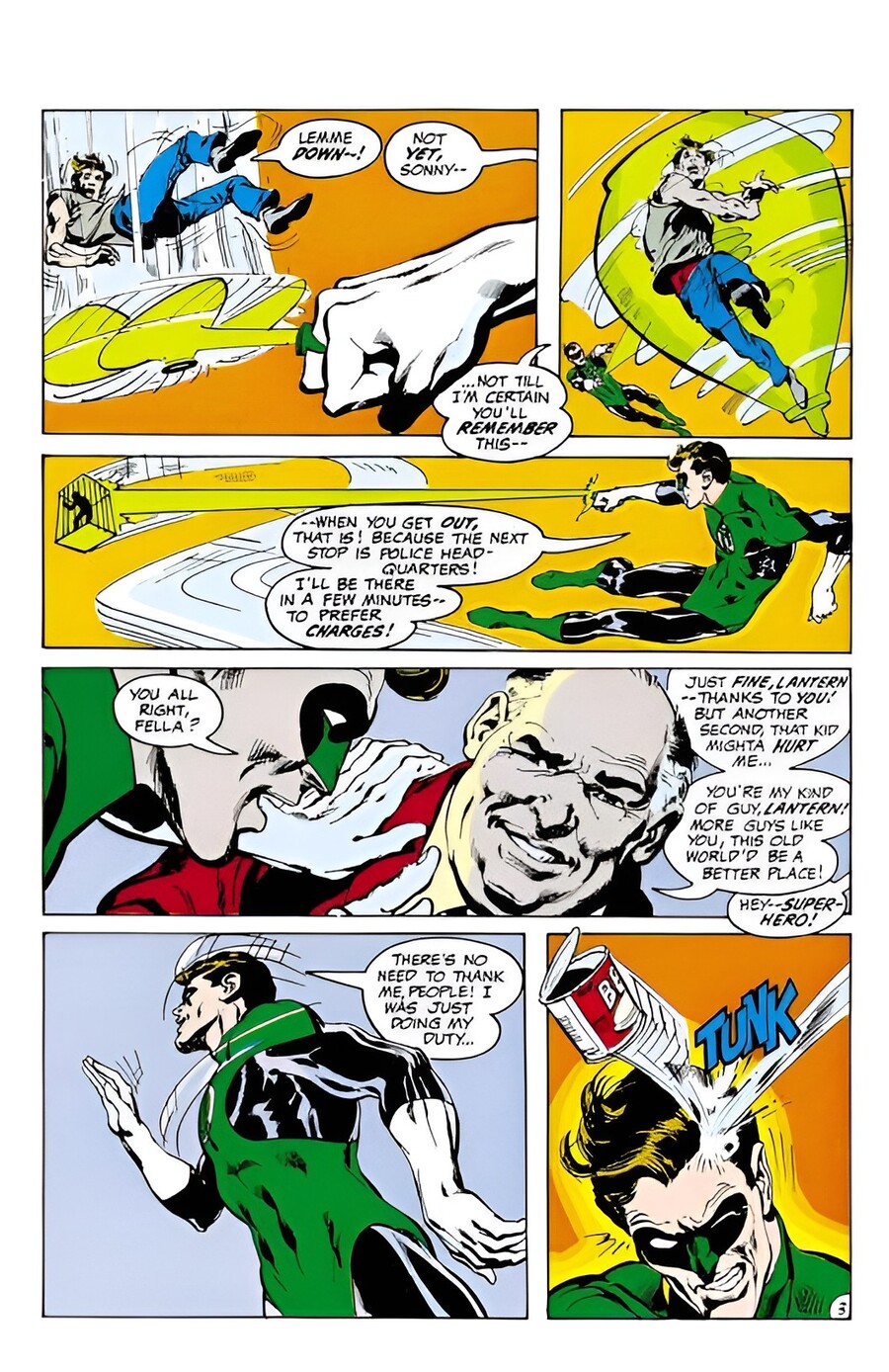
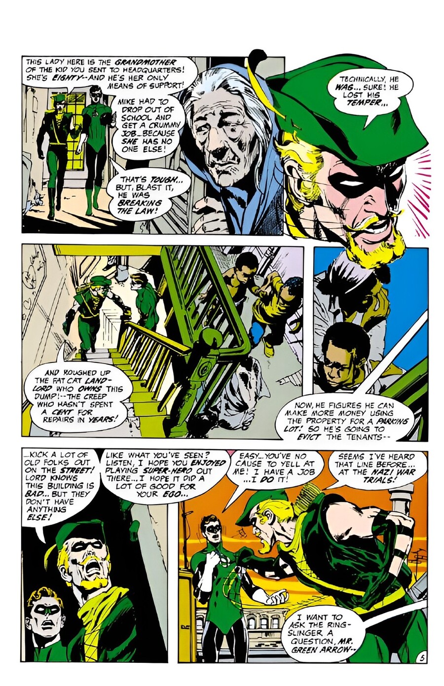
Green Lantern Vol 2 #76 (1970) — Dennis O’Neil, Neal Adams
The Crisis of the Heroic Ideal
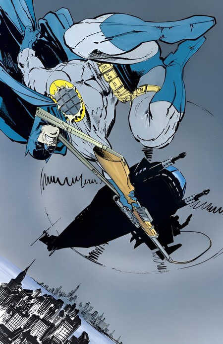
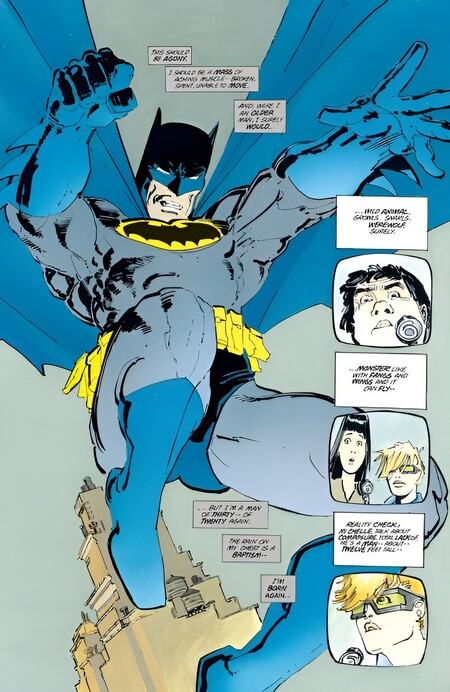
Batman: The Dark Knight Returns (1986) — Frank Miller
In the 1980s, according to Jeff Clark, the genre achieves self-awareness: «The Dark Knight Returns» and «Watchmen» reinvent the history of the superhero comic book. Frank Miller’s Batman («The Dark Knight Returns, ” 1986) is portrayed as aged, heavy, and physically imposing. Miller fractures the page into small panels and integrates television screens into the layout—and such a layout must be analyzed as a system of interconnected panels, not as a collection of isolated frames.
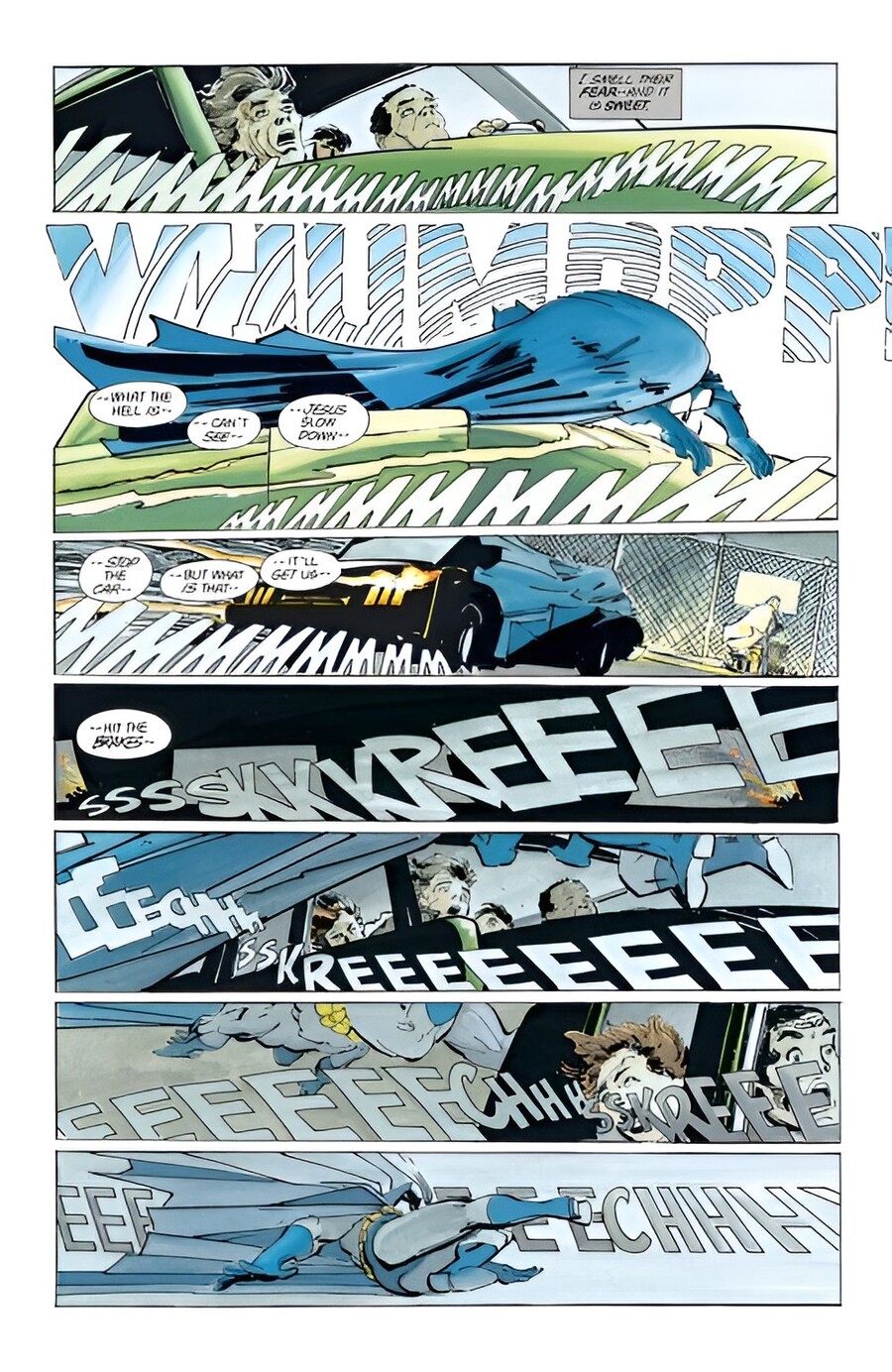
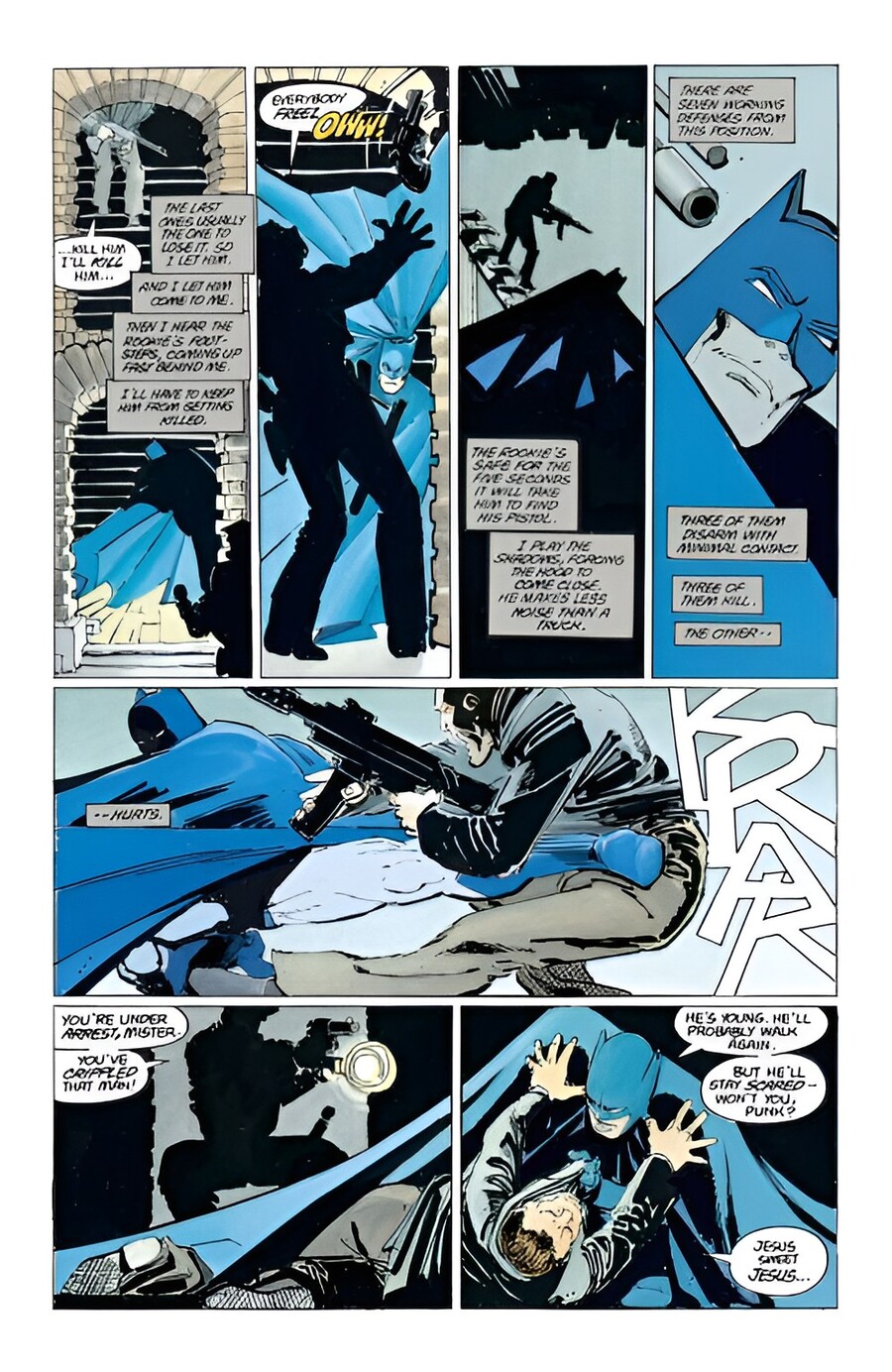
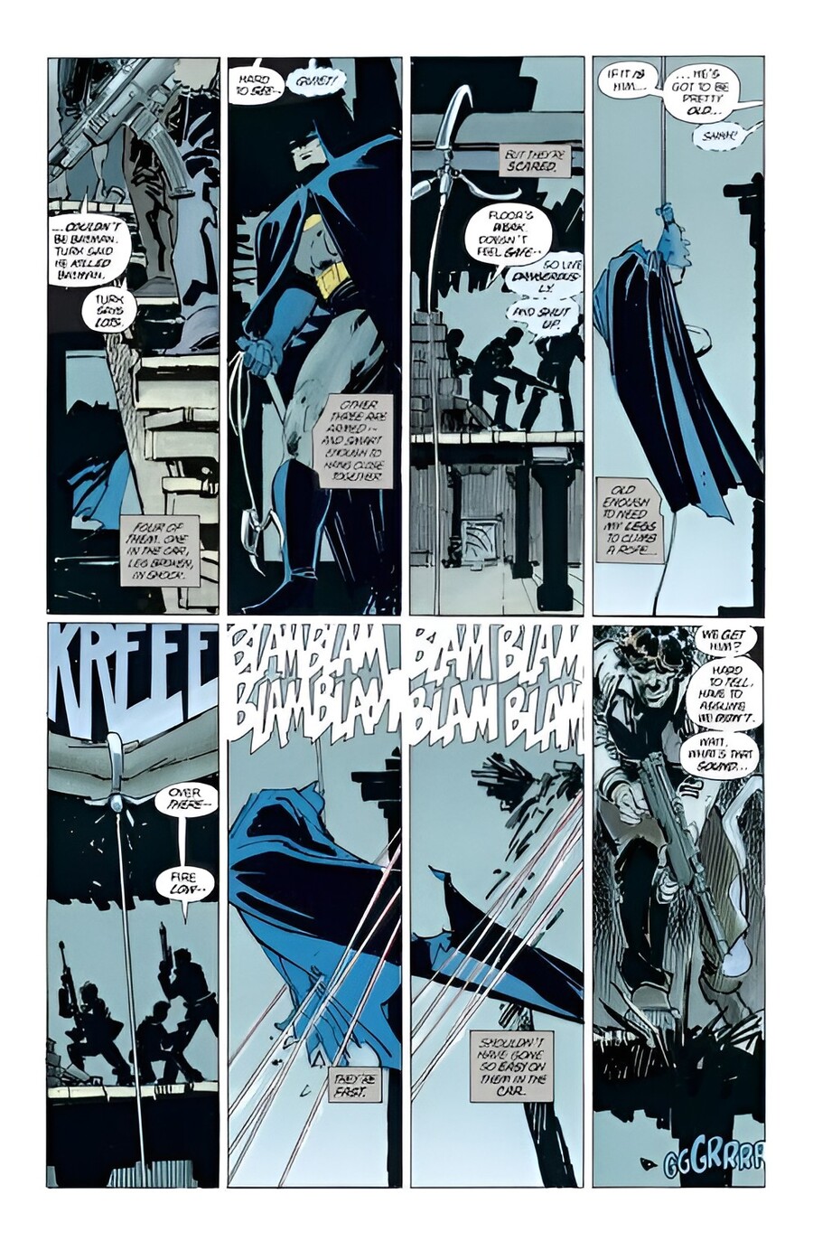
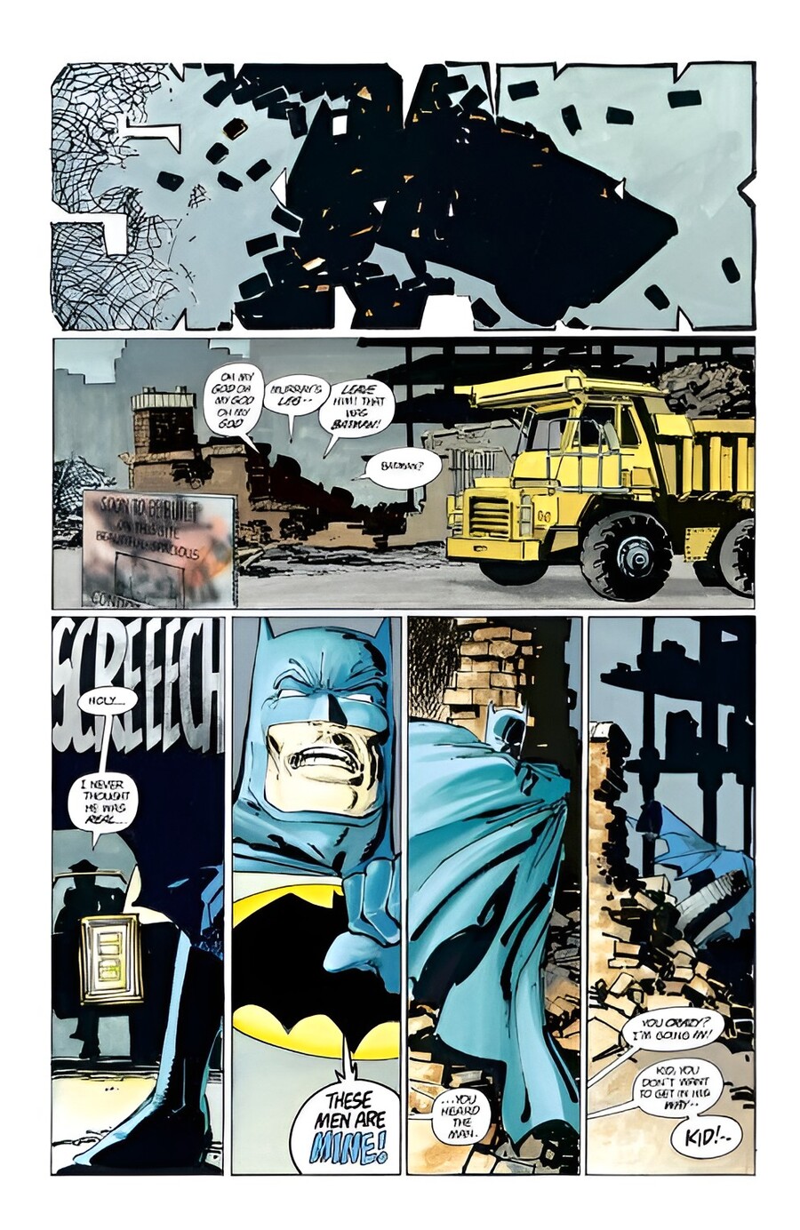
Batman: The Dark Knight Returns (1986) — Frank Miller
Alan Moore and Dave Gibbons, in Watchmen (1986–1987), construct the narrative on a rigid nine-panel grid. The regular layout creates a sense of control, against which the costumes—which retain their genre markers—sound ironic and unsettling. Doctor Manhattan is a notable exception: his nude, blue, glowing figure, without a costume or conventional heroic poses, portrays superhuman power as a detachment from humanity. The fifth issue, built as a mirror composition of pages, serves as an example of how the layout actively contributes to meaning.
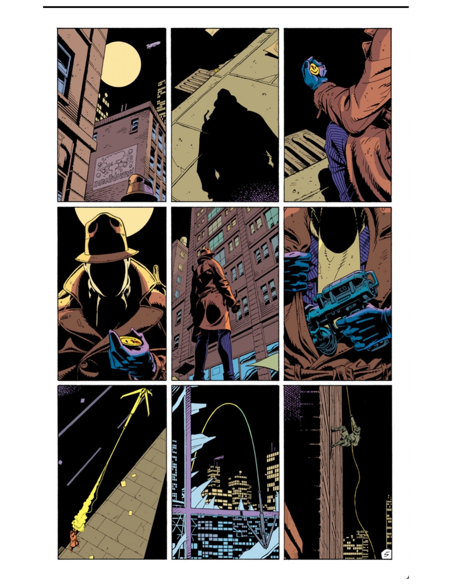
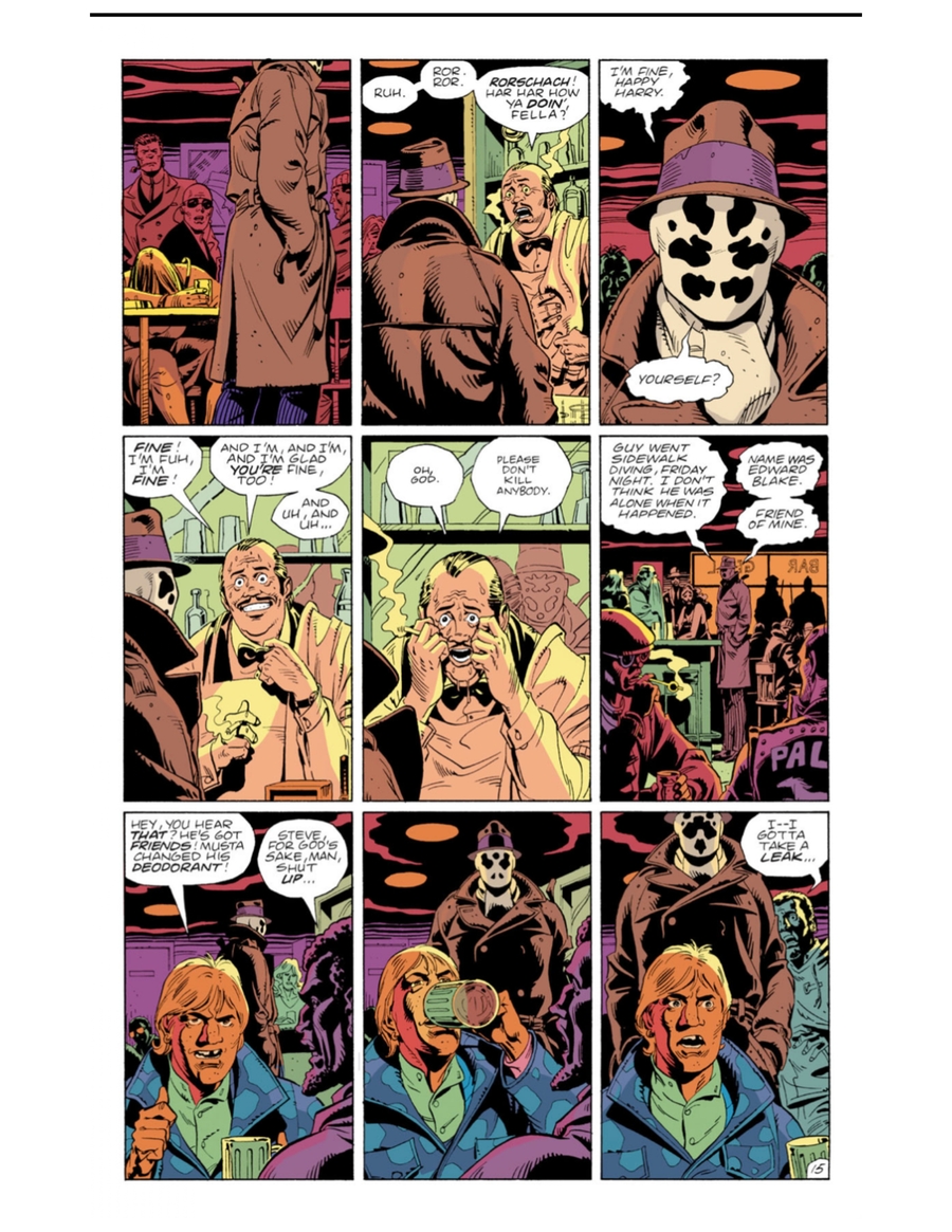
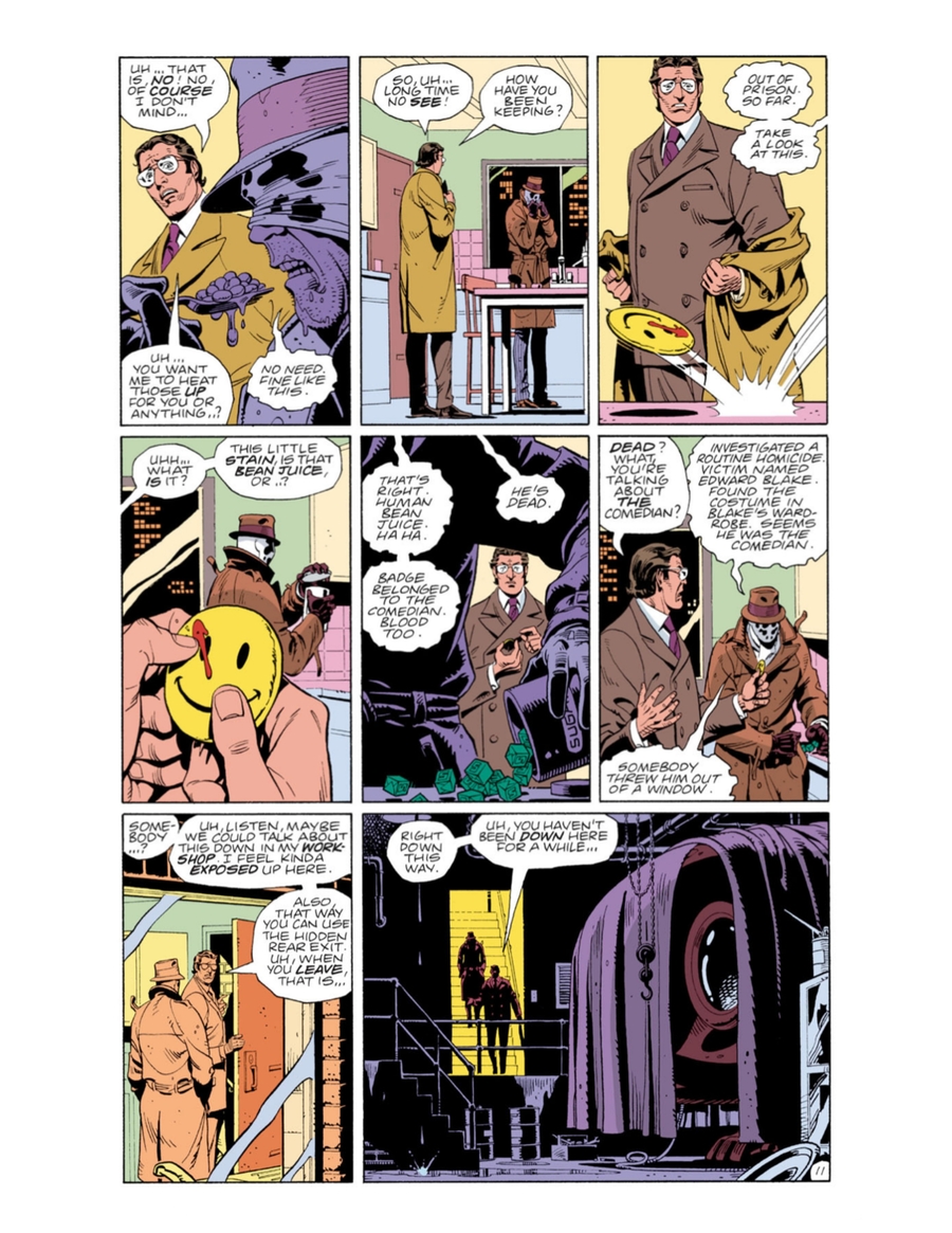
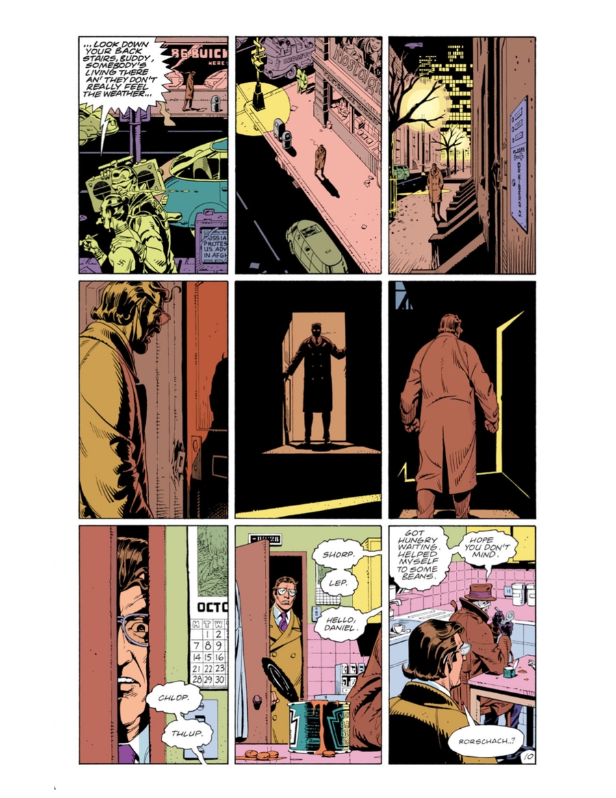
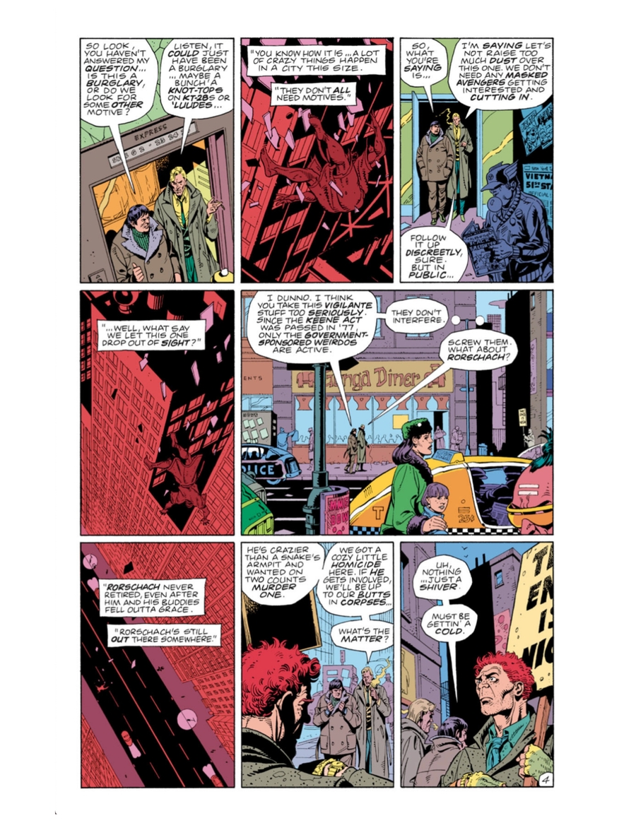
Violence in comics of this period ceases to be purely conventional. McCloud’s classification of panel transitions allows one to distinguish where violence is shown versus where it remains off-panel and is completed by the reader.
The Era of Antiheroes