Взаимодействие текста, орнамента и изображения в готической рукописи XIII–XIV веков
Concept
A Gothic manuscript from the 13th–14th centuries is a piece of medieval architecture, created during the height of the European style. Within it, long before the printing press, rules for typography, structure, and page navigation were established. Text, ornament, and image all served crucial functions: they set the visual and informational rhythm of the page. The ornament, in turn, divided the text, creating emphasis and facilitating navigation, while the image served as a commentary on the content and its symbolic aspects.
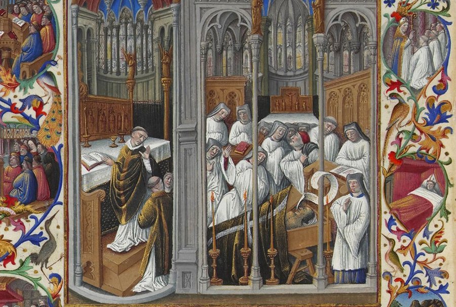
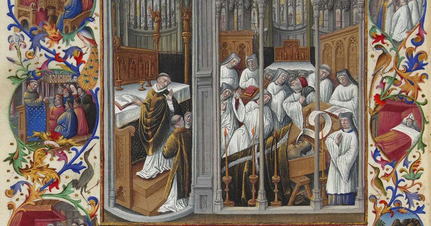
Burial of Raymond Diocres. Fragment of a miniature from «The Magnificent Horologium of Duke Berry.» Limbourg Brothers, Jean Colombe, 15th century. Musée Condé.
In this visual study, I hypothesize that the Gothic manuscript constitutes a deliberate and complex structure where initials, miniatures, and marginalia perform not only a decorative but also a navigational function.
The primary objective of this visual study is to understand how text, ornamentation, and imagery form a unified visual system. To achieve this goal, I will analyze digitized Gothic manuscripts from the Middle Ages, drawing upon contemporary written sources.
When constructing the structure of the visual study, I identified five sections: the page’s architectonics, Gothic script, southern and northern traditions of the Gothic manuscript, ornamentation and its functions, and the symbolism of imagery in the letter and miniature. Through this segmentation, I was able to examine the interaction of the elements within the Gothic manuscript of the 13th–14th centuries in greater detail.
Page Architecture
The layout of the page directly depended on the book’s intended purpose. Readers preferred that the information within them be presented in a specific manner. Books could be used for education, entertainment, or leisure. The arrangement of words on the page—their size, typeface, and placement—was a crucial factor. The choice of a particular design style affected the efficiency of using a medieval book both positively and negatively.
Purpose of the Books
In horologes and small prayer books, the text was typically laid out in a single column with a small number of lines—ranging from thirteen to twenty-one. The text block itself was compact, while the margins surrounding it were wide. This simple structure made the book comfortable for unhurried reading.
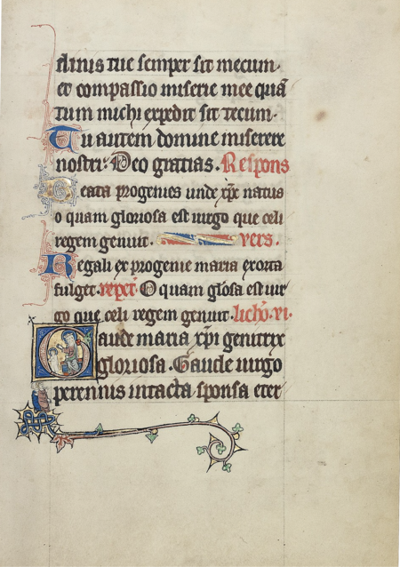
Unknown artist. First Steps with Jesus. The Raskin Clocks (M. S. Ludwig IX 3, Getty Museum). France, northeast, c. 1300.
University and legal codes looked different: the main text was arranged in two columns in the center of the page, with commentary—a glossary—running around it in the side and bottom margins.In some glossed Gospels, the page was divided into three columns: the biblical text was placed in the center, and explanations in the two side columns. This layout allowed the reader to see the sacred text and its interpretation simultaneously without turning pages.
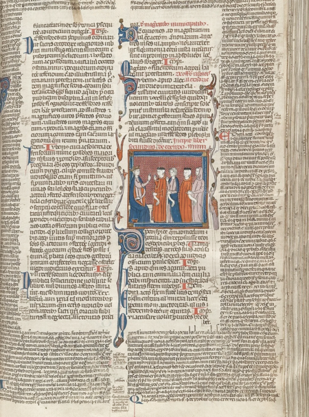
Justinian’s Code («Volume» and «Book of Feudalism»). Manuscript. Italy (Bologna), c. 1330–1335. National Library of Scotland. // Unknown master. Bible: New Testament (Gospels with commentaries). Italy (Bologna), c. 1200–1250. Victoria and Albert Museum (London).
Page Architectonics Guidelines
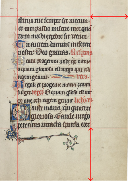
Geometric rules for typesetting strictly dictated exactly how scribes would layout the future book. The masters used rulers, lead pencils, or bright red ink to draw the grid. Sharp needles left barely perceptible dots around the edges of the parchment, serving as reference points for long vertical and horizontal lines of text.
The book margins were proportioned at 2:3 or 4:6. The narrowest margin was left near the spine, while the widest was placed at the bottom. The masters intentionally enlarged this area so that a reader would not obscure the written lines with their fingers while reading, allowing them to freely annotate important thoughts on the page edges.
Manuscript page featuring five holy women. Unknown French master, c. 1300. The Paul Getty Museum (MS Ludwig IX 3, folio 106).
Gothic Typeface: Density, Rhythm, and Rubrication
Density
The texture (script) determined the appearance of the page during the thirteenth and fourteenth centuries. Scribes were so adept at compacting the vertical strokes that the finished text visually resembled a woven cloth; this effect was achieved by tightly squeezing the characters horizontally and altering their customary forms. In these manuscripts, lowercase strokes notably grew longer. Conversely, artists intentionally shortened the ascenders and descenders.
The writing style evolved. By this time, the alphabet began to consist predominantly of strong vertical lines, which the masters supplemented with straight and diagonal strokes.
Watermill (illustration from Psalm 103). Miniature from the Lattrell Psalter. England, circa 1325–1335. British Library.
Rhythm
The writing appeared neat and structured. Each vertical stroke at the bottom concluded with a delicate upward movement. All these «legs» were uniform and rested precisely on a single, unseen line. The rhythm was further emphasized by the technique of touching opposing arcs, as the arcs of two rounded letters curved toward each other. Such letters were written with overlapping strokes, so they could share a common vertical line. Because of this, the line looked like a cohesive graphic ribbon, where the rhythm of the strokes took precedence over the spacing between words.
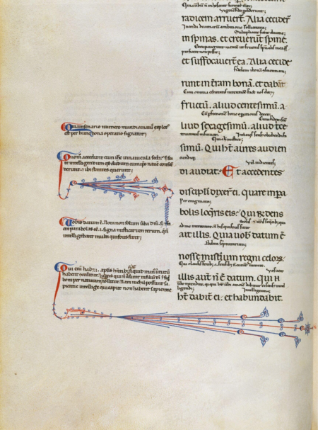
Page from the Malmesbury Bible (Numbers 1:24–26). Calligrapher Gerard Bilswy, 1407. Gothic script (Vulgate).
Topics
Rubrication served as the primary tool for navigation and semantic context. Red ink was employed for headings, initials, chapter numbers, and specific annotations. Rubrication helped the reader orient themselves within the text by indicating the beginning and end of textual sections and highlighting important passages.In manuscripts from the 13th–14th centuries, particularly in complex books—glossed Bibles, legal codes, and horologiums—red and blue elements acted as visual «anchors» for the eye scanning densely written pages, transforming the sheet into a structured space of information.
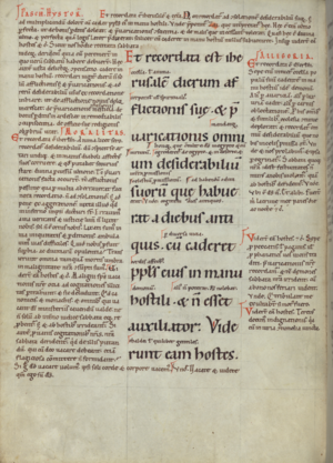
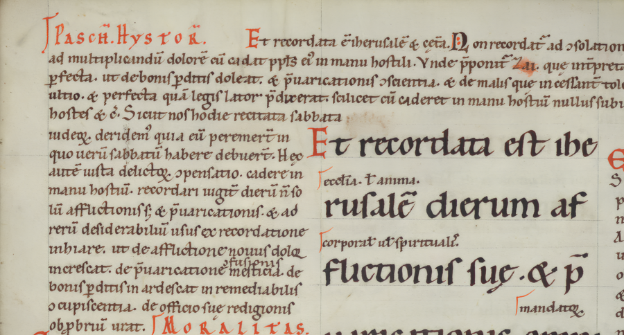
Gilbert Osersky. Ordinary Gloss to Lamentations of Jeremiah. Manuscript from the second half of the 12th century. From the Henry Walters Collection, Walters Art Museum.
Southern and Northern Traditions of the Gothic Manuscript
Density and rhythm formed the «woven» structure of the page, which by the 13th century had become the visual dominant feature of the Gothic book. However, this structure was not monolithic: within the single Gothic system, two distinct branches—which paleographers call the Northern and Southern textualist traditions—were clearly delineated from the 12th to the 13th centuries. This division reflected different cultural orientations, varying rates of adopting Gothic innovations, and divergent concepts of how a book should look and function.
Northern Tradition
The Northern tradition, prevalent in England, Northern France, the Netherlands, and German territories, pushed lateral compression and verticality to their limits. The letters here are extremely condensed horizontally, their proportions governed by strict geometry, and curved elements are minimized. The result is a sharp, «prickly» texture to the writing, where every vertical stroke ends in a delicate ascending flourish, and lines transform into a continuous graphic ribbon.