The Red Disc, White Field, and Grid: How One Design System Introduced a New Japan to the World
Introduction
The goal and research question are stated above. The working hypothesis to test is that the 1964 identity succeeded not because of a single object, but because the Design Committee integrated the emblem, posters, and pictograms into a unified system. This system spoke the international language of modernism (sans-serif typography, photography, pictograms in the spirit of ISO-symbols) while preserving a Japanese core—the red disc. Therefore, it was able to present post-war Japan as contemporary and open without erasing its own symbols. Add one sentence regarding the context: the first Olympics in Asia, a turning point in Japan’s re-entry into the global community.
Each chapter answers a question
1: Why did Japan need a new image?
2: Who decided what the Games would look like?
3: How does the emblem interact with the national flag?
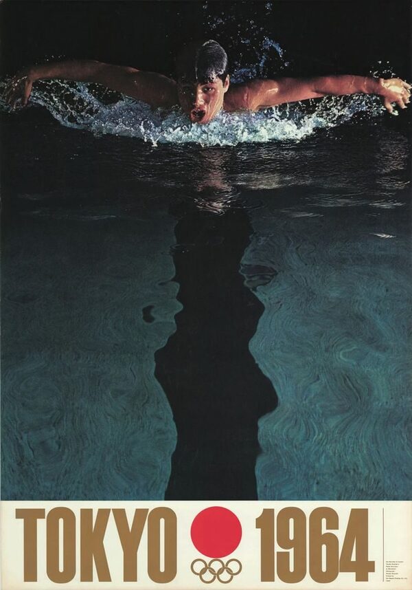
4: What do the posters communicate about speed, the body, and technology?
5: How does the sign work without language?
6: What forces shaped the outcome?
Chapter 1. The Country in Search of an Image
Official poster for the cancelled Tokyo 1940 Olympic Games
Tokyo was awarded the 1940 Games, but Japan declined them in 1938 during the war with China. Since those Games were tied to imperial festivities, their cancellation left the country without an international image untainted by militarism. The 1964 Games became a second chance, and designers had to respond to this precedent visually: not an empire, but a modern nation.
Aerial photograph of Tokyo after the 1945 firebombing
After 1945, the problem was twofold: devastated cities and symbols used in wartime propaganda, including the flag and the sun. A new identity could not simply discard these elements; instead, it had to rework them. The emblem in Chapter 3 addresses this challenge.
«Hiroshima Appeals», poster series, Yusaku Kamekura, 1983
Kamemura’s 1983 posters about the atomic bomb show that post-war designers already understood graphic design as a public statement for a mass audience: bold photography paired with restrained typography. In 1964, this function becomes official: the same designer is now speaking on behalf of the state, rather than against the bomb.
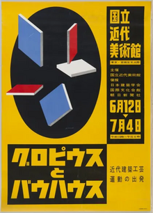
In the 1950s, designers established institutions: the Japanese Club of Advertising Artists (1951), the Japanese Design Committee (1953, among its founders was Katsumi Masaru), and the Nippon Design Center (1960). The World Design Conference in Tokyo (1960) added an international stage. By 1960, a profession had formed capable of producing a cohesive system—and this explains why Olympic design was a collective endeavor rather than the creation of a single author.
Tokyo won the vote at the IOC session in Munich on May 26, 1959, leaving about five years for preparation. A short timeframe benefits the system more than individual objects: when there are established rules for color, typography, and layout, hundreds of items can be produced uniformly. This is a hypothesis for analysis that needs to be verified in the design guide in Chapter 2.
Chapter 2. Design Philosophy and «Total Design»
Portrait of Katsumi Masaru
In 1960, the Design Council was formed under the guidance of critic Katsumi Masaru, who served as design coordinator, art director, and chief decision-maker. Giving the final word to the critic rather than to the corporation or the ministry was a key institutional choice: taste prevailed over bureaucracy, and nearly ten designers operated under a unified policy. Couldn’t that be what forged the identity into something cohesive?
Rome 1960 Olympic Games poster
The team spanned generations: from Hara Hiromu (b. 1903) to Takanori Yokoo (b. 1936), with Kamekura, Takashi Kono, Ryuiti Yamasiro, Ikko Tanaka, Kiyoshi Awazu, and industrial designer Sori Yanagi in between. This is crucial to the question of authorship: while Kamekura is credited in design histories, Hara assisted with the composition and the typeface for the emblem. The identity should more accurately be described as a collaborative effort with one visible face.
The design policy standardized the Olympic colors, unified typography (it is believed that Helvetica was first widely recognized internationally through this initiative), and layout rules in the form of a guide comprised of individual sheets. Because these individual sheets are easy to update and distribute to any print shop or sign-making workshop, the document format itself embodies systematic thinking. The main innovation was standardization, which allowed design to function as administration.
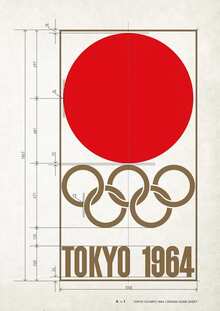
The design policy standardized the Olympic colors, unified typography (it is believed that Helvetica first gained widespread international traction through this standardization), and layout rules in the form of a set of individual sheets. These individual sheets are easy to update and distribute to any print shop or sign-making workshop, meaning the document’s form itself embodies systemic thinking. The main innovation was this standardization, which allowed design to function as administration.
Tokyo 1964 tickets with analog clock faces
The tickets were given to every spectator, so the identity was transferred from the wall to the hand. The dials of analog clocks connected the ticket to time and precision—a quality Japan wanted to showcase (hypothesis: compare this with the Seiko timing equipment at the same exhibition).
Tokyo 1964 Commemorative Medal
Medals, badges, invitations, and certificates illustrate how far the system has come—from the stadium to the pocket. Use them as proof of unity, rather than as separate objects, and explore which elements repeat (the disc, rings, typography, white space).
Cover of «The Games of the XVIII Olympiad, Tokyo 1964: The Official Report»
Official reports—serving simultaneously as primary source material and design objects—reveal how the Organizing Committee perceived its own work. Address this candidly, as the research relies upon a document that communicates the very ethos of the state, and corroborate it using museum catalogs and later scholarship.
Chapter 3. The Solar Disk: Emblem
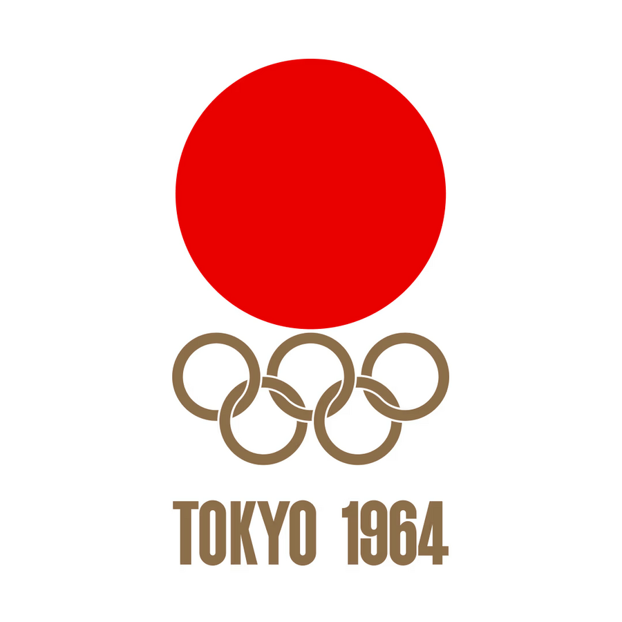
Tokyo 1964 Olympic emblem, Kamekura Yusaku
Emblem Anatomy: A red disk that is simultaneously a Hinomaru and the sun, golden Olympic rings, the inscription «TOKYO 1964”—all set against a white field. The simplicity was intentional: the symbol had to be legible on a flag, on a mark, and on a small television screen. The gold against the red and white is the sole ornamentation, connecting the national palette with the Olympic one. Note that Harashima Hiromu assisted with the composition and lettering, even though design histories often credit only Kamakura.
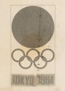
Poster No. 1 features neither an athlete nor a narrative, only a symbol, and it had the largest print run of the four (about 100,000 copies). It established the brand before any storytelling took hold—and that is the logic of identity systems.