Navigation
— Concept — Aesthetic Origins of Psychedelic Design — Color as a Tool for Expanded Perception — Typography and the Visual Deconstruction of Normality — The Influence of Pop Culture and the Music Scene — Psychedelica as a Language of Visual Protest — Conclusion — Sources
Concept
In my research, I aim to examine 1960s psychedelic design as a form of visual protest against the dominant social and cultural system. I am interested in how the graphic language of that era—vibrant colors, distorted typography, and visual effects referencing altered perceptions of reality—became not merely an aesthetic trend, but a means of expressing counterculture. Design, which emerged from the sphere of musical and artistic experimentation, transformed into a symbol of freedom, inner searching, and conscious resistance to mass values.
The psychedelic visual culture of the 1960s developed against the backdrop of massive global social change: anti-war movements, the fight for civil rights, the expansion of personal liberties, and experiments with the perception of reality. I view it not merely as an artistic style, but as a reflection of a generation’s drive to transcend rational thought and imposed social norms. Color, form, and composition in these works become metaphors for altered states of consciousness—an attempt to articulate ineffable experiences and internal discoveries.
I place particular emphasis on color as a key expressive tool within psychedelic aesthetics. Acidic hues, contrasting combinations, and fluorescent effects create a sense of expanded perception and emotional intensity. Color becomes an autonomous carrier of philosophical and aesthetic content, capable of evoking new sensations and associations in the viewer. Typography also plays a vital role: the deformation of letters, the rejection of conventional legibility, and the use of hand-drawn graphics form an aesthetic of visual chaos that resists the strict principles of commercial design. This is where the spirit of protest manifests—a drive to dismantle established canons of visual communication and offer the viewer a different, more visceral way of perceiving information.
The influence of pop culture and the music scene is especially noticeable in the posters, album covers, and magazines of that era, which became visual manifestos of freedom, energy, and collective imagination. Music, art, and design converged into a unified artistic reality, creating a unique visual language for the generation.
My goal is to demonstrate that psychedelic design is not merely a historical phenomenon, but a cultural code that remains relevant today. Its principles continue to be reinterpreted within digital culture and modern media forms, reflecting an ongoing search for alternative modes of self-expression, a pursuit of internal freedom, and an openness to new ways of perceiving the world.
Aesthetic Origins of Psychedelic Design
Psychedelic design of the 1960s did not emerge suddenly—it was the result of synthesizing numerous visual directions that preceded it in art history. Its formation is closely linked to the search for new forms of perception, a drive to express internal states, and a desire to contrast the rationalism of the postwar world with an emotional, sensual, and liberated aesthetic.
One of the key sources of inspiration was Art Nouveau (Modern) from the late 19th to early 20th century. Psychedelic-era artists actively reinterpreted the decorative plasticity of Modern—its flowing lines, organic ornamentation, fluid shapes, and biomorphic compositions.
For example, in Wesley Wilson’s poster for the Jefferson Airplane concert (1966), one can see a direct citation of Alphonse Mucha’s posters: characteristic female silhouettes, floral patterns, and halos surrounding the protagonist’s head.
Wesley Wilson poster for Jefferson Airplane concerts, 1966
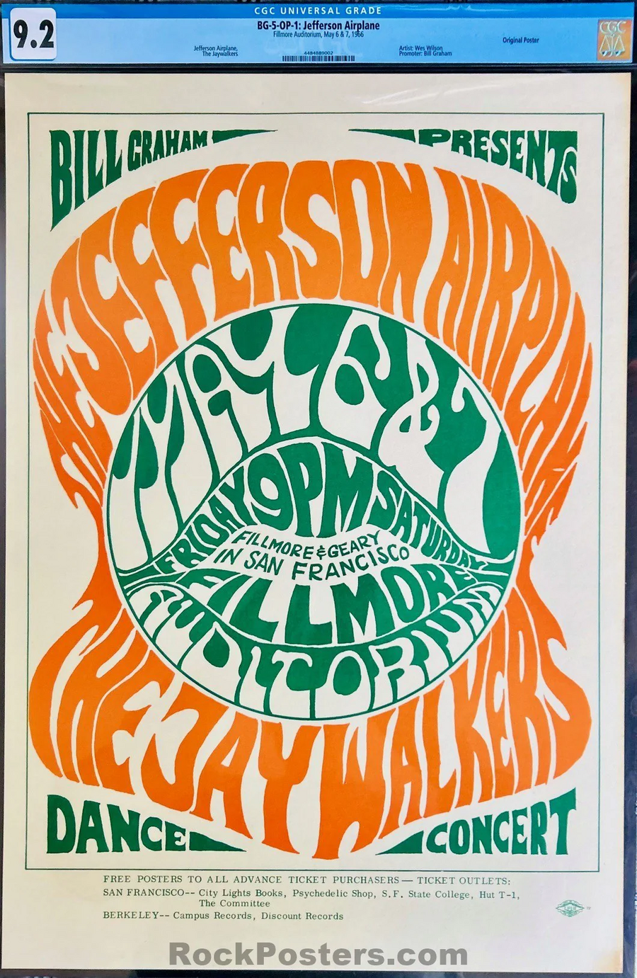
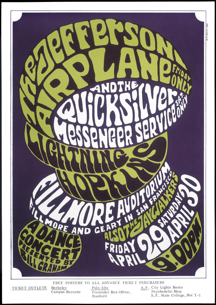
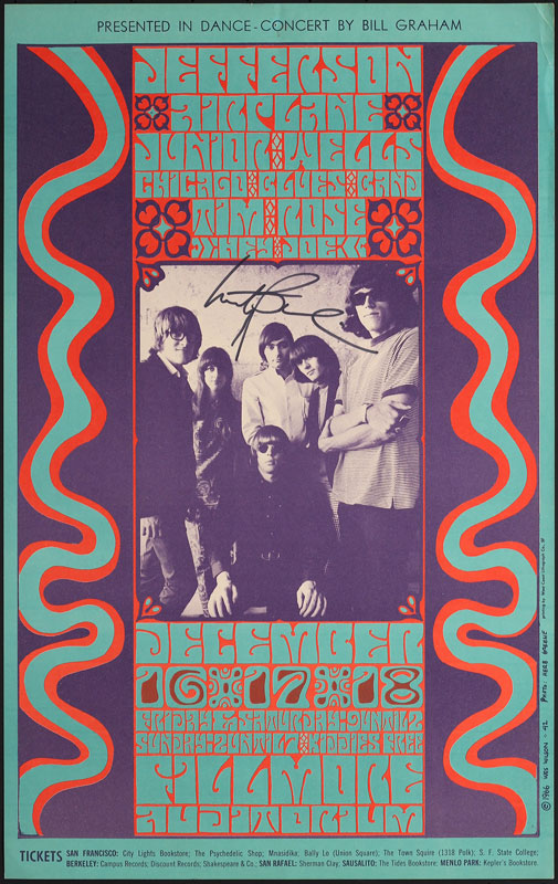
Wesley Wilson posters for Jefferson Airplane concerts, 1966
However, unlike the soft elegance of Art Nouveau, in psychedelia, lines become vibrating, and colors become acid-bright and high-contrast, creating an effect of optical oversaturation. The second significant influence was Surrealism—primarily in its drive to visualize the irrational, dreams, hallucinations, and altered states of consciousness. Rick Griffin’s poster for the Grateful Dead (1967) features unmistakable Surrealist motifs: fluid forms morphing into one another, and typography that resembles living organisms. Such solutions visualize the idea of the «flow of consciousness, ” dismantling the conventional boundaries between form and content.
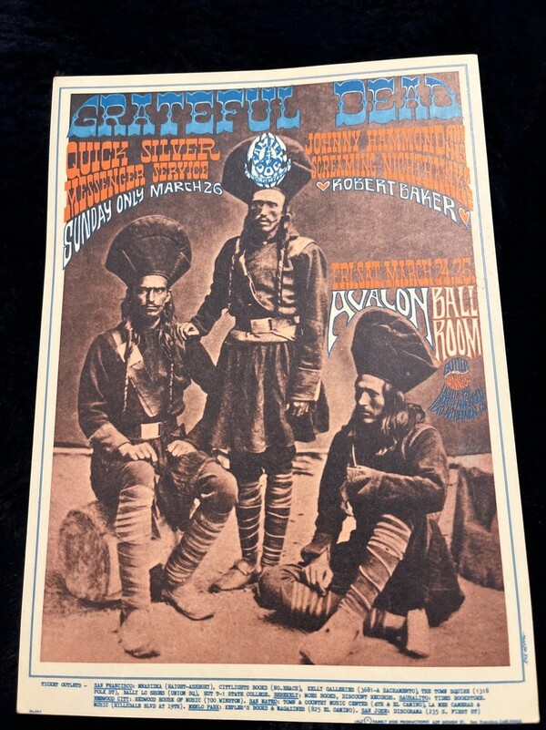
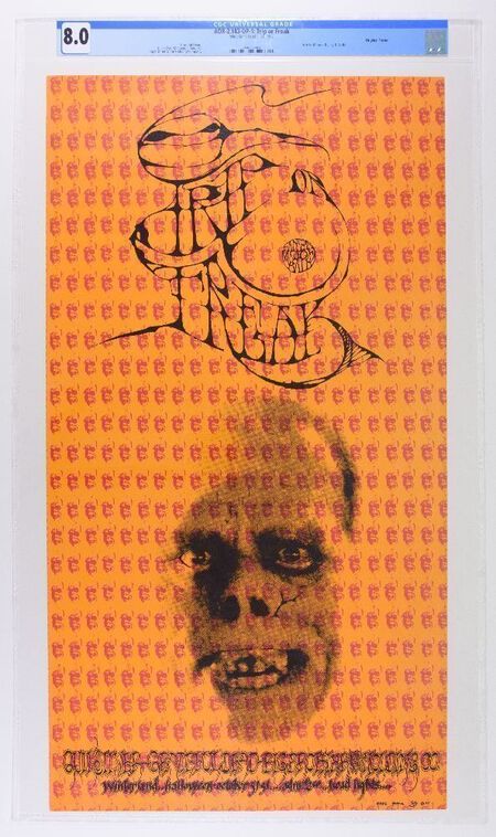
Rick Griffin posters for the Grateful Dead, 1967
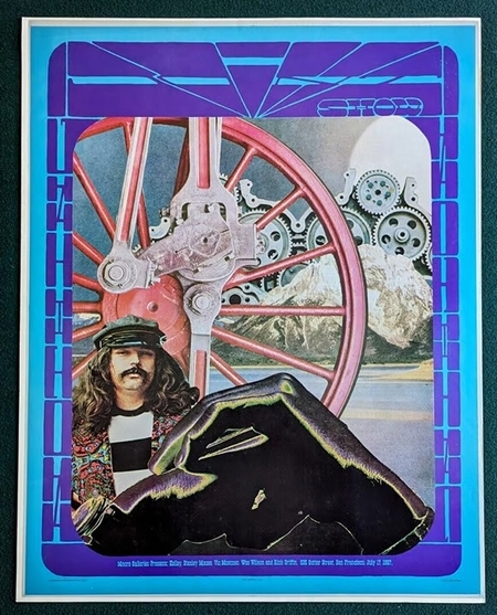
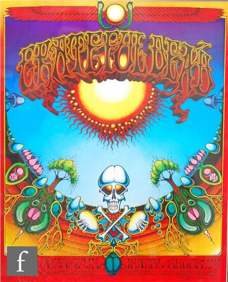
Rick Griffin posters for Grateful Dead, 1967
The influence of Op Art, as presented by artists such as Bridget Riley and Victor Vasarely at the time, is felt just as strongly. Their experiments with optical illusions and the perception of movement were reflected in psychedelic posters, where color and rhythm become tools for visual transcendence. Victor Moscoso’s poster for the Avalon Ballroom concert series (1967) is a prime example, where the contrast between fluorescent shades of red and blue creates a vibration that appears to literally «tremble» before the viewer’s eyes.
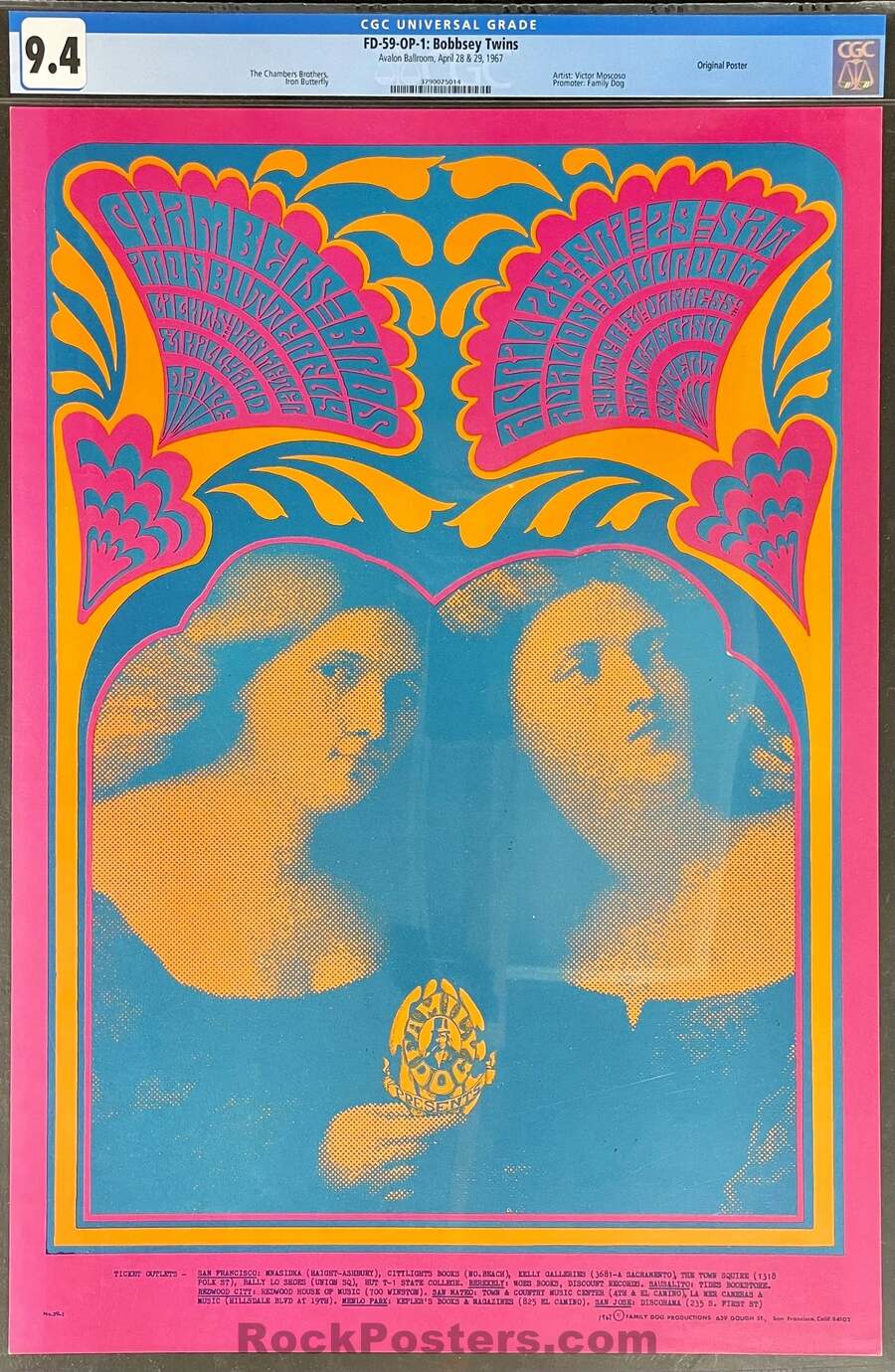
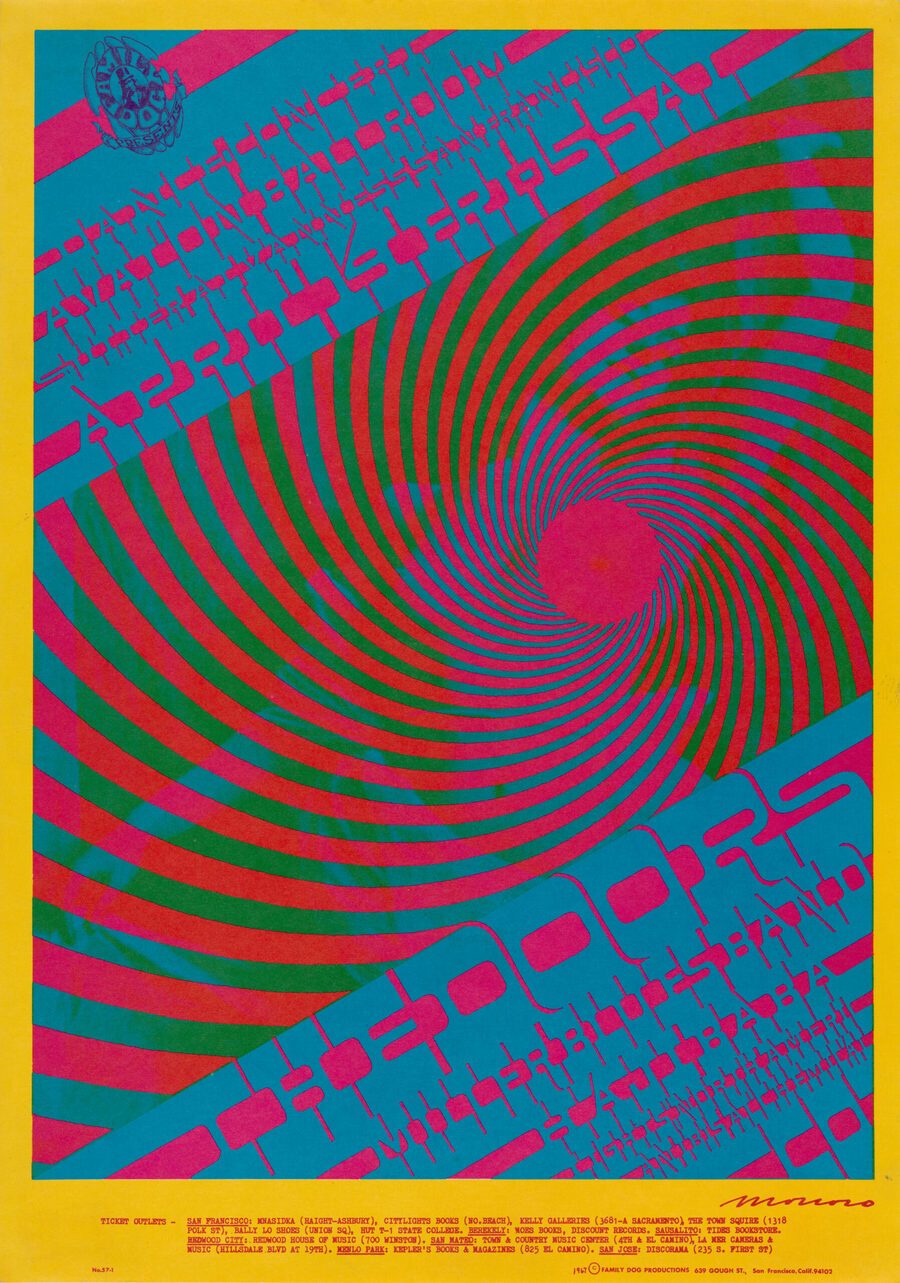
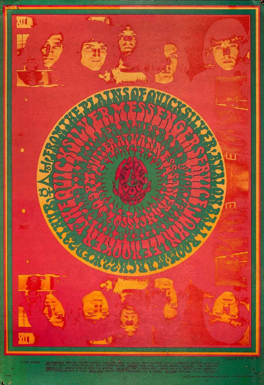
Victor Moscoso posters for a series of concerts at the Avalon Ballroom, 1967
Pop art, inspired by mass culture and media aesthetics, also played a significant role. Psychedelic design adopted its interest in comic books, advertising typography, and ironic visual quotes, but channeled this language against the system—transforming popular culture symbols into signs of protest. For instance, the cover of the album «Yellow Submarine» (1968), created by The Beatles studio in collaboration with artist Heinz Edelmann, combines bright outlines, grotesque figures, and fluorescent colors—creating a visual world where popular culture becomes an instrument of psychedelic utopianism.
Album cover for «Yellow Submarine,» created by The Beatles studio in collaboration with artist Heinz Edelmann, 1968.
Finally, one must note the influence of Eastern aesthetics—mandala, ornamentation, and Indian symbolism—which were brought into Western art along with the philosophy of the hippie movement. These motifs can be observed in the posters of Bonnie McLain, where ornamental symmetry and vibrant color fields create a sense of spiritual balance amidst visual chaos.
Poster «Skeleton & Roses» by Bonnie MacLean for the Grateful Dead / Oxford Circle, San Francisco, 1966
Color as a Tool for Extended Perception
In 1960s psychedelic design, color ceased to be merely a decorative element—it became a means of experiencing, a visual equivalent of altered consciousness and sensory liberation. Artists and designers of that era consciously employed color contrasts, fluorescent hues, and optical effects to induce in the viewer an almost physical sensation of vibration, trance, and visual saturation.
Color here doesn’t merely adorn an image; it impacts the psyche, compelling the viewer to see the world as if «from within an experience.»
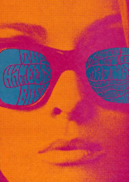
One of the most characteristic techniques was the use of acid palettes—combinations of bright orange, magenta, lemon yellow, azure, and toxic green. These tones, once considered too aggressive for a classic poster, acquire symbolic significance in psychedelia. For example, in Viktor Moscoso’s poster for The Blues Project concert (1967), the background is executed in a neon combination of fuchsia and turquoise, causing the image to literally «vibrate» before the viewer’s eyes. This color collision creates an illusion of movement and intensifies visual tension—mimicking the effect of hallucinogenic experiences so characteristic of the countercultural environment of that era.
Poster by Viktor Moskos for The Blues Project concert, 1967
Color in psychedelic design often becomes a carrier of emotional and spiritual states. In the posters of Wes Wilson for Avalon Ballroom or Fillmore Auditorium, colors «flow» into each other, like in a kaleidoscope. There are no conventional boundaries between hues—they create a sense of a continuous energy field where sound, light, and emotion exist as a unified whole. This approach reflects the philosophy of the era: a desire to dissolve the «self» into the common stream of perception, abandoning rational structures in favor of the intuitive and sensory.
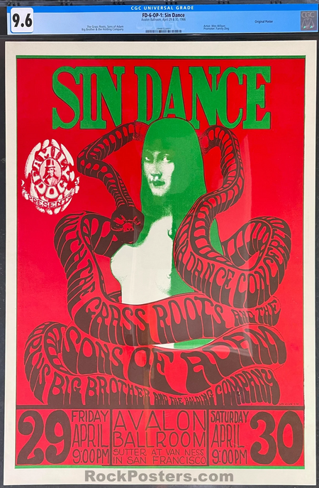
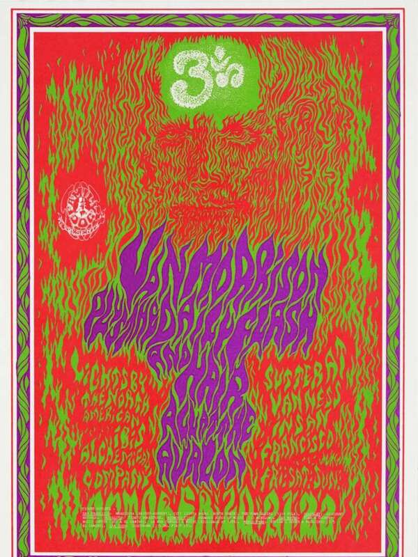
Wesley Wilson posters for Avalon Ballroom, 1966