Navigation
- Concept
- Before the Mascot: The Character as a Marketing Tool
- The Birth of the First Mascots
- Mascot Development
- The Character Beyond Packaging
- A New Era: The Mascot in the Digital World and Brand Collaborations
- Conclusion
Concept
The advertising mascot (from the English word «mascot"—a talisman) is not just a character on advertising banners; it is the face of the brand that shapes its character and mood.
Through appearance, facial expressions, color, and behavior, the hero helps capture consumers' attention, differentiate the product from competitors, and elicit emotional attachment to it.
This study examines the advertising mascots of American brands—from the earliest illustrated characters to modern figures. By analyzing companies across various sectors of the consumer market, we trace how the appearance and character of these figures have evolved, how they have become integral to corporate identity, and how they have influenced brand perception and popularization.The primary focus is on the visual characteristics of these characters and their role in communicating with the audience. This research aims to demonstrate how a mascot helps a brand acquire a distinct personality, a unique tone, and a recognizable image, transforming it from a mere advertising tool into an independent symbol of the company.
Before the mascot: The character as a tool for advertising
In the late to early 20th century, American advertising was primarily focused on showcasing the product itself and its benefits. The main goal was to tell the consumer about the item, emphasize its quality, and capture the buyer’s attention. For instance, the early Coca-Cola advertisement from 1886, «Drink Coca-Cola Delicious and Refreshing, ” emphasized the taste and properties of the beverage, while the 1902 ad, „Tis the Kodak Quality, ” highlighted the high quality of the product. Furthermore, this advertising campaign featured the Kodak Girl in the center of the composition—not quite a mascot in the modern sense. Nevertheless, this image can be considered a composite advertising archetype that helped the brand establish its own visual atmosphere, which would later be served by mascots.
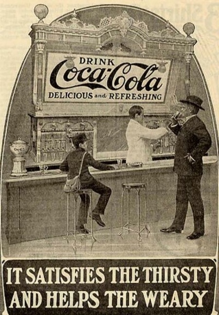
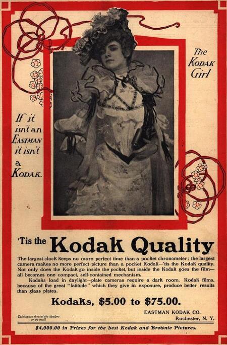
«Drink Coca-Cola, delicious and refreshing!» 1886, «'Tis the Kodak Quality» 1902
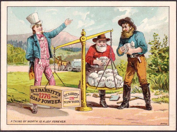
Advertising has frequently employed human figures to influence the perception of a product. Characters could represent the consumer, symbolize the quality of the goods, or imbue the advertising message with a humorous tone. Beginning in the second half of the 19th century, advertisers started using Uncle Sam (the personification of the United States of America) to promote a wide variety of products—from coffee and soap to tobacco and household gadgets. He functioned as a kind of advertising ambassador: he could recommend a product, demonstrate its benefits, or address the buyer directly.
The Consumer Persona
Symbol of Quality
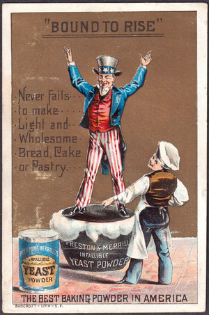
Humorous tone
The Birth of the First Mascots
Over time, random advertising imagery featuring children, adults, and animals gradually took a backseat as specific characters—the first mascots—became associated with the brands. These characters developed recognizable appearances, symbolic meaning, and progressively became integral parts of the corporate identity. The character no longer simply accompanied the advertisement; it helped define the company’s character and distinguish it from competitors.
One of the early American examples of a permanent brand character is the Quaker Man mascot for Quaker Oats (1877)—the image of a man dressed in Quaker attire was registered as a trademark. The Quaker figure reflects honesty, reliability, and traditional values. This calm, neat, and benevolent man creates the impression of a time-tested brand that one can trust. He symbolizes the quality and stability of the product.
The first mascot of the Quaker Oats brand (1877)
Morton Salt Girl — Morton Salt, 1914 The girl with the umbrella and scattering salt appeared in the Morton advertising campaign. Her image was connected to a specific product feature: the salt remained free-flowing even in humid weather. The character and the slogan, «When It Rains It Pours, ” became a unified advertising concept that developed further in the future. The girl with the umbrella reflects the product’s practicality and convenience. Her lighthearted, cheerful image makes the brand approachable and understandable.
Morton Salt Girl — Morton Salt, 1914
Mr. Peanut — Planters, 1918 The character emerged from a contest to create the Planters brand mascot. The winning design, by 13-year-old Antonio Gentile from Suffolk, Virginia, depicted a peanut with arms and legs. Later, the artist added a top hat, monacle, cane, and other details, forming the image of an elegant gentleman. This is a particularly telling example: the product itself transformed into an anthropomorphic hero with a distinct personality. Mr. Peanut embodies elegance, quality, and status. This grants the brand a unique identity, while elevating the everyday product to a more premium image.
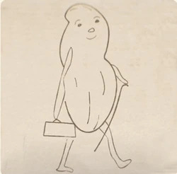
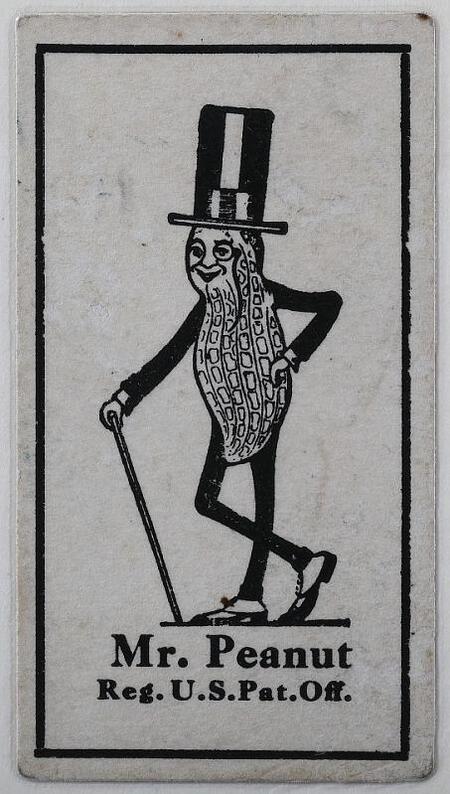
Drawing by Antonio Gentile, 1916, Mr. Peanut, 1918
The main difference among the mascots listed is that Quaker Man conveys brand values, Morton Salt Girl demonstrates product advantages, and Mr. Peanut transforms the product itself into a distinct character with a vivid personality.
Mascot Development
With the evolution of technology, shifts in visual trends, and changing consumer interests, mascots gradually transformed alongside the era. Throughout the 19th and 20th centuries, many characters repeatedly updated their appearance: they gained color, changed poses, attire, and even the character of the depiction. Nevertheless, despite these external transformations, brands sought to preserve the recognizable features of their mascots—the signature silhouette, specific details, or elements of the image that allowed buyers to recognize their favorite character and associate it with the brand.
Ronald McDonald — McDonald’s Mascot
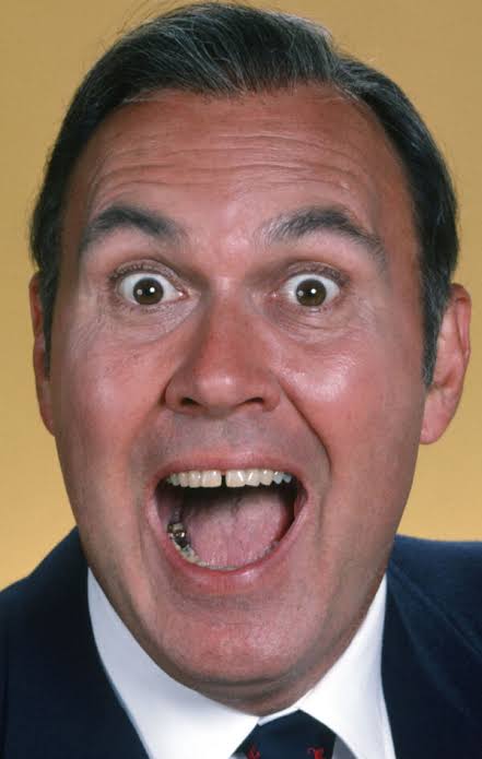
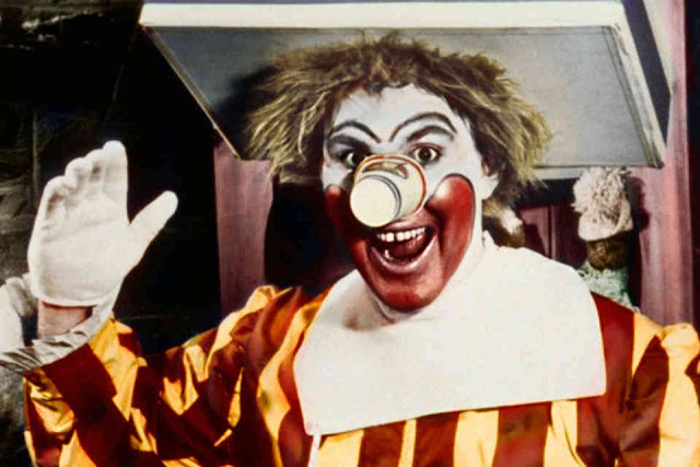
Ronald McDonald’s history is particularly interesting because his image changed almost completely shortly after his debut. The character was created in 1963 for American McDonald’s advertising. The first Ronald was the television host and actor Willard Scott, who had previously played the clown Bozo. His costume was quite unusual: he wore a tray topped with a hamburger, french fries, and a milkshake on his head, his nose was made from a paper cup, and another tray was positioned around his waist. This image directly linked the character to the restaurant’s products, making him memorable for children.
Character Beyond the Packaging
A New Era: Mascots in the Digital World and Brand Collaborations
Conclusion