Concept
Writing, throughout its history, has developed not only as a means of recording spoken language but also as an independent system for transmitting information, requiring its own methods of text organization and interpretation. Unlike oral communication, written communication lacks the speaker’s immediate presence; consequently, the reader cannot rely on intonation, vocal timbre, pauses, or other aspects of speech behavior. All content must be conveyed through graphic elements arranged on the page plane.However, early writing systems did not possess the same range of textual organization tools as modern ones. The ancient manuscript tradition widely utilized the principle of scriptio continua—continuous writing—in which words and sentences could be recorded without spaces or conventional punctuation. The text was a sequence of letters, and defining the boundaries of words and semantic structures largely depended on the reader’s experience and training. Reading demanded independent interpretation: one had to discern where one thought ended and another began.
One of the reasons for the emergence of the first punctuation systems was the need to facilitate the comprehension of written text and convey the characteristics of its oral rendition. The ancient Greek philological tradition played a particularly important role in this process. In the 3rd century BCE, the work of Aristophanes of Byzantium is associated with the development of a system for indicating semantic and rhetorical pauses. Dots, positioned at various levels relative to the line, were used to segment the text. Their placement could indicate a different degree of semantic completion: a short stop, an intermediate pause, or the conclusion of a major section of discourse.
Gradually, graphic notations began to perform more complex functions and subsequently started being used to convey rhythm, intonation, and nuances of vocal performance. This became particularly important in the practice of public and liturgical reading. During religious services, liturgical texts were recited according to specific rules of intonation, and the manner in which a phrase concluded could influence the choice of a melodic formula. In the article «Melodic Lection Marks in Latin Manuscripts for Mass» (2017), researcher Eleanor Giro examines the specialized notations found in Latin liturgical manuscripts. She demonstrates that these graphic signs helped the reader distinguish between complete, incomplete, and interrogative constructions, thereby dictating the appropriate manner of their delivery. Thus, punctuation served as a kind of instruction for reading aloud, allowing graphic elements to convey vocal characteristics that could not be discerned directly from the written text.
Similar systems evolved further in early medieval Europe. With the spread of Christian book culture and the increasing volume of texts being copied, there arose a need for more systematic organization. In monastic scriptoria, methods for text division, marking pauses, and isolating distinct semantic segments were gradually refined. During this period, the system of positurae developed—specific graphic notations that aided in organizing reading and distinguishing the nature of stops. However, a single, universal system did not yet exist: graphic forms and their applications varied depending on time, place, and scribal tradition.As written culture advanced, the functions of punctuation continued to expand. Marks began to be used for structuring text, demarcating paragraphs, indicating the conclusion of separate sections, and specifying the nature of utterances. The need emerged to convey more specific meanings that could not be expressed by the existing notations. Thus, separate signs of intonation, editorial marks, and symbols designed to denote the semantic and emotional qualities of the text gradually formed.
Obsolete signs
Punctus elevatus
Punctus elevatus
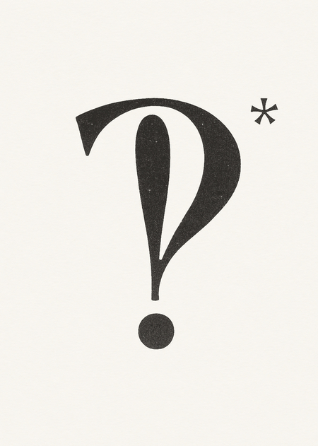
One characteristic feature of medieval punctuation was the punctus elevatus. It emerged in the Latin manuscript tradition and gained wide adoption during the Early Middle Ages. Its use was tied not only to marking the end of a sentence but also to indicating intermediate semantic pauses during reading.
Graphically, the sign consisted of a dot with a curved stroke positioned above it. The upper element could resemble a small comma, a hook, or a diagonal line. Depending on the script and the period, its rendering changed noticeably: more rounded forms, elongated strokes, and variants featuring an almost straight upper element can be found. The function of the sign was not entirely fixed. In the positurae system, it denoted a significant internal pause, but in Late Medieval manuscripts, it could also be used for less pronounced stops. Its meaning was often determined by context, neighboring signs, and the specific characteristics of the manuscript tradition.
In the late Middle Ages, the use of punctus elevatus gradually became less consistent. Scribes increasingly limited themselves to a simple dot, using oblique strokes and other simpler forms to separate clauses. Furthermore, with the development of printing, a need arose to standardize punctuation marks, which promoted the adoption of familiar forms of the comma, period, and semicolon.Today, this historical script can be found in specialized typefaces and academic publications. In Unicode, it is represented by the distinct character ⹎ (U+2E4E). Its existence allows for the reproduction of the historical mark without substituting it with a modern comma or semicolon.
Punctus flexus
Another interesting example of medieval punctuation is the punctus flexus. It gained popularity in monastic script and was particularly characteristic of the Cistercian tradition. Unlike the punctus elevatus, which indicated a more pronounced internal pause, the punctus flexus was used for a shorter stop. Its use was closely tied to the reading of religious texts and the organization of liturgical speech.Graphically, the sign differed from other medieval markings due to its unusual shape. It consisted of a dot and a curved element above it, which could resemble a jagged seven or a small loop. In different manuscripts, the upper element varied in its degree of slant and roundness.
Gradually, the sign lost its independent meaning. In late medieval manuscripts, scribes increasingly used a limited set of notations, not always strictly distinguishing between types of pauses. Instead of several special symbols, a single dot could be used, and the reading characteristics were determined by context. With the disappearance of traditions in which the punctus flexus held a stable meaning, the need for it also diminished. The sign does not have a separate standard Unicode code point. To reproduce it, special font projects are used, particularly MUFI — Medieval Unicode Font Initiative. This allows its form to be preserved in digital typography.
Paragraphs
In ancient Greek writing, there existed a distinct system of signs designed to organize text, which was often inscribed without spaces between words. Scribes used specific notations in the margins to indicate the boundaries of semantic units, separate dialogues, and facilitate the reading of lengthy texts.
One of the most common markings was the paragraphos. Its name derives from the Greek word associated with writing next to or near a line. In its simplest form, it was a short horizontal line placed beneath the start of a line. The dash might slightly extend into the left margin or run beneath several initial letters. Depending on the text, the paragraphos could serve different functions. In dramatic works, it denoted a change in speaker; in poetry, it marked the boundary between stanzas or metrical sections; and in prose, it separated segments of meaning.
Coronis
Coronices marked the endings of stanzas, poems, and books. They could span several lines in height and combine with paragraphos, as seen in the closing column of Hyperides’ oration. Among historical designs are forms resembling birds and elongated, winding outlines intersected by horizontal strokes. Skironis traces how the sign’s placement evolved: in some codices, coronices were placed around the final title or centered on the page beneath it. Thus, the sign became an integrated element of the book’s closing composition.
Paragraph
Paragraphus. Exon Domesday, Exeter Cathedral Library MS 3500, fol. 110v, record 110b2
The medieval paragraphus indicated the beginning of a paragraph, stanza, section, or individual clause. In the English manuscript Exon Domesday from the 1080s, it marked the start of entries. On folio 110v, the scribe—whom researchers identify as Gamma—placed a complex paragraphus before the entry regarding Tiverton. Other fragments of the same manuscript show that the number of crossbars and the outline of the main stroke could vary. Forms with one or two crossbars could perform the same function even within the same artifact. For the digital symbol ⹍, the single-crossbar rendition was selected.
Unsettled Signs
Written language has limited means of conveying intonation, emotional state, and the author’s attitude toward the subject matter. In oral communication, the meaning of a statement depends not only on the words themselves but also on vocal timbre, pauses, stress, volume, and changes in intonation. When transitioning to written form, a significant portion of these characteristics vanishes. Over time, the existing system of signs proved insufficient to convey more complex nuances of expression—such as irony, doubt, sarcasm, confidence, surprise, or emotional coloring.
This problem became particularly noticeable in literature, journalism, and print communication, where the author needed to control not only the content of the text but also how it was perceived. A standard question mark did not always allow one to distinguish a sincere question from a rhetorical one, nor could an exclamation point convey both surprise and distrust simultaneously. Irony could completely alter the meaning of a sentence, yet it had no graphic marker, leaving the reader to independently determine the author’s intent.
Punctus percontativus

Punctus percontativus
Also known as the percontation mark or Henry Denham sign. Graphically, it is a mirror image of the question mark.
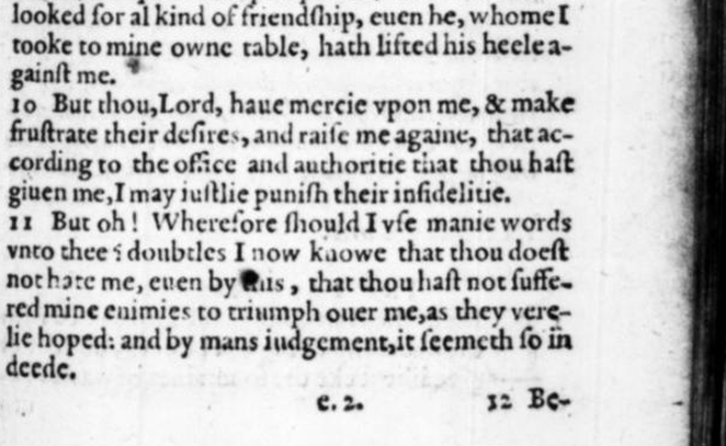
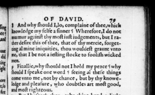
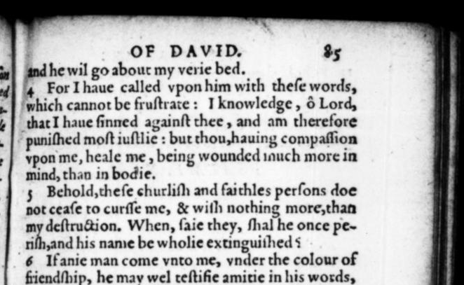
«The Psalms of David, ” 1581
In the Latin rhetorical tradition, two types of questions were distinguished. Interrogatio implied a «yes» or «no» answer, whereas percontatio was an open-ended question allowing for various responses. Denham proposed visually differentiating these structures using two distinct marks. The familiar question mark was retained for a standard question, while its mirror image was used for percontatio. This form allows for an easy connection to conventional punctuation while visually highlighting a different type of statement. The introduction of this new symbol was linked to the development of English printing and the desire to more accurately convey the structure of written speech. Printers experimented with various graphic notations, and some marks were used only in specific editions.
George Turberville, Tragicall Tales, 1587
The earliest uses of the punctus percontativus are associated with the 1581 editions of David’s Psalms, prepared by translator Anthony Gilby and printed by Henry Denham. In 1587, the mark also appears in George Terberville’s Tragicall Tales. Later, playwright Thomas Middleton employed it in rhetorical questions, thereby expanding the mark’s original function. Initially, it was not solely a sign of irony—its primary purpose was to distinguish between types of questions. The ability to use it to denote a rhetorical or sarcastic statement emerged later. However, the distinction between an open and a closed question did not always require a separate graphic marker; it could be determined by grammatical structure and context. Furthermore, using the mark necessitated a separate ligature that had to be created and incorporated into the typesetting. After several decades of limited use, it disappeared from common printing practice.
Irony Sign
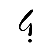
Point d’irony
A sign used to denote irony, sarcasm, and statements whose meaning is contrary to their literal content.