Table of Contents
1. Concept
2. Embodiment and Texture
3. Color
4. Light and Shadow
5. Special Effects and Deformation
6. Conclusion
7. References
Concept
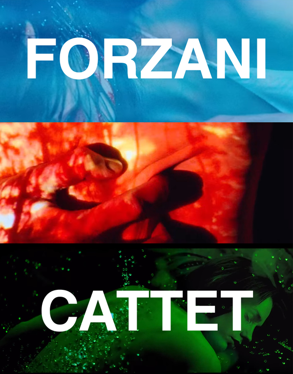
Ellen Catte and Bruno Forsani are a French directorial duo working in Belgium. To date, they have authored four feature films and are among the most prominent figures in the «neo-giallo» movement.
The giallo style (Italian: giallo—“yellow») is a unique subgenre of Italian cinema that merges thriller, horror, and detective erotica. It originated in the 1960s and served as a precursor to American slashers [1]. The term derives from the Italian word giallo («yellow») and refers to the cheap crime novels published by Mondadori in Italy starting in 1929, identifiable by their distinctive yellow covers.
From a film theory perspective, giallo is a phenomenon where visual form dominates narrative logic. The French duo inherits this recognizable visual lexicon, yet in interviews, the directors frequently discuss their desire to reinvent the genre’s grammar.
Ellen Katte: «…but I didn’t just want to reproduce Jallo; I wanted to make something personal, something of my own.» [2]
For the Jallo duo, it is a language—a set of «words» that helps tell their own story. This is why it is more accurate to refer to «Neo-Jallo» not as a genre category, but as post-genre formalism. This very understanding of genre as language establishes the framework for the entire visual language of the duo.
«Genre is created through codes, ” Bruno Forzani explains. „In Italian westerns and gialli, the genre is closely tied to mise-en-scène, so all the codes are embedded in the image, editing, sound, and cinematic techniques. We use these codes to tell our own story, not to pay tribute. It is a language—it is the words that help us tell our story.“ [3]
The research hypothesis posits that the visual language of Catt and Forzani should be interpreted as an autonomous narrative requiring a novel, visually oriented mode of perception. Their films impact the viewer not so much through symbolic meaning or hidden connotations, but through direct physiology, tactile and haptic sensation, and a range of visual associations with emotions and bodily states.To investigate the methods of their influence, the visual techniques were divided into four categories: corporeality and texture, color, chiaroscuro, and special effects.These categories were delineated based on the type of operation used to construct the image surface; the order of division follows a logic of progression—moving from the most direct tactile contact (skin, texture, close-ups), through color and light influence, to special effects that synthesize and deconstruct the first three layers, thereby maintaining the entire system in a state of tension.This structure allows for the testing of the hypothesis across different levels of image organization, from texture to optics, and demonstrates how its various facets contribute to the production of meaning.For this study, I selected four feature-length films by the directors: «Bitterness» (2009), «Strange Color of Your Body’s Tears» (2013), «Let the Corpses Burn!» (2017), and «Reflection in a Dead Diamond» (2025), because these works most completely reveal pure cinematic expression, unlike the early short films which were constrained by small budgets and compressed running times. Furthermore, the footage from the short films is only available in low quality, rendering them inadequate as sufficiently representative visual material.
Embodiment and Texture
Corporeality and texture are the first and most direct level at which the films of Catte and Forsani establish contact with the viewer. The dilation and constriction of pupils, swallowing saliva, the glide of sharp blades across rough skin—all of this immediately sets the emotional and sensual tone of the scene. Individual scenes may not have hidden symbolism—metaphors here function more literally, when a romantic experience is demonstrated through hands squeezing the neck, or internal conflict through physical contact with sharp objects or damaged flesh. To convey this haptic experience, the film relies heavily on numerous close-ups and extreme close-ups.
Eyes—the first thing that reveals a person’s reaction to what they see. Biologically, humans are capable of reading a person’s emotions with high accuracy by seeing only their eyes. A wide-open eye expresses shock or surprise; bloodshot eyes indicate anger; a narrowing pupil suggests fear. This technique often appears in tense scenes, helping us place ourselves in the hero’s shoes to understand how to respond to the unfolding events, allowing us to perceive subsequent moments through the prism of that feeling.
In the scene with the car (the film «Bitterness»), we read the heroine’s gaze—a look that carefully examines the interior and the driver. We see that she is quite focused, yet she avoids direct eye contact, and the dark sunglasses only reinforce this desire to evade. This gaze then shifts to a close-up of the driver’s concentrated and coolly detached expression. He stares directly into the camera lens, making the viewer feel physical discomfort.
Close-up shots of skin—another calling card of filmmakers. Despite representing the apex of fetishism, this technique is revealed in entirely new ways across different contexts. The brilliant, glistening skin of the characters in «Let the Corpses Tan!» directly conveys not only the heat but also the tension of the characters and the intensity of the atmosphere in a small, heavily armed village.
In another scene, the image of skin is presented in the light of Eros—a life-giving force, libido. It should be noted that in this case, there is also a shift in gender dynamics, which is another crucial aspect of the couple’s creative work. The men tie the crucified body of the heroine, Lucy, with ropes, and a liquid begins to pour from her, which they then drink. Although they act as executioners, they are simultaneously placed in a dependent position, under the woman’s authority, and only she is capable of quenching their thirst.
In «Goréchi,» the camera zooms in on Anna’s bare abdomen, and an ant crawls out of her navel—a rather direct metaphor marking the moment of sexual awakening.
At the same time, just an episode earlier, the skin surface serves as a field for investigating entirely different forces—the forces of death, Thanatos. This scene establishes a model for the viewer’s experience: touching the decaying skin becomes a contact with foreign material adhering to the fingers; Thanatos is conveyed here not through the symbolism of death, but through texture—the roughness, the coldness, the alien quality of dead skin.
And of course, one cannot ignore the scenes of the blade gliding across the skin and halting at its surface. Here, the viewer witnesses knife fetishism, in which the anticipation of the cut works more powerfully than the cut itself.
Close-ups of skin, eyes, and blades function as a language intended to impose a nearly visceral, bodily experience upon the viewer. Some critics use the term «eye attack» to describe this approach. After watching any of their films, the viewer is left with a powerful somatic reaction, as if they experienced the onscreen traumas themselves. [4]
Color
Color is a powerful tool that allows the viewer to perceive the tone and mood of a painting even before logical comprehension. Regarding Giallo films, the role of color in the works of Catte and Forsani also shifts toward direct sensory impact rather than symbolism. In the works of Argento or Bava—the most famous Giallo directors—there are numerous classic examples of how color establishes a chain of symbols. For example, bright red might function as a warning, a sign of «caution, danger, ” or „death is imminent.“ With Catte and Forsani, however, the color red does not signify a threat; it is itself a physical, almost tactile experience. Red works not as an enhancement, but as the event itself. It is not used to warn the viewer about a knife attack, but rather to merge with the attack itself, extending it onto another, chromatic plane.
Red greets us right at the beginning credits of every film, preparing us for a wild color immersion, and it also accompanies us in the final scenes.
The ever-shifting kaleidoscope of colors on stage during the opera («Reflection in a Dead Diamond») physically conveys a multifaceted and profound sensation—a journey of the mind or a flash of past images evoked by listening to beautiful music.
The same shift in color in the scene from the film «Bitterness,» when young Ana first sees her parents devoted to love, is capable of conveying the intensity with which she experiences this moment—the physical impulse generated by the incomprehensibility of what her undeveloped mind witnesses.
The dominant hue in «Let the Corpses Burn,» perhaps, is yellow. In different frames, it merges with the characters' skin tone, radiating a visceral connection through the screen; it blends with the landscapes and the sunlight, intensifying the sensation of heat; and finally, it merges with the color of gold—the film’s central thematic thread. The all-consuming golden glow that washes over the faces allows one to sense how obsession and gold fever literally permeate their pores. Meanwhile, this same luminescence breaks through the screen’s space, coloring the viewer’s own face—and perhaps even their thoughts—yellow.
The fading of colors, the return to a familiar «natural» palette, relaxes the optic nerve, and we regain a sense of control, creating distance from persistent color and tactile contact. For instance, in the finale of «Bitterness, ” the blue tone—which conveys the body’s coldness or the artificial lighting of the scene—gradually dissolves, the protagonist’s skin regains a healthy color, as we watch her return to life.
Chiaroscuro
If color dictates the intensity of the impact, light and shadow govern visibility itself—determining what the viewer sees and what remains hidden from them. Forsani and Katte continue this same logic: shadow is primarily not a symbol of anxiety or mystery, but a means of reproducing a specific kind of vision.Darkness does not oppose light as a metaphor for good and evil; rather, it acts as an active matter capable of compressing space, narrowing the field of vision, and ultimately replacing the image.
The most radical example is the motif of silhouettes moving directly toward the camera until the screen turns completely black. In «Bitterness,» a young Ana is pursued by a dark figure, and at the end of the film, the killer in black gloves appears as a shadowy silhouette—a mass of darkness that has gained volume. The camera does not pull away, nor does it allow the viewer to discern the character. Instead, it allows the figure to advance, and as the silhouette nears, its shadow fills the entire frame. This technique also removes the viewer’s distance: the camera does not show what is hiding in the darkness, but compels the viewer to feel that something faceless is closing in on them.
The vignette, seen through a keyhole, translates the same logic into a field of constriction. The shadows along the frame compress the visible area into a narrow aperture, thereby either placing the viewer under the gaze of the watcher or compelling the viewer to peer in. This intensifies not only the psychological aspect but also the physical sensation of presence in the frame.
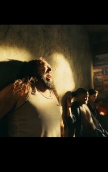
In this frame from «Let the Corpses Burn!», Lucy’s silhouette dominates the buried character and, simultaneously, the viewer, blocking sunlight from both and determining what is available to their sight.