How to depict an event that no one has witnessed? In the illuminated manuscripts featuring Beat Liaban’s commentary on the Apocalypse, the end of the world is presented as a space of vibrant planes. Artists portray angels, monsters, celestial cities, and catastrophes, abandoning the illusion of depth that is familiar to us. Color becomes a method of construction—to segment episodes, emphasize figures, establish rhythm, and connect disparate events onto a single page. This study examines the miniatures as autonomous artistic compositions where the unseen takes on a recognizable form. Special attention is paid to the interaction between color, contour, scale, repetition, and character placement.
This project is a coursework assignment from a student at the School or a research project from a faculty member at the School. This project is non-commercial and serves educational purposes.
In the history of art and medieval books, beatus (or beati) refer to illuminated manuscripts featuring the text, «Commentaries on the Apocalypse, ” composed in the 8th century by the Spanish monk Beatus of Liébana.
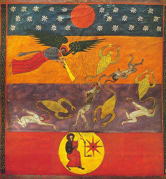
The image displays a medieval book miniature from a Spanish-Moorish manuscript titled «Beatus, ” specifically from the manuscript „Beato de Facundo“ (1047).
Key research question
What artistic means did miniaturists of the 10th–11th centuries use to transform apocalyptic visions into expressive images, and what role did contrasting color fields play in this? How did color help the viewer perceive complex compositions and distinguish between concurrent events?
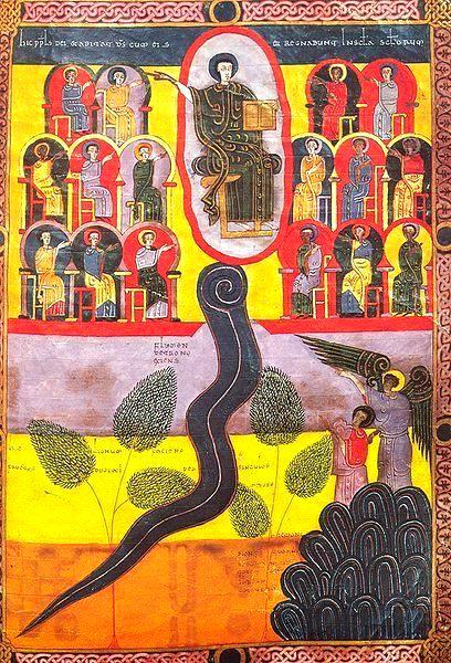
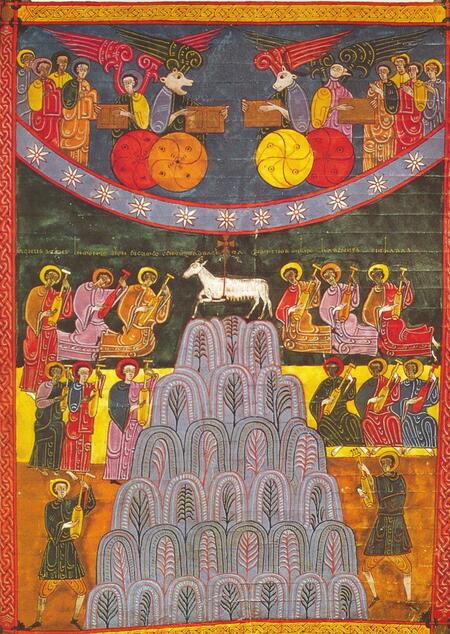
The image displays miniatures from the famous 11th-century manuscript, «Beata of Fernando I and Sancho, ” dated 1047, created by the artist Facundus.
Hypothesis
It is hypothesized that the vibrant palette of illuminated manuscripts was more than mere decoration. Color helped organize the plane of the page, delineate boundaries between spaces and episodes, guide the viewer’s eye between figures, and create emotional tension. Furthermore, identical narratives across different manuscripts could receive vastly different color schemes. Expressiveness was not built on the universal meaning of any single hue, but on its relationship to adjacent colors, outlines, and the overall composition. Comparing these works will allow us to determine which techniques were replicated and which were dependent on the specific workshop’s artistic tradition.
Material Selection Principle
The basis of this study comprises miniatures by Beat of Morgan (10th century), Beat of Facund (1047), and Beat of Saint-Sever (11th century). Manuscripts from a single textual tradition were selected—though they vary in time and origin—to allow for a comparison of similar narratives and diverse artistic approaches. The material is curated based on the expressive quality of color contrasts, spatial construction techniques, recurring motifs, depictions of fantastic creatures, and multi-figure compositions. Both complete folios and isolated fragments are examined to permit a detailed analysis of the artistic methods employed.
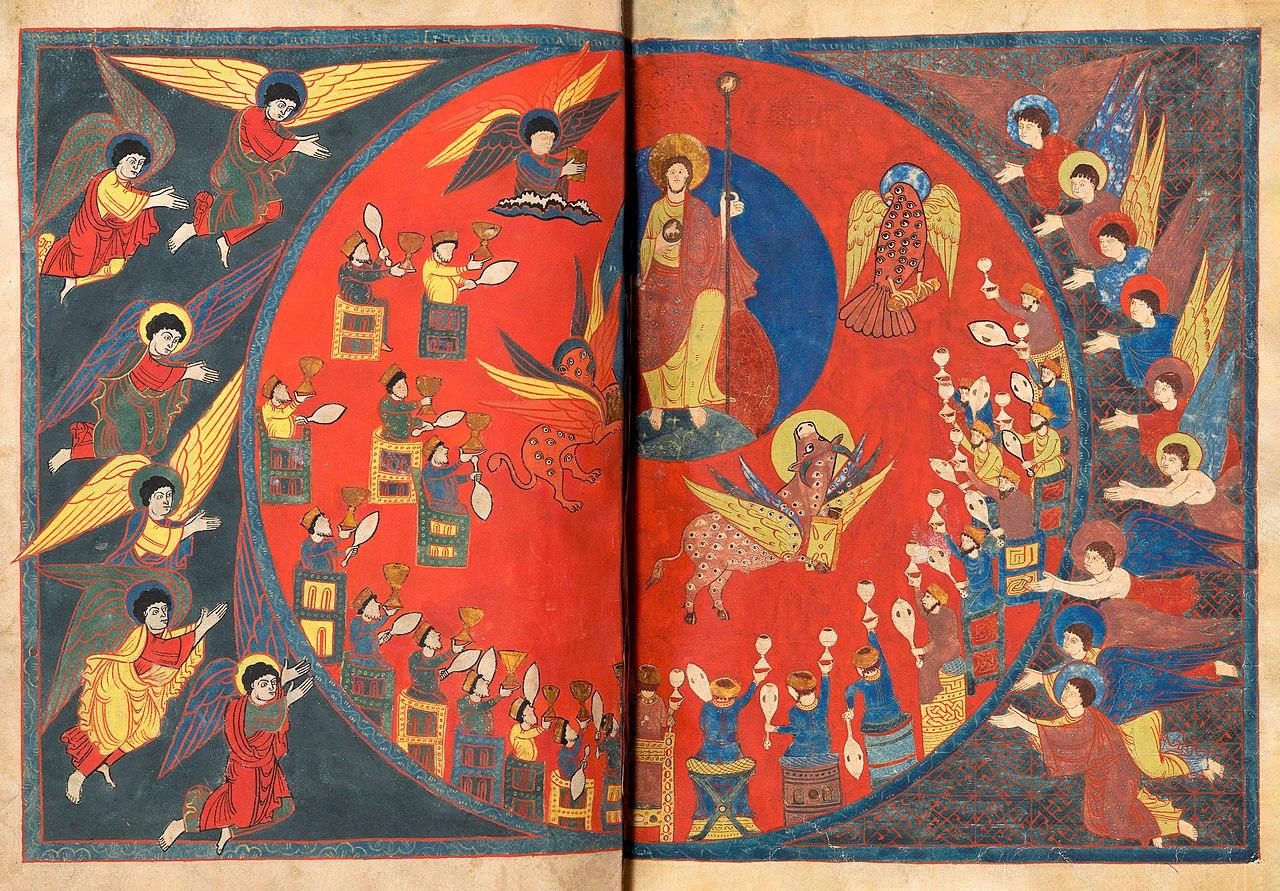
The image displays a fold-out miniature from a medieval Spanish manuscript—"Beata from Silos,» c. 1091–1109—which is housed in the British Library.
Structuring Principle
The material is organized not chronologically according to biblical events, but according to six aspects of artistic language:
Apocalypse in Color—palette brightness and contrast.
Space from Stripes—color planes and composition building.
Color as Sign—highlighting characters and events.
Anatomy of the Monster—fantastic forms and conventional representation.
Rhythm of Disaster—repetition of figures, gestures, and color patches.
Three Images of the End Times—a comparison of manuscript artistic systems.
Each chapter builds from a general overview to details and miniature comparisons. This approach allows for an examination of color as one of the fundamental tools of medieval visual storytelling.
Apocalypse in Color
Morgan Beatus, created around 940–945 by the scribe and illuminator Maes. The manuscript is housed in the Morgan Library & Museum in New York.
In medieval illuminated manuscripts, the Apocalypse depicted in the Beatus of Liébana is not shown as the world sinking into darkness, but rather as a sequence of rich, high-contrast compositions. Red, yellow, blue, and green dominate large areas of the page, forming a distinct artistic language. The vividness of the miniatures is particularly noticeable in the Beatus of Facunda, where many scenes unfold against a background of horizontal color bands.
Color performs several functions simultaneously here. It makes the images visually expressive, helps separate figures from the background, and organizes the space within complex scenes. Unlike painting, which focuses on reproducing natural light, miniatures use color primarily as an independent means of constructing the image.
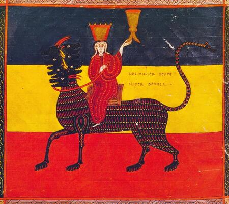
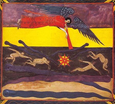
The photograph displays miniatures from the medieval manuscript «Beatus Facunda» (1047), which is housed in the National Library of Spain in Madrid.
The combination of saturated hues and abstracted forms creates a distinct vision of the Apocalypse—not a realistic depiction of a catastrophe, but an artistic interpretation of prophetic visions. Color itself becomes one of the most recognizable features of these manuscripts.
Stripe Space
The image displays a miniature from an 11th-century medieval manuscript—the «Beatus of Fabundus» (c. 1047)—which is housed in the National Library of Spain in Madrid.
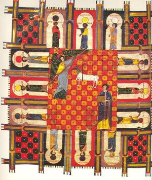
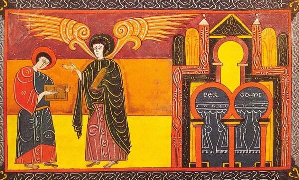
Miniatures of «Beatus the Venerable» (c. 1047), housed in the National Library of Spain in Madrid.
One of the characteristic features of Beatus miniatures is the construction of space using horizontal bands of color. Instead of gradually diminishing objects into the background, artists often divide the page into several color zones, within which figures, architectural elements, and entire episodes are placed.
The image displays a medieval book miniature, «The Sixth Seal (Apocalypse VI), ” from the manuscript „Morganus Beatus, ” dated 962, created by the Spanish artist and scribe Magius.
This space does not aim to imitate the real world. It is governed by the compositional logic of the image: bands establish rhythm, create boundaries between individual areas, and allow multiple actions to be united on a single plane. Color ceases to be an attribute of objects and becomes part of the work’s very structure.
It is particularly interesting to observe how figures are positioned within color zones or how they intersect their boundaries. Because of this, the composition is perceived simultaneously as a unified decorative surface and as a space filled with events.
Color as Signifier