This project is a student academic assignment from the School of Design.
This project is not commercial and serves educational purposes.
Concept and Topic Selection
Gold in the history of European art up to the early modern period rarely functioned merely as a «color» or a «material.» Its presence in a work was almost always excessive relative to the representational task—too costly, too bright, too unruly in its reflective capability. It is precisely this excess that makes gold a convenient entry point for visual inquiry. This paper examines how gold was used in Western European and Byzantine art from late antiquity through the end of the sixteenth century, and what significance was assigned to it within the decorative programs of sacred icons, altarpieces, and personal devotional objects. The main thesis is that the decorative function of gold was not secondary to the symbolic one: the very materiality of the metal, its luster, and its capacity to change appearance with the viewer’s movement generated meanings that pigment alone could not convey. This is the focus of my work. For a long time, I have been interested in the evolution of gold’s decorative use—not merely as an indicator of the patron’s wealth, but as an autonomous visual language.
The primary objective of this research is to trace the evolving function of the golden element within the artwork’s space—from being purely formative to taking on spatial and conceptual dimensions. The work systematically examines key milestones in the deployment of gold decoration across the European area, covering ancient city-states, barbarian kingdoms, Byzantine expansion, and Western European Christian art.
Topics
I. Concept and Topic Selection II. Golden Background: Abandoning Space or Other Space III. Comparison: Gold in Byzantine Icons and Italian Altarpieces IV. Gold and Corporeality: Reliquaries and Jewelry V. The Disappearance of the Golden Background as a Design Shift VI. Conclusion and Bibliography
Golden Background: Rejection of Space or Another Space

Дуччо ди Буонинсеня фрагмент «Маэста» 1308–1311 годы

Дуччо ди Буонинсеня фрагмент «Маэста» 1308–1311 годы
The most prominent tradition of gold use in European painting before the 15th century was the golden background in icons and altar pieces. In the Byzantine tradition, gold replaced the sky and landscape, creating a zone that could not be related to empirical space. Researchers have variously explained this function: as an image of divine light, as a sign of sacred, timeless presence, or as a decorative plane consciously interrupting perspective. For design analysis, something else is important here: gold functioned not as an depiction of light, but as its physical medium. The foil reflected the actual light from candles and window openings, and the image changed depending on the lighting and the viewer’s position. This characteristic brings the golden background closer not so much to painting, but to the shimmering surface of mosaic or stained glass.
Duccio di Buoninsegna, «Maestà,» 1308–1311
Technically, this required a dedicated discipline. Gold was applied in the form of the thinnest sheets onto a prepared ground, often over red clay (bolus), and polished to a mirror shine; in areas requiring a less intense luster, it was left matte. Even at this stage, the division of labor between «decorative» and «representational» was evident: the gold was not so much painted as it was mounted, and its effect depended on the lighting almost as much as on the artisan’s hand.
Duccio di Buoninsegna fragment «Maestà» 1308–1311
Comparison: Gold in Byzantine Iconography and Italian Altarpieces

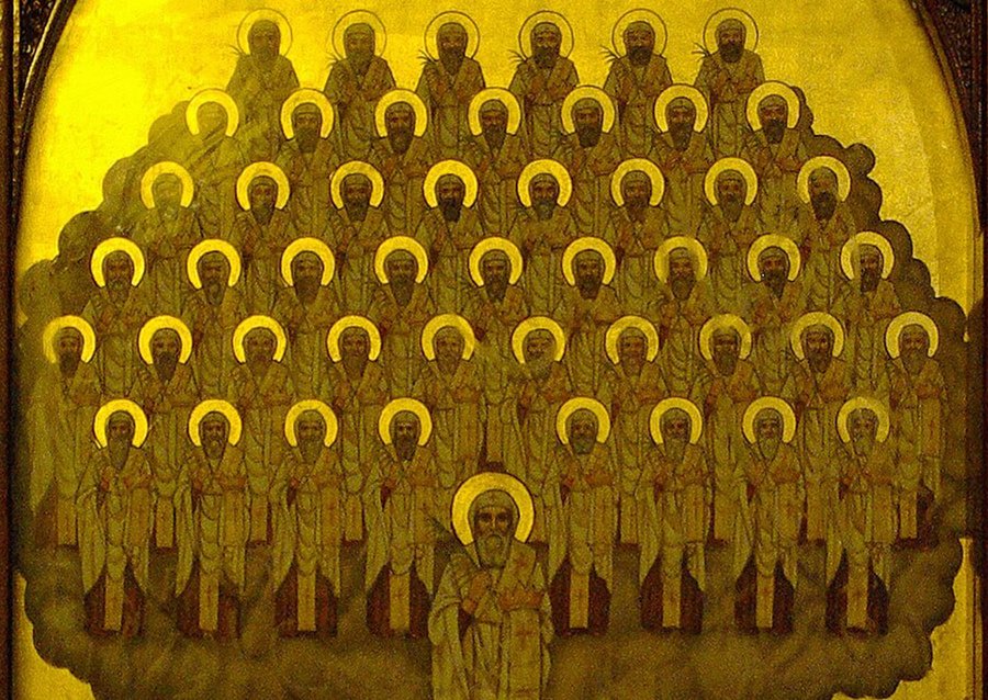
Unknown Master. «Forty-nine Martyrs of the Skit» late 17th century
Unknown Master. «Forty-Nine Martyrs of Skit» late 17th century
Unknown Master. «Forty-Nine Martyrs of Skit» late 17th century
Unknown master. «Leonty Rostovsky, Metropolitans Peter and Alexy, ” late 15th century
If we compare the two, we can understand how the same decorative strategy yields different emphases. In Byzantine iconography, gold strives for maximal uniformity: the background was meant to be perceived as a single luminous medium, not as a sum of individual flecks. Robert Nelson suggests interpreting such a background not as «sky» nor as «decoration, ” but as an impenetrable zone in which the believer’s gaze constructs an idea of the divine through the refusal of description. This is an important takeaway: here, gold functions through restriction, not through the enrichment of the image.
Konstantinos Adrianopoulis. «Saint Lawrence» 17th Century
Unknown Master. «Pietà, ” 1450–1500.
Unknown Master. «Saint Martin» 1500
Theodoros Pulakis. «Archangel Michael» 1650–1699
Ioannis Lambardos. «St. George with a Decapitated Head in Hand» 16th century
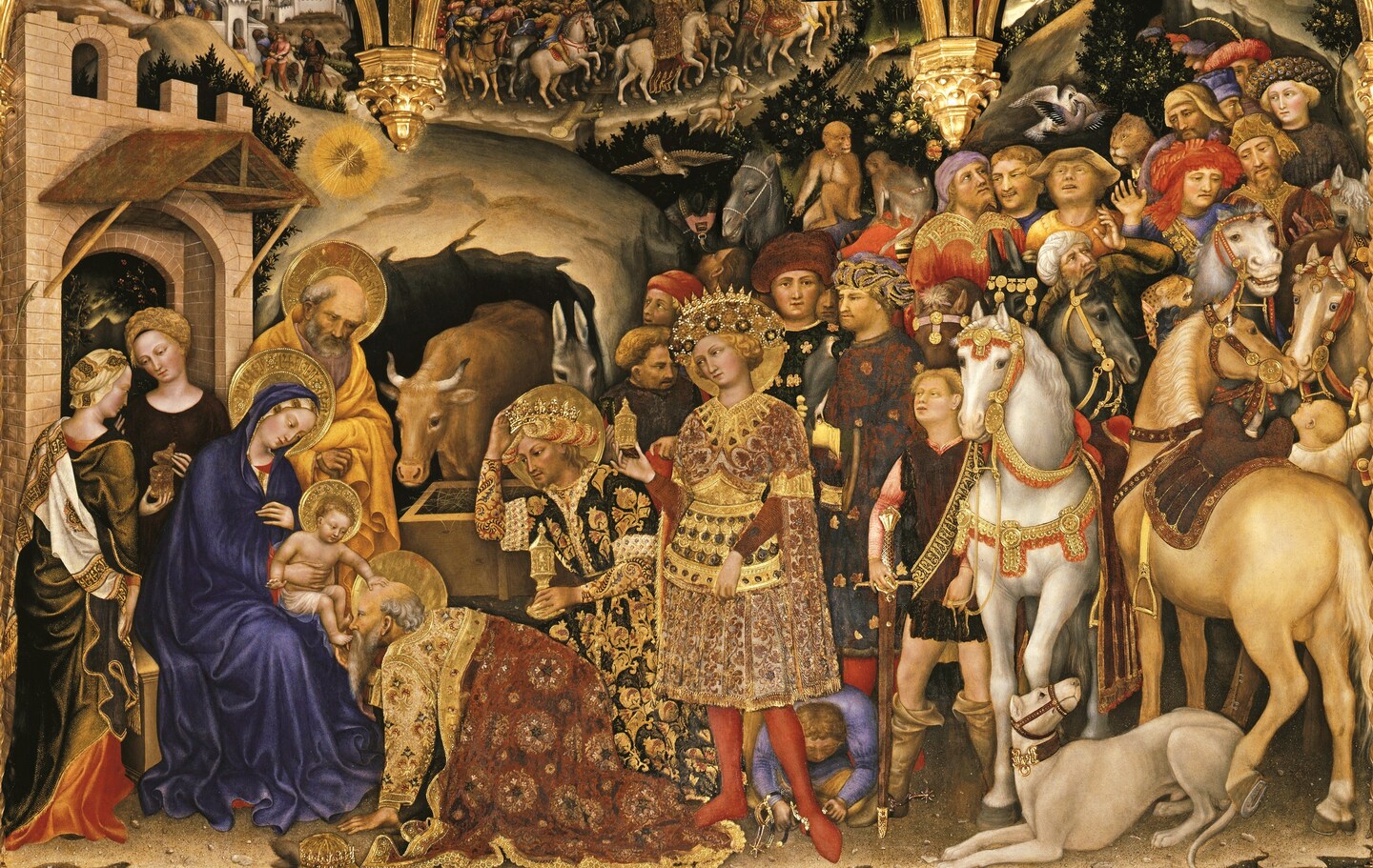
In Trecento Italian painting, gold, while retaining its sacred function, becomes increasingly involved in ornamental play. In the altarpieces of Gentile da Fabriano or Duccio, gilded backgrounds coexist with embossed nimbuses, gold hatching on garments, and imitations of jewelry. Decorative qualities here do not negate symbolism but render it more fragmented—tied to detail. The viewer is no longer simply immersed in the brilliance; they are examining it. This distinction can be articulated as follows: the Byzantine tradition tends toward gold as an environment, whereas the Italian tradition tends toward gold as an accent.
Gold and Corporeality: Reliquaries and Jewelry
Beyond painting, gold remained a material up to the 17th century that connected the image to the body—whether real or symbolic. Reliquaries, icon casings, and pectoral crosses were crafted from gold not only because of the material’s value, but also because the imperishability of the metal contrasted with the decay of flesh. In late medieval pendants, gold is combined with pearls and rubies, and the choice of stones followed established associations: pearls were linked to purity, while the red ruby represented Christ’s passions. The reverse side of such a cross might feature an enamel depiction of the «Man of Sorrows,» visible only to the owner. Here, gold performs a dual decorative function: on the exterior, it denotes status and preciousness; on the interior, it serves as a setting for an intimate image intended only for the owner’s eyes.
This duality is crucial for understanding the decorative function of gold as a whole. It is almost never merely «beautiful»; even in its most ornamental manifestations, it marks the boundary between the mundane and the sacred.
The Disappearance of the Gold Background as a Design Shift
By the late 15th—early 16th century, the gold ground in Italian altarpiece painting nearly disappears. This disappearance is often described as the «triumph of realism» or the «discovery of perspective,» but for visual research, something else is more important: gold didn’t so much lose as it migrated. It remains in the frames, in jewelry details, in embroidery, and in ornamentation, but it withdraws from the center of the picture plane. Researchers link this shift to a complex set of causes: the growing interest in natural light and landscape, the changing status of the artist—for whom «skill» became more important than «material"—and the gradual displacement of gold as a symbol of sacred presence by more narrative and psychological means. It is telling that gold was not «exposed» as an illusion; it simply ceased to be the primary carrier of sacred meaning, yielding that role to the depicted space and human action.