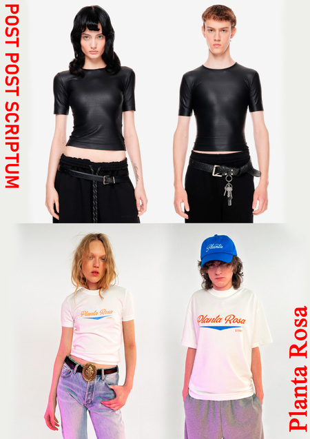
Comparative Analysis of the Brands Post Post Scriptum and Planta Rosa
Post Scriptum
WE DON’T ADOPT EXTERNAL SILHOUETTES, IMAGES, OR NORM; WE RE-STITCH THEM TO OUR MEASURE.
THIS IS AN ALTERNATIVE TO THE BASIC WARDROBE—
A WARDROBE FOR TWO: CLOTHING THAT DOESN’T IMPEDE YOU FROM BEING YOURSELF. IT MAKES ROOM FOR YOUR EXPRESSION.
(core ideas)
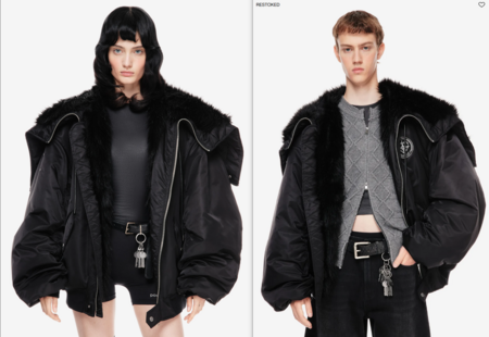
-Blurring boundaries, primarily gender. Adherence to non-binary fashion—unisex items. Coverage, silhouettes, and, in general, the clothing assortment leans toward pieces suitable for both genders simultaneously.-Freedom and self-expression. The brand emphasizes that clothing should not dictate how one should look, but rather provide space for personal expression. This is reflected in relaxed, sometimes intentionally «imperfect» silhouettes and specific material textures, such as ripped and worn elements.-Play with contrasts and contradictions. Designs often feature combinations that seem incompatible at first glance: for example, the strictness of lines paired with deliberately careless details, or high-tech fabrics combined with vintage elements.-A leaning toward minimalism in terms of shapes, colors, and slightly in the tailoring.
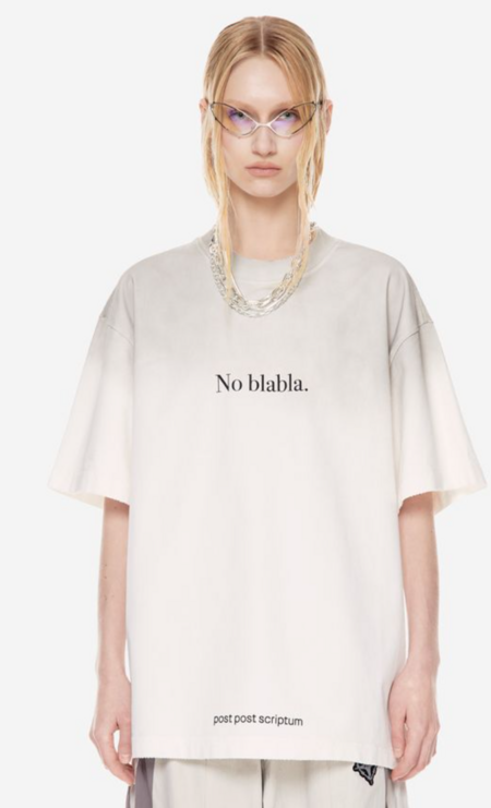
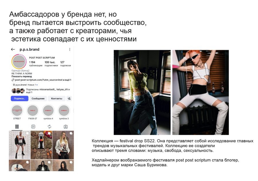
Brand ShowpieceThe brand’s history began with it: in the P. P. S. office, the first sample T-shirt printed with the manifesto is still kept under glass—“This is where it all began.»
Planta Rosa
The most important elements are the quality of the material, interesting styling, and visual appeal.
The founders share a vision for design and fashion, infusing their love for vintage items, interest in photography, art, and pop culture from around the world into each creation.
(Core concepts)

— Reimagining Heritage. Brand creators draw inspiration from vintage items, art, photography, and global pop culture. They take historical and artistic references and transform them into contemporary design. The focus leans toward athletic style, but infused with elements of «retro, pop culture, and so on.»
— Minimalism. Contemporary yet simple silhouettes. Concise forms. A restrained color palette. Minimal decorative elements. The emphasis is placed on volume and proportion.
— Material Quality. They seek out more texture, focusing on simple, commonly available fabrics on the market, such as knits.
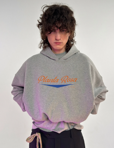
The brand’s signature piece: a hoodie that encapsulates all the brand’s DNA—combining the athletic aesthetic of university uniforms, vintage references, and superior material quality.
Target Audience Comparison

Individuals aged 25–35, predominantly from creative industries, with above-average income.
They use clothing to express their identity, employing garments as a medium of communication.
Their loyalty is high but niche, as it is built upon ideology and cultural affiliation.
Conclusion
Brands might appear visually similar at first glance, but one brand attempts to sell products through its visuals, while the other sells an image through its visuals. Consequently, we end up with different target audiences that may overlap.