ПОЧЕМУ ЭТО ТАК ВЫГЛЯДИТ?
«Why does it look like this?”—an educational media platform about the visual environment that surrounds us every day.
1. Media Goal Description
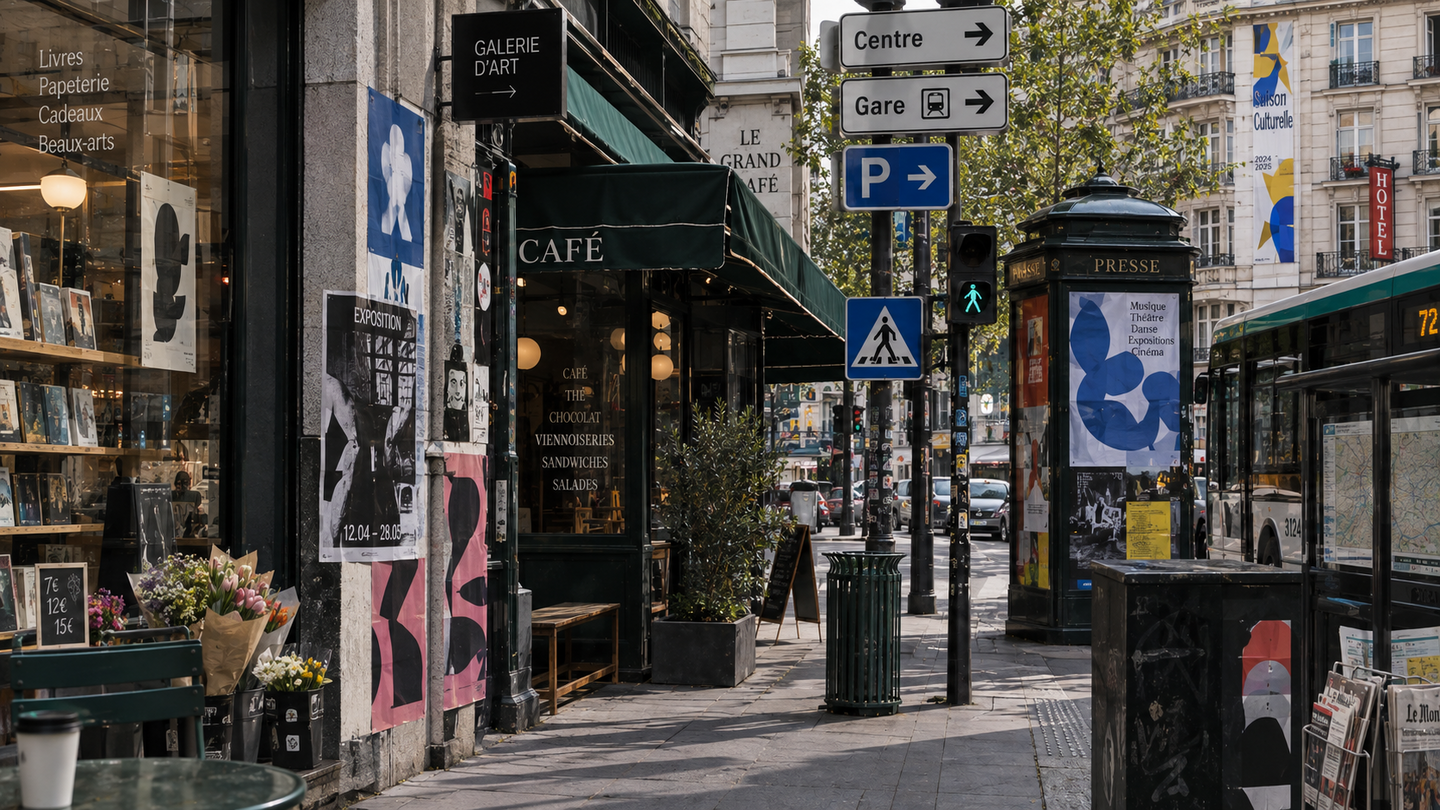
The project takes familiar objects and visual solutions and breaks them down into their components: color, form, typography, composition, symbols, and context of use. We are accustomed to seeing packaging, signage, interfaces, logos, advertisements, and urban navigation, but we rarely stop to consider the reasons behind their appearance. Why is pharmacy packaging often white? Why are discounts marked in red? Why do high-end brands use a lot of negative space? Why do different segments within the same category use a different approach to branding? Each piece begins with a simple observation or question, gradually revealing why a visual solution looks the way it does and what impression it creates. An object’s appearance can be rooted in design, cultural, historical, or psychological reasons, all of which are explored in this media. This piece doesn’t just showcase interesting design examples; it teaches the reader how to analyze the visual environment. The reader gradually begins to notice recurring techniques and understand their functions. The main goal of the project is to make the visual environment more understandable and to teach the reader how and why visual solutions work.
2. Themes of Future Media
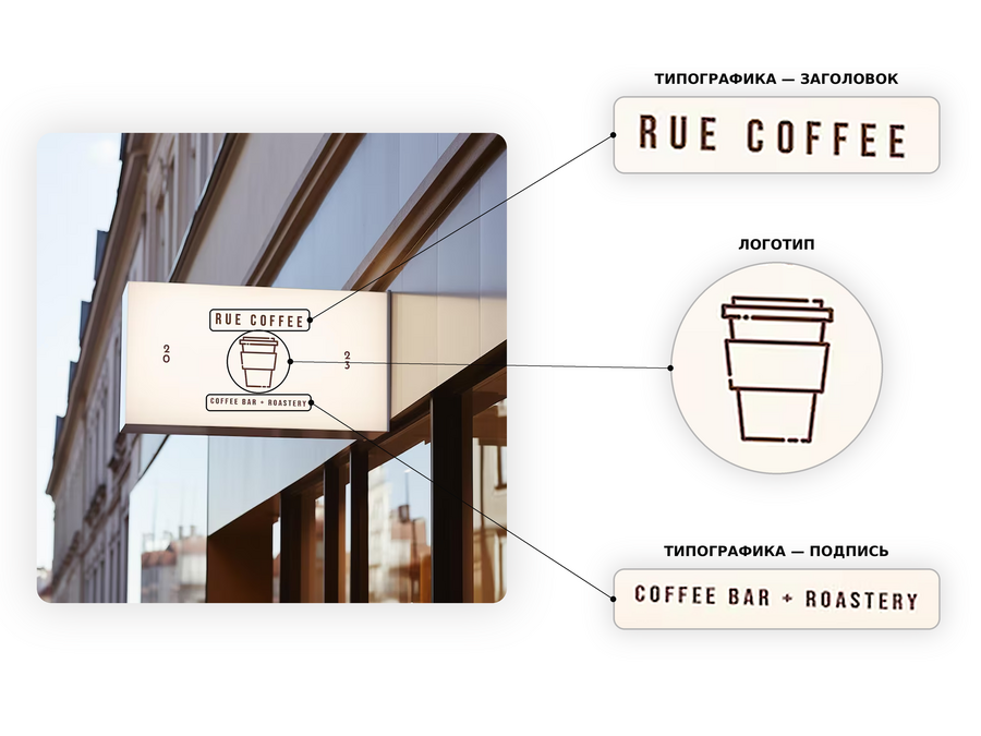
Segment: B2C, educational media aimed at the end-user—an individual interested in understanding the visual solutions in their environment. The project generates content for individual consumption. Topic: design, visual culture, and the everyday visual environment. Format: educational media that explains the reasons and principles behind visual solutions.Narrow Topic: the causes and principles of visual solutions in daily life.The basis of the publication is a specific visual object, element, or technique (a store sign, a price tag, a logo, a restaurant menu, an advertising banner, a navigation sign).
3. Competitors and Their Analysis
Competitors can be categorized into three groups: direct, indirect, and potential. Direct competitors are design and visual culture media that share a similar audience; indirect competitors include city, culture, and educational media that address the visual environment; and potential competitors are Telegram channels, blogs, YouTube channels, and visual platforms. This analysis helps determine which topics and formats already exist and what niche the project can occupy.
I identified the following criteria for competition:
- How much the content overlaps with my topic
- The angle of presentation (what is primary: news, object, history, expert opinion, or explanation)
- Content formats across media
- Visual style
- Tone of voice and the nature of reader engagement
Direct Competitors
Indirect Competitors
Potential Competitors
Findings from the Competitive Analysis
Main takeaway: Media should not just showcase interesting design; it should teach people to notice and understand its logic through familiar objects.
Explain, Don’t Just Show Competitors have many projects and collections, but fewer resources that thoroughly explain the logic behind visual decisions. Therefore, the media should focus specifically on analyzing what, why, and how something works.
Start with Everyday Objects Most design media treat design as a professional field. We can approach this through familiar objects—such as packaging, signage, applications, advertisements, and navigation—and use them to reveal design principles.
Use Visuals as Part of the Explanation We can adopt the strong visual presentation of competitors, but we shouldn’t use it merely for illustration. Comparisons, highlights, and diagrams must help the reader independently grasp the differences between design solutions.
Combine Short and In-Depth Content A brief question can capture attention, while a more detailed breakdown can provide a comprehensive understanding of the topic. This allows a single theme to be adapted across various formats.
Maintain Expertise While Speaking Simply Professional knowledge can be utilized without overwhelming the reader with jargon; complex principles can be explained through clear, illustrative examples.
4. Distribution Channels
The main platform is Telegram. It allows for the integration of short explanatory texts, images, videos, polls, and discussions.
It is also convenient to save content from this medium; a user can revisit the material later or share it with someone else.
Formats: — Cards (a brief visual analysis of a single object) — Deep Dive (a more detailed publication with history and context) — Comparison (two similar objects—why is one perceived as expensive while the other seems inexpensive?) — Poll (the reader is first prompted to make a hypothesis before the explanation is given) — Short Video (a visual experiment or animation)
Secondary platform — Instagram (visual showcase) It is used for content where the visual analysis itself is the primary mode of communication.Formats: -Carousels -Reels -Short visual observations -Stories For example, a carousel: «Why does this logo look expensive?» two logos—the first is a visual observation—the second is a comparison—the explanationTelegram provides detailed explanations; Instagram offers a quick visual entry point to the topic.
Secondary Platform — YouTube (In-depth Analyses) It is used for more complex topics that cannot be fully covered in a few cards.
Format: — Video analyses of various lengths, from 5–10 minutes up to 30–40 minutes, depending on the topic. For example, «Why do all banking apps look the same?» We systematically analyze several banking interfaces—show the evolution of their designs—and explain general visual techniques.
*Instagram belongs to Meta, a company recognized as an extremist organization and banned in the Russian Federation.
5. Target Audience Description

PERSONA 01 — Masha, 21 Design Student
Masha is studying design. She constantly saves images, gathers references for academic projects, and strives to develop her visual acuity.
Problem: A large number of saved images does not always translate into genuine understanding.
Need: To develop visual thinking not only by viewing references but also by understanding specific design techniques.
JTBD: When I see interesting design, I want to understand what decisions make it up so that I can apply that principle in my own work.
What my media provides: — Visual breakdowns — Comparison of solutions — Explanations of typography, color, and composition — Examples from real-world contexts
Why she will return: The publications transform into a library of visual principles for her, rather than just a collection of pretty pictures.
PERSONA 02 — DANYA, 25 Creative Specialist
Danya works as a designer/SMM specialist and frequently encounters the need to quickly find visual solutions. He follows design channels, but most of the content consists of news, case studies, and compilations.
Problem: He doesn’t want a new reference; he wants to understand why a specific technique works.
Need: To quickly find explanations for visual solutions that he can apply to his work.
Job to Be Done (JTBD): When I need to make a visual decision, I want to understand the logic behind similar solutions so that I don’t choose something just because I «like it.»
What my media provides: — Deconstructions/Breakdowns — Comparisons — Visual principles — Explanation of the connection between form and perception
Why he will keep returning: The media becomes a source for rapid visual observations that he can apply to his work.

PERSONA 03 — LIZA, 23 A visually curious individualShe is not professionally involved in design. She enjoys themed collections on Pinterest, exhibitions, beautiful cafes, cinema, architecture, and fashion.Problem: She often notices something is «beautiful, ” but she is interested in understanding why it seems beautiful to her.Need: To acquire knowledge about visual culture without having to study professional literature.JTBD: When I notice something interesting, I want to quickly understand why it makes such an impression so I can better comprehend the visual world around me.What my media provides: -Explaining complex visual phenomena in simple terms.Why she will return: Gradually, she begins to notice more details in everyday life and wants to learn even more.

PERSONA 04 — ANYA, 27 Owner of a small brand
Anya develops a small brand of clothing and home goods. She independently crafts its visual identity: selecting packaging, colors, fonts, photography, and social media presentation. She studies other brands extensively and saves designs she likes, but she doesn’t always understand why one visual identity feels good and convincing while another does not.
Problem: When making visual decisions, she doesn’t understand which specific design solutions are appropriate for her particular brand or what elements create the desired impression.
Need: To grasp the logic behind visual decisions so that she can consciously choose the aesthetic for her brand rather than simply copying examples she likes.
JTBD: When I need to decide how my brand should look, I want to understand how visual techniques influence its perception and are applied in specific contexts so that I can build a logical design system.
What my media offers: — Breakdowns of packaging and identity design — Comparison of different visual solutions — Explanations of how color, typography, and composition exert influence — Real-world examples from branding and everyday life
Why she will return: The media helps her gradually form her own system of visual decisions, which she will apply to her brand work.