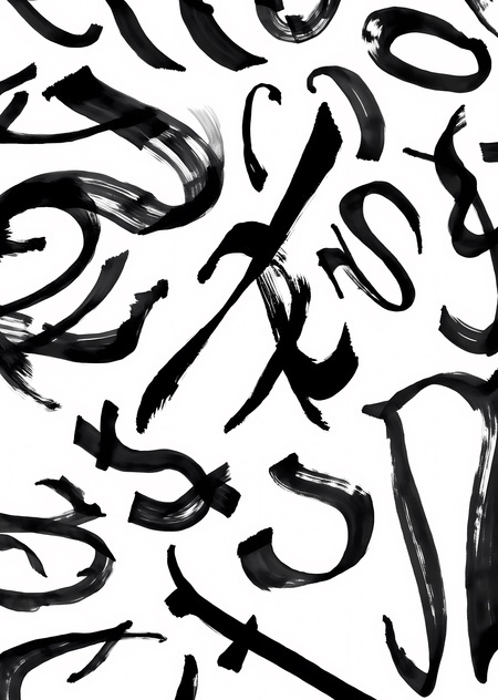
ASGLYPH — Letter Abstractions
Project Idea
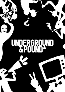
It all started long before this course. I had a project for my application—it was about street art. To make the posters look alive and distinct from everything else, I hand-drew the typography: I designed the letterforms myself, sketching the letters with a brush, special markers, and ink. The results were fantastic, but it took an enormous amount of time—a single good set of characters could consume an entire evening.
With this project, I found myself wondering: what if I had a generator that created such shapes by itself? Not a finished typeface, but a stream of whimsical brushstrokes from which one could discern a grapheme—and then, based on that, finish drawing the letter in my own style. Essentially, a machine collaborator that suggests lettering ideas, but the decision-making and final execution remain mine.
That is how the project was born: to train a generative neural network in my handwriting style so that it could invent new letters—expressive, fragmented, lively forms within which the sign resides.
Source data set
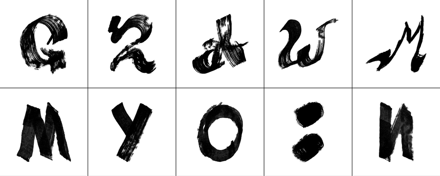
I compiled the dataset manually, and it turned out quite substantial—over two hundred scanned letters, each one I drew myself with brush and ink. This is not a complete typeface; some characters are recognizable, while others are almost abstract strokes, and that is the essence of the style.
Next, I prepared them for the training set: I cut out each letter from the background, placed it in the center of a pure white square, standardized their size while preserving the brush texture—the dry stroke, the torn edge, the uneven fill. For the training data, I selected the cleanest and most diverse samples—about two hundred.
Preparation and Learning Process
The foundation is Stable Diffusion XL, which I further fine-tuned using the DreamBooth + LoRA method, adjusting it to fit my small custom dataset.
The environment was hosted on Kaggle. First, I prepared the environment and the image captions: I ran every letter through a captioning model and added my stylistic token—ASGLYPH—to the description so the network would associate this «label» specifically with my style. After that, I started training.
From the parameters: 768 resolution, about 1200 steps, to avoid burning through the free session. The training took 2 hours and 14 minutes.
The result of the first generation, even with a simple prompt, pleased me: the grapheme turned out excellent. However, the background was lacking—due to the nature of diffusion generation, it came out gray and photographic, requiring cleanup in post-production. Then, I expanded the prompt and added a negative prompt, which noticeably improved the result: the background became clean while preserving the lively texture of the brush.
Result
The result is pure satisfaction. The large dataset I manually collected proved entirely worthwhile: the model trained exceptionally well and generates vibrant, characteristic glyphs. These aren’t just pretty smudges—you can genuinely find unexpected solutions within them, starting from the grapheme and completing the sign in your own style.
I love drawing letters, but usually the most labor-intensive part is the search—you sit there and manually iterate through hundreds of letterforms until you find the right one. Now, that stage is speeding up significantly—the model suggests options, and I select and refine them. So, I will definitely be using it in my work going forward: it streamlines and accelerates that precise creative, exploratory phase that the whole endeavor was initiated for.