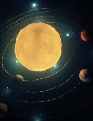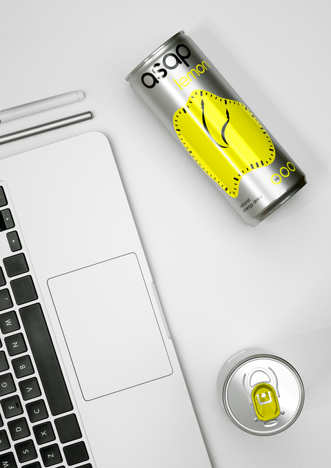
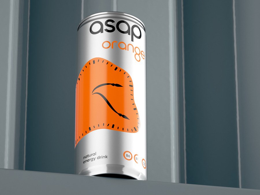
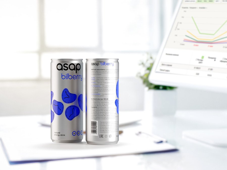
ASAP energy drink is named after the expression «As soon as possible» borrowed from office slang. Deadlines, meetings, working hours: all this is about time, endless energy, and constant movement. The packaging’s central element is the image of a fruit-shaped clock, the smoothness of which illustrates the uneven flow of time. From 9am to 6pm, office time works differently, it accelerates and slows down. This insight underpins the visual language of the drink packaging.
Original size 2133x1600
Original size 2133x1600
Original size 2133x1600
Original size 2133x1600
Original size 2133x1600
Original size 4200x2363
Original size 2133x1600
Original size 2133x1600
Original size 4200x2363
Original size 2133x1600
Original size 2133x1600
Original size 2133x1600
Original size 2133x1600
Original size 2133x1600
Original size 2133x1600
Original size 2133x1600
Original size 2133x1600