Index
Concept I. Blue as Distance II. Blue as Closeness III. Blue as Light Conclusion
Concept
In late medieval European painting, blue was typically identified by its function: sky, sea, or the Virgin Mary’s cloak. This semantic shorthand too quickly reduces color to a ready-made sign. During the 14th and 15th centuries, ultramarine had its own material history. The pigment was made from lapis lazuli, which was sourced only from Badakhshan (Afghanistan) and transported halfway across the world to Europe—hence the name azzurro oltremarino, meaning «blue from beyond the sea, ” and its high value. On the surface of the painting, the route vanishes, leaving only clues in the artist’s distribution of color.
Ultramarine was incorporated into images alongside precise calculation. Its quantity depended on the commission, its quality on the patron’s means, and its placement on who in the composition was meant to be closest to the viewer. Consequently, color is viewed not merely as a substance or an artistic choice, but as financial documentation. This approach allows one to read the painting based on its visible surface, without separating its form from the conditions of its production.
Material Selection Principle
The row includes works where blue occupies varying distances from the viewer. The same piece may appear twice if the overall view and the detail offer different observations. For analysis, Italian and Dutch paintings from the 14th–15th centuries were selected, along with technical illustrations and publications that allow for the differentiation between the visible color and the established pigment composition. Where laboratory data is unavailable for a specific frame, the analysis remains visual and clearly denotes this boundary.
Research Structuring Principle
The material is divided based on the degree of blue’s proximity to the viewer and whether the color remains an attribute of the object. In the section «Blue as Distance, ” the blue resides in the depth of the image—the sky, the garden, the background—and belongs to the depicted world. In the section „Blue as Nearness, ” it is concentrated in the clothing of the main figure and is read as a sign of her place within the composition. In the section „Blue as Light, ” the object loses its color identity: a vaulted surface painted onto the canvas ground—here, blue functions as a medium through which figures are seen. Three cases differ in layer density: the less blue an object has, the thinner the paint on its surface. The extreme of the series is the absence of expensive pigment, when the color originates from the ground. This scheme allows for the comparison of items based on the function of the surface while preserving cases that do not fit the structure.
Key question: How do the area, placement, and state of the blue indicate access to an expensive material?
Ultramarine functioned as a statement about status. Its presence, quantity, and placement read like a document detailing the commission, the workshop, and the standing of the depicted subject. Yet, this document is never entirely transparent: some of its composition is confirmed by analysis, some is determined by probability, and some exists only as a visual reading of the surface.
Principles for Selecting Text Sources
The textual sources were curated across three levels. Museum catalogs provide dating, technique, dimensions, and storage location. Technical publications establish pigment composition and describe material changes. Historical texts document workshop terminology and processing methods. General information about color symbolism is not used as evidence. Every conclusion is linked to a specific frame and to a source capable of supporting it.
I. Blue like the distance
In the background zone, blue is distributed throughout the space. It can occupy a significant area, but its value is perceived through its saturation level, its proximity to whites, and its placement in the layer. The first section examines the background, the sky, and deep planes as areas where a costly color neighbors more accessible blues.
Fra Angelico. «The Annunciation,» 1425–1426. Tempera on wood, 162,3 × 191.5 cm, Prado Museum, Madrid.
The blue begins here with the ceiling vaults. The arches are assembled from repeating fields: a dark dome, a light lintel, and a light blue section behind the colonnade. The azure does not cover the space with a uniform carpet. Instead, it is broken up by the architecture and recedes behind the white columns. Deeper in the garden, the blue becomes lighter and less substantial. Its function is tied to distance, so the area itself says nothing about the pigment’s specific shade.The frame shows how the blue is gathered into a repetitive vault pattern. The contours of the arches cut the color into individual segments, and the gaze reads them sequentially. In the shaded areas, the blue appears nearly black; next to the white columns, it transitions into a cooler, lighter tone. The technical composition of this specific fragment, using the available sources, is not established, so this discussion focuses on the color’s visual behavior. This is vital to the thesis: depth is constructed through a series of localized decisions assembled into a unified field.
How the blue ages
Dirk Bouts. «Position in a Coffin, 1450s. Glue tempera (distemper) on linen canvas. 87,5 × 73.6 cm, National Gallery, London»
The technical catalog of the National Gallery of London describes a case where blue areas of lapis lazuli darkened, and individual zones associated with smalt lost their original saturation. For the viewer, the surface already tells a story of aging. The greenish or brown tint does not always reflect the artist’s intent. The analysis is necessary for the discipline of sight: color is compared with the composition and condition of the layer; a pure pigment sample from a textbook remains a secondary reference. Visual analysis documents the result, while the technical source explains the possible cause.
Far, where blue thins out
Jan van Eyck and Hubert van Eyck. «Ghent Altarpiece, ” 1432. Oil on wood panels, approximately 375 × 260 cm when open, St. Bavo’s Cathedral, Ghent.
The lower register of the retable builds depth through a multitude of green, blue, and gray gradations. Blue is not highlighted as a distinct precious sign; rather, it is integrated into the landscape fabric, where distance is built through the repetition of subtle variations. The composition of each section cannot be determined solely from the reproduction, so the conclusion pertains to function: the space appears rich due to the work of layers and details, even if the expensive blue is reserved for individual figures and accents. The great distance here is created through the economy of distribution.
In the overall view, the distant greenery and blueness of the landscape lead the eye toward the central scene. Mary’s blue mantle in the upper register occupies far less area than the lower landscape, yet it holds a denser color mass. This comparison cannot be translated into a cost calculation without analyzing the layers. Visually, a different ratio is evident: the distance disperses color across numerous objects, while the clothing concentrates it around the face and gesture.
II. Blue as Close
In the second section, blue is incorporated into the clothing. The fabric contracts the distance—it belongs to the figure that the composition presents to the viewer. Here, the way the placement of color connects the material value to the image hierarchy is particularly noticeable.
Duccio di Buoninsegna. Maestà, 1308–1311. Wood, tempera, gold leaf. 213 × 396 cm. Museum of Cathedral Works, Siena
Maria’s cloak forms a dark triangle at the center of a golden field. Its edge traces around the body, and the folds, which are sparse, fragment the overall mass. The gold envelops the blue, making its density more apparent. The ratio of areas in the composition is crucial: the gold covers more surface area, yet the blue gathers the figure and separates it from the row of angels and saints. Technical publications on early Sienese painting confirm the joint use of lapis lazuli and ultramarine; the exact composition of the entire mantle in this image cannot be definitively established without local analysis.
Magnification reveals three distinct boundaries: the blue edge of the cloak, the red lining, and the golden background. Color functions through proximity. The blue appears deeper next to the red and darker next to the gold. The visual hierarchy is constructed from area, edge, and adjacency—a single pigment name is insufficient to explain it.
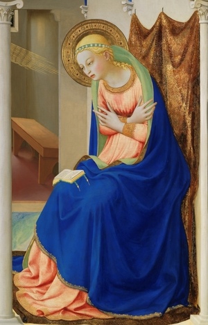
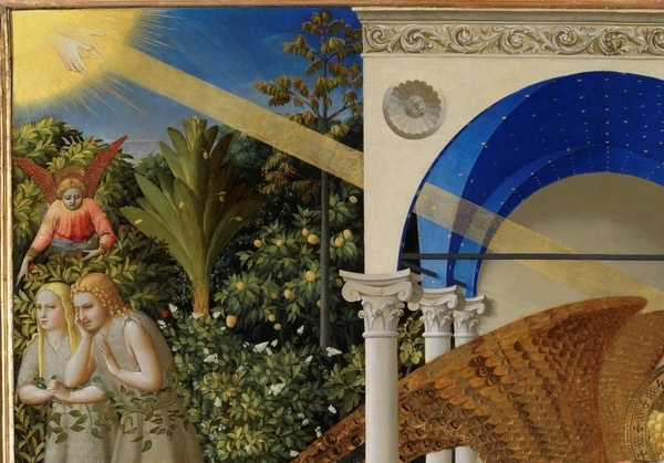
Fra Angelico. «The Annunciation, ” 1425–1426. Tempera on wood, 162,3 × 191.5 cm, Prado Museum, Madrid.
Maria’s cloak, lying over the pink garment of Franjelico, occupies the foreground of the figure. Its blue is darker than the blue of the ground and garden, causing the fabric to advance toward the viewer. The edge of the cloak is shaped with soft curves, and the folds cast long, vertical shadows. The composition of these zones is not specified in the sources used; visually, the blue here functions as the body’s shell, while the distant blue remains a fragment of the environment. One narrative receives two different distances of color.