Headings:
— Concept
— Triumphant Christ: The Crucifixion of Hero
— Transition: The Crucifixion from San Domenico to Arezzo
— Turning Point: Giotto, The Crucifixion from Santa Maria Novella
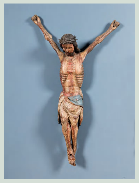
— Suffering Christ: German Mystical Crucifixion
— Comparative Analysis
— Conclusion
— Bibliography
Visual Research Concept: Rationale for Topic Selection. The topic focuses on the transformation of the visual language of suffering in European art during the 10th–14th centuries, specifically using the Crucifixion scene. The selection is based on the fundamental shift in iconography that occurred during this period: moving from the Christus triumphans (Triumphant Christ) type to the Christus patiens (Suffering Christ) type. This transition is not merely a stylistic shift but also reflects changes in theology, the psychology of perception, and the relationship to the human body. Art began engaging the viewer’s empathy for the first time, drawing them into shared feeling. The relevance of the topic is underscored by the fact that the mechanisms of visual engagement invented by medieval artists remain foundational to European visual culture to this day.
Material Selection Principle. Four monuments were selected for this study, representing key stages of this transformation: the Crucifixion by Hero (c. 970, Cologne Cathedral), the Crucifixion from San Damiano (c. 1180, Cimabue), Giotto’s Crucifixion (c. 1290, Santa Maria Novella, Florence), and the German mystical Crucifixion of the 14th century. The selection principle is comparability based on image type (the Crucifixion scene in a monumental format), chronological sequence within the period leading up to the end of the 14th century, and the visual presentation of each monument for its respective stage. The material is restricted to the European tradition because this is where the shift from triumph to suffering manifested most distinctly.
Research Structuring Principle. The structure is built on both chronological and analytical principles simultaneously. The work is divided into sections: 1. Introduction (problem statement and key question) 2. «The Triumphant Christ»: analysis of the Crucifixions by Hero and Cimabue 3. «The Turning Point»: Giotto’s Crucifixion 4. «The Suffering Christ»: the German mystical Crucifixion of the 14th century 5. Comparative analysis of visual parameters (gaze, posture, blood, face, hands, background) 6. Conclusion (findings and answer to the key question). Thus, this sequence demonstrates the evolution of visual decisions from triumph to suffering.
Principle of Selecting and Analyzing Textual Sources. Textual sources are selected across three categories: 1) research on the iconography of the Crucifixion and the shift between the types Christus triumphans and Christus patiens; 2) works concerning the history of visual perception and emotion in the Middle Ages; 3) art historical monographs dedicated to specific monuments (the Crucifixion of Gero, Giotto, Chimabue). Priority is given to academic publications and monographs. The source analysis is structured around comparison: how different authors explain the causes and mechanisms behind the change in visual language.
Key Research Question and Hypothesis. Key Question: What visual means did medieval artists from the 10th to the 14th centuries use to depict the image of suffering, and how did these means engage the viewer in empathy? Hypothesis: The transition from Christus triumphans to Christus patiens is accompanied not only by changes in posture and facial expression but also by the development of a system of visual details (closed eyes, sagging body, naturalistic blood, distorted face) that intentionally work to involve the viewer emotionally.
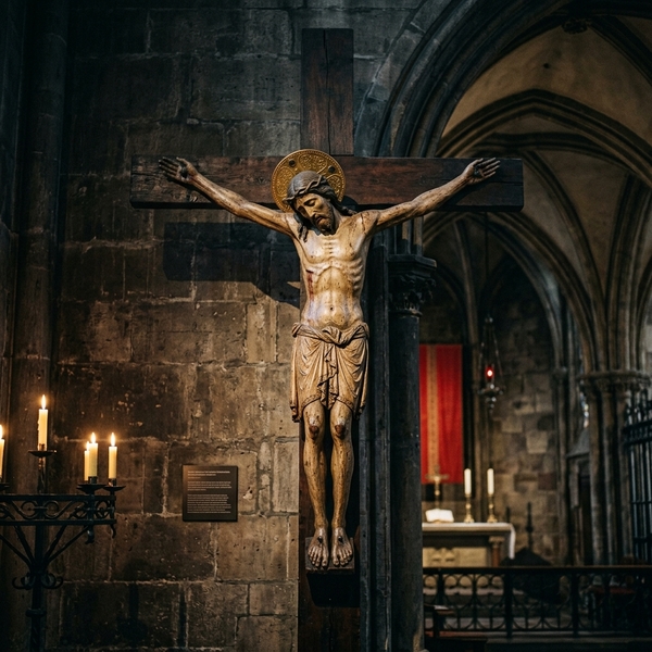
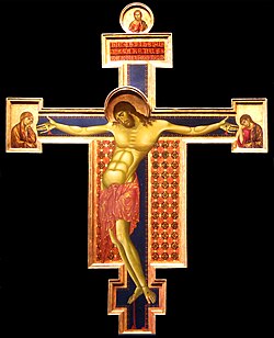
The Crucifixion by Gerro (c. 970, Cologne Cathedral)—the earliest surviving monumental crucifixion in Northern the Alps. Before this work, Christ on the cross was usually depicted triumphant, with open eyes and a straight posture. Gerro is the first to portray Christ as dead: his head is bowed, his eyes are closed, and his body sags under the weight of his arms.The Crucifixion from San Domenico in Arceto (c. 1265–1271) is a transitional piece moving toward the «Suffering Christ.» Cimabue takes a step forward from Gerro’s Crucifixion: Christ’s head is bowed, his eyes are closed, his body curves in an arc, and his face bears the marks of pain. However, the Byzantine tradition remains strong—linearity, conventional anatomy, and gold leaf. Nevertheless, Cimabue is already engaging the viewer’s emotion, and the grieving Mother and John at the sides of the cross enhance this impact. This is not yet the naturalism of Giotto, but it is a step toward it.
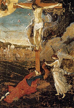
Comparing four monuments reveals how the visual language of suffering evolved step by step.
Eyes and Face. In Gerro, the eyes are closed, but the face is serene—Christ seems to have «rested» rather than to be suffering. In Chimamanda’s work, the eyes are also closed, but pain is beginning to appear on the face. In Giotto’s work, the face is contorted with suffering, and in the German mystical crucifixions of the 14th century, there is an extreme grimace of pain.
Body Posture. Gerro maintains a «royal» uprightness, with only the head inclined. Chimamanda curves the body into an arc, creating tension. In Giotto’s work, the body sags under its own weight, and the arms hang limply. In the German crucifixions, the body is emaciated almost to a skeleton.
Blood. In Gerro, the blood is symbolic, almost imperceptible. In Chimamanda’s work, restrained traces appear. In Giotto’s work, blood realistically streams from the side wound. In the German crucifixions, it pours in streams over the entire body.
Function of the Image. Gerro is a symbol of victory over death (Christus triumphans). Chimamanda is the first step toward empathy. Giotto is a scene of physical pain that involves the viewer. The German crucifixions are a tool of emotional shock.
Conclusion: The visual language of suffering develops not linearly, but through the accumulation and intensification of details: from closed eyes (Gerro) → to the curved body (Chimamanda) → to realistic blood and sagging (Giotto) → to naturalistic agony (German mystical crucifixions). Each subsequent monument amplifies what the previous one only suggested.
Through visual investigation, we can address a key question: what means did medieval artists of the 10th to 14th centuries use to construct the image of suffering and engage the viewer in empathy?
Analysis of four monuments reveals that the transition from the Triumphant Christ to the Suffering Christ is a progressive invention of a visual apparatus of compassion, achieved through minute detail. The Gero Crucifix (c. 970) takes the first step: it is the first time Christ is depicted as dead, with closed eyes and a bowed head, yet the body retains a «royal» straightness, and the suffering remains more symbolic than physical.
Cheminabue in the Crucifixion from San Domenico (c. 1265–1271) intensifies this language: the body curves, pain appears on the face, and the grieving figures alongside the cross set an emotional frame for the viewer. However, Byzantine linearity and stylized anatomy still temper the effect.
Giotto in the Crucifixion from Santa Maria Novella (c. 1290) makes a qualitative leap: the body sags under its own weight, blood from the wound becomes a visible, almost physically palpable marker of death, and the figure gains volume and weight. It is here that suffering ceases to be a «sign» and becomes a spectacle that the viewer cannot watch indifferently.
Germanic mystical crucifixions of the 14th century push this language to its limit: the emaciated body, copious blood, the contorted face—all function as a tool for emotional engagement, designed to elicit compassion rather than merely interpreting a symbol.
The study’s hypothesis is confirmed: the shift in iconography is accompanied by the formation of a system of visual details (closed eyes, sagging body, naturalistic blood, distorted face) that intentionally work toward the viewer’s empathy. Medieval Crucifixion art is a conscious manipulation of emotion, a step-by-step progression toward a visual language of suffering that would become fundamental to European culture.
Cimabue. Crucifix. c. 1270–1285. San Domenico, Arezzo. Image: Wikimedia Commons. URL: https://commons.wikimedia.org/wiki/Category:Painted_crucifix_by_Cimabue_(Arezzo)
Giotto di Bondone. Crucifix. c. 1290. Santa Maria Novella, Florence. Image: Wikimedia Commons. URL: https://commons.wikimedia.org/wiki/Category:Painted_crucifix_by_Giotto_(Florence, _S.M._Novella)
West or Southwest Germany. Crucified Christ (Crucifixus dolorosus). 1325/50. Freiburg Münster. Image: Onlinesammlung Freiburg. URL: https://onlinesammlung.freiburg.de/...