
Navigation
Concept Ornament and Emblem Quote and Letter Color and Brushstroke Genre Composition and New Protagonist Iconographic Image in a Secular Scene Conclusion
Concept
«The revolution found its first and best reflection in porcelain.» French critic. Cited in L. V. Andreeva [1]
On the back of one of the plates, based on a design by Sergei Chekhonin, there are two dates. The Imperial stamp of Nicholas II dates to 1898, while the Soviet stamp dates to 1921 [6]. There are twenty-three years between them, yet the plate itself is a single piece.
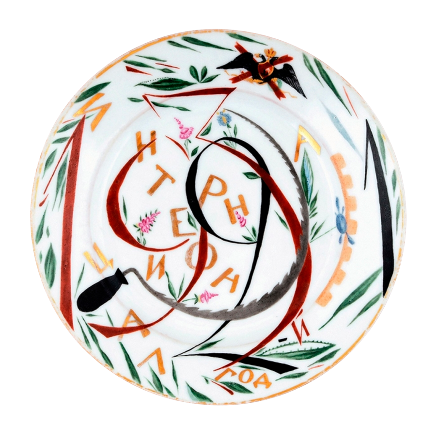
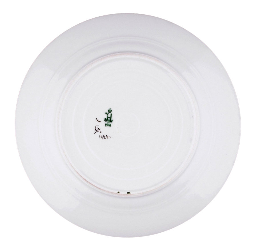
Before the Revolution, the Imperial Porcelain Factory served the court. It produced dinnerware for palaces, state banquets, and gifts. After 1917, the factory took on a new mission: producing propaganda porcelain [10]. Soviet emblems and slogans appeared on plates and cups. Political commentary could now resonate from the surface of an object people were accustomed to seeing at the dining table.The subject matter of the decoration also changed. Art historian L. V. Andreeva links propaganda porcelain to the search for a new revolutionary morality. The idea of class struggle was interwoven with pre-existing concepts in Russian culture regarding labor, justice, and duty [1]. I became interested in how this synthesis became visible. What form did the new slogans take when integrated into the ornamentation? Which familiar image forms helped to depict the heroes and events of the revolutionary era?
Key research question: How did artists at the State Porcelain Factory recontextualize pre-revolutionary motifs and techniques in agitprop porcelain, and what role did these traditions play in depicting the new regime, its heroes, and the era’s events?
The focus of this research is the porcelain created by Sergei Chekhonin and Alexandra Shchekatinina-Pototskaya between 1918 and 1923. For specific comparisons, I refer to the works of Zinaida Kobyletskaya and Mikhail Adamovich. I select pieces that can be compared based on a particular technique: inscription placement, compositional structure, or the figure’s gesture. I present the object in its entirety, and then highlight a specific detail that illustrates its connection to the pre-revolutionary tradition.I select textual sources based on the features of the painting they help clarify. Gollerbach offers a contemporary perspective on color and brushwork [8], while the works of Andreeva and Voinova assist in comparing the porcelain with folk art and icon painting [1, 4]. I correlate these observations with the images, and I verify the authorship, titles, and dates of the works using catalogs.
Ornament and Emblem
Artists at the State Porcelain Factory combined political symbols with traditional decorative painting in diverse ways. In Chekhonin’s work, flowers either frame the emblem or form the letters of the state monogram itself. At Shchekatykina-Pototskaya and Wilde, the same Gosizdat symbols are arranged into various compositions. In works commemorating the 8th Congress of Soviets, the celebratory bouquet and the starburst convey the meaning of a single event in different ways. In the finale, the imperial eagle returns as part of an image signifying a change in power.
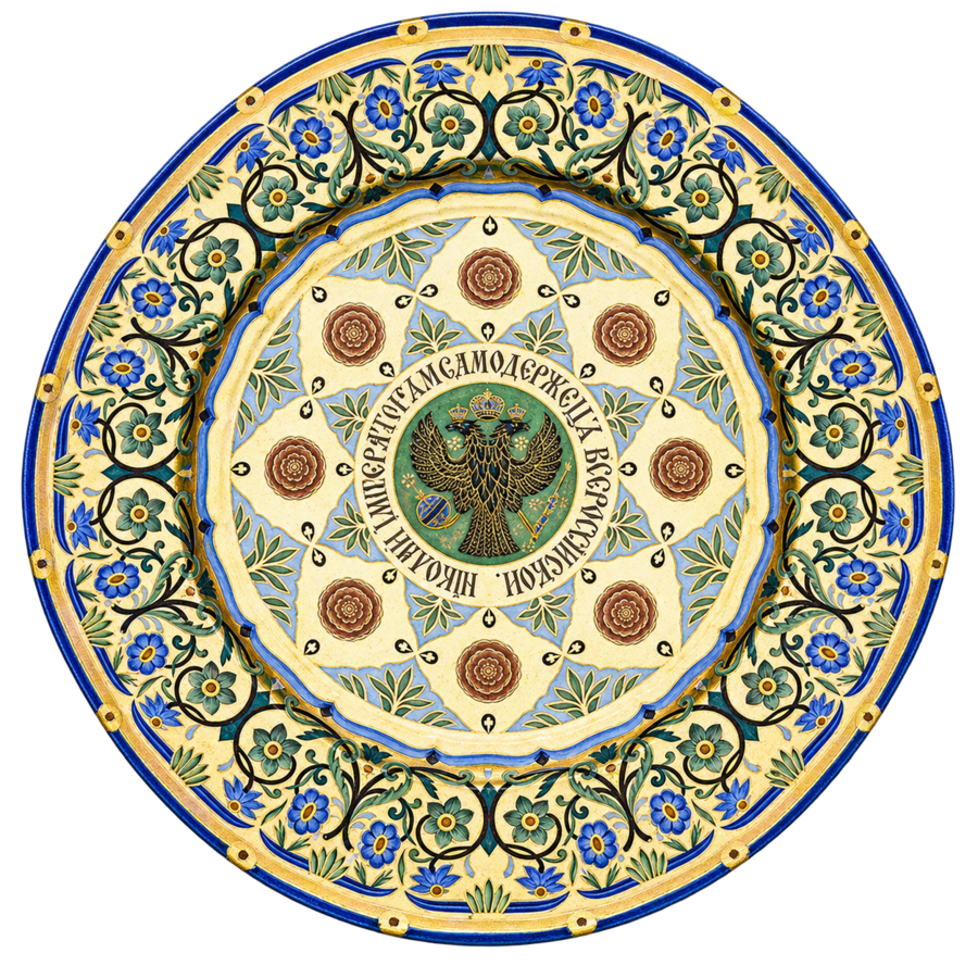
At the center of the Kremlin service plate is a double-headed eagle. It is surrounded by an inscription bearing the name and title of Nicholas I, a row of red rosettes, and a wide floral border. The ornamentation is composed of several concentric zones, each with its own design and boundary. The repetition of the rosettes emphasizes the circular shape, while the inscription designates a specific space within it for the coat of arms [14].
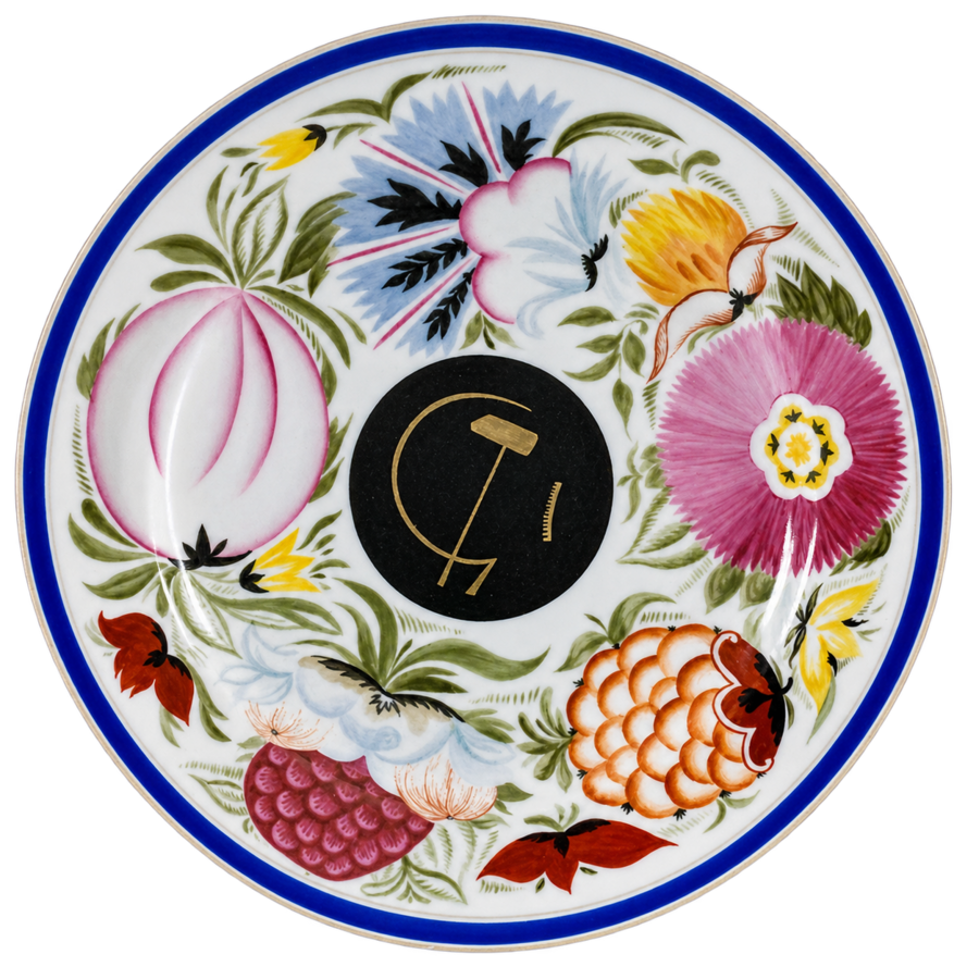
On the plate designed by Chekhonin, the center is also highlighted, but the transition to it is executed differently. Large flowers and fruits come almost right up to the black medallion. The clear boundary of the medallion gathers thin gold lines representing a sickle, a hammer, and part of a gear into a single emblem. On the open white field, these lines might get lost among the large areas of color. Inside the black circle, they are legible separately from the wreath [12].
Both decorative designs lend a sense of solemnity to the state emblem by placing it at the center of the ornamental composition. In the Kremlin tableware, this role is fulfilled by a sequence of belts. For Chekhonin, the decisive element is the contrast between the complex, polychromatic painting and the simple form of the medallion.
In the «RSFSR» plate (1922), Chekhonin revisits the floral motif from the 1918 anniversary painting and alters its function. On the early plate, a wreath surrounds a black medallion bearing an emblem. Here, small flowers are gathered into a garland that echoes the curves of interwoven letters. The vegetal ornament transitions from framing the piece to becoming part of the monogram itself.
The large hammer, placed diagonally, immediately stands out against the delicate lines. The monogram is read more slowly: the viewer’s gaze follows the curves of the letters, occasionally continuing along the floral garland. In this way, Chekhonin utilizes the familiar technique of floral painting to imbue the new state insignia with form.
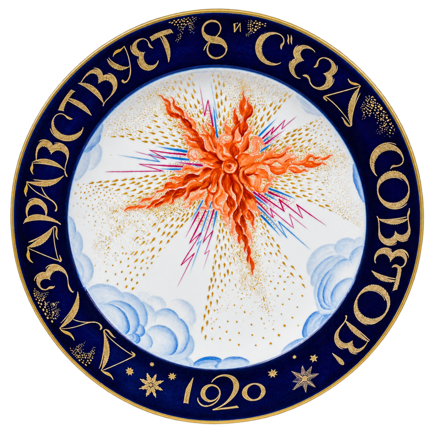
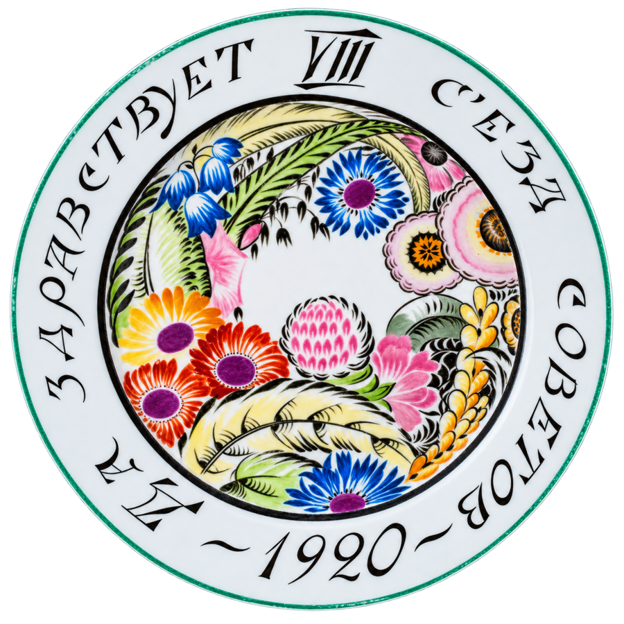
In R. F. Wilde’s work, flowers and stalks form a wreath around a small white opening. The gaze moves in a circle—first along the stalks, then along the black letters on the border. The inscription «Long Live the VIII Congress of Soviets» changes the interpretation of the design. Thanks to it, the familiar floral wreath is perceived as festive decoration for the Congress. In Z. V. Kobyletskaya’s work, the gaze immediately stops at the red-orange star and then follows the tongues of flame, zigzags, and gold dots that spread across the white field. A wide cobalt border with an inscription frames this burst of energy. In R. F. Wilde’s dish, the traditional floral motif lends solemnity to the political event. Z. V. Kobyletskaya, similarly, creates a circular composition as a frame for a tense, dynamic image.
Both plates are dedicated to the same congress, and on both, the familiar division between the painted field and the decorative rim is discernible. This allows one to see how the former compositional scheme adapts to different depictions of the revolution.
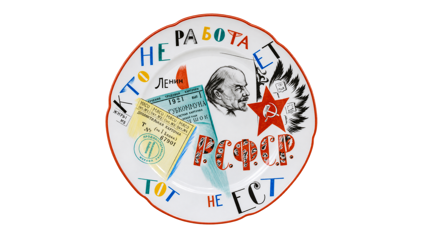
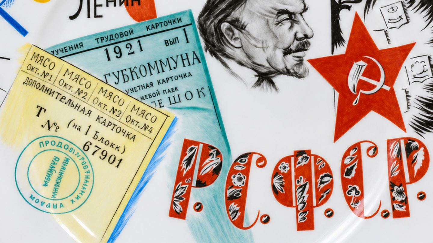
At the center of the plate, designed by M. M. Adamovich, is a portrait of V. I. Lenin based on a drawing by N. I. Altman. The double-headed eagle is shifted toward the edge of the composition. The artist shows only a portion of the coat of arms, which is overlaid by a red star. Because the eagle is still recognizable, the juxtaposition of the two symbols communicates a change in power.
On imperial porcelain, the double-headed eagle signified the connection of an object to the court. In M. M. Adamovich’s painting, it becomes an image of departed authority. This is evident in the placement the artist assigns to each symbol: the portrait occupies the center, the star advances to the foreground, and the eagle remains behind it, visible only partially.
in
www