BRAND IDENTITY & PACKAGING DESIGNER
Don’t let your brand fade into the noise. Turn on the spotlight.
Hi! I’m Polina Penzenskaya, a 21-year-old communication and brand designer at HSE Art and Design School. I craft bold visual identities, tactile packaging, and cohesive graphic systems that transform business values into unforgettable visual stories.
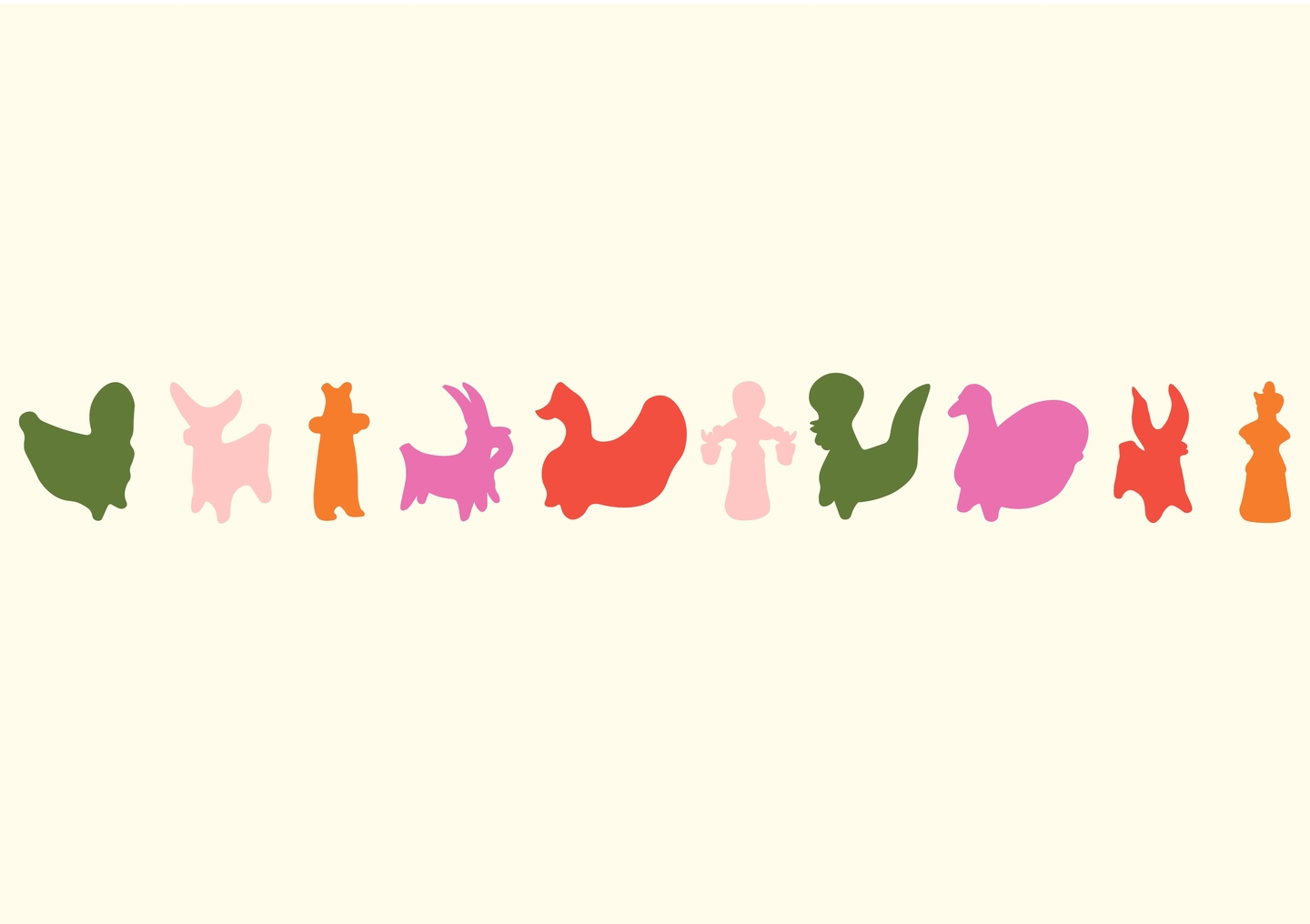
✦ Meet Lumi — your guide through this portfolio
Think of me as a visual highlighter. As you scroll through this longread, I will point out the hidden meanings, strategic decisions, and graphic details that make each project work. Follow the colored accents—they lead straight to the core of Polina’s design thinking.
Youthful energy meets structural logic.
At 21, I combine a sharp feel for contemporary visual culture with rigorous academic training in Communication Design (workshop of Konstantin Travin). For me, graphic design is never just about making things look «pretty.» It is a language of empathy, structure, and precision.
THE MARKET CHALLENGE
Why do great products stay invisible?
Every day, consumers scroll past thousands of logos and walk by hundreds of shelves. Most brands fall into one of two traps: they either blend into safe, generic clichés or create chaotic visuals detached from their actual product. Without a clear visual code, even the best idea gets lost.
How I turn visual noise into brand clarity:
01 / Meaning First — I dig deep into the product’s origin, audience pain points, and cultural context before drawing a single line.02 / One Strong Metaphor — Every identity needs a single, unmistakable visual hook that people remember after a one-second glance.03 / Systemic Scalability — From a tiny social media avatar to a 3D box or street signage, the system adapts effortlessly.04 / Tactile & Emotional Contact — Packaging and print must make people want to reach out, touch, and keep.
Who I work with & what I deliver
I partner with emerging startups, lifestyle and beauty brands, cultural spaces, and creative agencies looking for a fresh, conceptually solid visual voice.
My core deliverables: Full Brand Identity Packaging Design Merch & Print Systems Visual Guidelines
SELECTED CASE 01 / BRAND IDENTITY & ENVIRONMENT
HIGHLIGHT — A coworking space where you are never alone
✦ Lumi says: «Let’s start with the project that inspired my own name. How do you turn an ordinary study room into a vibrant youth community?»
The Challenge: Fighting student isolation and study burnout
Students preparing for exams often struggle to find the right environment. Studying at home feels lonely and distracting, while traditional offices or libraries feel cold, sterile, and overly corporate. The goal was to create a brand identity for a student-focused coworking space that combines high productivity during the day with warm social connection in the evening.
The Idea: The Highlighter Marker as a symbol of focus and life
When students study, their main tool is a highlighter marker—used to select the most important thoughts on a page. I transformed this everyday study habit into a powerful brand metaphor: HIGHLIGHT selects the best moments of your student life. The vertical neon stroke inside the letter «I» becomes a dynamic beam that connects people, spaces, and ideas.
The Solution: A two-mode visual system
I built a flexible graphic language that shifts its rhythm depending on the context:
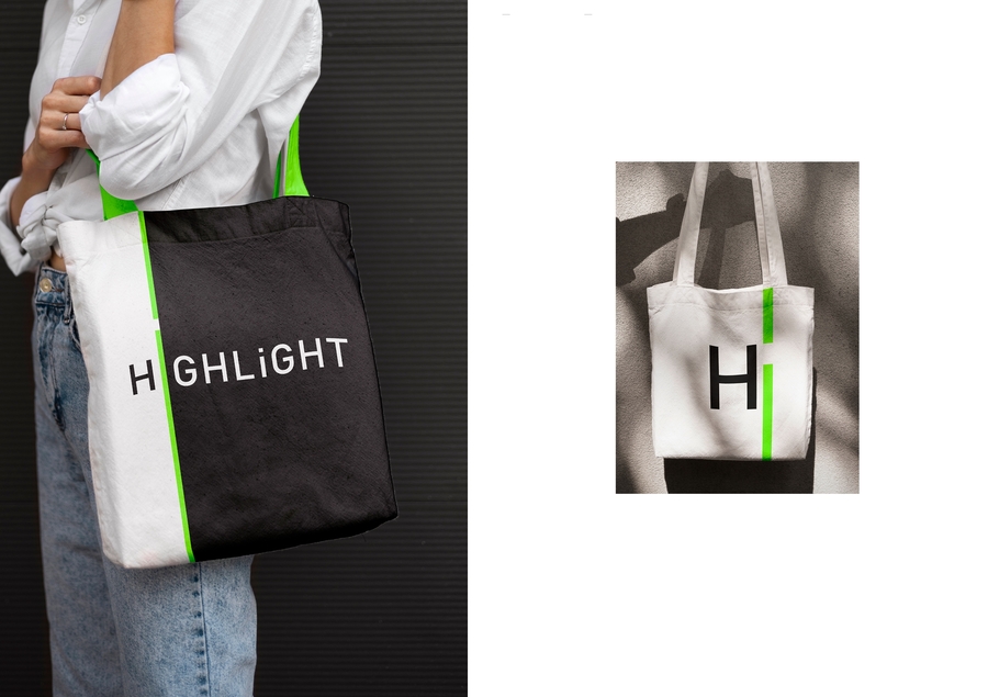
• Focus Mode (Study): Strict black-and-white typography pierced by a single, disciplined vertical highlight line for navigation, passes, and workspace signage.
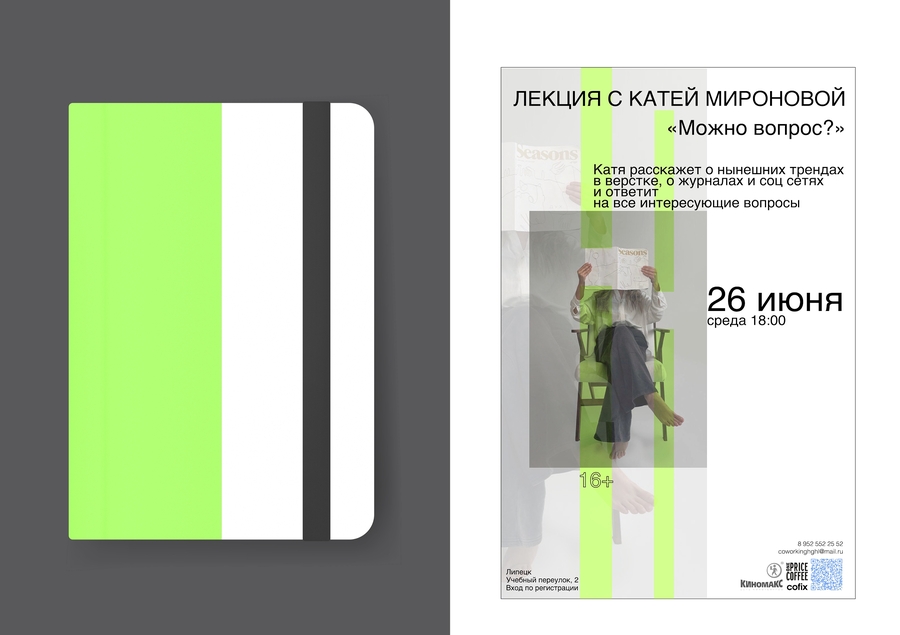
• Community Mode (Evenings): Expressive hand-drawn blue scribbles, lively event posters for board game nights, and personalized coffee cups that spark conversation.
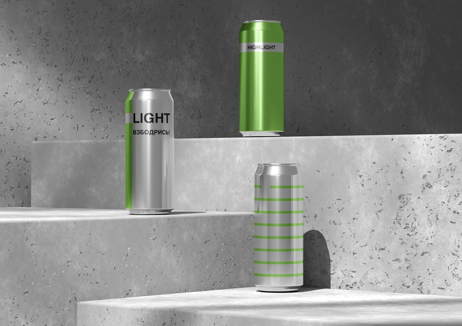
Project Outcome & System Reach:
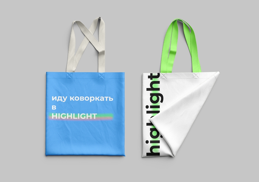
Over 30+ brand touchpoints designed in a single cohesive presentation—from architectural signage and web interfaces to wearable merch (tote bags, tees, duct tape, and stationery). The vertical line makes the brand recognizable even without reading the logo.
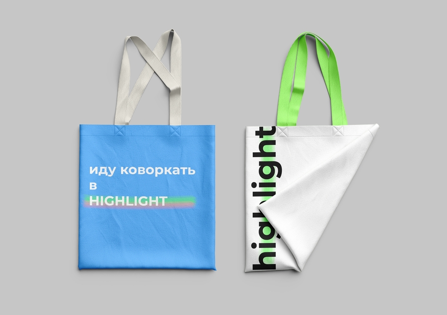
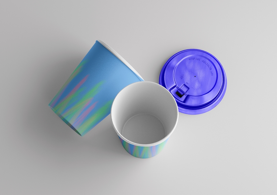
SELECTED CASE 02 / PACKAGING DESIGN
DVURECHYE — Skincare born from healing peat and clay
✦ Lumi says: «Now let’s switch from digital-age youth energy to raw, tactile nature. How do you make therapeutic mud look desirable and modern on a beauty shelf?»
The Challenge: Rethinking local mud cosmetics
«Dvurechye» is a skincare brand based on therapeutic muds and clay extracted from the Dvurechye Yesaulovo peat deposit in the Lipetsk region. Traditionally, mud-based cosmetics suffer from outdated, pharmaceutical, or overly «dirty» visual associations. The challenge was to design a packaging line for body creams and face masks that communicates natural origin and geological depth while looking sleek, contemporary, and premium.
The Idea: Geological layers & the meeting of two elements
The name Dvurechye («Two Rivers») and the nature of peat deposits inspired a visual metaphor of natural stratification. Where lush green surface flora meets deep, mineral-rich dark earth, healing power is born. I translated this natural boundary into a bold, organic wave that divides every package into two contrasting worlds.