Part 1 — Method
Portfolio — graphic design, branding, print
I find the image that reveals a project, and grow it into a system
From mark and custom type to packaging and objects. The image comes from the subject itself: a spiral for immersive theatre, a shoreline for skincare.
A beautiful image isn’t a brand yet. Most visuals are assembled from lucky accidents — striking, but they fall apart the moment you need to build a system.
The problem I solve
Studios and small brands get one strong cover easily. What’s hard is a language that holds across everything — from logo and type to packaging, merch, and space.
I don’t work with separate pictures, I work with a principle. First I find one image that describes the subject precisely, then I test it on everything, and keep only what survives as a system.
One image, grown into a system. The subject’s essence → the form that carries it → a language that works everywhere.
How it works
The image isn’t invented for looks — it’s drawn out of the subject itself. That’s why it reads as recognizable but not literal: it depicts nothing specific and leaves room for a story.
From there the image becomes a construction kit. One form sets the type, the color, the rhythm, the modularity — and runs through the whole project without breaking into separate decisions.
Part 2 — Work
Case 01 — branding + custom type
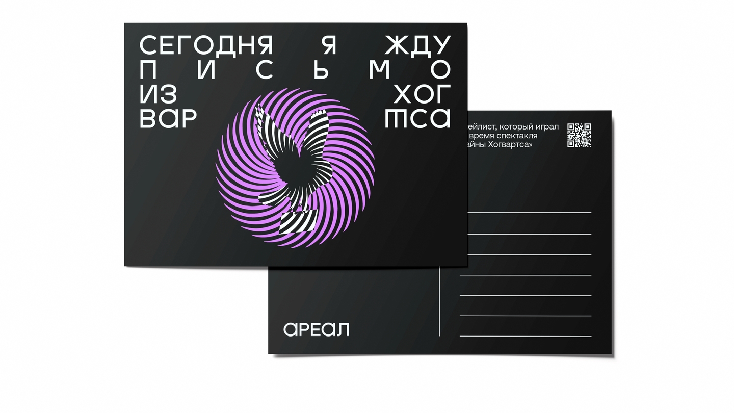
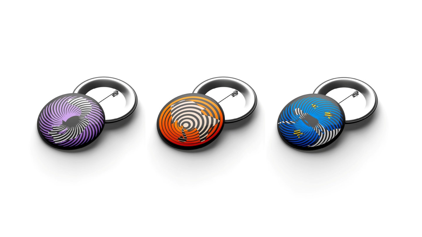
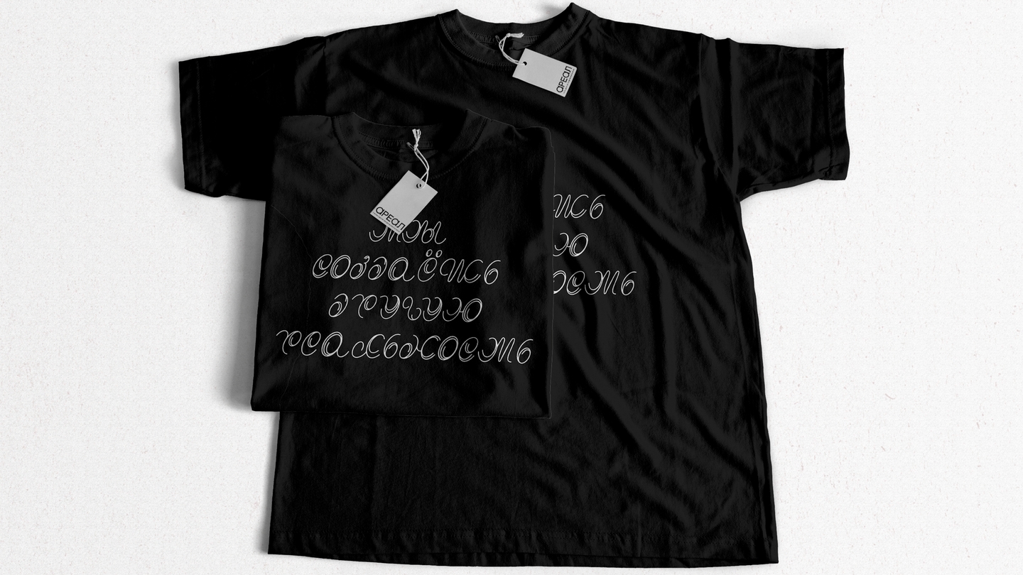
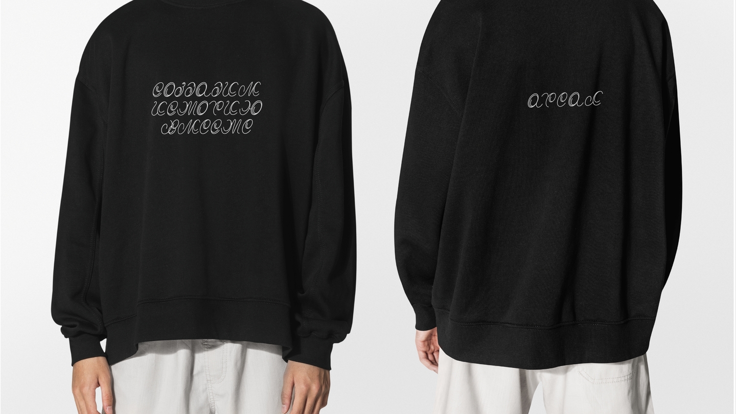
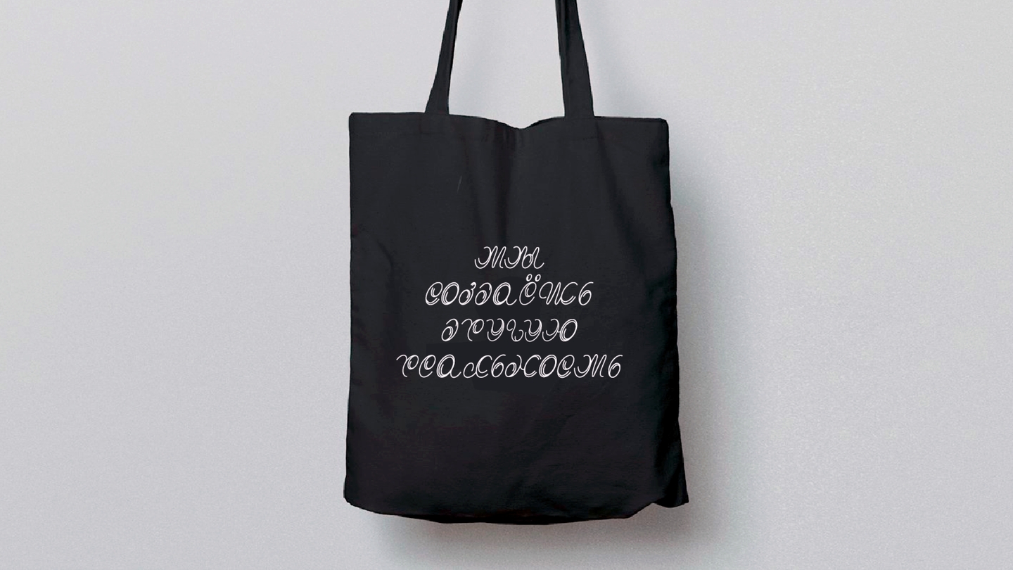
AREAL
Visual identity for an immersive theatre · student project
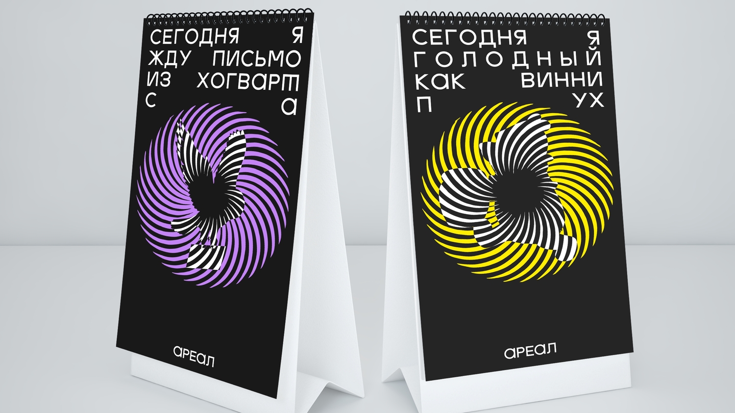
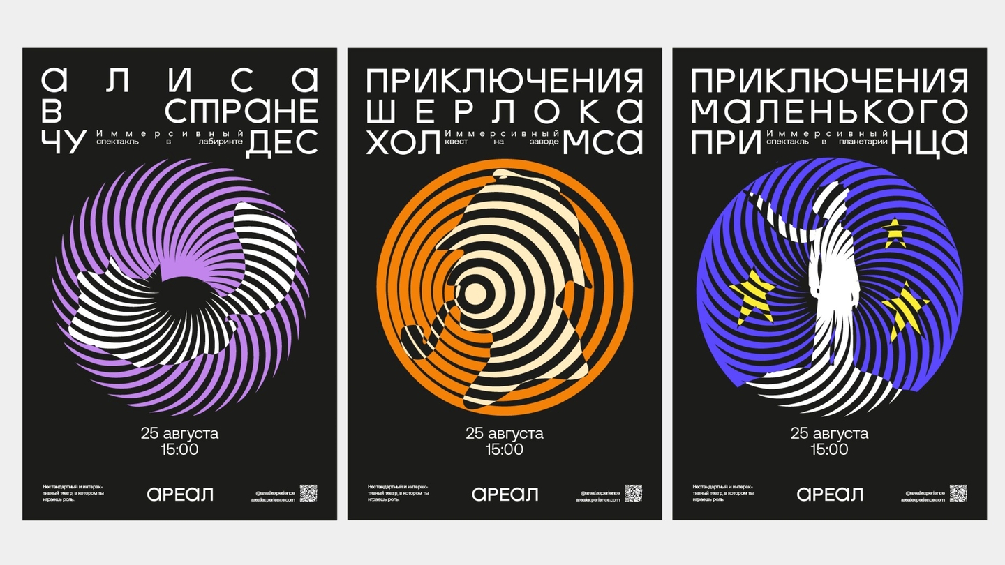
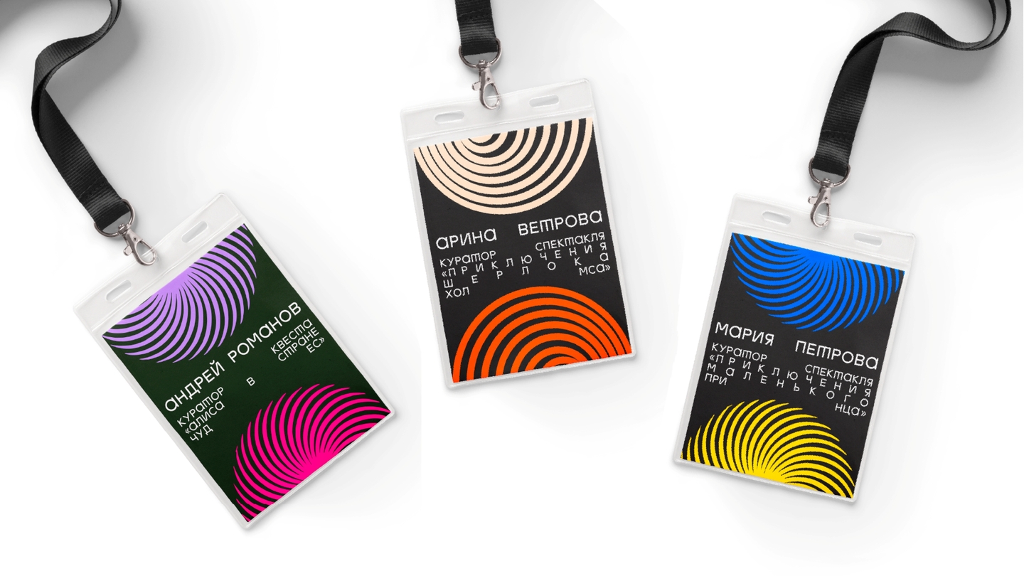
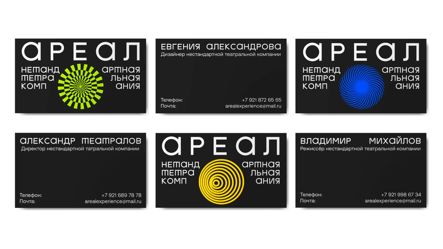
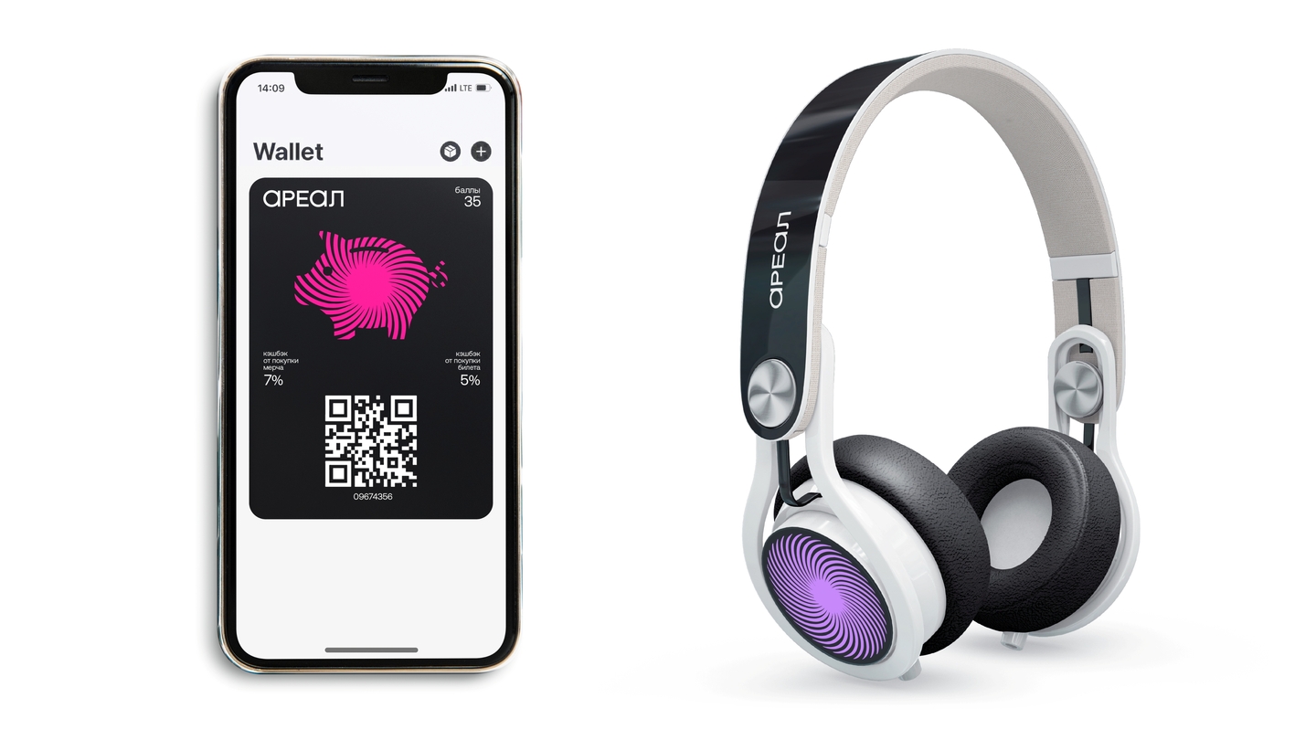
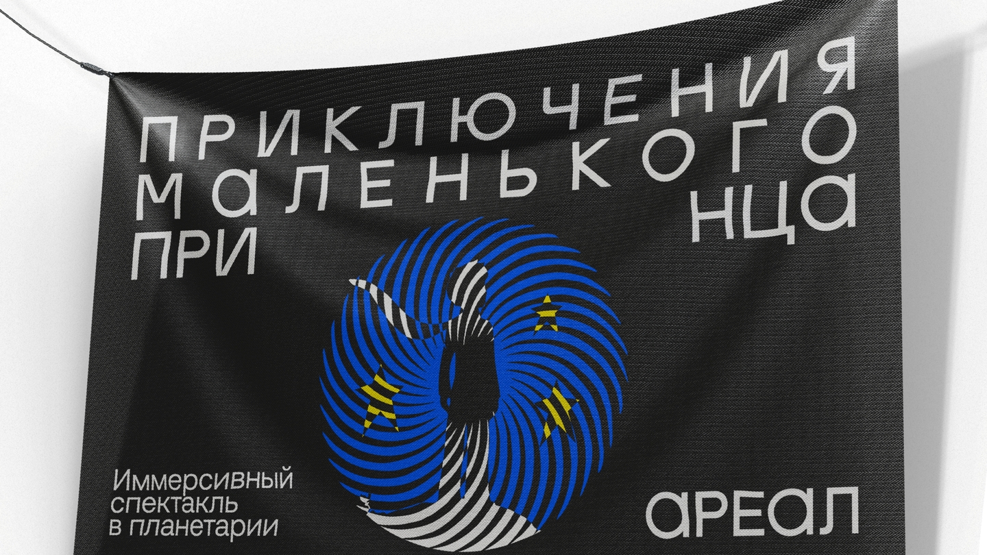
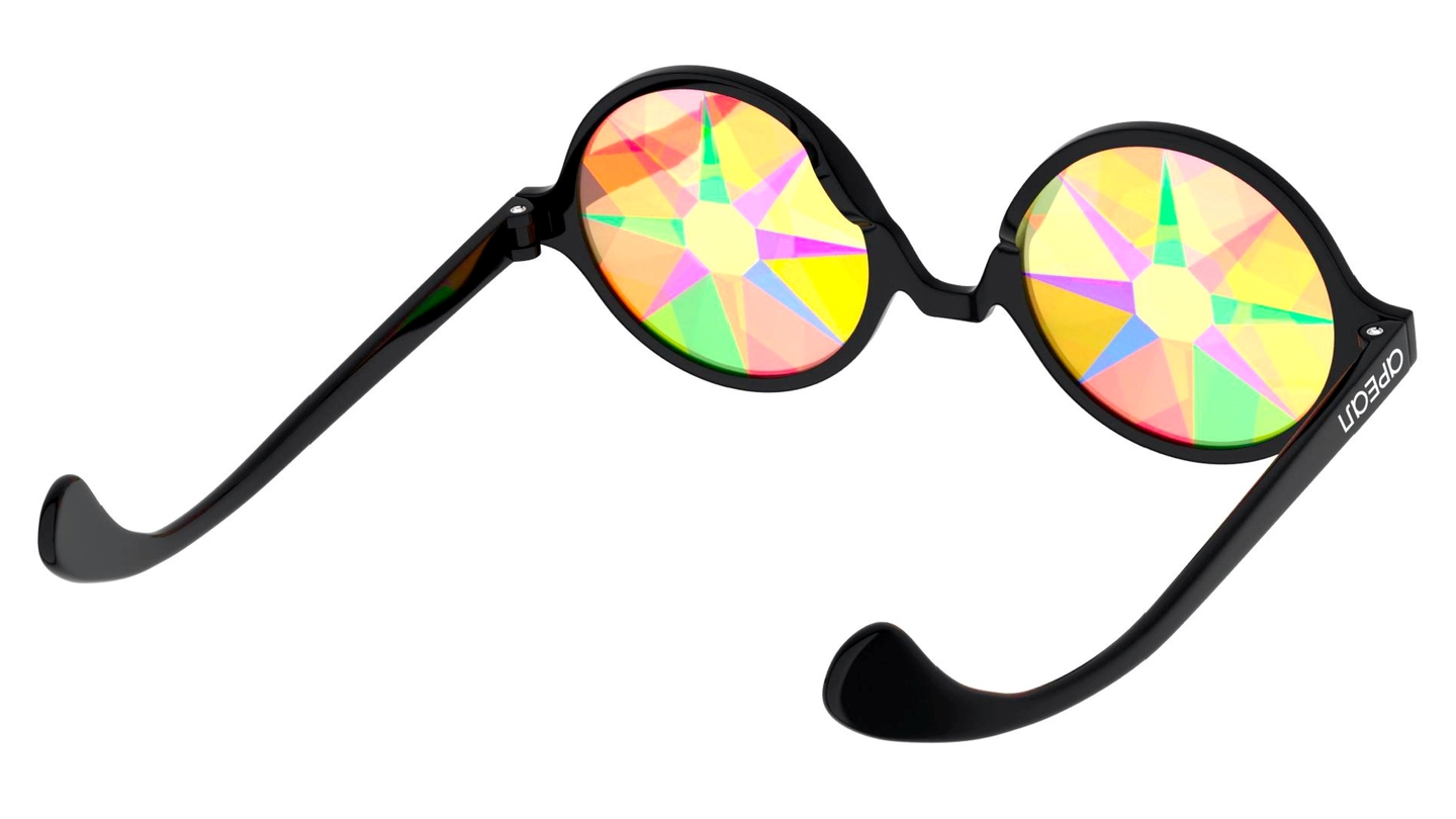
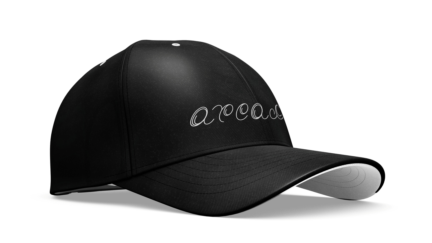
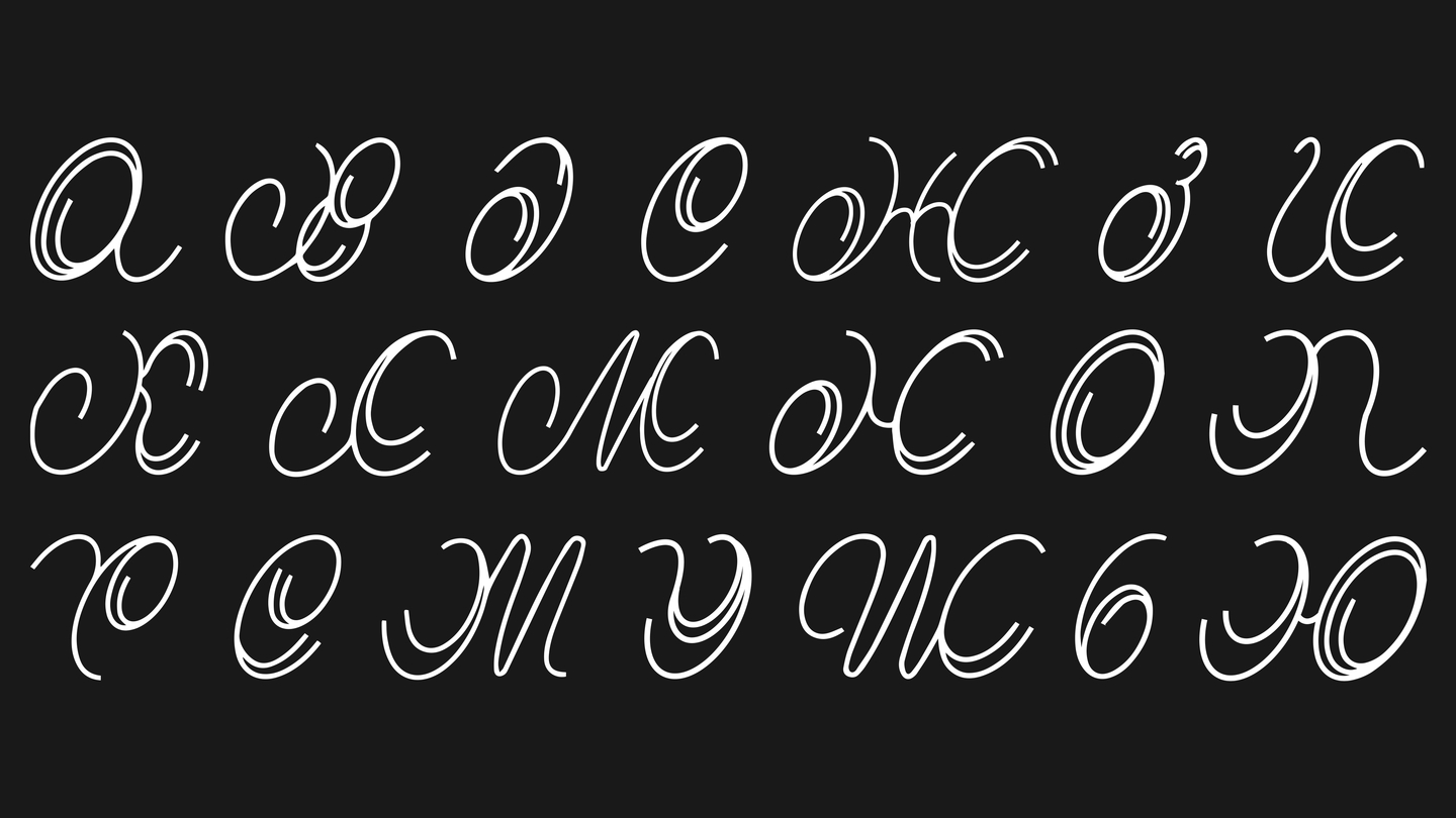
EssenceA theatre where the audience becomes the hero: show, game, and quest merge into a single story.ImageSpiralling circles — a hypnotic shape the characters grow out of. The spiral as a metaphor for full immersion.SystemOne form runs through everything: posters, business cards, headphones, flags, a flip mood calendar, and a custom typeface where the same motion lives inside the letters.
Case 02 — packaging + 3D
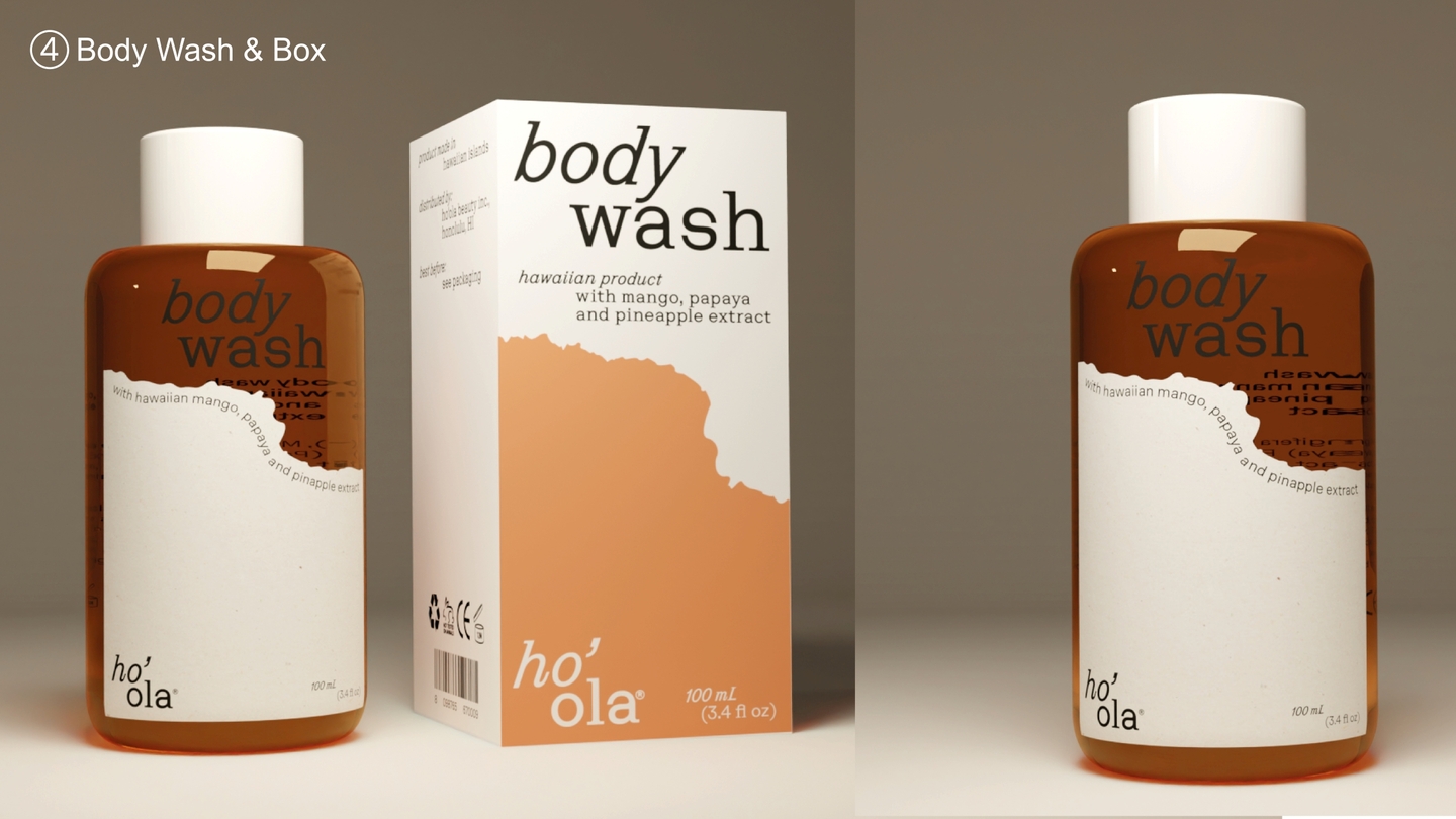
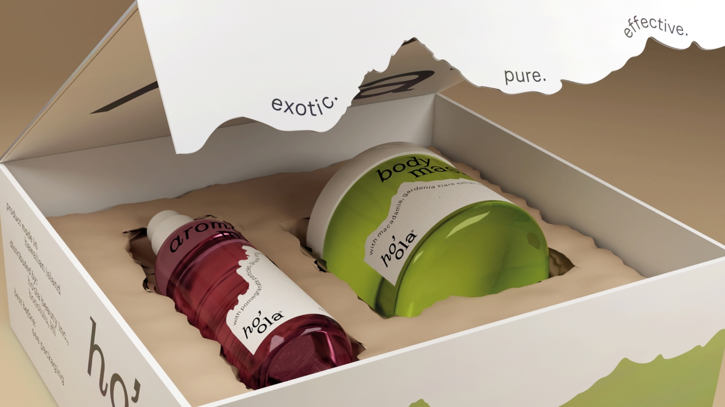
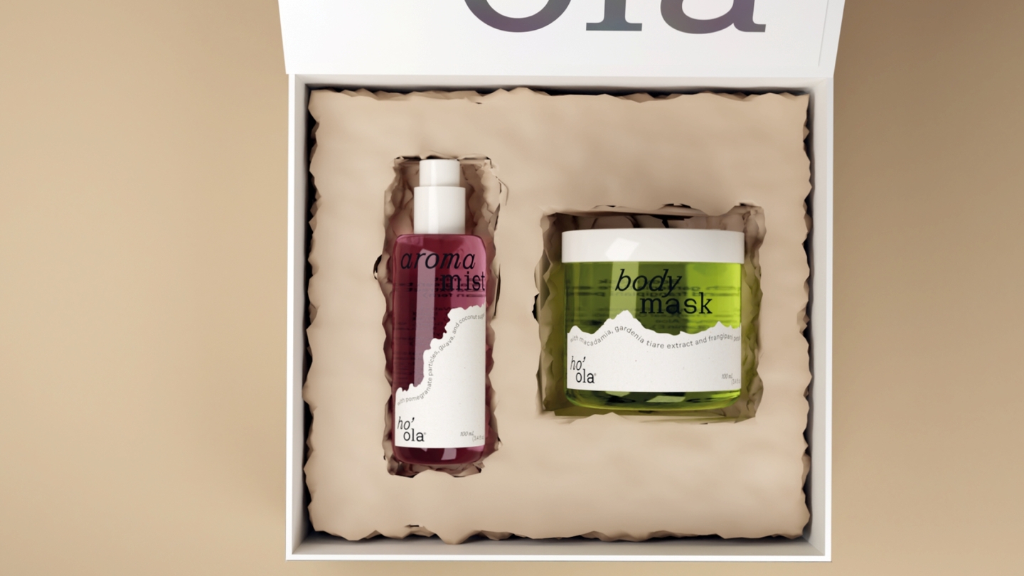
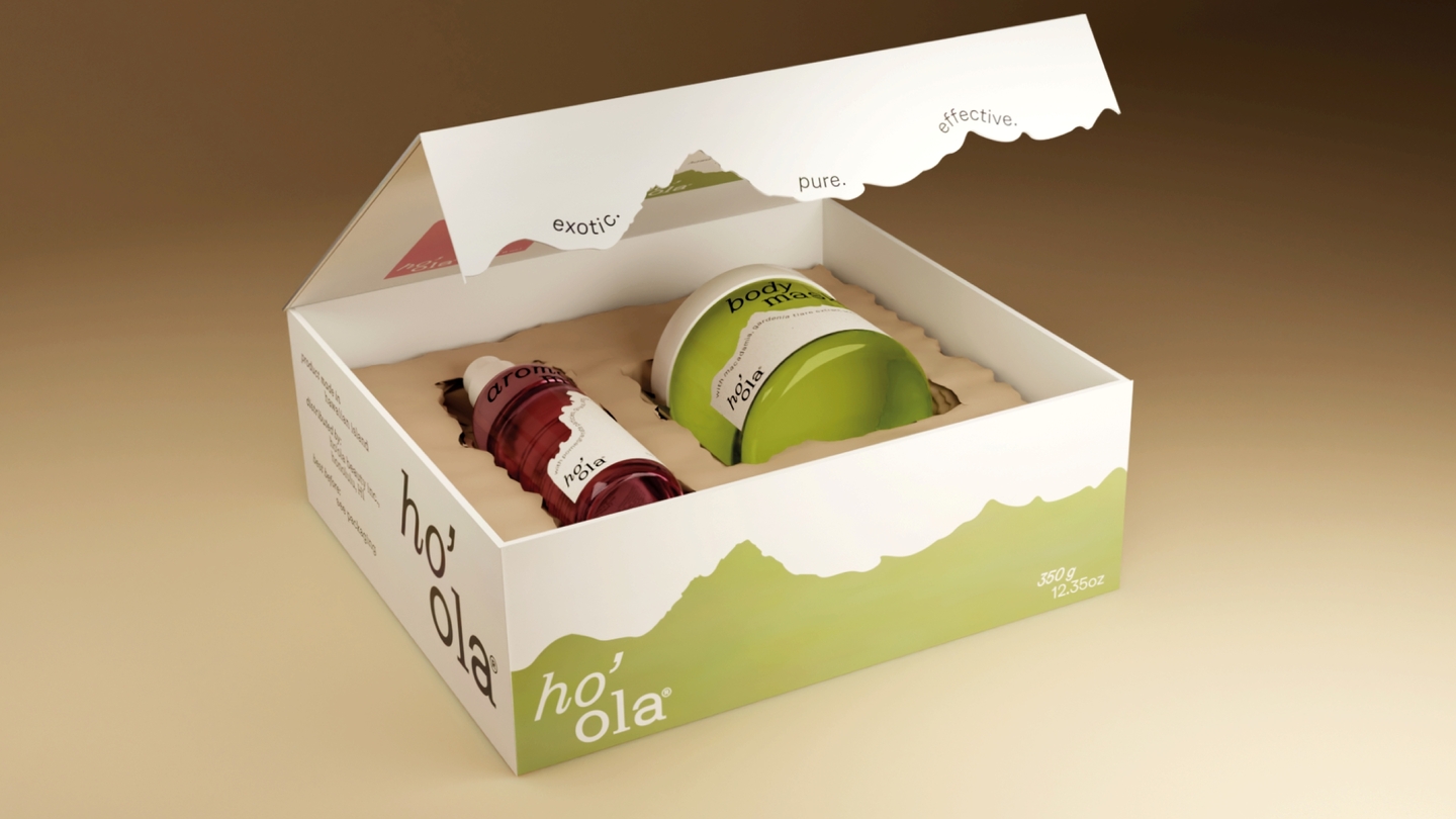
Ho’ola
Skincare packaging · concept · Blender visualization
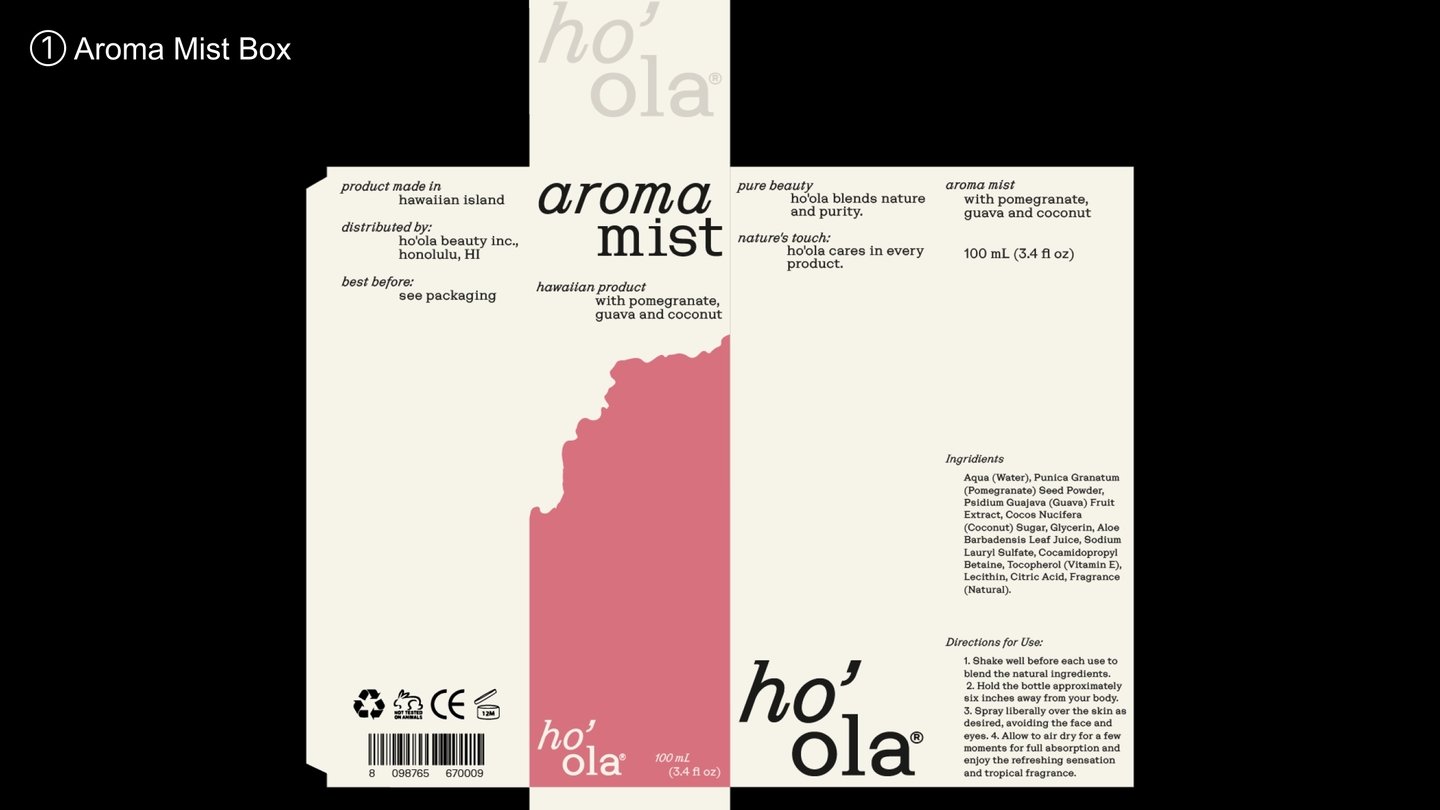
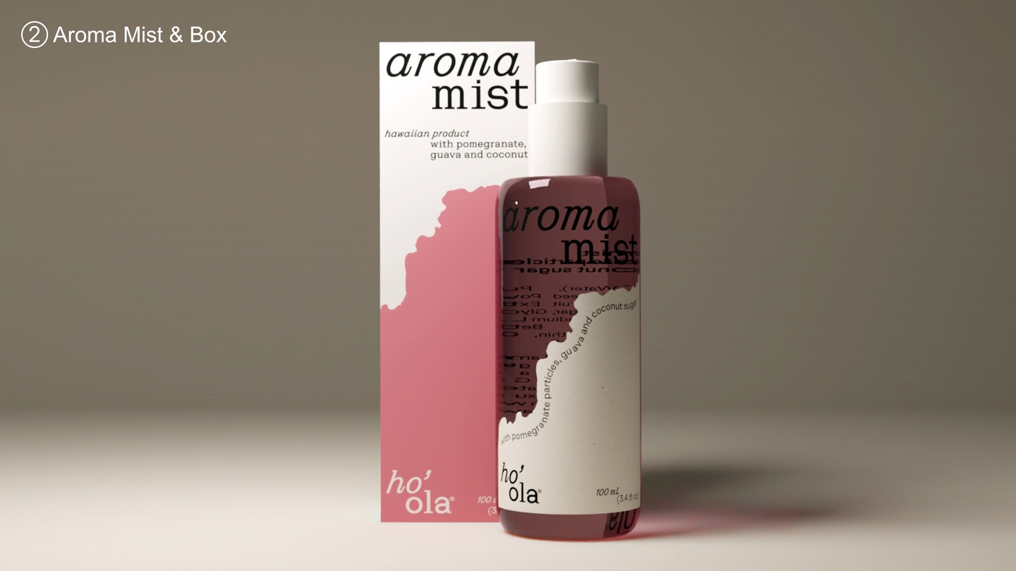
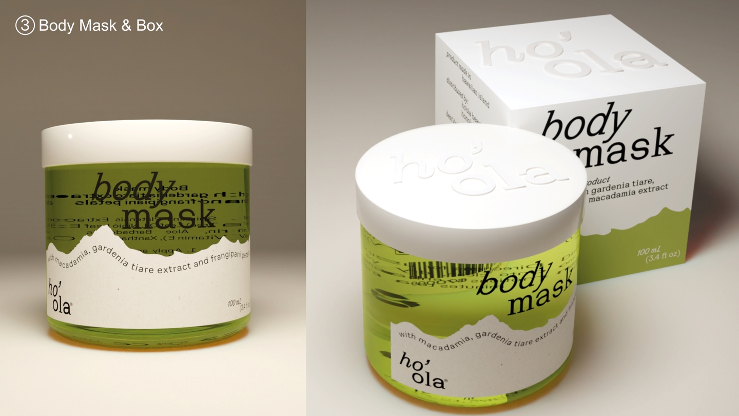
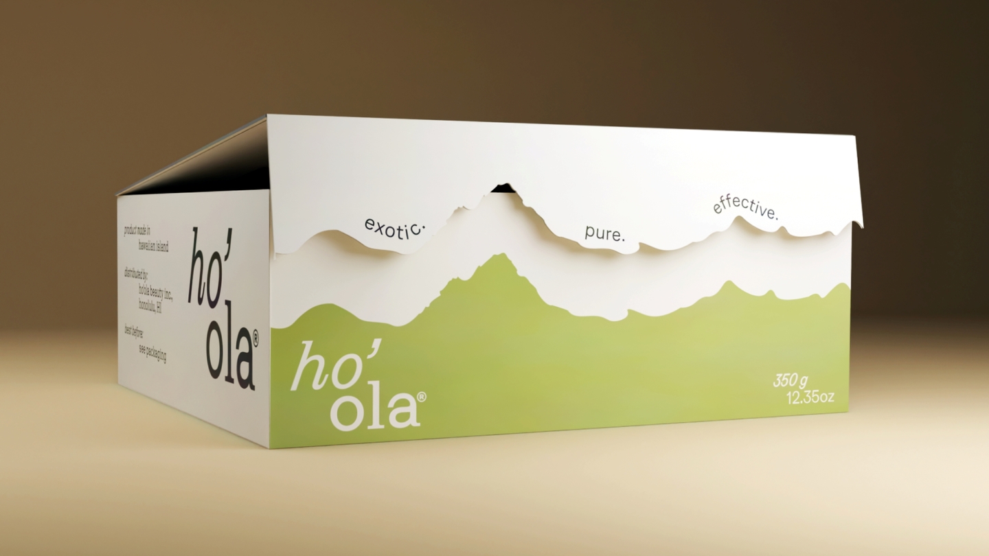
EssenceHawaiian skincare built on one idea: separation, like the islands' own landscapes.ImageA sticker shaped like a sandy shore splits each package into «water» and «land» — the calm transition from ocean to warm sand.SystemOne device scales across the whole line: aroma mist, body mask, shower gel, and a gift box. Colored glass carries the freshness; the typography is given room to breathe.
Case 03 — concept + photography + design
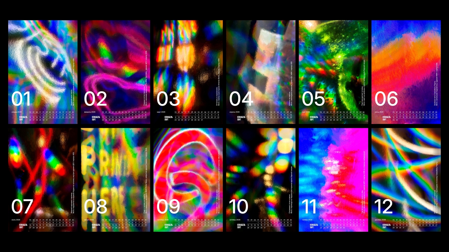
Lights of Sevkabel
2026 calendar · student brief, HSE University × Sevkabel Port
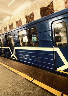
EssenceA calendar for a waterfront cultural space in Saint Petersburg. A story about light that connects space, people, and time.ImageFound light: a camera and a sheet of holographic paper. Nothing staged — light revealed itself on staircases, in lettering, underfoot.SystemFrom those accidental reflections, a color arc of the year — from the cold tones of January to the warm glow of December.
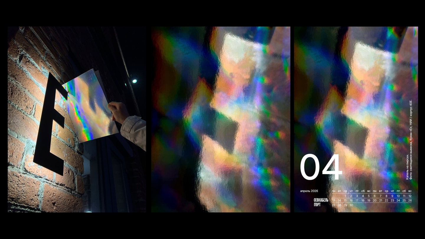
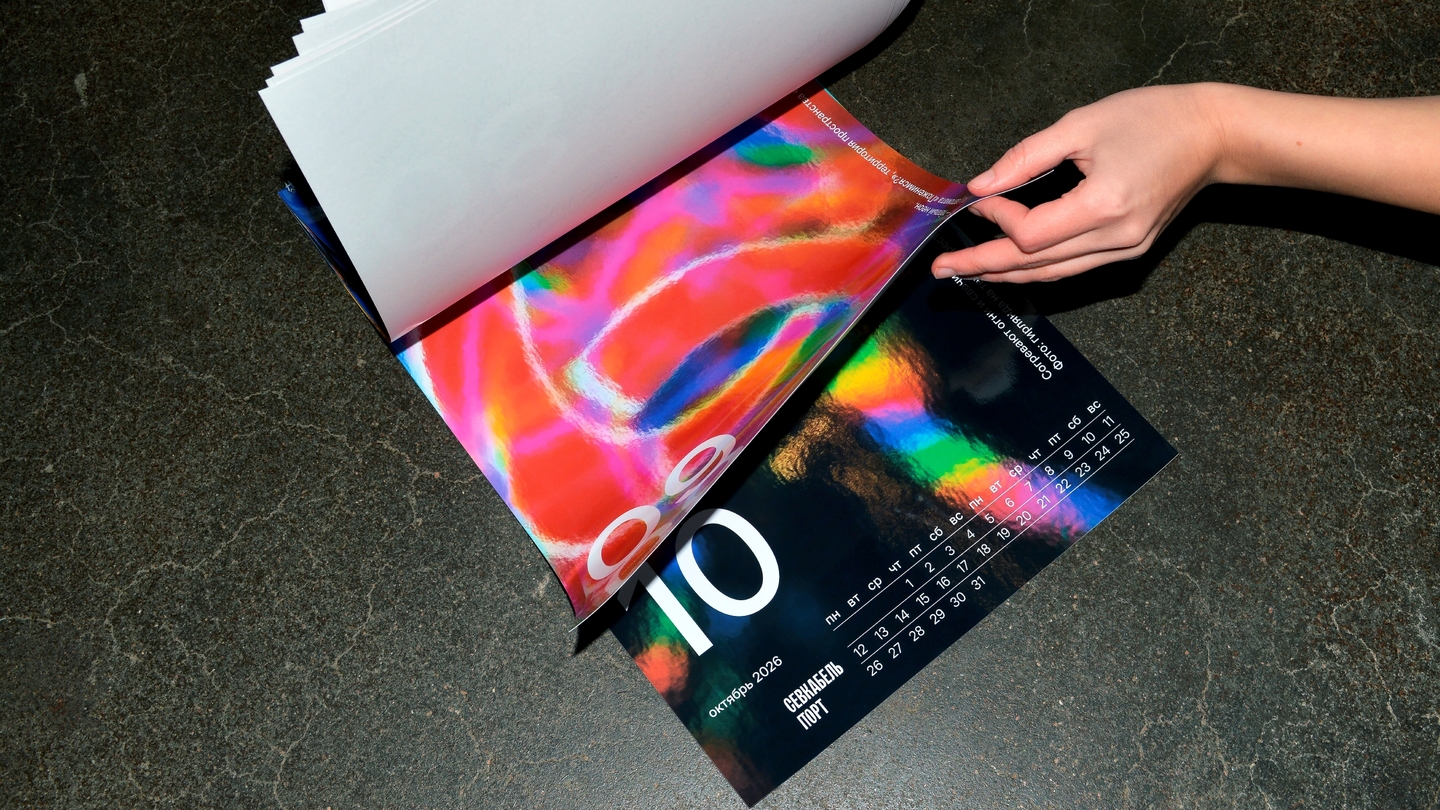
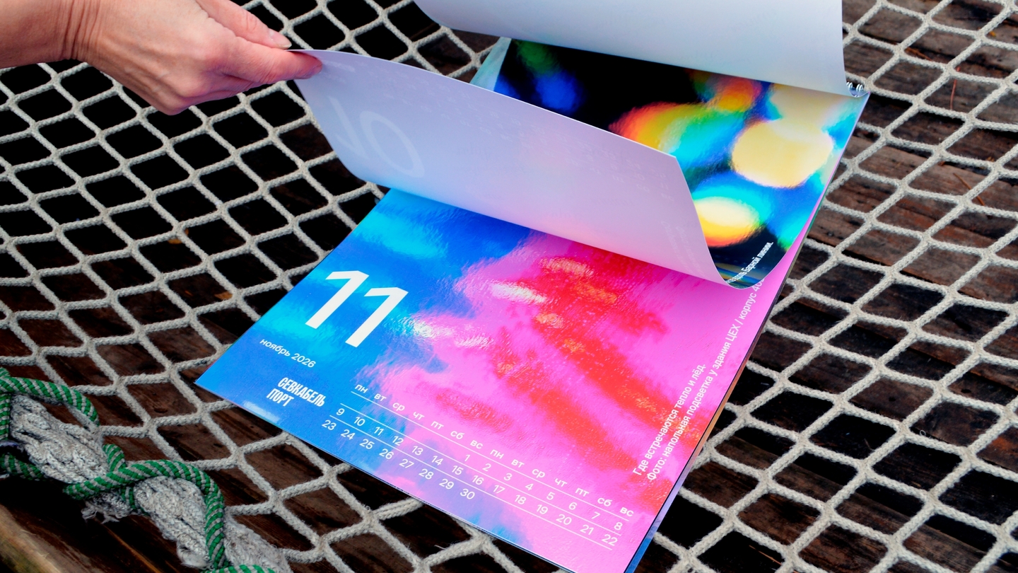
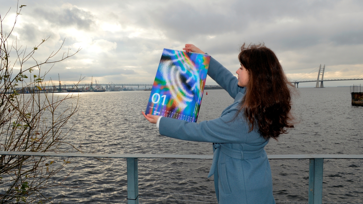
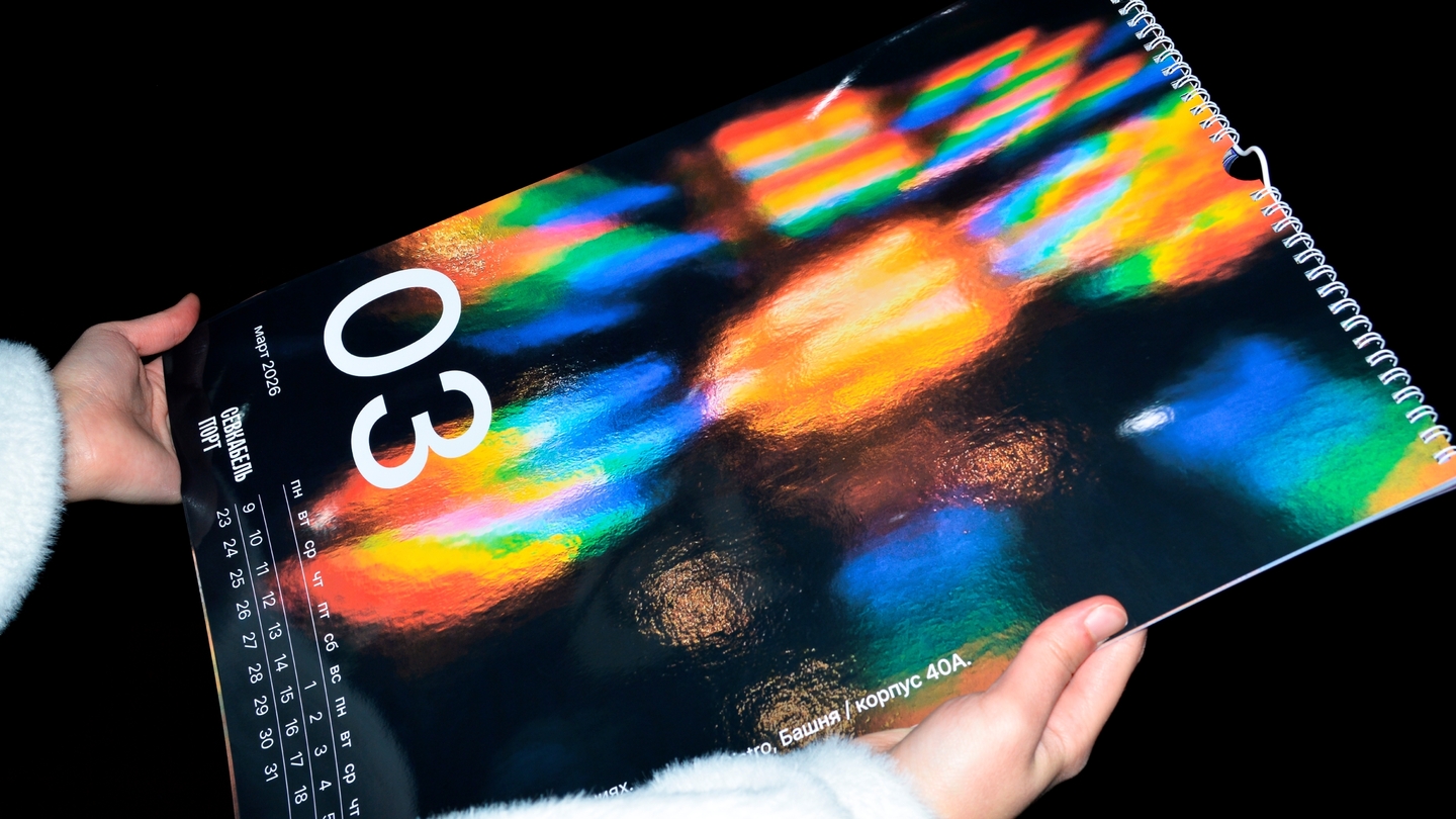
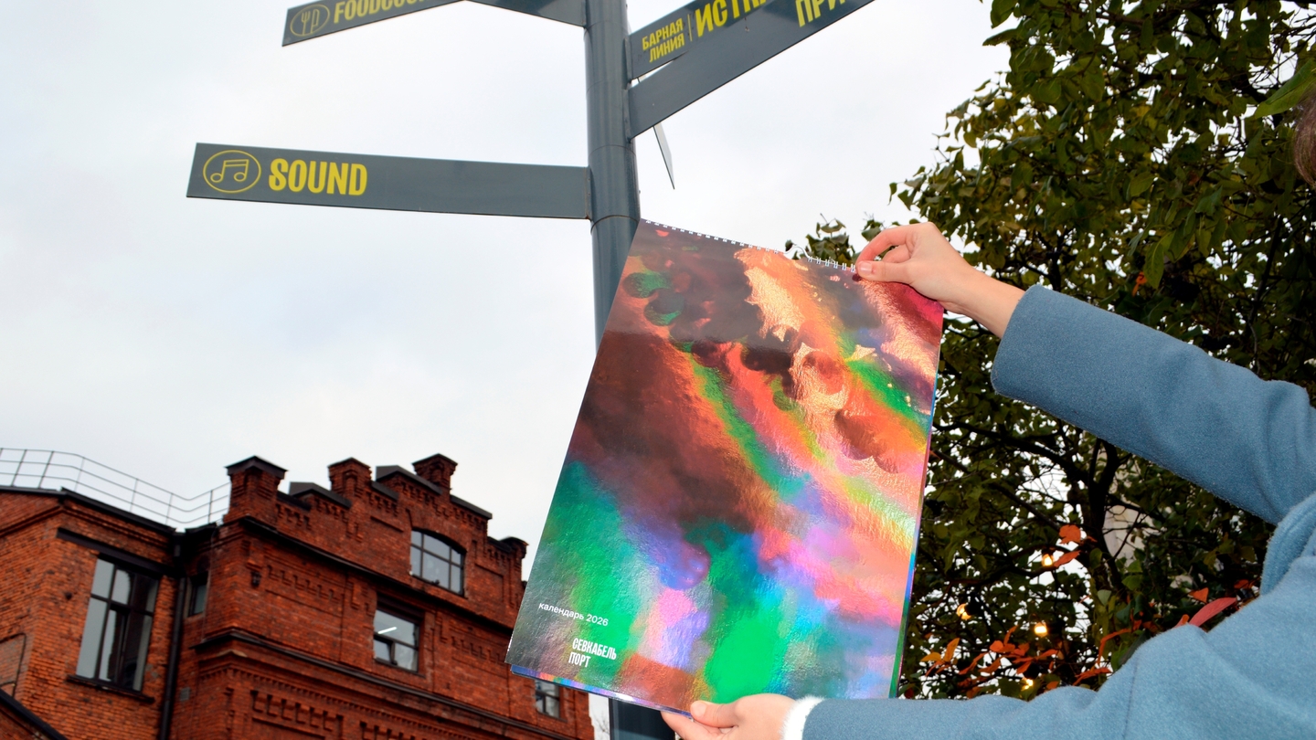
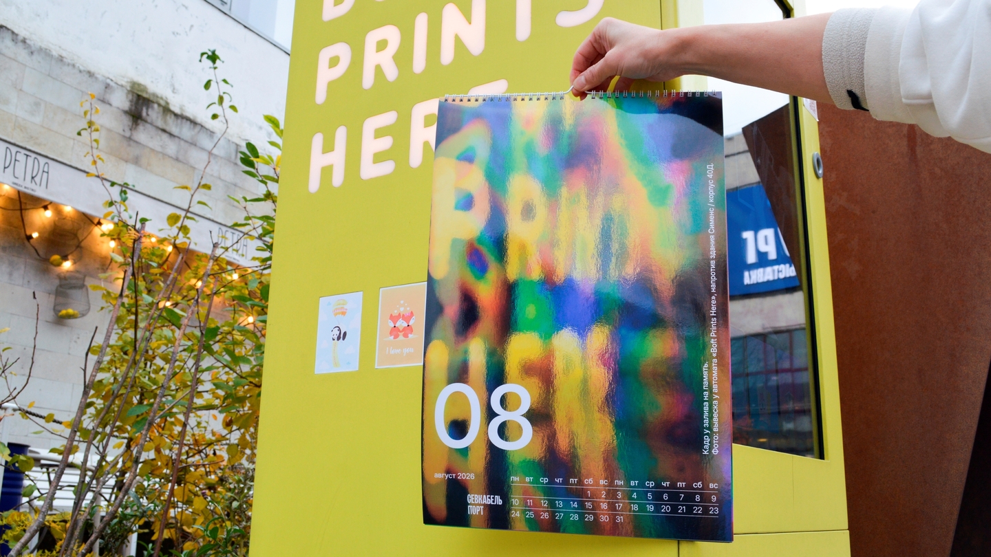
How I take a project through: image → system → applications. Every step is checked against whether the language holds as a whole.
Wider than one genre
Beyond branding, the same method works in illustration, print, product, and motion.
A postcard series where crafts come alive as characters. Album illustrations built from paper collage. Children’s furniture on a single clover geometry. A short AI film — from story and sketches to animation.
Different media, one way of thinking: find the image and take it all the way.
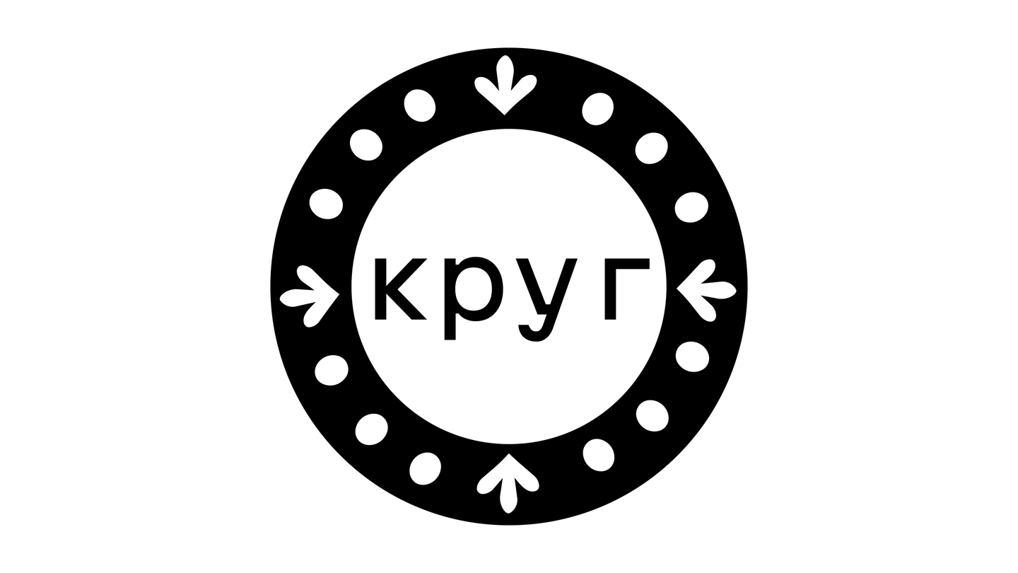
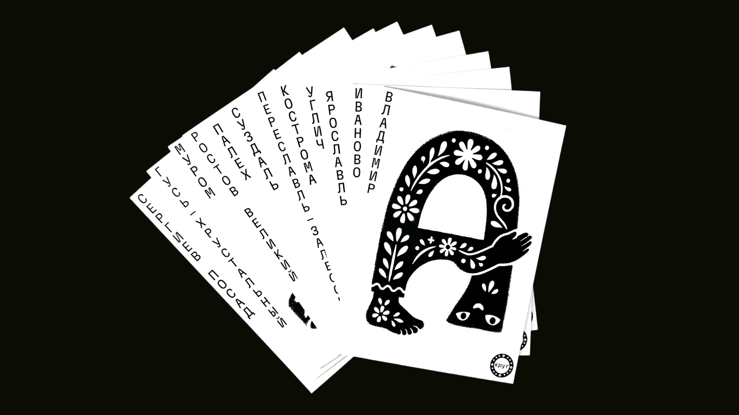
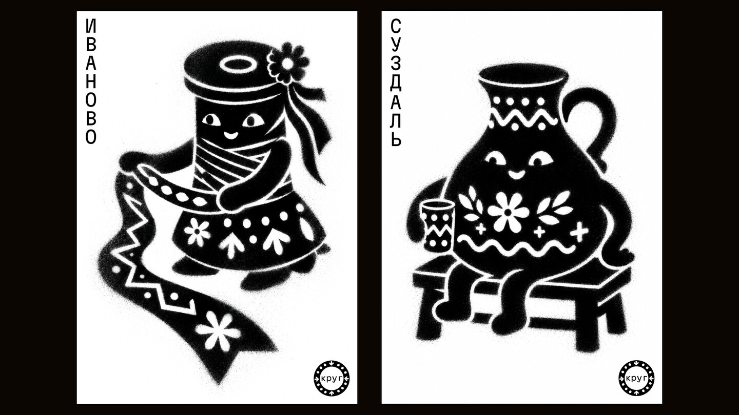
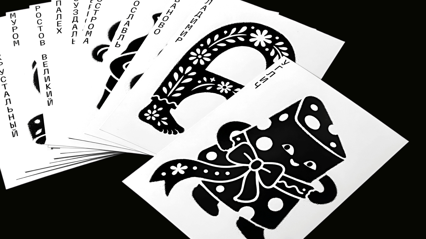
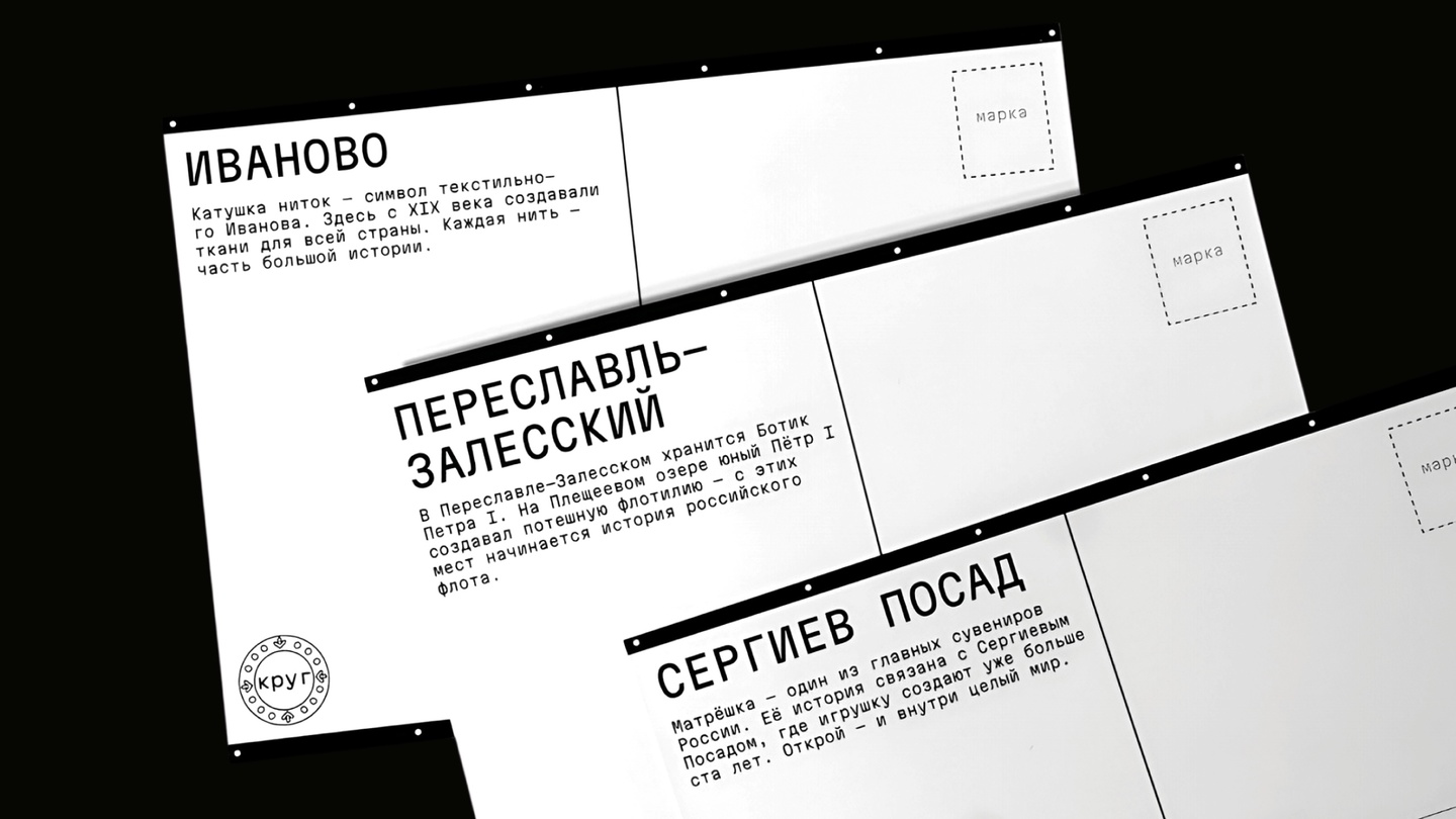
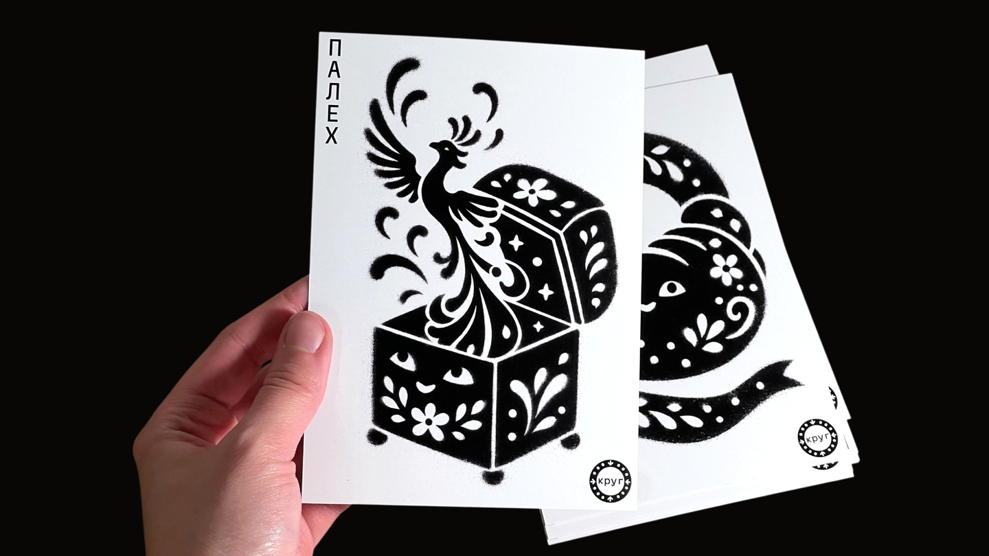
Krug — a postcard series where old-town crafts come alive as characters
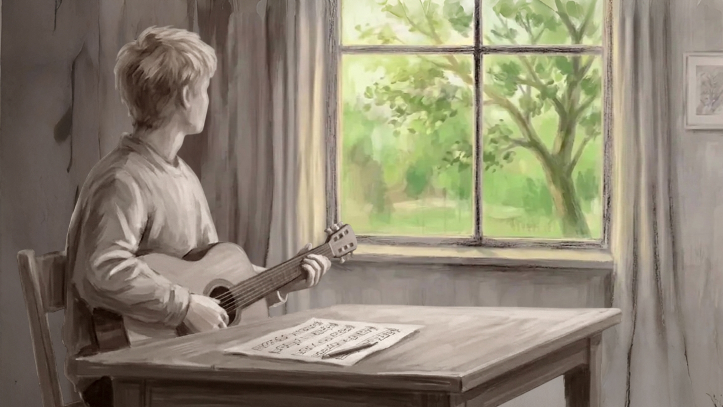
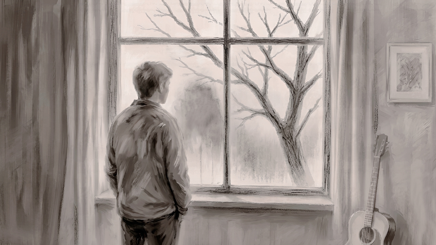
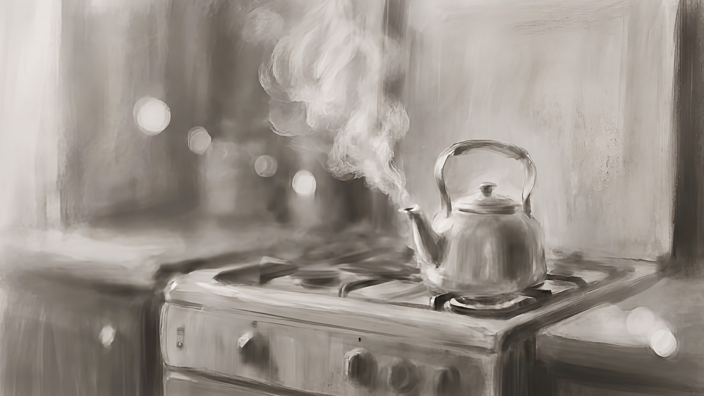
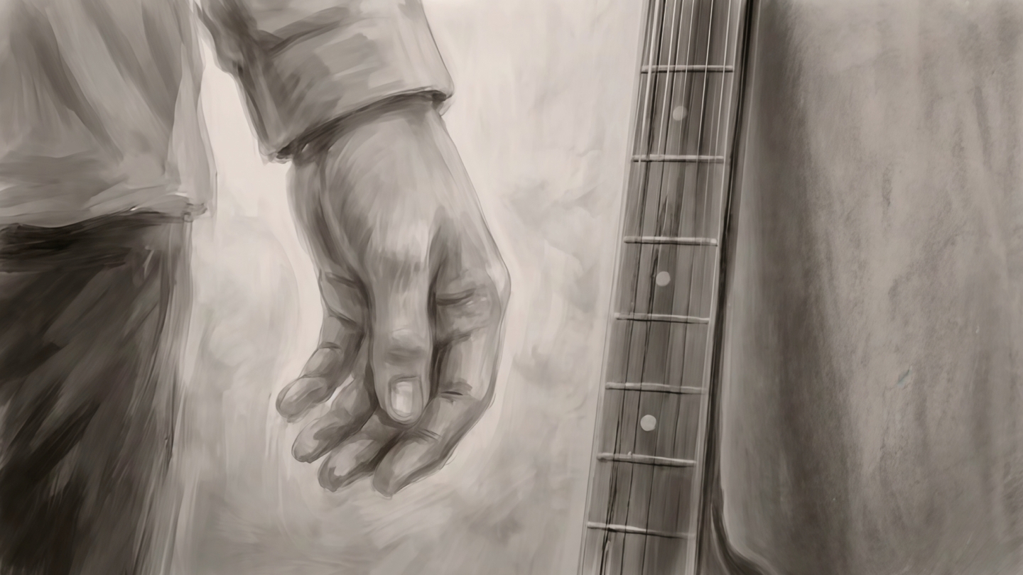
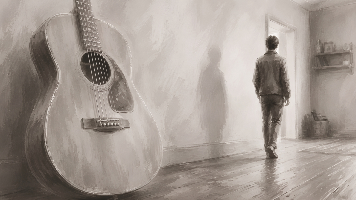
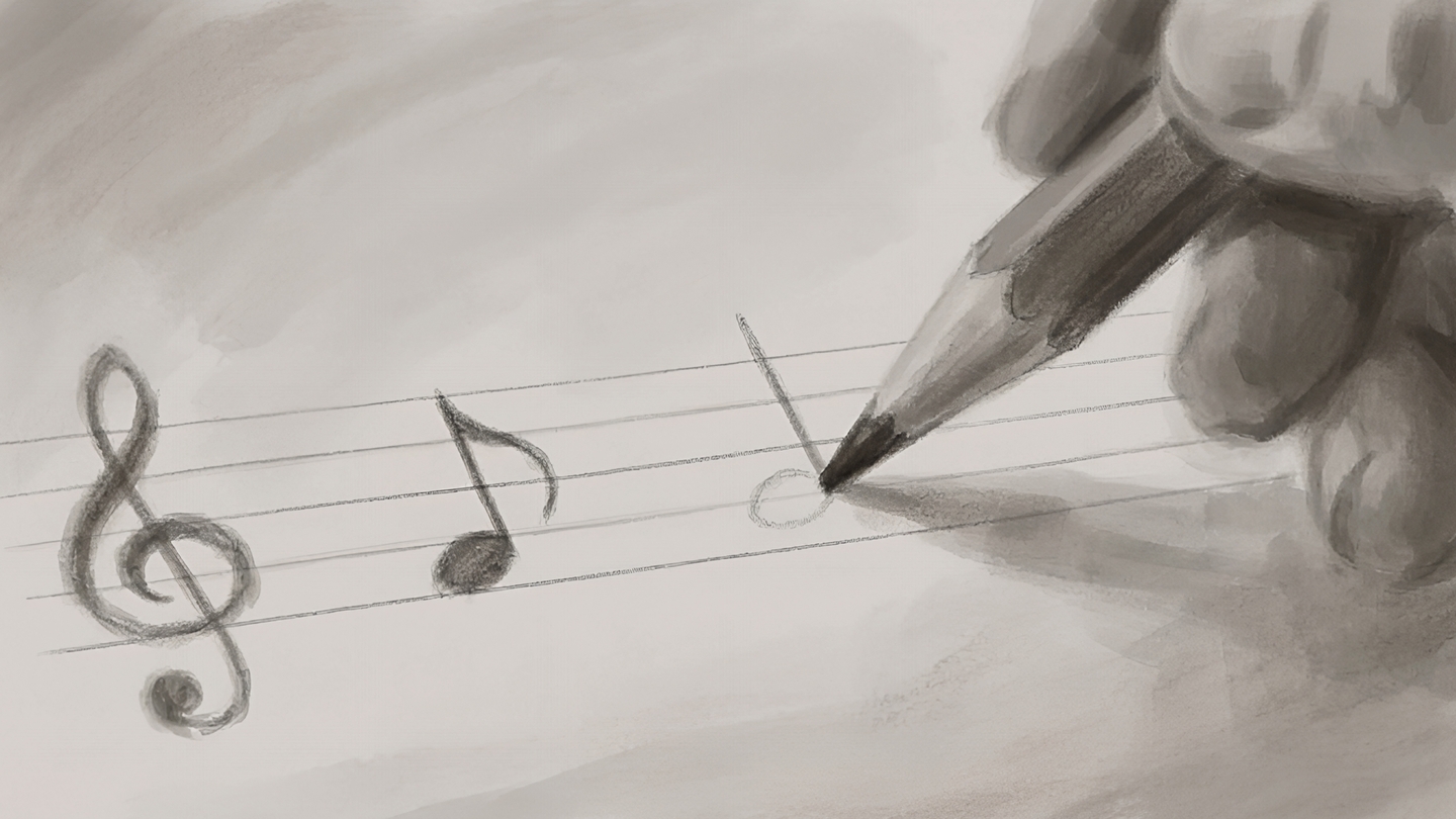
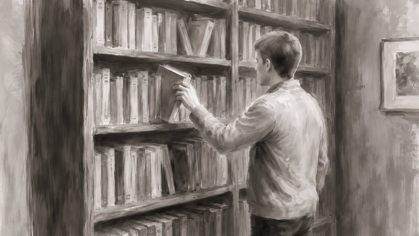
While He Was Waiting — a charcoal short film brought to life with AI
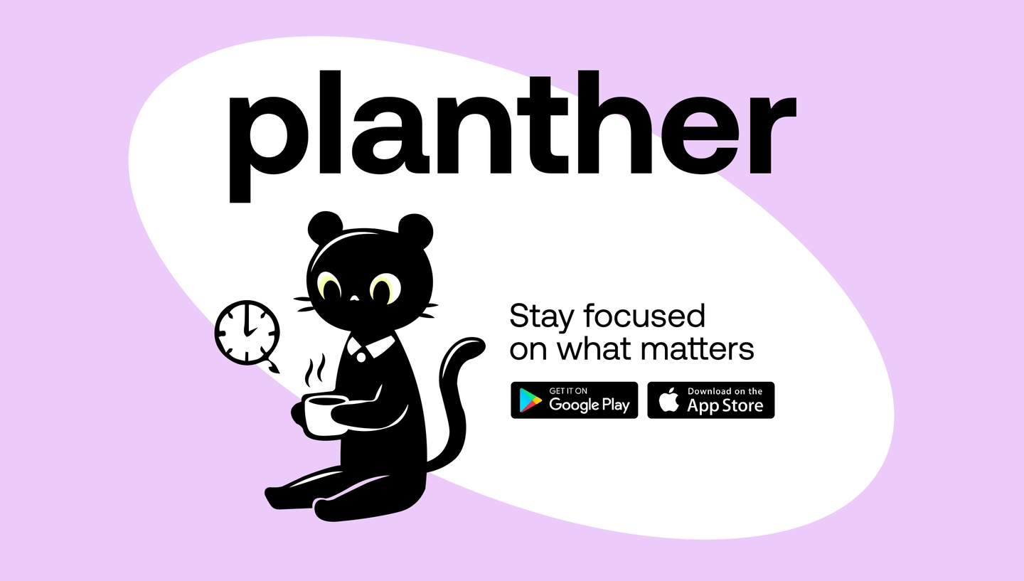
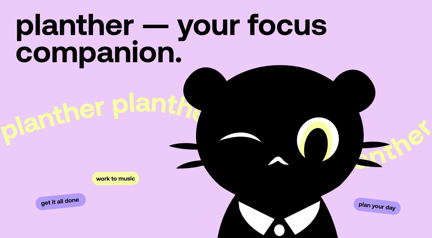
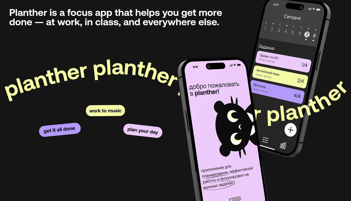
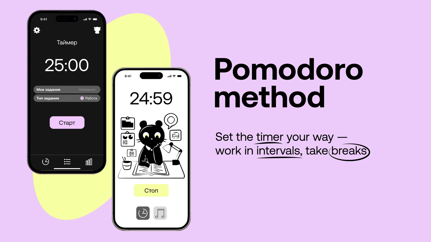
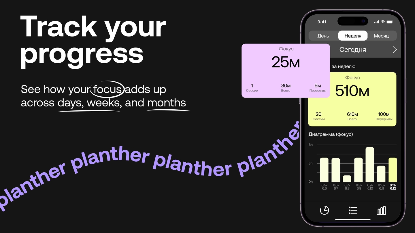
Planther — a focus app with a character