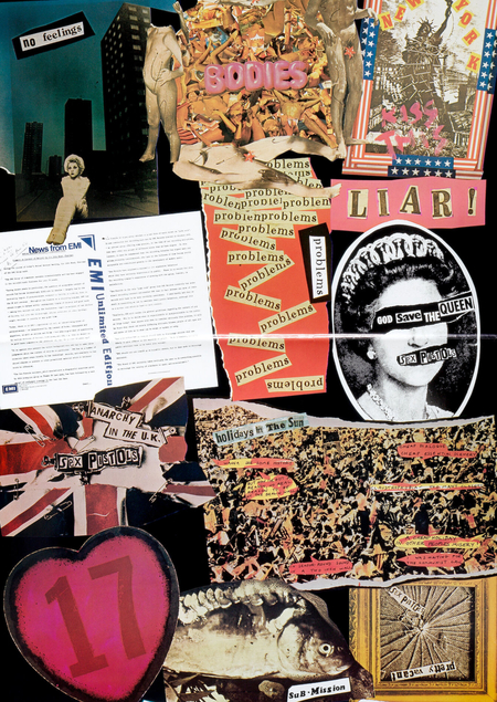
[Concept]
British punk graphic design of the 1970s became one example of how graphic design can transcend conventional visual communication and transform into a tool for cultural protest.
Amidst public discontent, economic crisis, and disillusionment with traditional values, punk forged its own visual aesthetic. This manifested in music album covers, posters, fanzines, and independent print publications, characterized by collage, raw typography, intentional compositional disruption, and the appropriation of mass culture imagery.Unlike traditional graphic design, which prioritizes order and visual clarity, punk graphics often embraced a sense of chaos. However, this outward sloppiness was underpinned by a specific system of visual techniques. The deconstruction of familiar forms, the juxtaposition of incompatible images, and the intervention into established symbols became a means of expressing dissent against societal and cultural norms.
Jamie Reid’s creativity plays a special role in this phenomenon. His work for the Sex Pistols gained wide recognition, but the artist’s interest lies not only in creating the group’s recognizable imagery.
Reed developed a unique graphic methodology based on assigning and transforming imagery, employing cut-out typography, and referencing political symbols. His early work with Suburban Press and his subsequent political graphics allow us to examine the evolution of this method outside of musical culture.
I am interested in exploring Reed’s work specifically as an independent graphic practice. In his pieces, visual form doesn’t merely convey content—it actively participates in shaping the statement. Familiar images acquire new meaning, and conventional design solutions are utilized to create a sense of conflict and provocation.
The subject of this research is British punk graphic design from the 1970s–1980s as a phenomenon of visual culture. The object of study is Jamie Reid’s unique visual language—including his compositional, typographical, and pictorial techniques—as well as his methods for transforming existing imagery into graphic statements.
[Research Question]
How does Jamie Reid forge a visual language of British punk graphics through collage, typographic deconstruction, and the reinterpretation of mass culture imagery?
[Hypothesis]
Jamie Reid’s visual language is constructed through the intentional subversion of traditional graphic design principles and the transformation of existing visual imagery. Collage, cut-out typography, compositional disorder, and the appropriation of popular culture symbols function not merely as stylistic quirks, but as vehicles for expressing a protest stance. It is suggested that the recognizability of the artist’s graphics stems from the sustained combination of these techniques, which allow him to unify visual provocation and political content into a cohesive system.
The research will be based on the graphic works of Jamie Reid, created in the 1970s and 1980s. The visual corpus will include covers for music releases, posters, independent print materials, political graphics, and other works that allow for tracing the development of the artist’s methodology.When selecting works, it is important not to limit the scope to the most well-known pieces for Sex Pistols. While those works are undoubtedly key to understanding Reid’s creative output, they alone do not reveal the full breadth of his graphic practice. Therefore, the study will incorporate early work for Suburban Press, pieces from the period of collaboration with Sex Pistols, and the political graphics of later years.The main selection criterion will be the capacity for a substantial visual analysis. The corpus will include works in which the artist’s characteristic techniques are particularly pronounced: the use of collage, the transformation of photographic images, intervention in national symbolism, the deconstruction of typography, and the disruption of conventional compositional structure.
[Navigation]
[1] British Punk and the Visual Culture of the 1970s [2] Jamie Reid and the Formation of an Authorship Method [3] Fundamental Techniques of Visual Language [4] Jamie Reid and the Sex Pistols [5] The Political Graphics of Jamie Reid [6] Synthesis of the Visual Method
British Punk and the Visual Culture of the 1970s
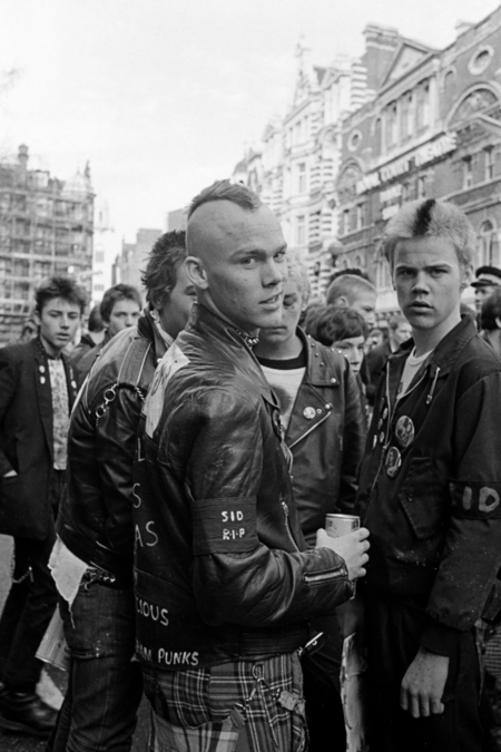
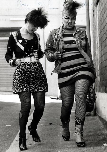
Unknown artist, London, 1970s
British punk emerged in the mid-1970s amid profound social and economic shifts. Britain was experiencing a period of instability—industrial decline, rising unemployment, strikes, and a crisis in traditional political institutions amplified the sense of uncertainty. For a segment of the younger generation, the future ceased to look like a promise of prosperity. Instead, it was perceived as a continuation of the existing crisis.
Unknown artist, London, 1970s
Punk became one way to express this discontent. It did not propose a unified political program or a universal solution to social problems. Rather, it was united by the rejection of established authorities, cultural norms, and notions of what art, behavior, and human appearance should be.
This dissatisfaction manifested not only in music but also in visual culture. Punk rejected the idea of design as an activity that should create harmonious, aesthetically refined, and easily digestible imagery. Instead, it employed roughness, sharp contrasts, provocation, and the deliberate violation of established rules.
Unknown artist, London, 1970s
Visual form became a way to express dissent. Even a poster or a music album cover could be interpreted as an act of resistance against the prevailing culture.
The Sex Pistols group on stage at ULU in 1976
Punk developed as a reaction against the existing music and cultural industries. Unlike the rock culture of the previous decade, which focused on performance virtuosity, complex compositions, and large-scale concert productions, punk aimed for extreme immediacy.
Johnny Rotten and Steve Jones performed with the Sex Pistols in 1976.
The «Do It Yourself» (DIY) principle became one of the key elements of the movement. Musicians formed bands without professional training, organized concerts in small venues, independently released recordings, and distributed printed materials.The same logic applied to graphic design. Punk graphics were created using readily available materials: newspaper clippings, photographs, cheap paper, photocopies, and basic printing techniques. The visual language was formed not so much by professional equipment, but through experimentation and free manipulation of images.
Unknown artist, London, 1970s
The lack of resources was not perceived solely as a limitation; it became part of the aesthetic.
Johnny Rotten in a Sex Pistols costume. Sid Vicious and Vivienne Westwood are talking, and next to them is the bassist himself in a designer T-shirt, 1970s.
DIY aesthetics allowed a move away from the conventional division between the professional designer and the consumer of visual culture. An image could be created, reproduced, and distributed by virtually anyone. In this sense, punk represented not just a musical genre, but also an alternative model of graphic production.
However, autonomy did not mean the absence of visual principles. A recognizable set of techniques gradually emerged from the apparent carelessness: contrasting typography, fragmented imagery, crude montage, harsh color combinations, and deliberately disrupted composition.
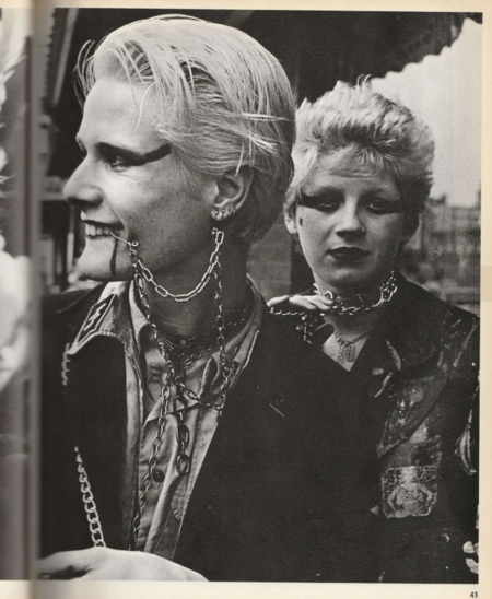
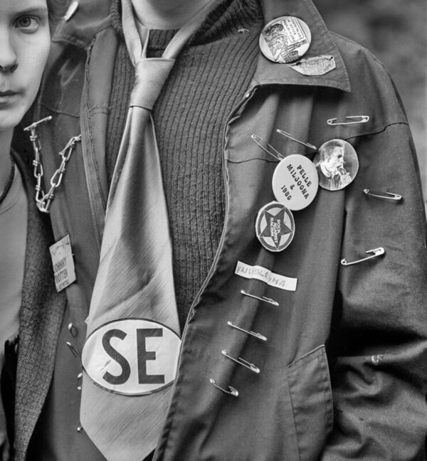
Unknown artist, Punk, London, 1970s
Independent zines played a crucial role in the development of punk graphics. Fanzines, flyers, and small magazines allowed ideas to spread beyond major publishers and record companies. Their content often included interviews, song lyrics, political commentary, photographs, and original illustrations.