My name is Sofya Roitman. I’m a communication designer who works primarily with brand identity.
In every project, I try to find a starting point that will help shape the entire visual identity: this could be the history of a place, a unique feature of a material, the structure of language, or the nature of the project itself.I enjoy exploring the context, looking for unexpected connections, and testing how the ideas I discover work in graphic design. The result is a system in which typography, color, composition, and individual elements are linked by a common logic.In this portfolio, I’ve compiled projects in which this approach has manifested itself in various ways.
I’m curious about how an idea becomes a graphic design
How do I approach projects?
Research. I study the project, its history, unique features, and target audience. I look for details that can serve as the foundation for the concept.
↓
Concept. I formulate the main idea and determine how it can be expressed visually.
↓
Development. I work with typography, graphic elements, color, and composition. I test how they work together and what possibilities they offer.
↓
Implementation. I assemble the elements into a system and see how it works across different media.It’s important for me to understand why a visual solution is structured the way it is. This helps maintain a connection between the initial idea and the final design.
1. Matryoshka — the hotel’s brand identity
1.1 Problem
The place already has its own history. How can we tell that story in a modern way?
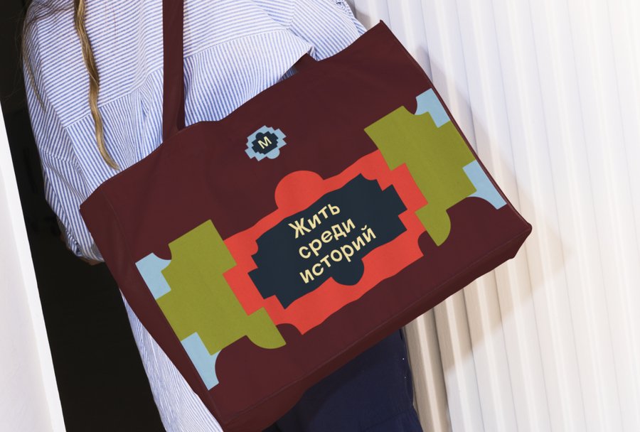
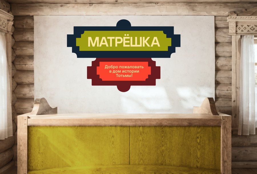
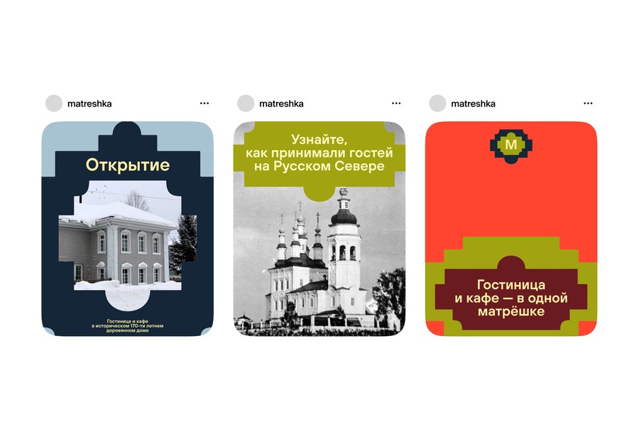
«Matryoshka» is a boutique hotel with a café located in a historic 19th-century wooden house in the center of Totma. The project is rooted in the history of Totma’s merchant-sailors, their voyages, and the city’s connection to Russian America.I was interested in finding a graphic image that would convey the character of this place and support the hotel’s overall concept. The architecture of Totma, historical details, and the idea of traveling to another era all played an important role here.
1.2 Concept
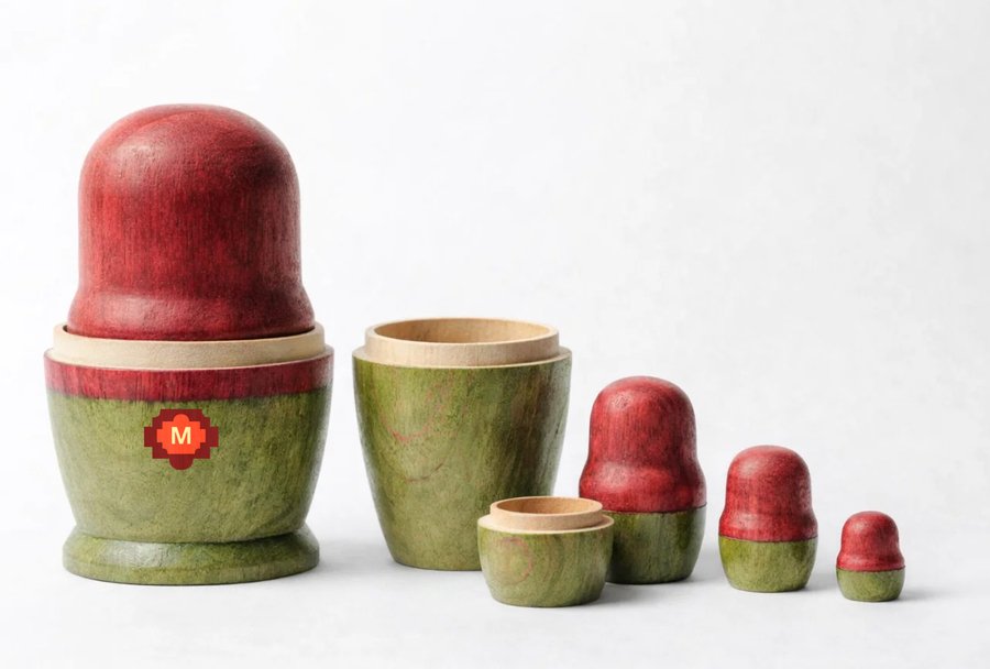
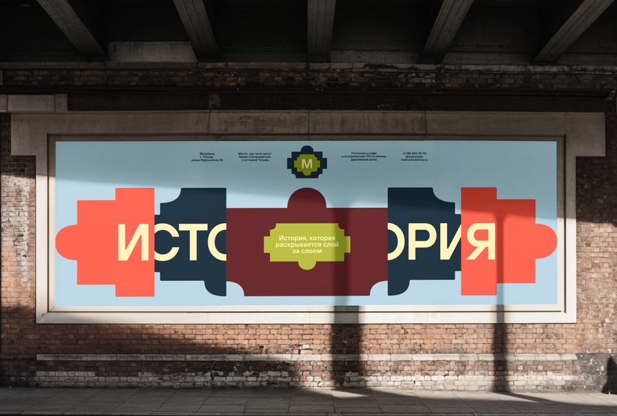
A matryoshka doll is associated with an object that conceals other objects inside it. I liked the idea of gradual revelation: the more closely you look, the more details you notice.I applied this principle to the project’s graphic design. The foundation was based on Totma’s ornamental patterns and architectural elements. They can be nested inside one another, layered, and combined to create new compositions.Thus, the hotel’s name became the guiding principle for the entire visual system.
1.3 Result
A Visual Identity Rooted in Place
In this project, the history of Totma becomes part of the brand identity through ornamentation and architectural details. The principle of nesting connects these elements to the hotel’s name and defines the logic behind the graphic design.This project demonstrates my approach to working with context: I look for distinctive features that already exist within the project and explore how they can form the basis of a visual system.
2. Museum of Woven Stories
2.1 Problem
How can we tell the story of a craft through its very structure?
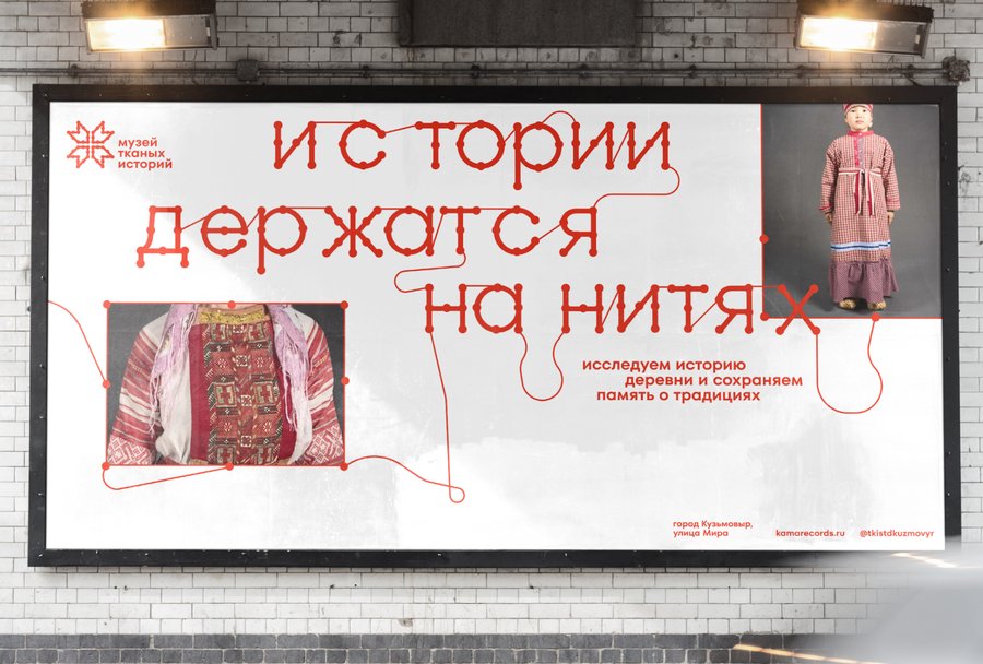
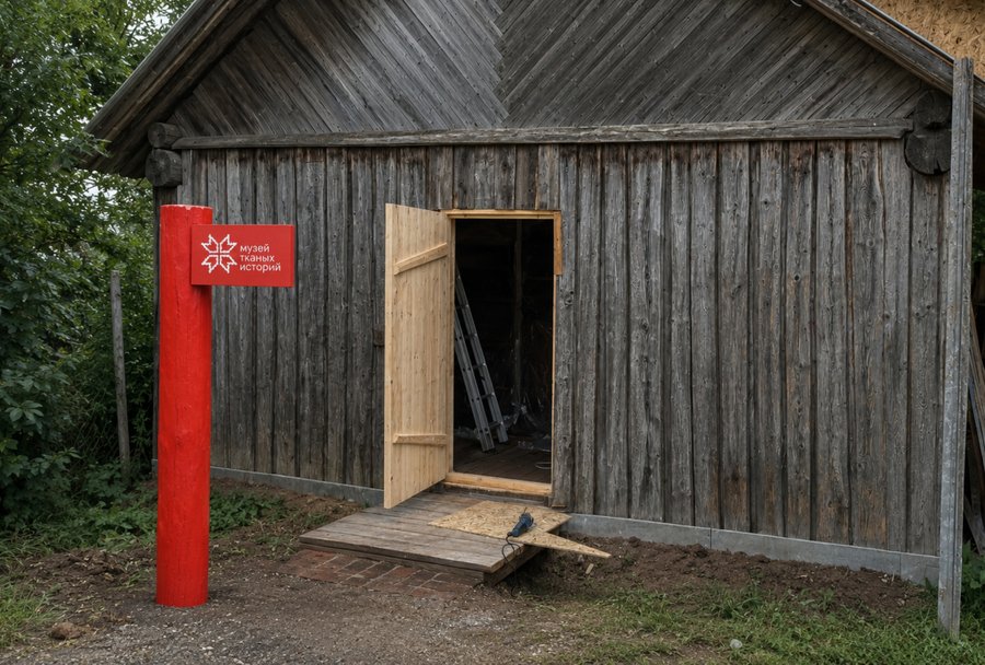
The Museum of Woven Stories is a project by KAMA records dedicated to weaving in the village of Kuzmovyr in northern Udmurtia.Behind every woven piece lies a set of specific skills, a sequence of steps, and knowledge that is passed down from person to person. I wanted to find a way to highlight this aspect of the craft and show that cultural heritage is shaped, in part, by the daily work and experience of the artisans.
2.2 Concept
Fabric has two sides
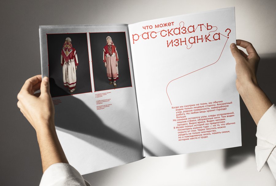
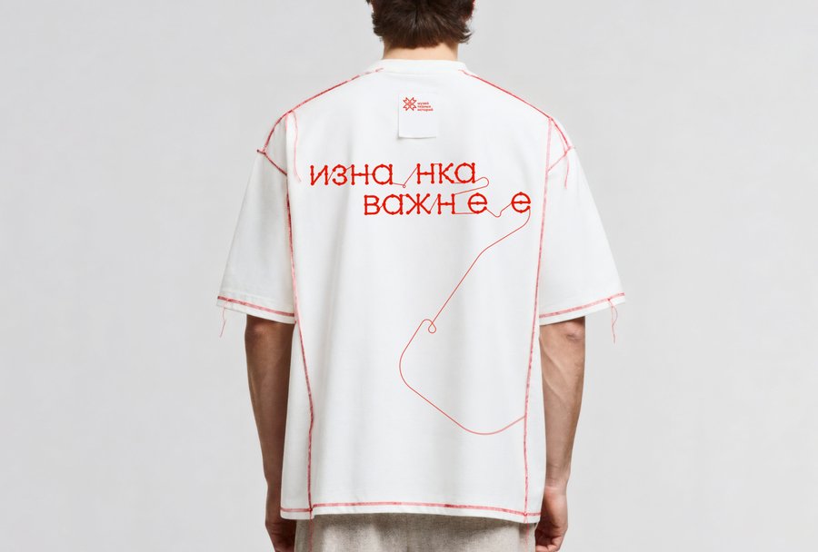
Every piece of fabric has a right side and a wrong side. One shows the finished product, while the other reveals the fabric’s structure.This characteristic became the basis for the museum’s concept. I was intrigued by the possibility of using the very principle of weaving to discuss craftsmanship: to reveal what usually remains hidden behind the finished product. That’s how the idea of «the reverse side of the process» came about.
2.3 Result
Seeing the Story Behind an Object
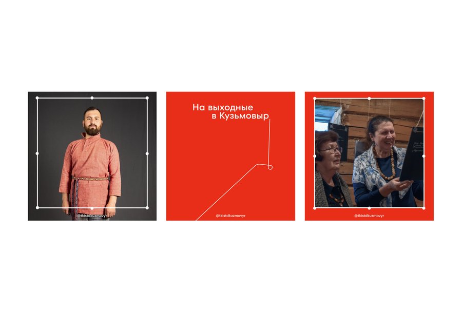
In this project, I was interested in the possibility of discussing cultural heritage through the details of the craft itself. The concept of the right side and the wrong side helped me formulate an idea that is directly linked to the museum’s collection.The project demonstrates how the physical properties of a material can serve as a starting point for developing a visual language.
3. Maxim Gorky International Literary Festival