about me
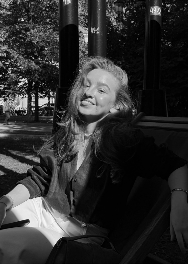
Hello! I’m Maria, a communication designer. I create strategies and digital products that seamlessly integrate into complex B2B processes and deliver emotional B2C experiences.In every project, deep analysis is my starting point. I identify system vulnerabilities, customer pain points, and underlying desires. These insights form the foundation of your core idea, which I then bring to life visually. My goal isn’t just to make things look beautiful, but to create conscious, user-friendly, and functional designs that evoke emotion and drive action. Experience shows that conscious design is what truly solves core business challenges. My superpower is synthesizing the mindful embodiment of your company’s values with the emotional resonance of your audience. It’s that perfect balance that anchors your core vision and gives your product a strong conceptual core and clear purpose!
my projects
KUBUS
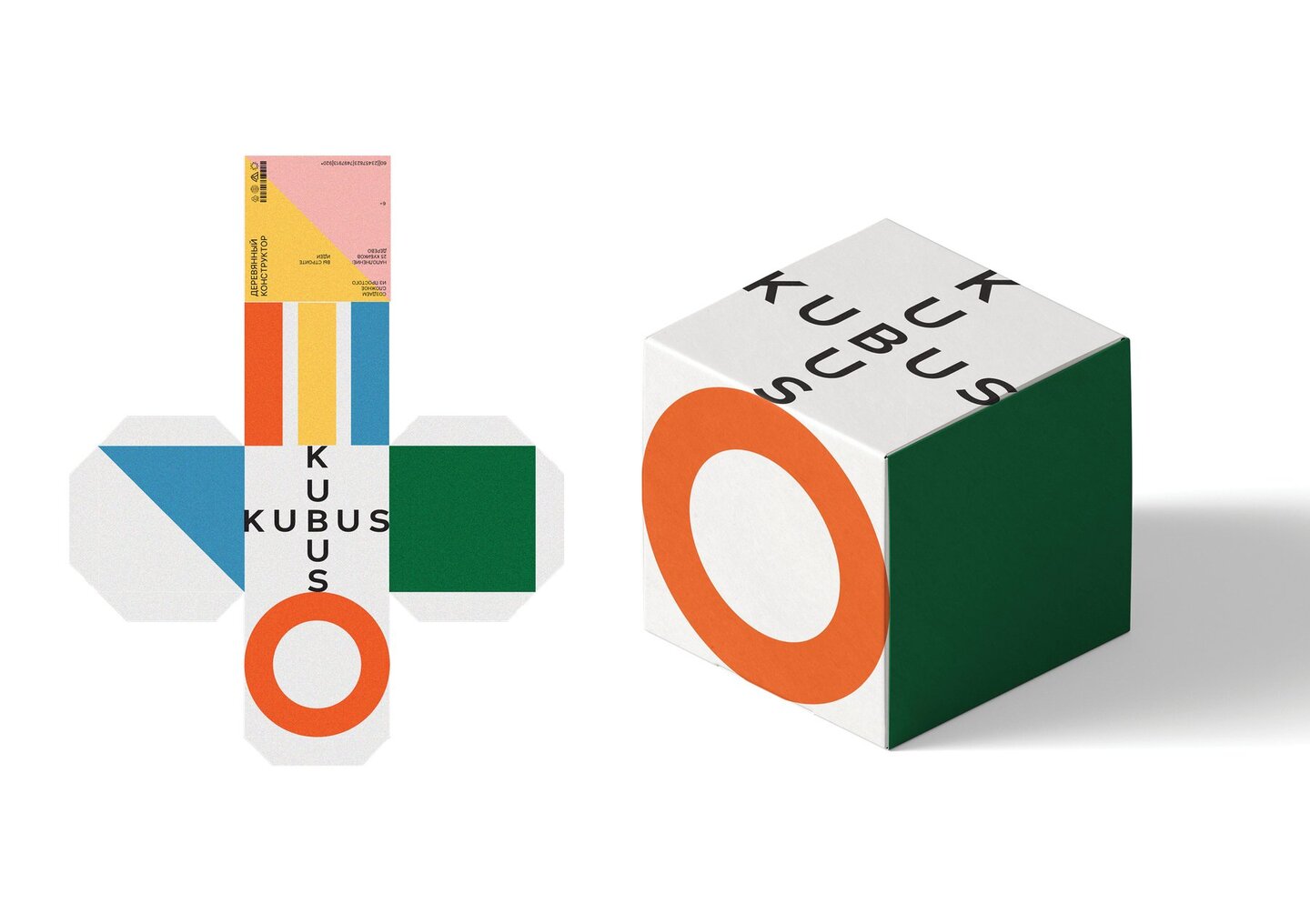
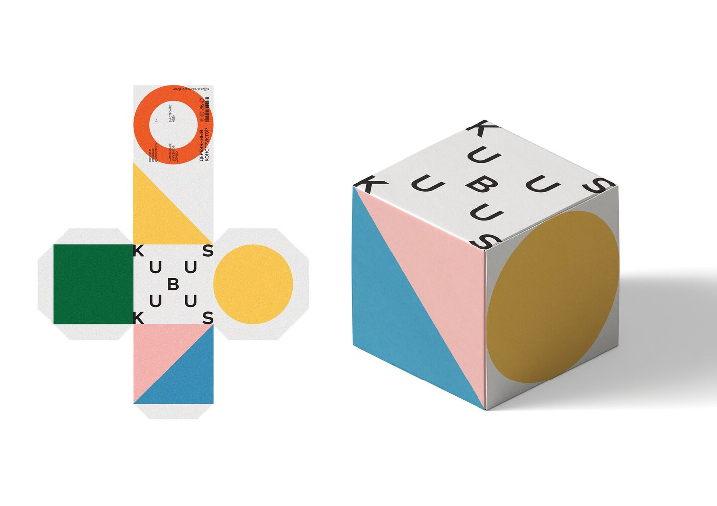
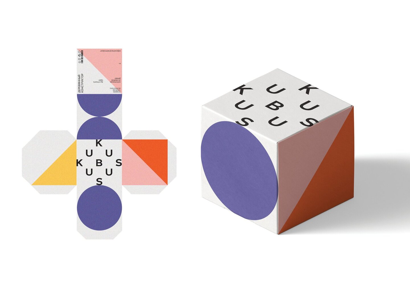
KUBUS is a brand that crafts wooden construction sets, blending timeless traditions with modern aesthetics to create a unique experience for both children and adults. It develops, unites, and brings ideas to life. You build ideas; we build your mood!The Challenge
The goal was to design a visual identity not just for a children’s toy, but for a product that captivates both kids and adults. Depending on the context, the set shifts its role—transforming from a playful toy into interior decor, a thoughtful gift, or a stylish souvenir.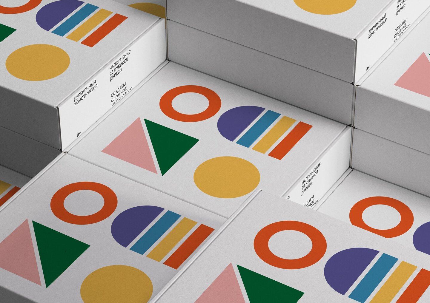
The Approach
I aimed to preserve emotional imagery while avoiding an overly juvenile aesthetic. The goal was to create vibrant visuals that spark imagination, inviting everyone to momentarily step back into childhood and get mesmerized by the bright, sculptural forms.The Solution
By combining simple silhouettes with clean, pure colors, I synthesized a sense of carefree joy with modern style. The key insight here is that regardless of age, we are all drawn to harmonious compositions. These visual elements adapt seamlessly, reassembling in unique ways across various media and physical surfaces.The Future Strategy
also conceptualized a potential collaboration between KUBUS and Crocs, where the wooden building pieces double as shoe charms. The target audiences and core values of both brands perfectly align, meaning this crossover would fulfill the inner desires and playful spirit of consumers on both sides.RUSLO
is a contemporary reinterpretation of tradition, preserving history through new forms and silhouettes. The brand creates spaces and furniture in the traditional Russian folk style, viewed through the lens of modern design trends, resulting in a striking and memorable aesthetic.The Approach
"Ruslo» translates to «riverbed.» While using direct water imagery might seem like an obvious choice, it risks being unemotional and literal. Instead, I opted for deeper, more conceptual symbolism. The brand’s target audience is affluent and deeply engaged with history and art. They are intellectual consumers who enjoy the process of discovery and appreciate symbols that provoke new thoughts and associations.The bird is movement, a direction — the river’s flow —staying true to one’s course.
The Solution
I embraced the metaphor of the riverbed as a source, a beginning, and a flow of purity. From this exploration, the bird emerged as the core symbol. Notably, the bird illustration features a chalk-like texture, paying homage to artisanal, handcrafted labor. Furthermore, the brand’s founder works with specific natural materials—wood, ceramics, textiles, and metal—which became the foundation for the visual identity and the brand’s functionalism. Simplicity and elegance form the perfect complement. The metaphor acts as an imprint of history, a trace of the cultural code that is gaining new momentum today.Imprints — traces of history. Texture as a sensation, a tactile connection to tradition, and a symbol of sensory experience.
TRUESHKOWSKI
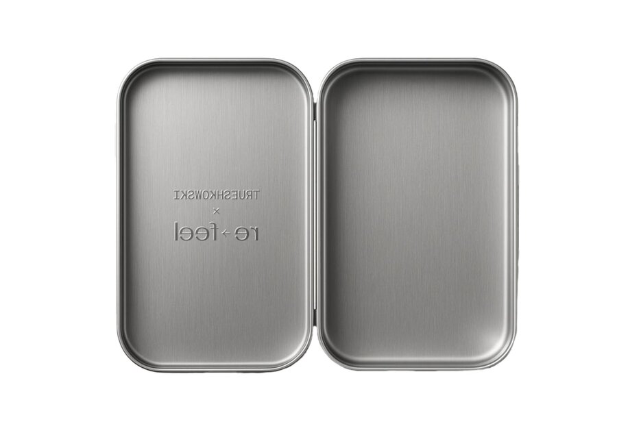
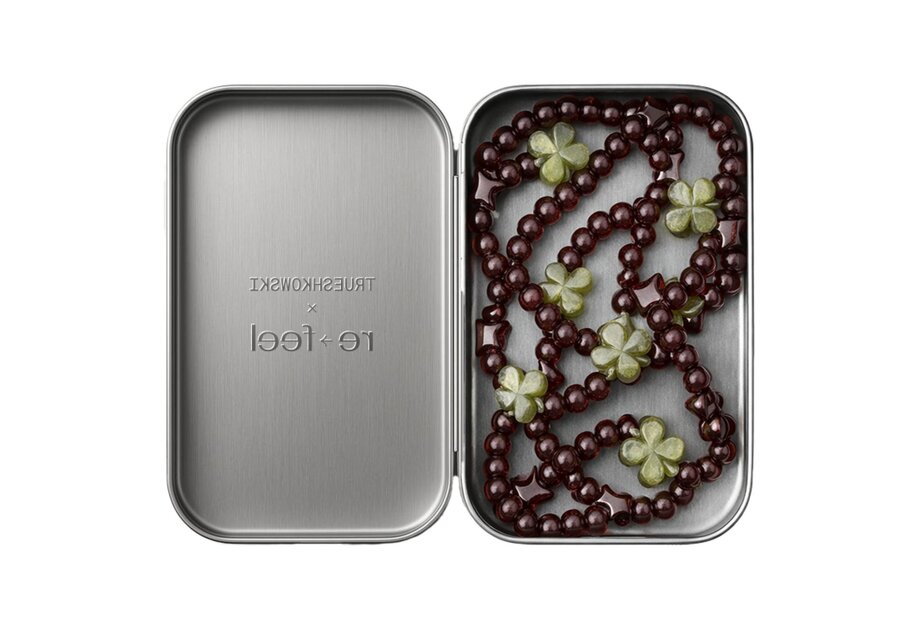
is a brand that infuses fun and irony into your personal style. It represents a unique blend of playful rebellion and conscious maturity, specializing in jewelry and accessories crafted from natural stones and contemporary jewelry components.The Approach
The core challenge was to balance a mature visual code with a sense of «playful rebellion.» In this context, beads are not merely accessories; they are an expression of inner protest, a way to stand out, and a bold tool for self-expression. Yet, it was crucial to maintain a sense of delicacy and a touch of formality, elevating the pieces from simple beads to fully realized, intentional elements of one’s image.The Solution
I captured this delicate balance through expressive typography, where the letterforms themselves transform into beads. The resulting identity is distinctly mature and slightly rebellious. Its unconventional, non-obvious shapes generate the exact emotional resonance and attitude that the brand embodies.