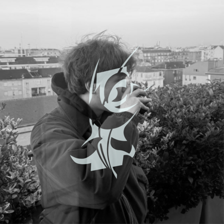
Hi, I’m Gleb.I’m a fourth-year Communication Design student at HSE University, specialising in visual identities for independent brands, local producers and small businesses.I work with brands that have something unique to offer, from everyday food products to independent flower shops. I enjoy finding interesting details in familiar things and turning them into memorable visual ideas.My goal is to help small brands express their individuality through thoughtful, playful and recognisable design. I believe that even the simplest product can have a strong identity when there is a good idea behind it.
My Projects
This selection brings together three branding projects for independent businesses and local products. Each project explores a different way of giving familiar things a distinctive character.From traditional bread and homemade sauerkraut to unusual floral arrangements, I worked with different products, audiences and visual approaches.Together, these projects show how I turn simple observations, cultural references and small details into visual identities with their own personality and logic.
Project One — Zhatva
Zhatva is a student branding project for a local bread producer based in the Krasnodar region, Russia. The concept combines traditional bread production with contemporary bakeries and retail spaces, aiming to bring authentic bread-making practices back into everyday life.The ChallengeThe challenge was to change the perception of bread as an ordinary mass-produced product. I wanted to highlight the value of traditional bread-making and create a distinctive identity that makes a familiar product feel relevant and engaging.The Approach I took the Russian saying «Bread is the head of everything» as the starting point for the concept. By interpreting the phrase literally, I replaced the heads of illustrated characters with different types of bread.This playful visual metaphor became the central idea of the brand, combining cultural tradition with humour and a contemporary approach.
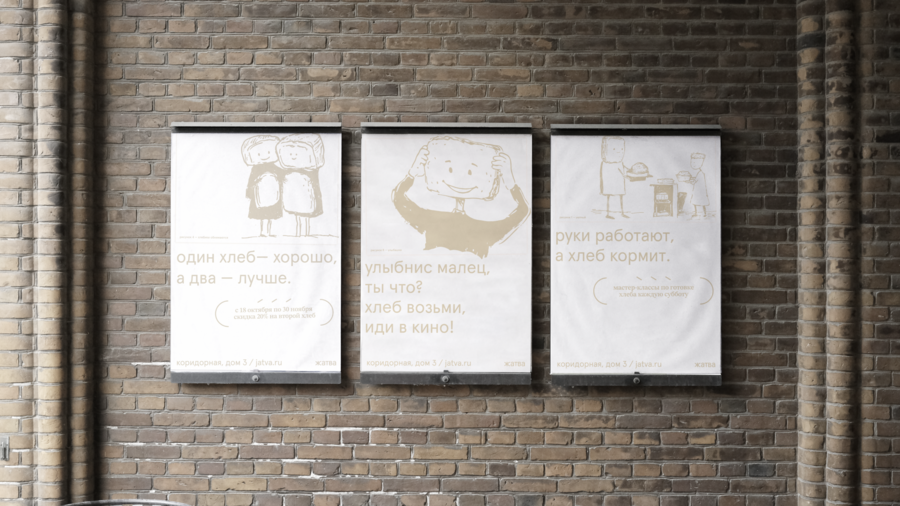
The IdentityI developed a visual identity built around bread-headed characters, supported by a logo, illustrations and a flexible graphic system.The identity extends across different brand applications, creating a friendly and recognisable visual language that presents traditional bread in a playful and contemporary way.
Project Two — Anyutina Kapusta
Anyutina Kapusta is a concept brand of traditionally fermented sauerkraut. The project explores how a familiar Russian food product can become relevant to a contemporary audience while preserving its connection to traditional preparation methods, family values and homemade food.The Challenge The challenge was to change the perception of sauerkraut as an old-fashioned everyday product. I wanted to make it appealing to a younger audience without losing the sense of authenticity, warmth and tradition valued by existing consumers.The Approach I built the concept around the image of a grandmother and the feeling of receiving something homemade from a loved one. Grandmothers often express care through food, sending packages and sharing what they have made.This observation inspired the central idea: to reinterpret sauerkraut packaging as a personal parcel sent by your grandmother.
The Identity I developed a visual identity combining a logo, character illustrations, packaging and additional brand applications.The grandmother became an illustrated character, while the packaging reinterprets familiar postal elements in a playful, contemporary way.Together, these elements create a warm and recognisable visual language that connects a traditional product with feelings of care, familiarity and home.The brand communicates a simple idea: Good taste begins at home.
Project Three — So’mbra
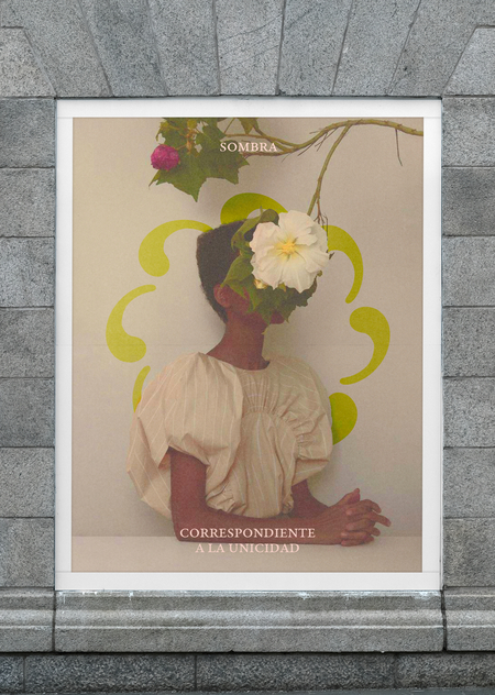
So’mbra is a local flower brand specialising in unusual flowers and unexpected colour combinations. Rather than following traditional approaches to floristry, the brand brings together different colours and varieties to create distinctive floral compositions.The Challenge The challenge was to develop a recognisable visual identity that would reflect the brand’s unconventional approach to floristry.I wanted to communicate its individuality, attention to colour and ability to bring contrasting elements together into a harmonious whole.The Approach I took the apostrophe in the name So’mbra as the starting point for the visual concept, transforming it into a flower petal.By repeating this simple shape in a circular composition, I created a distinctive symbol that connects the brand’s name with its product.This idea reflects the essence of So’mbra: different elements coming together to create something unexpected and harmonious.
The Identity I developed a visual system built around the petal symbol, expressive colour combinations and flexible graphic compositions.The identity includes a logo, brand graphics, packaging, social media design and additional applications.The repeated petal becomes a recognisable graphic element, allowing the identity to adapt across different formats while maintaining a consistent visual character.