
Redesign of «Pelmeni Buffet»
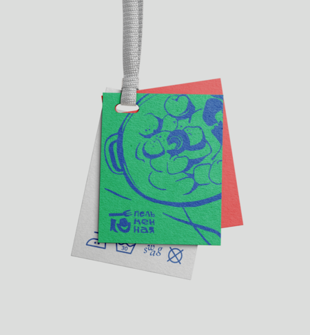
New branding for «Pelmeni Buffet,» reflecting the updated concept of the establishment and its light, friendly character.
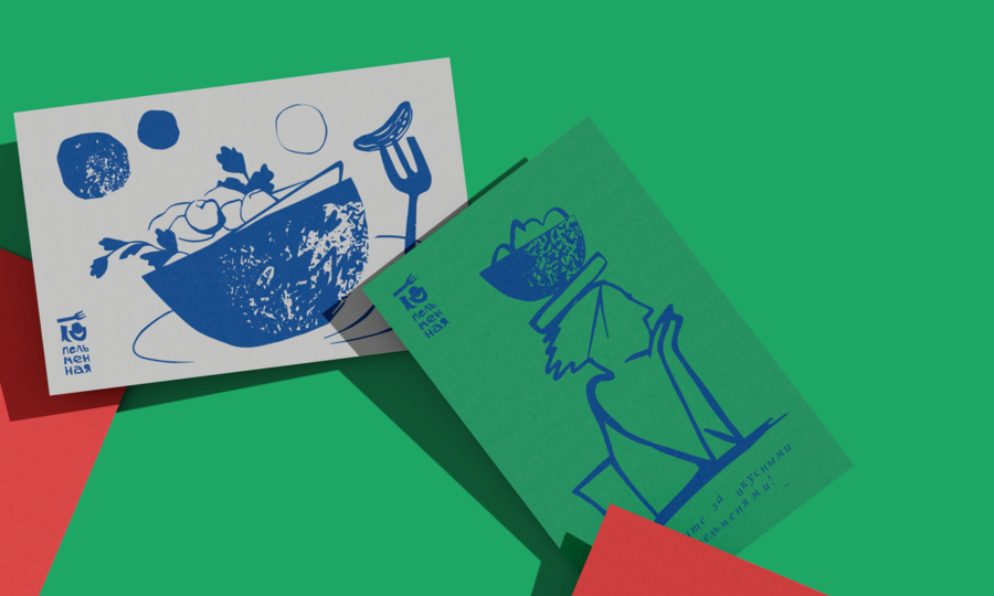

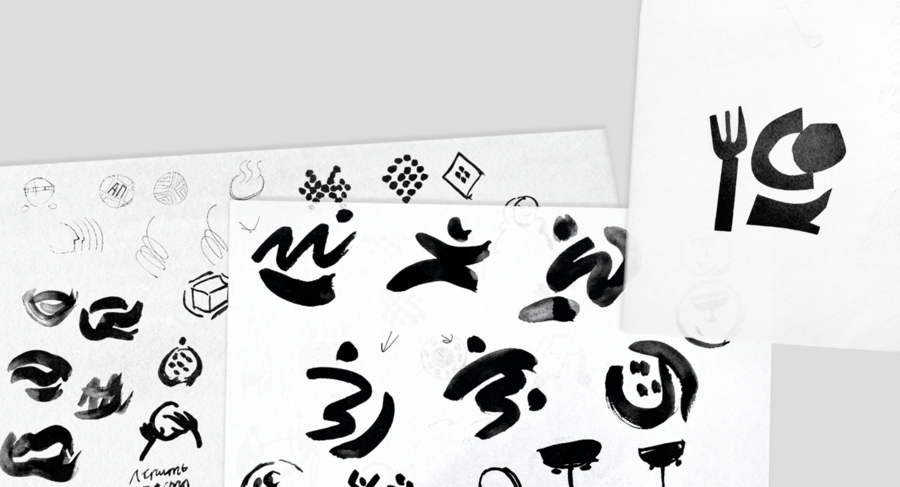



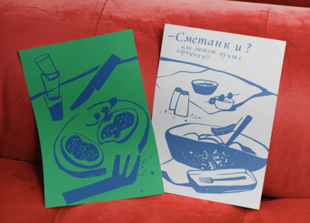
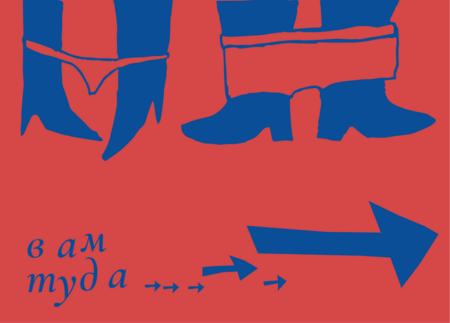
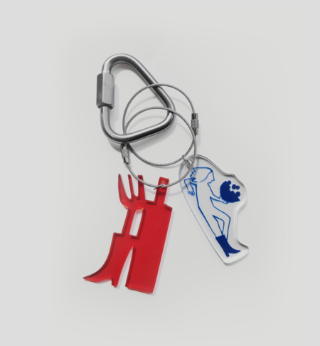
The graphics are built upon contrasts that emerge from combining fine lines with solid fills.





The Brand Identity of «Piter» Publishing House
When working on the project, it was necessary to account for the diversity of literary genres that the publishing house specializes in.
The developed concept allowed us to solve the stated problem. Each connecting stroke of the letter «I» in the main logo and its variants corresponds to a specific literary genre and also represents a book positioned at an angle.
This work was created as part of the St. Petersburg Young Design 2022 competition.
Cranberry packaging in sugar