About me:
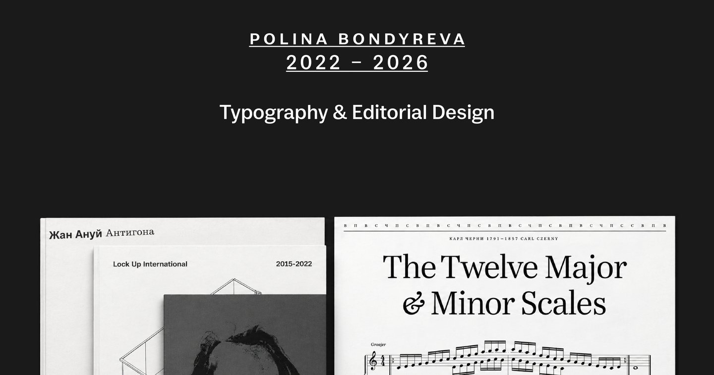
I’m Polina Bondyreva — a communication designer specialising in typography and editorial design.
I’d love to work with:
— Design studios
— Publishers
— Brands
— Cultural institutions
I design books and printed publications, using typography, layout and rhythm to give content a clear structure and a distinctive character.
Open to freelance projects and collaborations.
Email: polinabondyreva@yandex.ru
Telegram: @pbondyreva
Project 1:
Casus & Rufus Specimen
Book Design · Typography · Concept
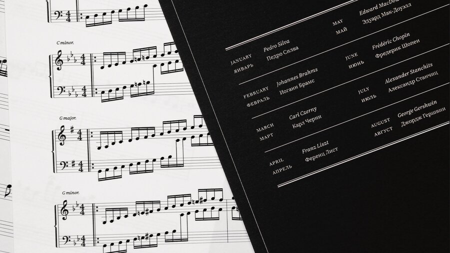
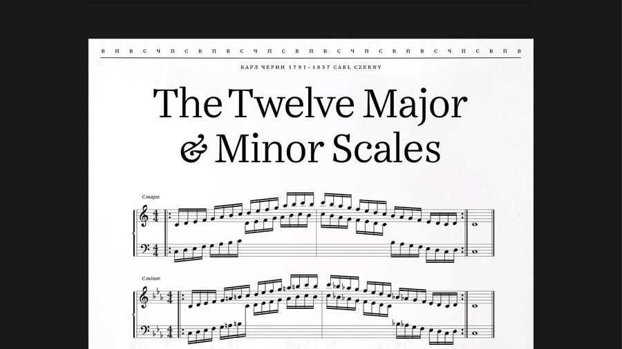
Context & Brief: To create a type specimen as a calendar, pairing Rufus, a musical symbol typeface, with Casus Pro, a serif for text.
Challenge: To showcase Rufus through complete musical scores, combining notation, text and a calendar system in one composition.
Solution & Concept: Twelve months — twelve compositions, each typeset from scratch using Rufus. The pieces were selected for their contrasting typesetting densities: intricate, densely set passages alternate with lighter, more spacious arrangements. Casus Pro provides headings and supporting text, unifying the twelve sheets.
Project 2:
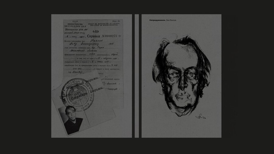
Uninvented. Lev Razgon
Book Design · Research
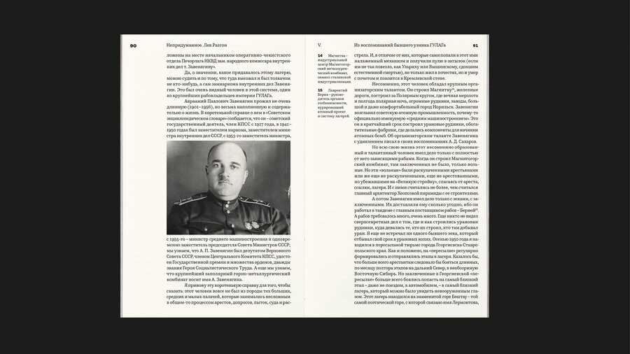
Context & Brief: To research Lev Razgon’s biography, gather information from multiple sources and shape it into a cohesive narrative.
Challenge: To bring diverse biographical materials into a consistent layout while clearly distinguishing the main text, documents and supporting information.
Solution & Concept: A publication that immerses readers in Lev Razgon’s era through his biography, stories of those close to him, and interviews.
Project 3:
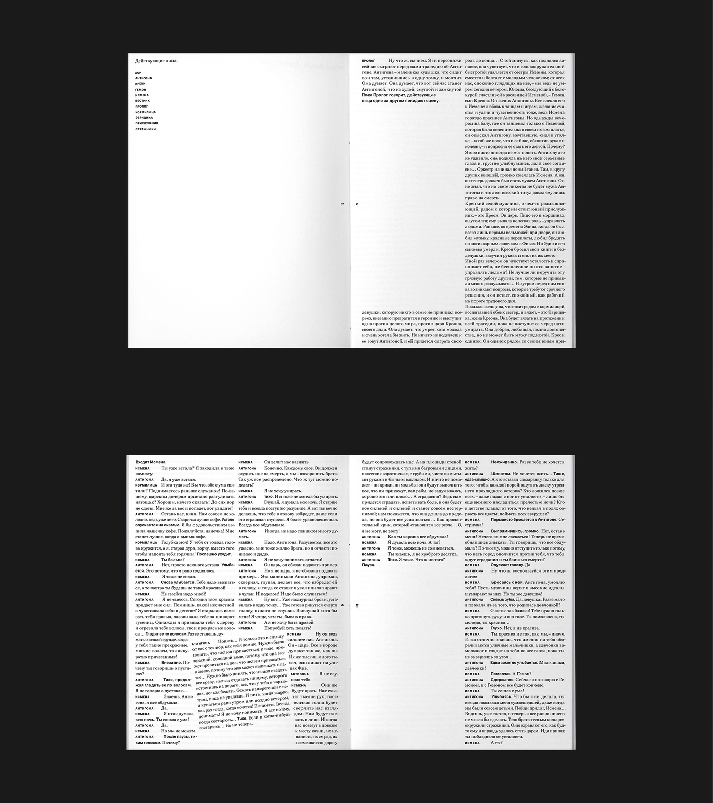
Antigone — Jean Anouilh
Book Design · Typography · Experimental Layout
Context & Brief: To design an edition of a play that reinterprets an ancient myth as a drama about freedom, choice and the price of power.
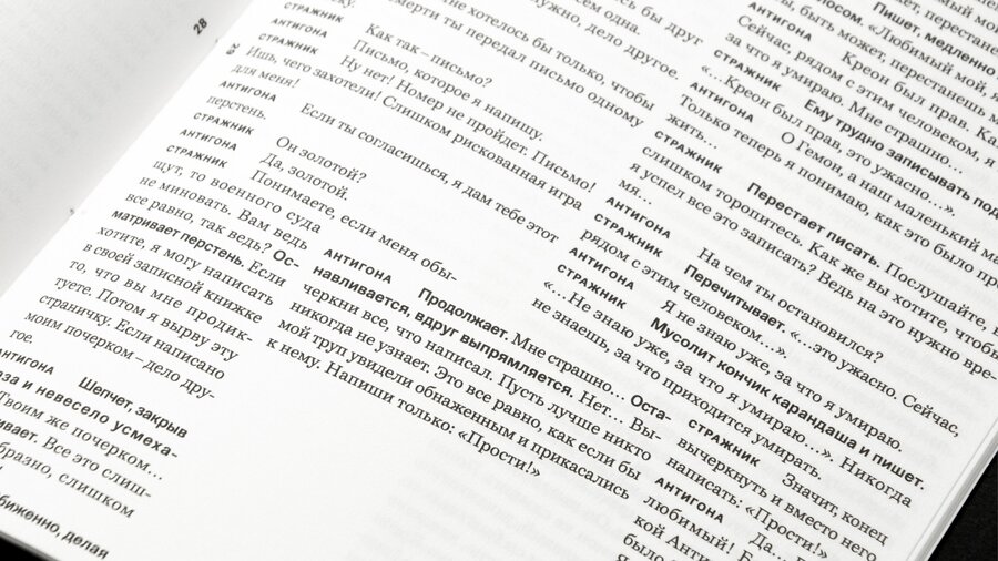
Challenge: To convey the emotional tension of the dialogue through typography while maintaining readability.
Solution & Concept: A two-column layout establishes the narrative rhythm. At moments of conflict, fear, command and refusal, key lines break out of the columns and cross the centre of the spread at an angle. These disruptions turn the play’s emotional peaks into visual accents.
Project 4:
Casus & Rufus Specimen
Book Design · Typography · Layout
Context & Brief: To create a type specimen as a calendar, pairing Rufus, a musical symbol typeface, with Casus Pro, a serif for text.
Challenge: To showcase Rufus through complete musical scores, combining notation, text and a calendar system in one composition.
Solution & Concept: Twelve months — twelve compositions, each typeset from scratch using Rufus. The pieces were selected for their contrasting typesetting densities: intricate, densely set passages alternate with lighter, more spacious arrangements. Casus Pro provides headings and supporting text, unifying the twelve sheets.
Have a publication in mind? Let’s talk.
Visit my website ↗