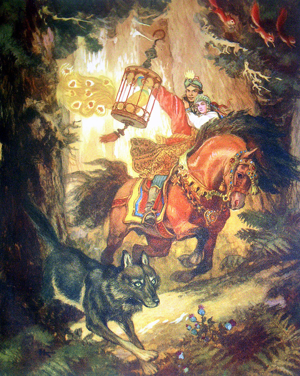
«This artist did more than just illustrate a series of children’s fairy tales. He showed us the ancient Rus, mysterious Japan, colorful Burma, exotic India, grandiose China, mystical Korea, and many other countries whose folk tales adorned the master’s work.» [2]
Concept
Soviet art of the first half of the 20th century is often presented as a monolith carved from ideological granite. What frequently comes to mind is the image of the worker with a hammer, a stern gaze from a propaganda poster, or the unity of the nation’s diverse peoples. However, if one examines the legacy of that era more closely, an astonishing symbiosis emerges—one that initially seems impossible for the art of that time. Under one cover, in one publication, and within one studio, fierce political satire coexisted with the fragile magic of folk tales.
This was not accidental. In a world being built from the ground up, the artist was assigned the role of a demiurge, creating a new reality. The poster was an instrument of the present—it demanded conciseness, monologue, appeal, sharpness, and instant emotional detonation. The fairy tale, conversely, was like a space of eternity, yet it conveyed the same values through the images of heroes and exotic birds, but using the language of metaphors and archetypes.
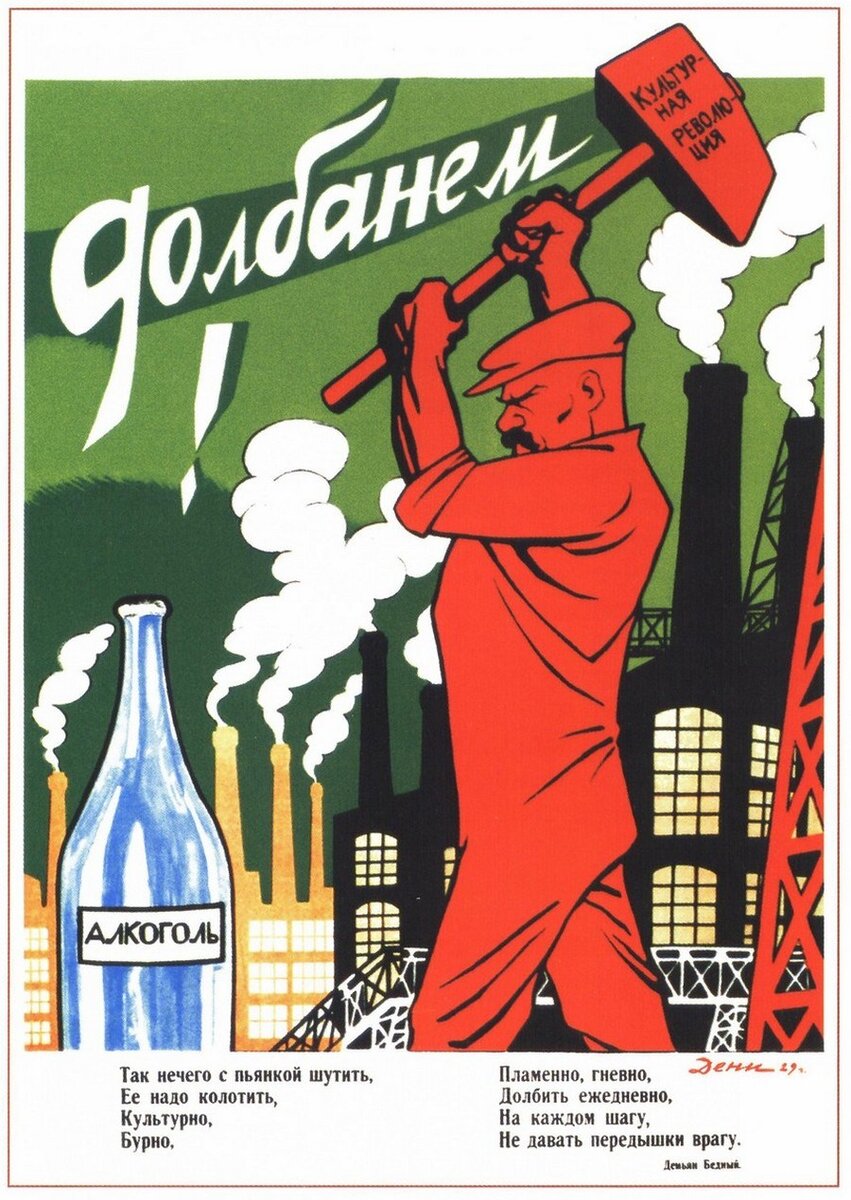
Viktor Nikolaevich Denisov (Viktor Deni) — «Dolbanem!» 1930
Poster artists operated within a condition of «visual scarcity.» A limited palette, dominated always by anxious red and deep black, forced them to seek expression not in detail, but in silhouette.
The figures in the posters were not people, but symbols carved from will and metal.
This was a project of a new reality, constructed on paper. The defining characteristic of this genre was the economy of means for maximum impact of meaning. In the poster, the line was like a blade: it had to be precise, relentless, and instantly recognizable.
Surprisingly, the same hands that scrawled harsh slogans on billboards could, in the quiet of a studio, render the most delicate ornaments and the curves of a fairytale cottage’s roof. If the poster was a form of «street art» aimed at the masses, the fairy tale was a form of «domestic art"—a conversation with the reader.
Here, flatness gave way to depth, and sharp contrast yielded to soft watercolor washes. The fairy tale became a space for artistic inquiry, a place to study the psychology of semi-fanciful, yet vibrant, characters.
Yuriy Alekseevich Vasnetsov — Book «Ladushki» 1964
In my research, I aim to uncover how these disciplines, while existing within the same time frame, represent two facets of a single master’s vision. First, how the poster art provided discipline while the fairy tales offered freedom, and how Kochergin utilized both approaches. How he mastered two distinct styles. Most importantly, what distinguished his fairy tale illustrations from those of his contemporaries, warranting dedicated focus?
In my visual research, the narrative will be segmented into specific thematic blocks. The first section will offer a brief introduction to the artist’s life and how he arrived at art. The subsequent sections will delve into his body of work from a deeper perspective and explore how these works relate to one another. Following this, I will compare his work with that of his contemporary to highlight what distinguishes Nikolai’s pieces from others. At the conclusion of my visual research, I will present a final summary based on all the gathered information, along with a personal reflection. Furthermore, I have selected numerous examples of various propaganda posters and fairytale illustrations from the Soviet era—some belonging to Nikolai Kochergin and others to several other artists—to provide illustrative examples.
Categories
- Concept
- Path to Art
- Poster Artist
- Master of Fairy Tales
- Difference from Dmitry Orlov
- Conclusion
The Path to Art
Nikolai Mikhailovich Kochergin’s creative journey is a rare example of how an artist didn’t just switch genres, but sequentially «sprouted» from stark applied graphics into pictorial illustration.
Kochergin was a graduate of the renowned Stroganov Academy, where he studied sculpture. This education laid the foundation for his style—he always «felt» volume and anatomy.
It was history itself that led him to graphic design. The Revolution and the Civil War demanded immediate action from artists. In 1918, the young artist traveled to the front lines, where he became one of the creators of the «ROSTA Windows» in Kharkov, Baku, and Petrograd. At that time, the poster was the only way to survive and express oneself—it was an art of direct action that allowed for no hesitation.
Nikolai Mikhailovich Kochergin — «May 1, 1920» 1920
Kochergin long viewed the poster as a necessary duty, rather than the ultimate goal of his creativity and potential. Although he was a recognized master of propaganda, he constantly searched for an outlet for his soul, which demanded «substance» in his work.
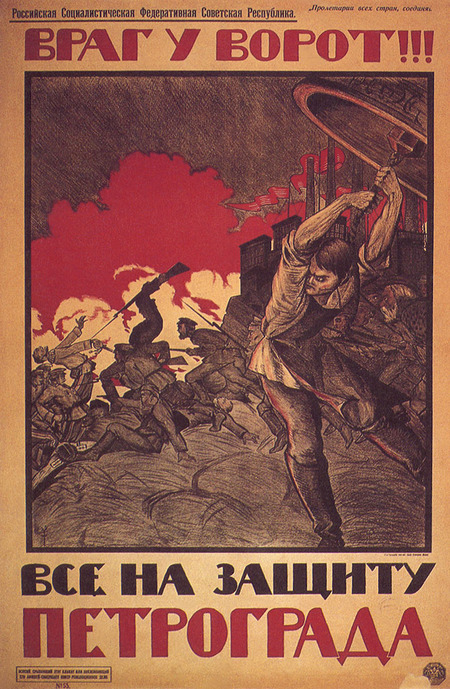
Nikolai Mikhailovich Kochergin — «Enemy at the Gate!» 1919
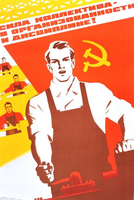
Igor Anatolyevich Kominarets — «The strength of the collective lies in organization and discipline!» 1983
He approached the book slowly and carefully, experimenting with magazines as if testing whether he was ready to trade a concise slogan for a complex narrative. His final «entry» into the world of fairy tales, after 50 years, felt like a conscious return to his authentic self.
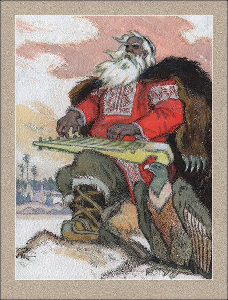
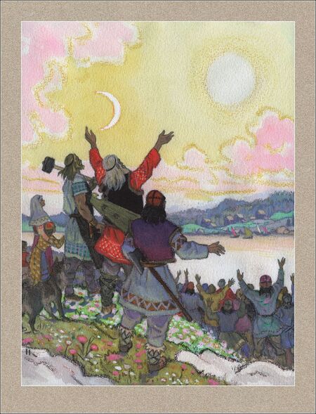
Nikolai Mikhailovich Kochergin — from the series of illustrations for the Karelian-Finnish folk epic «Kalevala, ” 1953.
To briefly chart his creative trajectory chronologically yields the following list:
1918–1920s: The era of the «combat» poster. Aggressive, sharp graphic style. 1930s–1940s: Search for a style. Return to poster design during the Great Patriotic War (TASS Leningrad branch). 1950s–1974: The flourishing of a «vivid» fairy-tale style. Creation of major book masterpieces.
Poster Artist
He stood at the genesis of Soviet political poster art and exerted creative influence on many younger generations. [1]
Kochergin’s early posters (1918–1921) were highly concrete. They addressed the fight against the invaders, called for enlistment in the Red Army, and satirized the White Guard generals. These works needed to outpace all newspapers and react to news faster than it could become obsolete.
Nikolai Mikhailovich Kochergin — «The Queue for Vrangelen!» 1920
Beginnings in «ROSTA Windows» and «TASS Windows» demonstrated to Nikolai the dominance of the hand stencil. A maximum of three or four color fields—no room for error, and a sterile purity of line.
Although circumstances drew him here, the artist was barely in his twenties, and a revolution was in full swing; art was expected to come out into the streets to engage with ordinary people. The fast pace of such work captivated the young Kochergin. Collective creation, sleepless nights, the feeling of how one’s drawing could influence the entire country—but it was more of a «youthful fervor.» Even in the earliest posters, it was evident how «constricted» he felt, forcing him to set his love for volume and numerous colors aside.
But it wouldn’t be accurate to say that posters merely «stifled» Nikolai Kochergin’s potential, preventing him from developing or forcing him to abandon his affinity for pictorial qualities. Posters taught Kochergin that a single precise silhouette could communicate more than a hundred fine lines—how to construct the viewer’s intended trajectory across the vast space of the sheet.
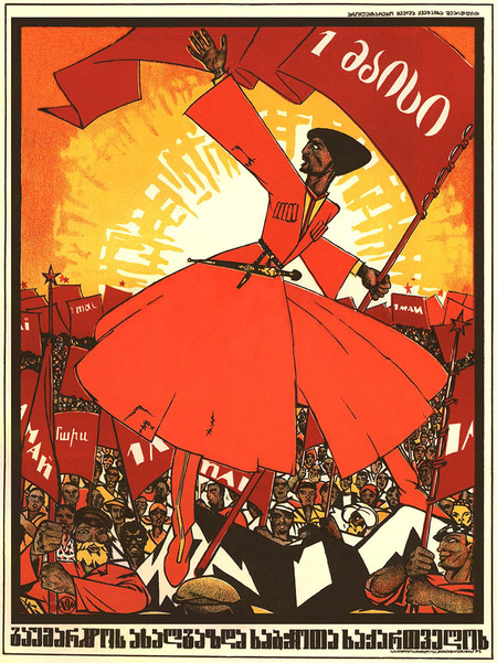
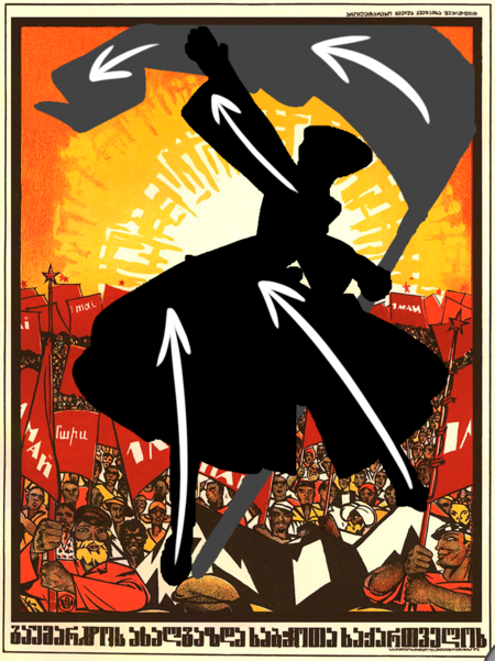
Nikolai Mikhailovich Kochergin — May 1, 1920
Distribution of silhouettes and trajectory of gaze
The knowledge gained can also easily be seen in his future works and in book illustrations.
Nikolai Kochergin’s posters were always «softer» compared to his contemporaries; his primary tools—plasticity and volume—remained constant even when attempting to «flatten» them for «two-dimensional» assignments. His color palette was also broader, and in serious subjects, he made an effort to render landscapes, folds of clothing, and emotions. While other artists deliberately moved toward simplification, Kochergin consistently strove to provide anatomical depth.