From Concept to Identity

The digital soul is not binary code, not a matrix—it is an analog artifact where eternity is contained within a stark black chassis, and the golden patterns of the conductive traces represent the glow of undying life.
A clear, graphic toggle switch icon signifies the activation of a connection between the physical world and the cloud memory, not the end of a process. The rays are conduits of energy.
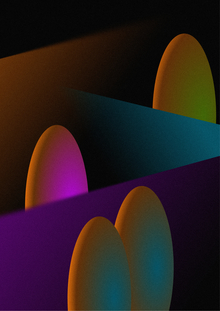
The light of the soul and the brown flesh of the earth, flowing into one another, perform a miracle of transformation. Their gradient is the crucible where memory gains value and conductivity, becoming gold. These golden pathways—rivers—continue in eternal data beyond the brief course of the departed’s life.
Black Background: Infinity, mystery, tranquility, technological foundation (like a circuit board).
Golden Rays: Energy, life, memory, conductors, value, connection.
Multi-directionality: The complexity of the individual, the multi-directional flow of data, the dialogue between past and present, between the soul and the viewer.
A dynamic system reflecting the essence of the project.
The MEMORY logo encapsulates a fundamental paradox: memory is a system that cannot be turned off. By replacing the letter «O» with a power-off symbol, we visualize the very essence of the project—overcoming finiteness.
Our stationery is concise yet powerful brand ambassadors, rendered in the signature black and gold palette.
This is a small black crab—a final refuge for a digital soul—crafted within a stark black sarcophagus. Inside, a microchip is preserved on gold paper.