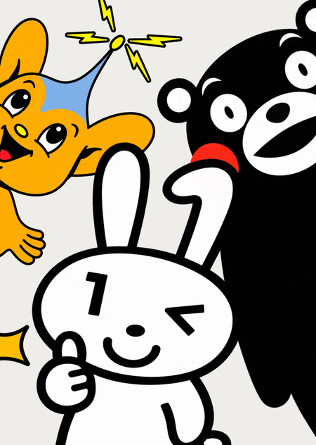
Concept
In Japan, mascots are used by more than just commercial brands and the entertainment industry. Municipalities, prefectures, police forces, government services, and other public institutions also have their own characters.
An official institution is typically perceived through its name, emblem, form, documents, and regulations. A mascot adds another visual language to this—it has a face, a name, a personality, emotions, and its own mannerisms.
This creates an interesting contradiction. Structures related to power, control, or administrative procedures begin to communicate with the human user through a soft and friendly character.
The research aims to study how Japanese institutions utilize mascots to create a more accessible image and what visual principles facilitate this effect: anthropomorphism, rounded plastic design, expressive eyes, gestures, character, biography, and the connection between the character’s appearance and the functions of the institution itself.
The relevance of this topic stems from the fact that the mascot has become a full element of public communication. It appears on official websites, posters, in social media, the urban environment, at events, and as a physical costume. Studying this phenomenon allows us to understand how communication design can alter the nature of the relationship between a system and a person.
Research Objective: To trace how Japanese public institutions utilize mascots in their communications and to identify the visual techniques through which these characters become more approachable and friendly.
Key Question: How do Japanese institutions use visual and communicative means—such as mascots—to make their image more approachable and relatable to people?
Hypothesis: An institutional mascot creates an additional emotional layer to the official identity. A face, a name, anthropomorphic features, soft plasticity, gestures, and character transform an impersonal structure into a specific character. Because of this, official communication becomes less distant and assumes a more relatable form. Furthermore, the mascot does not replace the institution’s official emblem; rather, it serves a different function: the emblem identifies the structure, while the character defines the nature of its interaction with people.
Material Selection Principle
For this study, we selected three official Japanese mascots representing different types of public institutions: Pipo-kun, the mascot of the Tokyo Metropolitan Police Department; Maina-chan, a PR character of the national My Number system; and Kumamon, the official PR mascot of Kumamoto Prefecture.
These cases allow us to compare three distinct types of relationships between an institution and an individual: authority and safety, government service, and territorial identity.
Each case is examined based on a consistent set of parameters: — the character’s visual design and plasticity; — anthropomorphic traits; — color and proportions; — the symbolism of individual elements; — name, personality, and biography; — the types of messages conveyed through the character; — gestures and emotional expression; — the character’s use across different mediums and platforms.
Only characters officially utilized by the institutions themselves and those with a sufficient number of available primary and academic sources are included in the study.
Sources: Academic research on mascots, yuru-chara, kawaii, anthropomorphism, municipal and institutional communication, as well as the official websites of the Tokyo Metropolitan Police Department, Digital Agency Japan, and Kumamoto Prefecture.
Principle of Rubrication
Pipo-kun: power takes a face—the Tokyo Metropolitan Police Department.
Maina-chan: the system becomes a character—the My Number state system.
Kumamon: the territory begins to speak—Kumamoto Prefecture.
This division illustrates three vectors of movement from institution to individual:
power $\rightarrow$ persona system $\rightarrow$ persona territory $\rightarrow$ persona
Pipo-kun: Power gets a face
Pipo-kun appeared on April 17, 1987, as the official symbolic mascot of the Tokyo Metropolitan Police Department. His creation was intended to strengthen the bond between the police and the city’s residents and to shape an image of policing that is perceived as approachable and trustworthy [7].
Tokyo Metropolitan Police Department. Pipo-kun at an official event. No year specified.
The character’s name reflects this very mission. It is derived from the English words «people» and «police.» Thus, the idea of mediation between the individual and law enforcement is inherent in the mascot’s name [7].
Pipo-kun illustrates how police functions can be translated into character language. Large ears, eyes, and an antenna make the abstract qualities of the institution visually comprehensible: the ability to listen to residents, observe events, and react to changes takes concrete form. Through soft plasticity, expressions, and anthropomorphic traits, the police image becomes less distant. The mascot does not replace the institution’s official identity; rather, it creates a more accessible way for people to connect with it.
Satiko Uehara. Pipo-kun. 1987.
This approach is connected to the broader use of kawaii in Japanese institutional communication. Researchers Ian McPherson and Terri Jane Bryant note that large eyes, rounded forms, and other elements of the kawaii visual language can be employed by organizations to make their messages more accessible and appealing, and to soften the image of impersonal or authoritative institutions [2, p. 43]. The authors specifically point to the prevalence of mascots in the communication of Japanese government bodies, including the police [2, pp. 43–44].
Tokyo Metropolitan Police Department. Pipo-kun Festa 2025 Spring at the Police Museum. 2025.
The formal institution adopts a character who does not visually demonstrate power or control. His image is built around openness, attentiveness, and benevolence.
Over time, Pipo-kun evolved beyond the role of a static symbol. The character acquired a family: parents, a younger brother and sister, and grandparents [7].
All family members bear a strong visual resemblance to one another: they retain the characteristic head shape, large ears, eyes, antenna, and the general principle of body construction. Differences appear primarily in color, specific details, and proportions, which allows the characters to be perceived as relatives while remaining distinct.
This enhances the anthropomorphization of the image while simultaneously forming a cohesive character system. Pipo-kun gains social connections and biographical details that are no longer directly tied to police functions, making him resemble an independent protagonist with his own environment.
Tokyo Metropolitan Police Department. The Pipo-kun Family. No Year.
The character is utilized both as a participant in educational communication. The Tokyo Metropolitan Police Department releases animated materials featuring Pipo-kun covering road safety, bicycle riding rules, interactions with strangers, crime prevention, and actions in hazardous situations [7].
In the educational animations, anti-hero characters appear alongside Pipo-kun, each associated with a specific improper or dangerous behavior.Visually, they are constructed in opposition to Pipo-kun himself. While his appearance is soft, rounded, and friendly, the anti-heroes look like fantastical monsters—they have sharp teeth, unusual proportions, tense expressions, sharp silhouettes, and contrasting colors. Their appearance immediately conveys that they belong to the «negative» side of the story.Moreover, each character is linked to a specific infraction: one deceives, another violates traffic laws, and a third attempts to lure a person away. This allows the abstract concept of a violation to gain a recognizable visual identity and become part of the visual conflict between Pipo-kun and his adversaries.
Tokyo Metropolitan Police Department. Monster Introduction. No Year.