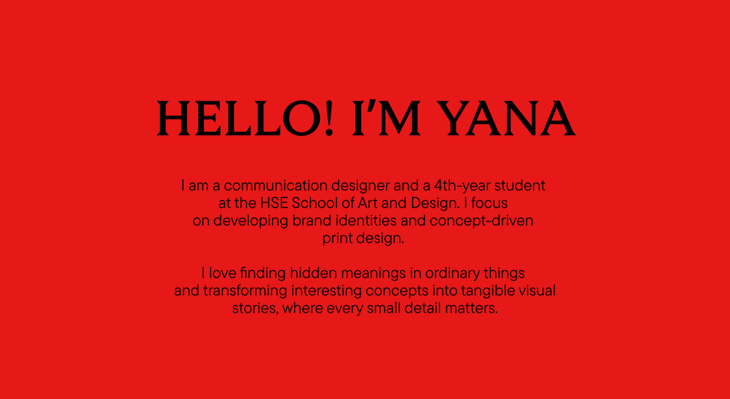
About me
Исходный размер 4914x2690
MY APPROACH
I always start with immersive research into the project’s background. Instead of creating random visuals, I look for unique details and hidden meanings that are already there.
From there, I explore how this core idea can grow into a complete brand identity. I look at how the concept adapts to different formats, making sure that everything works together to tell one cohesive story that people can understand and feel.
Case 01 / AQUARIUM BREWERY
Visual identity and wayfinding system based on a real brief.
Context & Challenge
A craft beer brand from Nizhny Novgorod needed a distinctive visual identity to stand out.Craft packaging often feels repetitive, relying on industrial or overly minimal clichés. To give Aquarium Brewery a true advantage in a crowded local market, I completely rejected standard beer graphics.Исходный размер 2800x1660
Concept & System
The entire identity is built around a custom mascot"the prince on a horse.» He acts as a dynamic visual guide through the city’s myths, literally traveling from one narrative plot to another across different product labels.Исходный размер 2800x1166
Исходный размер 2800x1660
Исходный размер 2800x1660
Исходный размер 2800x1660
Every can is a new chapter of a local legend.
Исходный размер 2800x1660
Исходный размер 2800x1660
Solution & Outcome
The wild folklore illustrations are held together by a strict, heavy typographic grid. The design system makes the look authentic, bold, and highly recognizable on the shelf, turning a regular product into an engaging collectible story that you want to examine closely.Case 02 / LYAMIN LIBRARY
Visual identity and wayfinding system based on a real brief.
Context & Challenge
Small public libraries in remote places often look outdated and visually neglected. The challenge of this project was to completely change the image of a library in the village of Lyamin to attract a younger audience, while deeply respecting its geographic roots.Исходный размер 4200x2490
Concept & System
The visual system connects a clean, simple layout with authentic regional context. The color palette of soft mint greens, deep blues, and warm creams is directly inspired by the Northern Lights, which is the main natural phenomenon of this area.Исходный размер 2800x1660
Исходный размер 4200x2490
Исходный размер 4200x2490
Исходный размер 4200x2490
Solution & Outcome
A comprehensive and functional packaging for the physical space, covering interior navigation, staff badges, bookmarks, and social media templates. The space moved away from its cold administrative atmosphere and turned into a cozy, contemporary cultural center.Case 03 / AIRPORT TABLO CALENDAR