Concept
Part 1: Why Do We Dream of the Middle Ages?
Part 2: The Middle Ages in Logos
Part 3: The Middle Ages in Typography
Part 4: Medieval Imagery in Advertising Campaigns
Conclusion
Bibliography and Image Sources
Concept
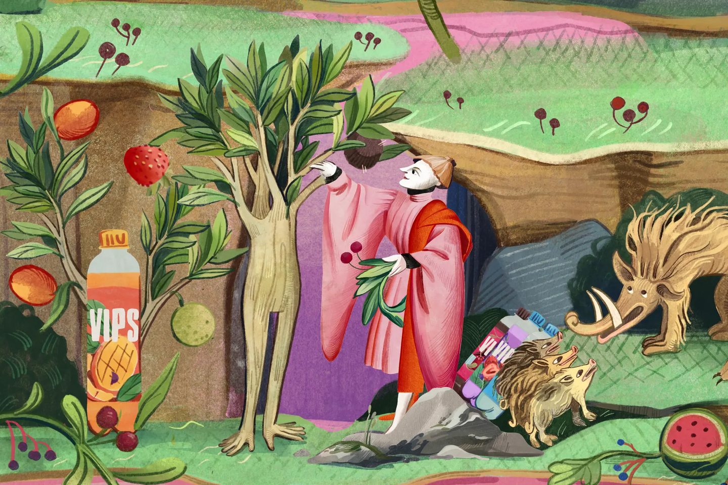
In recent years, references to the Middle Ages have become more noticeable in advertising campaigns: brands are building commercial narratives around knights and royal feasts, and tapestry compositions are forming the basis of campaign design. These medieval motifs appear in the advertising for all sorts of goods and services—be it technology, apparel, beverages, or bank deposits. I was intrigued by how an era often associated with notions of darkness and backwardness is becoming a source of imagery for contemporary advertising.
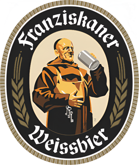
This research spans the period from 2000 to 2026. The sample includes logos, corporate fonts, and advertising campaigns where medieval motifs are used to convey brand identity or become integral to the narrative. Inspirations are drawn from imagery of European Medieval times, and brand examples cover diverse sectors—fashion, brewing, automotive manufacturing, banking services, electronics, and social advertising. The sample also includes imagery that may read as medieval but actually references a later period. For instance, the monk on the Paulaner emblem relates to the history of a 17th-century monastic brewery—this example allows us to examine which motifs evoke associations with the Middle Ages regardless of their original origin.
The research is divided into three parts. The first part examines brand logos: crests, emblems, and imagery that can remain consistent in a brand’s identity for decades. The second part addresses typeface forms of medieval origin (or fonts inspired by medieval script). The final section is dedicated to campaigns that utilize medieval imagery. Within this section, examples are categorized according to their association with medieval figures, royal courts, and medieval graphic design. This sequence allows us to trace how the impact of an image shifts when moving from a constant brand identity to a specific advertising campaign.
The research question is what specific Medieval period modern advertising evokes and what role Medieval imagery plays in brand communication. The hypothesis is that advertising most often draws upon the image of the Middle Ages—an image that has already been reinterpreted in art and popular culture—and its role changes depending on the medium.
The theoretical foundation is provided by Umberto Eco’s essay «The Dream of Medievalism,» the text by Leaby, and a review by Christian Dam, Benjamin Hartmann, and Kati Brunk on the marketing use of the past. Campaign descriptions published by agencies and brands serve as primary sources.
Part 1:
Why do we dream of the Middle Ages?
In his essay, «Dreams of the Middle Ages, ” Umberto Eco traces how European culture has engaged with this era across different periods. Medieval themes and forms were reinterpreted in Renaissance literature, Romanticism, Neo-Gothic architecture, and the works of Walter Scott, William Morris, and the Pre-Raphaelites. According to Eco, the legacy of the Middle Ages remained an integral part of European culture; each new interest in this epoch built upon existing conceptions of it. Furthermore, the Middle Ages, for Eco, largely defines the structure of modernity, as this is when the frameworks of trade cities, universities, and many political institutions were formed. [ECO]
Eco presents several versions of the Middle Ages, including the Middle Ages as deconstruction, as a source of national identity, as well as its ironic, barbaric, and romantic versions. Therefore, the question of this era’s return begins with a clarification: which specific image is being returned? In my research, I use this principle to distinguish the versions of the Middle Ages that emerge in advertising. [ECO]
Familiar images of knights, castles, and royal courts are shaped by fairy tales, fantasy, film, and video games. Erin Leaby describes pop-medievalism as part of mass culture, where these images are repeated and transition across different media. Advertising largely continues this trajectory. [POP-MEDIEVAL]
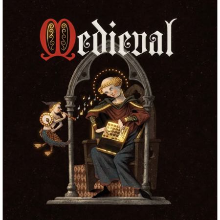
Why have these images become more noticeable in recent years? Elizabeth Goodspeed examines the «Future Medieval» aesthetic in graphic design as a reaction to the long-standing dominance of minimalism. In the works she associates with this direction, dense ornamentation, grotesque figures, and deliberately irregular forms appear. Goodspeed connects the somber nature of this aesthetic to a sense of uncertainty, noting that «how we interpret the past says a great deal about our contemporary concerns.» She contrasts the «Future Medieval» with the vibrant, fairy-tale-like «Mid Century Medieval» of the mid-twentieth century. In both cases, designers reference mythical imagery, but one interpretation evokes a fantastical atmosphere, while the other conveys a sense of unease. [GOODSPEED]
Laurel Borrelli-Pearson also links the interest in the Middle Ages to societal anxiety. In her review of the Fall 2025 collections, she writes about a «collective yearning for the return of valiant heroes and heroines.» [BORRELLI] In these collections, she highlights the chivalric line, associated with strength and protection, and the courtly line, where luxury and status take center stage. Avery Trufelman examines the idea of protection in more detail. In her view, armor becomes a metaphor for psychological resilience and independence (for instance, the image of Joan of Arc is linked to the symbol of female strength). [TRUFELMAN] Fabrizio Mollo, in turn, interprets Gen Z’s interest in internet aesthetics like castlecore, weirdval, and knightcore as a way to survive a crisis. [MOLLO]
Dam, Hartmann, and Brunck demonstrate how referencing the past helps a brand create a sense of authenticity, continuity, and uniqueness. Nostalgia, in this case, can be directed toward an era the viewer knows only through images and descriptions. However, brands curate details and imagery to build a compelling version of the past. [DAM] In the case of the Middle Ages, these details often include heraldry, knights, feasts, and beautiful ladies, while wars, epidemics, and social inequality frequently remain outside the scope of the advertisement.
Part 2:
The Middle Ages in Logotypes
When a brand chooses a coat of arms, a knight, or, for example, a monk as its symbol, that image becomes part of its visual code. A coat of arms may indicate its place of origin, a monk may evoke the history of a craft, and a knight may suggest nobility or protection. But what connection to the past lies behind these images? To answer this question, we can compare logos based on four criteria: the sign’s origin, the motif used, the meaning acquired within the product category, and the changes made during redesign.
Evolution of the Leffe Logo: 1. 1240–1929; 2. 1929–2003; 3. 2003–2013; 4. 2013–2021; 5. 2021–Present
Leffe traces its history to a 12th-century abbey and the first mention of beer in 1240, while Weihenstephaner is connected to 1040 and the history of the Benedictine monastery. In both cases, the reference to the Middle Ages points to a specific place and brewing traditions. However, modern Leffe production is, of course, not connected to monastic life—the brand belongs to an international company, and the image of the abbey preserves the memory of the beer’s origins within its brand identity.
The Evolution of the Peugeot Logo: 1810–Present
Peugeot’s history is linked to the figure of the lion, which appeared in the brand’s identity. In the 2021 version, the lion’s head was placed within a shield, allowing the figure to be perceived as part of a crest. Thus, the heraldic form provided a new interpretation of an image that already belonged to the company.
In other cases, the connection to the Middle Ages arises through similarity with already familiar imagery. The Paulaner logo features Saint Francis of Paola, who lived in the 15th century. However, the brewery itself was established in 1634, and the emblem appeared in 1928. The monk figure unifies the saint’s history, the brewery’s monastic origins, and a later graphic form into a single symbol. The two-tailed siren in the Starbucks logo is reminiscent of the Melusine from a medieval legend—here, the connection is based on figural resemblance, since the legend itself has no relation to the coffeehouse’s history. For Disney, Neuschwanstein Castle in Germany served as one of the prototypes for the castle. Thus, the medieval castle enters the studio’s branding through 19th-century romantic architecture and the fairy-tale scenery of the amusement park.
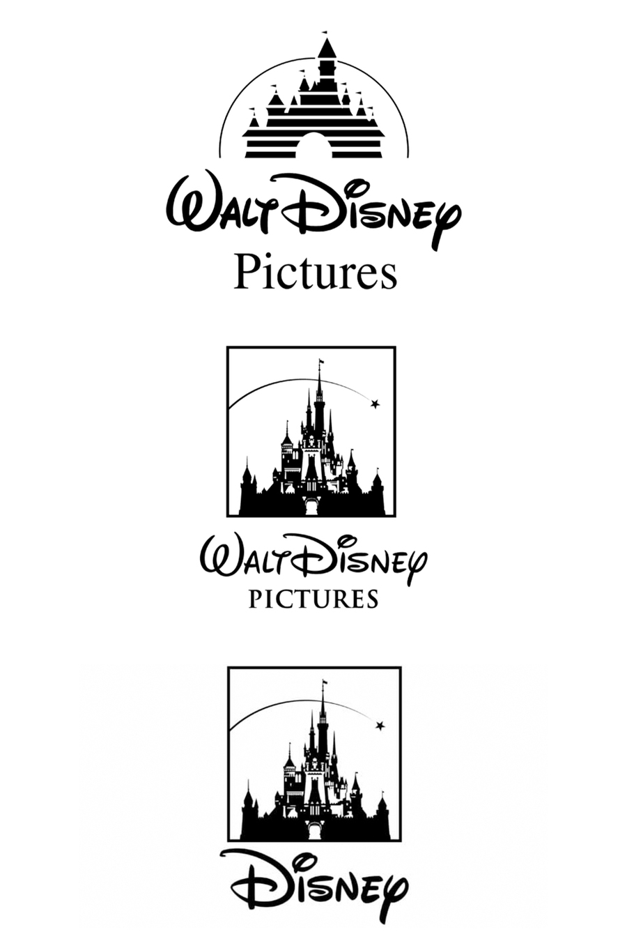
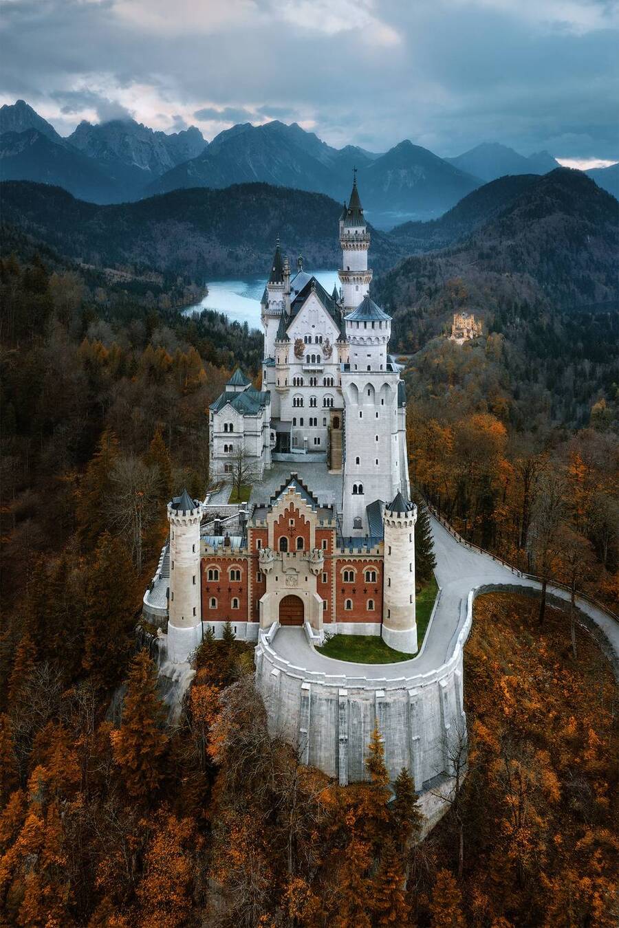
1. The Evolution of the Disney Logo from 1985 to the Present. 2. Neuschwanstein Castle in Bavaria.