One designer, every touchpoint
Space · Print · Digital · Product
I help businesses and cultural institutions turn complex or heritage-rich content into things people can use, understand and buy — from wayfinding and books to apps and merchandise.
Hi, I’m Darya!
I’m a multidisciplinary designer working across environmental graphics, editorial design, UX/UI and product design. The medium changes from project to project, but the method stays the same: find what really matters to the people on the other side and make it simple, clear and pleasant to deal with.
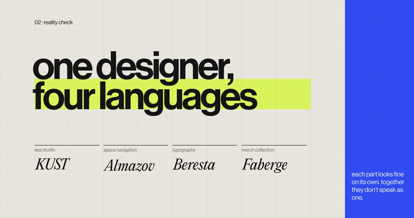
The reality check
Most brands are split between several contractors: one studio draws the app, another makes the signage, a print shop handles the catalogue and a supplier produces the merch. Each part looks fine on its own — together they speak different languages, and the audience feels it.
The problem
The richer the content, the easier it is to lose. A large campus confuses visitors, a unique collection stays in storage, a difficult craft scares beginners away, and a famous symbol fails to reach new buyers. These are design problems — and they can be solved.
Four cases, four media
From space to product, in order of business impact
Every project below follows the same logic: the client’s situation, the problem, my solution and the value it brings.
Almazov Centre
Wayfinding · Pictograms · Environmental Graphics
The Situation: Almazov National Medical Research Centre is one of the largest multidisciplinary medical research centres in Russia. Its ecosystem keeps growing with new locations, and every day it welcomes people of different ages and with different needs.
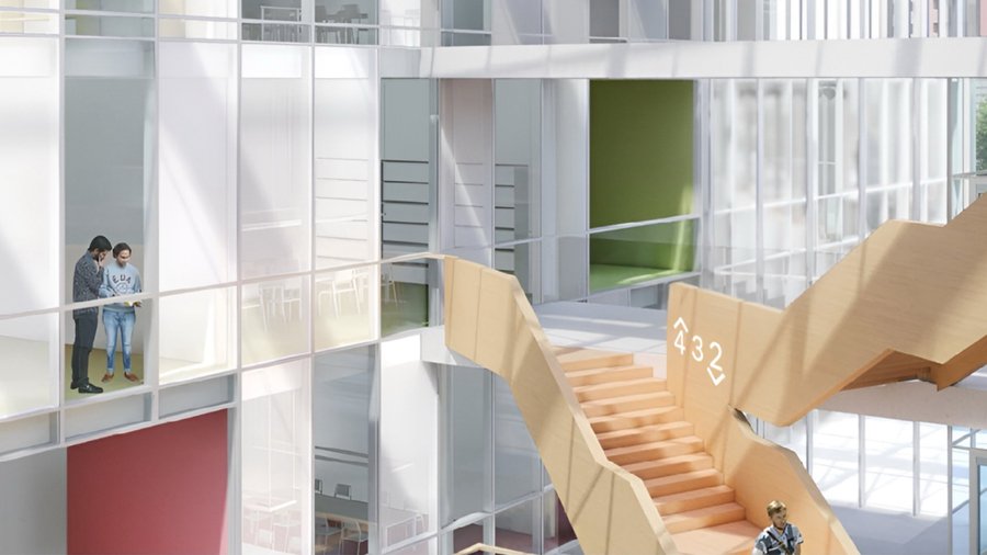
The Problem: The campus interiors are already full of bright colours and expressive textures. The new navigation had to bring order to a complex system without overloading the space.
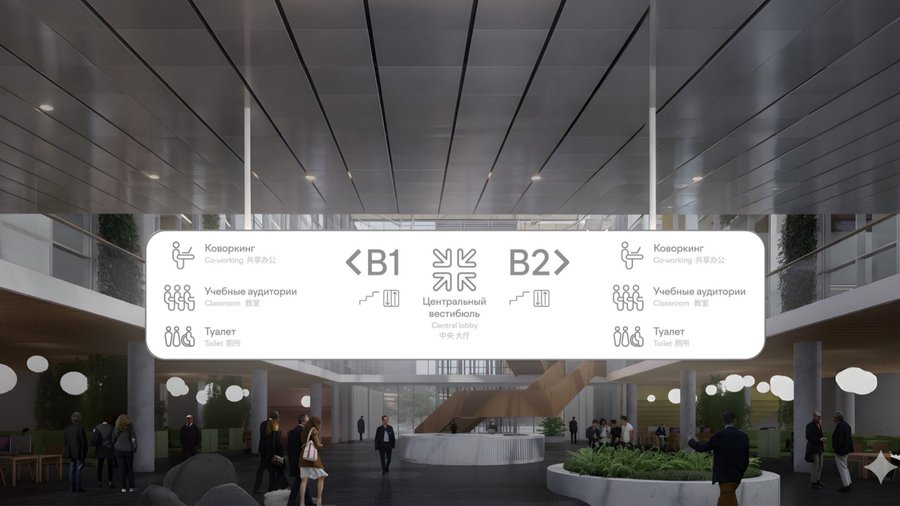
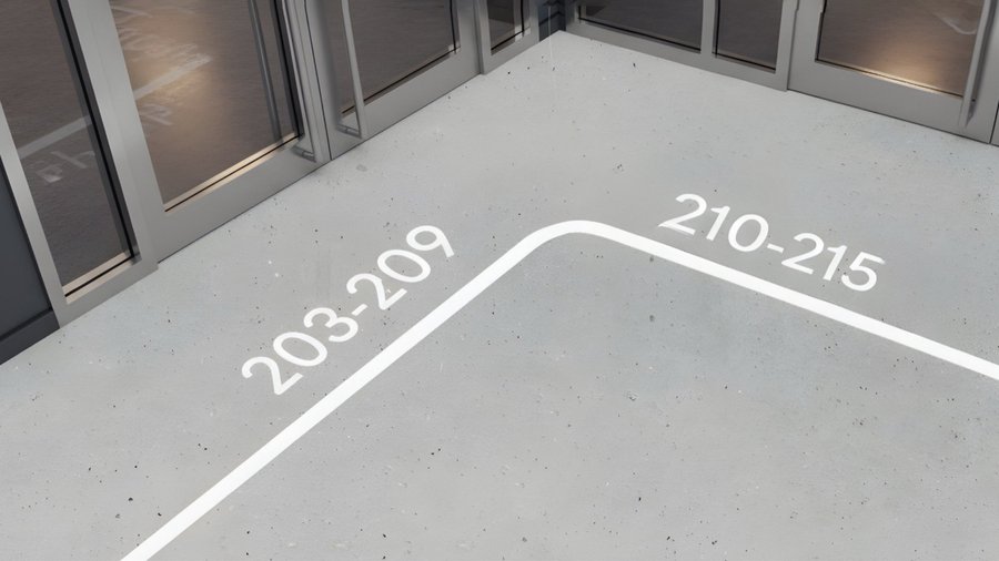
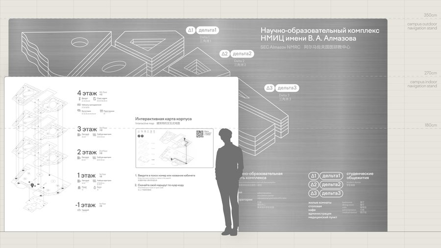
The Solution: I designed a wayfinding system in calm grey and white: an outdoor stand with a campus map, an indoor stand with an exploded floor plan and an interactive map, wall, hanging and floor signs. Aluminium plates and bodies echo the materials of the buildings, and the soft pictograms follow the rounded, friendly shapes of the corporate typeface Factor A.
The Value: One clear visual language for the whole campus — designed to help visitors find their way with less stress and to grow together with the centre.
Curator: Nika MyakinenkovaLearn more → link to the full project
Birch-Bark Letters Catalogue
Book Design · Editorial · Cultural Heritage
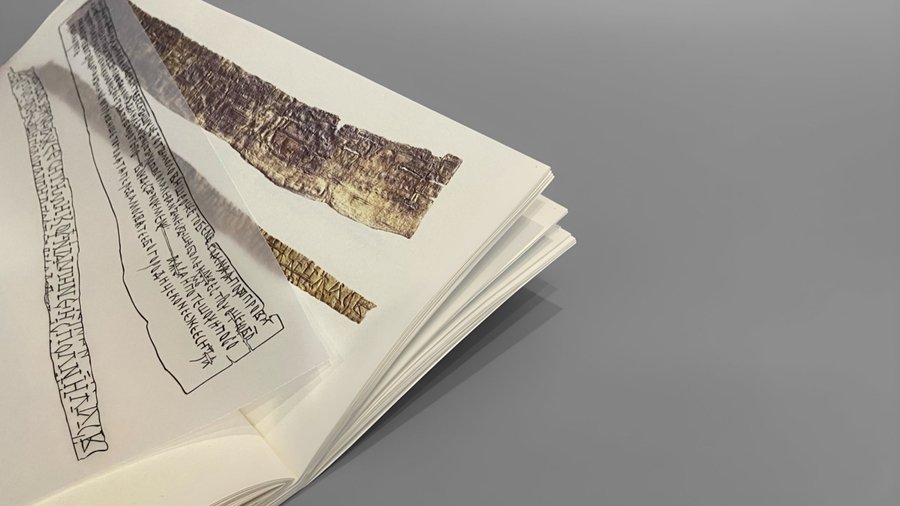
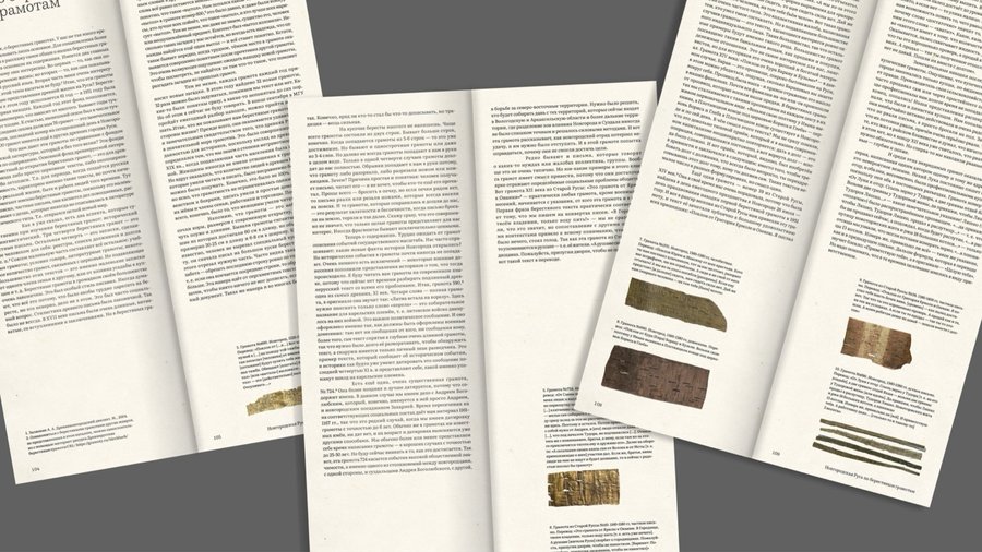
The Situation: Birch-bark letters are a unique artefact that tells us about the lives of people a thousand years ago. Yet few of them are on display: single letters travel to local exhibitions in the Novgorod region, permanent displays exist only in museums, and people from other regions rarely get to see this evidence of the past.
The Problem: A fragile artefact tied to one place cannot reach most of its potential audience.
The Solution: A universal printed catalogue of reproductions for any museum or exhibition space where the letters are shown. Its format presents the letters at actual size, and the modular structure can be expanded with new texts.
The Value: People from all over the country can see the letters and take a piece of history home, and museums get one product that works across venues.Learn more → link to the full project
KUST
App Design · UX/UI · Branding
The Situation: Floristry is a popular hobby, but beginners rarely know where to start: which flowers go together, what to choose as a base and how to assemble a bouquet that lasts.
The Problem: Without guidance a creative craft feels complicated, and curiosity fades after the first attempt.
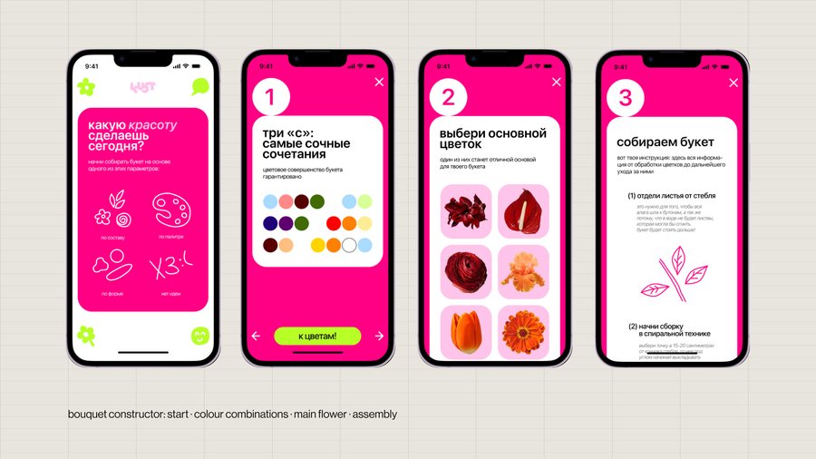
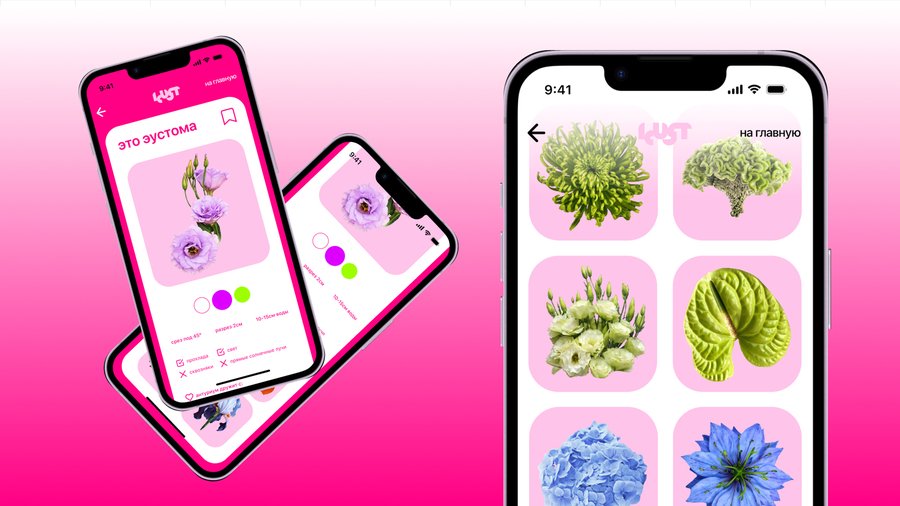
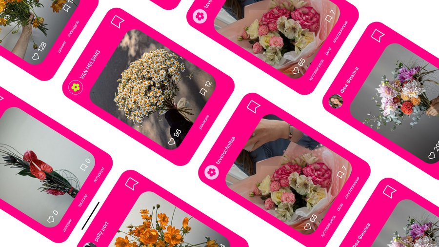
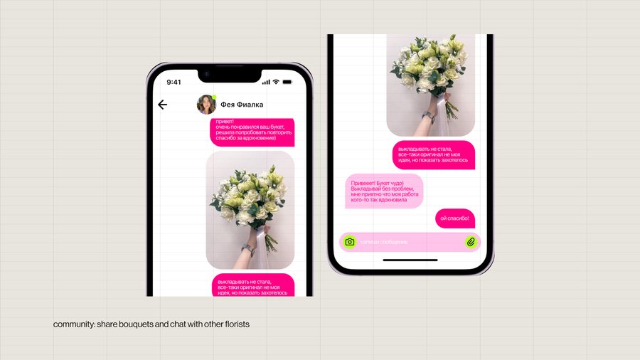
The Solution: KUST is a pocket self-tutor in floristry. A bouquet constructor starts from composition, palette or shape — or from «no idea» — and leads step by step: colour combinations, the main flower, then instructions from preparing the stems to further care. A flower dictionary helps to find interesting varieties, and a community feed gives inspiration and a place to chat. A bright pink and lime identity keeps the tone playful.
The Value: A difficult craft becomes approachable, and a single try turns into a habit — with a community built around the product.Learn more → link to the full project
Try prototype on your phone
Fabergé Museum Merch
Product Design · Merchandise · Packaging · Cultural Branding
The Situation: The museum shop is a significant source of income, aimed at women 35+ with a high income.
The Problem: The shop misses men and young people. Its key symbol, the Easter egg, is hard to adapt to modern functional merch while keeping it fully recognisable.
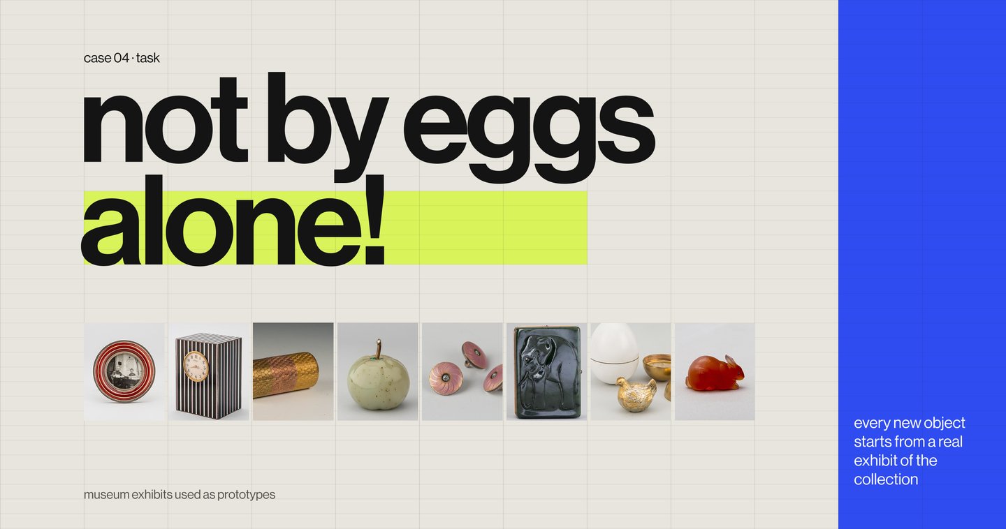
The Task: Adapt the cultural and visual code of Fabergé to current trends, keep the connection with the museum and attract a new audience. Not by eggs alone!
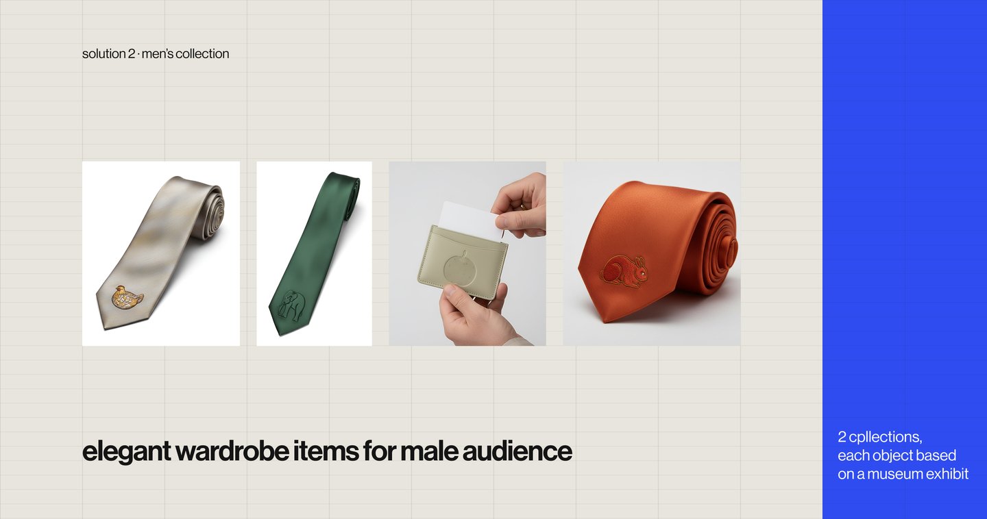
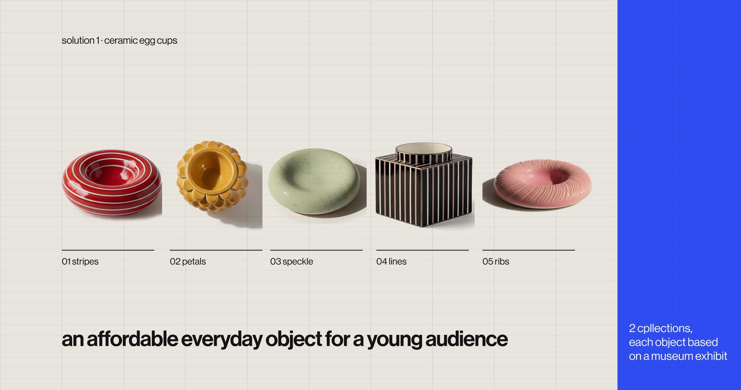
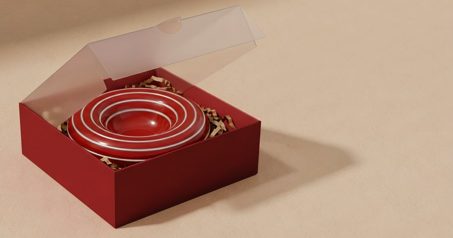
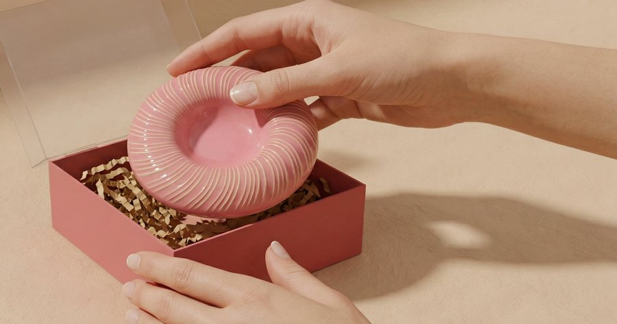
The Solution: Every object grows from a real exhibit of the collection. Ceramic egg cups are an affordable, hedonistic breakfast item for young buyers that brings Fabergé into everyday life. A men’s line — polo shirts, ties and a card holder — is based on exhibits depicting animals whose symbolism reads as a wish: the elephant stands for wisdom and stability, the rabbit for abundance and longevity. It answers the question visitors often ask: «Do you have anything for men?» Two kinds of packaging complete the line: gift boxes for the egg cups and universal shop bags with copy referring to the museum collection.
The Value: Three directions for two new audiences, built on the museum’s own collection — a merch system the shop can keep expanding.
Curator: Sofya SyrovatskayaLearn more → link to the full project