Who am I?
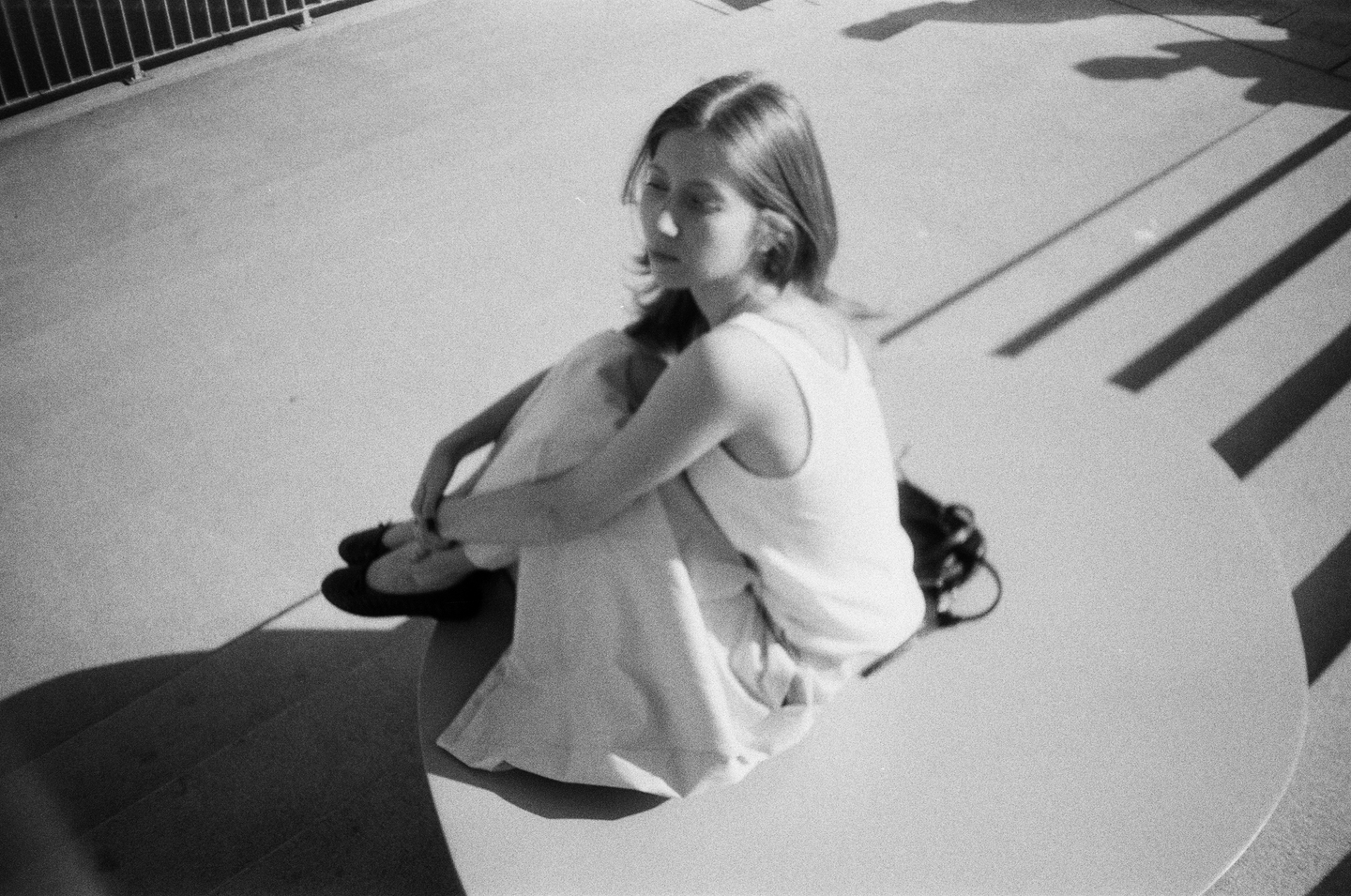
My name is Sofya Glazkova, and I’m a brand designer.
I create visual identities, branding and graphic communication that translate the character of a project into a distinctive visual language.Working across fashion, culture, art and media, I explore how ideas, emotions and visual details come together to shape the way a project is perceived.
Visual Identity · Branding · Posters · Graphic Communication
How I think?
I approach every project by looking beyond its surface — exploring its context, character and the ideas that make it different. I collect details, look for meaningful connections and develop a concept that can guide the entire visual direction.
For me, good design is about finding the right form for an idea. I combine conceptual thinking with sensitivity to emotion, typography and composition, making sure that every element contributes to a coherent whole. I want my work to feel distinctive, considered and complete, with nothing added without a reason.
Brand identity
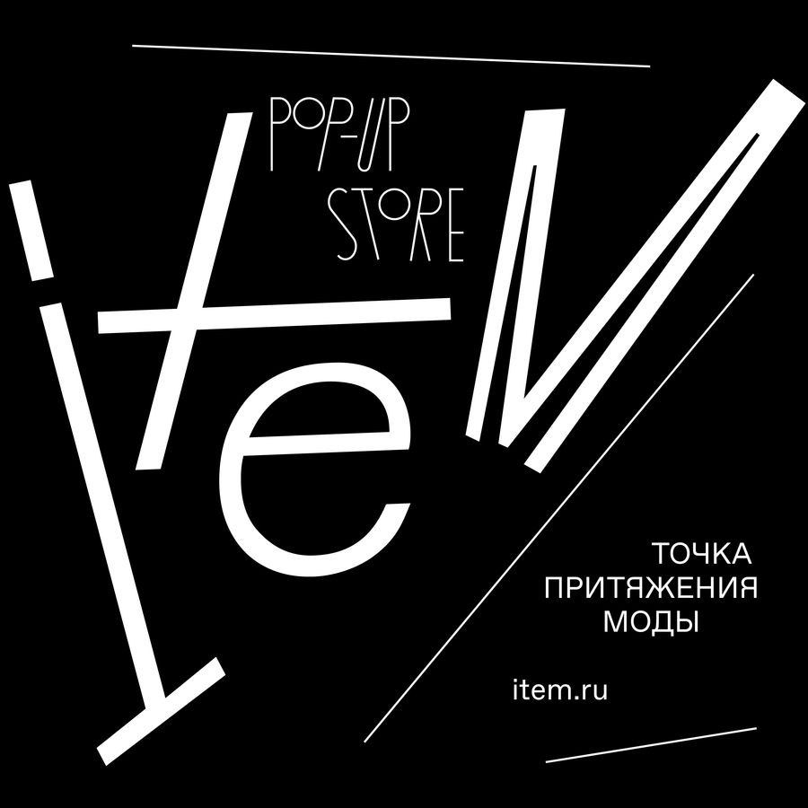
ITEM — Pop-up Store Rebranding
The Challenge
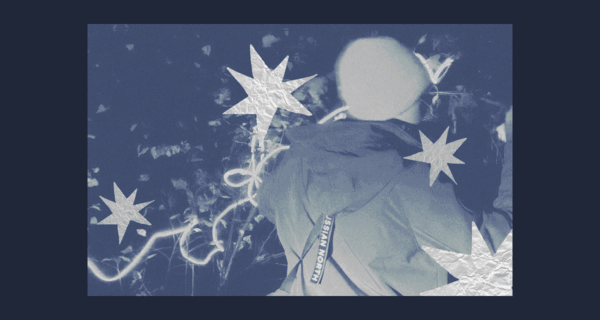
ITEM pop-up store, a new temporary retail format by Sobaka.ru, brings fashion to life as an event rather than a static space. The challenge was to reflect this dynamic, ever-changing character through a refreshed visual identity.The Idea
A comet became the central metaphor of the rebranding, symbolising movement, momentum and the brand’s event-driven nature.The Identity
The concept shaped a flexible visual system combining a variable logo, delicate typography, dynamic graphics and a distinctive photographic style, designed to adapt across different formats and touchpoints.The Outcome
A recognisable yet adaptable identity that allows ITEM to brand spaces quickly and evolve with each new event while maintaining a consistent visual character.
From concept to form — ANTIFRAGILITY
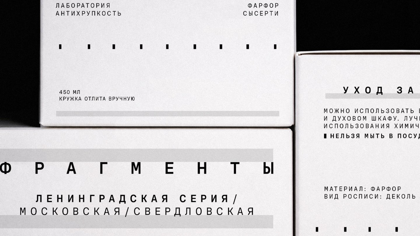
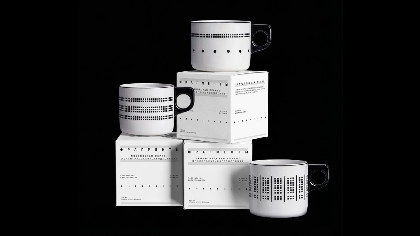
ANTIFRAGILITY — Packaging for Fragments
The Concept
Antifragility is a research-driven project that values thoughtful observation and dialogue over trends and mass appeal. Each collection grows out of research, leaving space for reflection and interpretation.The Challenge
To develop a packaging system for the Fragments collection that organically extends its visual identity and conceptual meaning, continuing the story of the collection through form.The Solution
Inspired by constructivist architecture, the design combines geometry and rhythm with expressive typography, restrained graphics and tactile materials. Together, they create a sense of quietness and balance, revealing the collection’s story without unnecessary details.The Outcome
A cohesive packaging system that brings together visual clarity, materiality and conceptual depth. It continues the collection’s meaning while leaving room for curiosity and individual interpretation.
Craft & detail
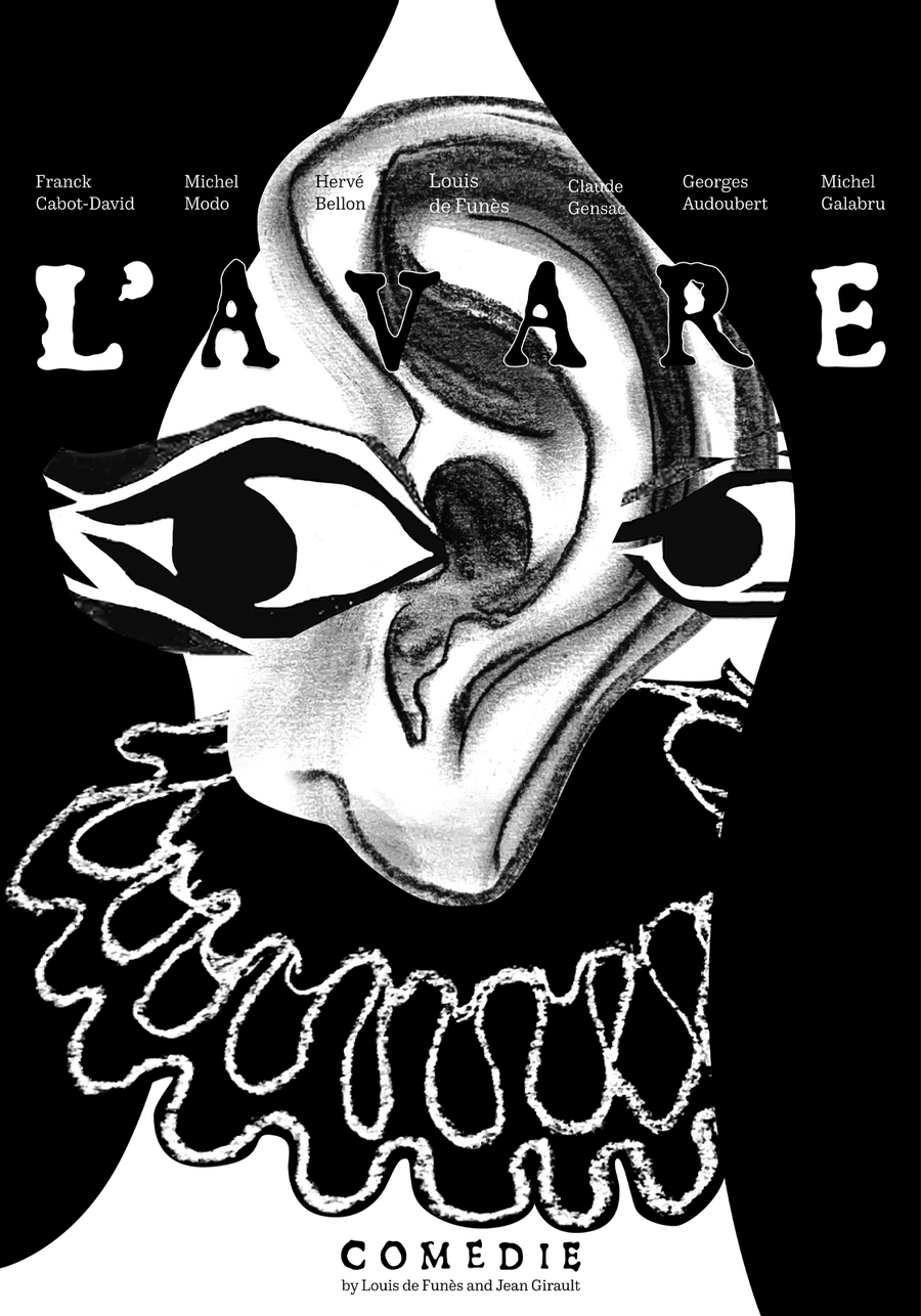
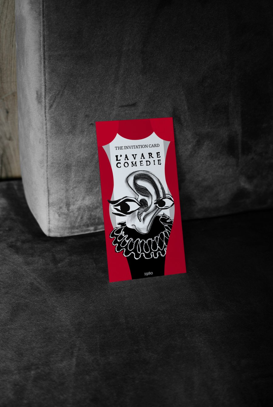
Poster for L’AVARE film
The Concept
Inspired by the 1980 French film L’Avare, I explored how a character’s obsession with wealth can shape his entire appearance. Driven by the constant fear of losing everything, the protagonist becomes a figure stripped of almost all individuality.The Visual Language
Exaggerated eyes and ears convey his perpetual alertness and suspicion, while the collar remains the only trace of his former identity. Hand-drawn in charcoal, the illustration brings a raw, tactile quality to the poster.My Approach
I work with meaning as the starting point of visual communication, reinterpreting cultural heritage through contemporary graphic language. For me, a poster is not simply an image of a story, but a way to distil its essence into a distinctive visual form.