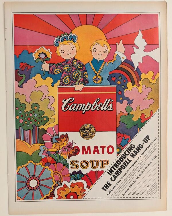
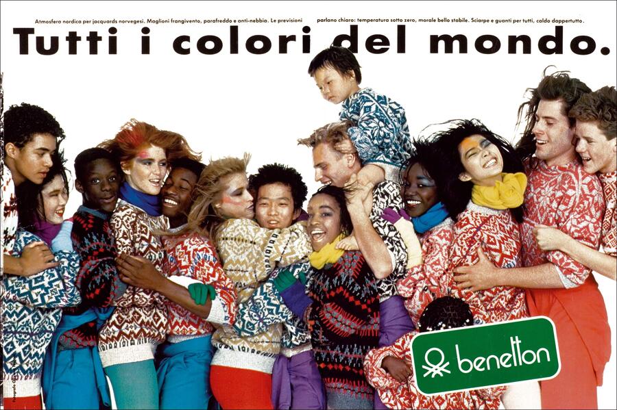
Abstract
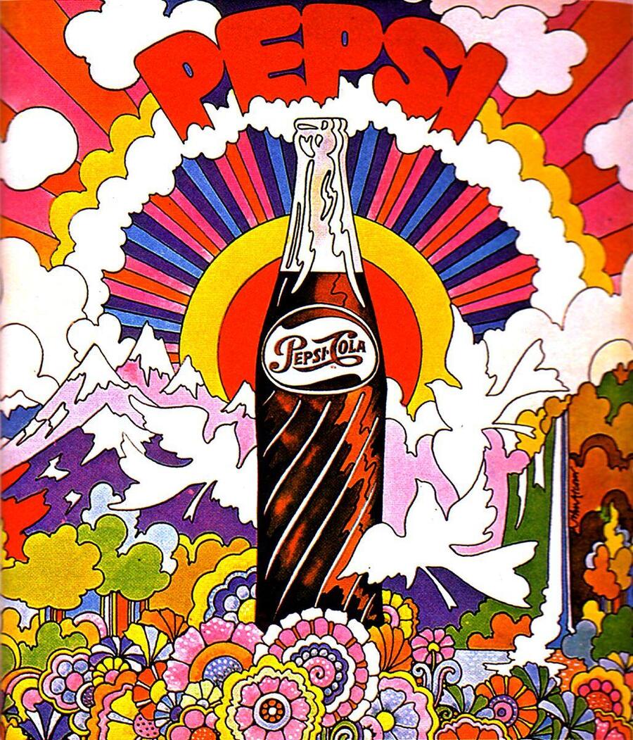
This visual study is dedicated to examining color as one of the key tools in advertising communication. The work explores the role of color decisions in shaping a brand’s visual identity, capturing consumer attention, and establishing specific emotional associations. Special attention is given to the psychological and cultural perception of color, as well as its use across advertising campaigns from different historical periods. Based on an analysis of advertising posters, print advertisements, and contemporary marketing campaigns, the research investigates how color serves as a means of conveying brand values, setting a mood, and influencing the target audience. This work allows for a tracing of the evolution of color usage in advertising and defines its significance in creating an effective visual message.
Introduction
Color is one of the most expressive tools of visual communication. It has the power to capture attention, evoke emotional responses, form associations, and influence the perception of the surrounding world. Color plays an especially crucial role in advertising, as it is often one of the first elements a potential consumer notices.
Since the advent of mass advertising, color has been used not merely as a decorative element, but as a means of conveying specific meanings. Various color palettes helped distinguish the advertised product, create the desired mood, and establish a recognizable brand identity. Over time, the use of color in advertising has evolved into an integral part of a deliberate visual strategy aimed at establishing an emotional connection between the brand and the consumer.
The relevance of this topic stems from the fact that in today’s information landscape, individuals are constantly exposed to a vast amount of advertising messaging. Amid intense visual competition, color has become a crucial tool for capturing attention and distinguishing a brand from the multitude of others. Moreover, its significance transcends aesthetics—color can be associated with specific emotions, product qualities, and cultural perceptions.The goal of this study is to examine the characteristics of color usage in advertising, determine its impact on the perception of a promotional message, and trace how color strategies have evolved over time.
Chapter 1. Red: From Attention-Grabbing to Emotional Connection
Early Coca-Cola advertising. Red is used as a vibrant accent, helping to highlight the product and make the poster recognizable.
Red has held a significant place throughout the history of advertising due to its visual expressiveness and ability to capture attention. It is associated with energy, activity, passion, and power, which is why it was frequently used to make the advertised product stand out among other offerings.
In the first half of the 20th century, red was extensively employed in print advertising, posters, and commercial signage. In an era where printed materials remained the primary method of visual communication, vibrant color accents helped make the advertising message more noticeable. Red was used in headline design, product packaging, and imagery to draw the potential buyer’s eye.
One of the most recognizable examples of using the color red is the advertising for Coca-Cola. Gradually, red transformed into a crucial element of the brand’s visual identity. It became associated not only with the drink itself but also with a certain lifestyle, festive atmosphere, socializing, and positive emotions.
A Coca-Cola advertisement featuring festive imagery. Red begins to be associated with coziness, joy, and family traditions.
In the second half of the 20th century, red began to be used not only as a means of attracting attention but also as a tool for creating the emotional image of a brand. In the advertising of food products, beverages, and mass-market goods, it often helped shape a sense of dynamism, activity, and product accessibility.In modern advertising, the significance of the color red has endured, though its application has become more deliberate. Brands utilize it to build recognition, highlight key compositional elements, and establish lasting visual associations.Thus, red has evolved from a simple advertising accent to a complete element of visual identity, capable of forging an emotional connection between the brand and the consumer.
McDonald’s advertisement. The contrast between red and yellow is used to create a dynamic, energetic, and instantly recognizable image.
Contemporary Coca-Cola advertising. Red becomes an integral part of the brand’s sustainable identity, unifying various advertising formats.
Chapter 2. Blue and Cyan: From the Symbol of Stability to the Language of Trust
Advertising hygiene and household goods. Blue tones evoke associations with cleanliness and freshness.
Blue and cyan colors are traditionally associated with calmness, reliability, stability, and confidence. In advertising communication, they have gained widespread use due to their ability to create a sense of order, professionalism, and security.
In the first half of the 20th century, blue hues appeared in advertising for household goods, home appliances, and hygiene-related products. Their use helped to create a visual impression of cleanliness, tidiness, and quality. Unlike bright and contrasting color schemes, blue was often perceived as more reserved and universal.
In the second half of the 20th century, blue assumed particular significance in corporate advertising. With the growth of large companies, the banking sector, and the technology industry, there arose a need to forge an image of reliable and stable organizations. Blue became one of the most common colors in corporate visual identity.
IBM Advertisement. Blue helps shape the image of a technological, serious, and reliable company.
This became particularly noticeable in the advertising of technology companies. With the advancement of computer and digital technologies, the color blue began to be associated with innovation, rationality, and professionalism. It was used to create an image of trustworthy companies.In modern advertising, blue and light blue continue to be actively used in the banking, medical, educational, and digital service sectors. However, contemporary brands are increasingly experimenting with shades, gradients, and color combinations, transforming traditional blue into a tool for developing a unique visual identity.Thus, the historical development of the color blue in advertising illustrates how the initial association with purity and calmness gradually incorporated the meanings of technological sophistication, stability, and trust.
Modern Samsung advertising. Blue is used to convey technology, modernity, and trust.
Chapter 3. Green: From Natural Associations to Ecological Marketing
Advertisement for soap, cosmetics, and household goods. Green is used to convey freshness, cleanliness, and naturalness.
Green color in advertising has traditionally been associated with nature, freshness, health, and naturalness. Its meaning is particularly interesting to examine in a historical context, as over time, green has come to symbolize not only the natural qualities of a product but also the environmental responsibility of brands.
In the first half of the 20th century, green was actively used in the advertising of food, household goods, and hygiene products. It helped create associations with freshness, naturalness, and purity. Visual images of plants, leaves, and natural landscapes complemented the color schemes, reinforcing the impression of the advertised product’s natural quality.
In the second half of the 20th century, especially with the growing public interest in environmental protection issues, green acquired a new meaning. It gradually became a symbol of the environmental movement and a responsible attitude toward nature. This influenced the advertising industry—companies began using green to emphasize the natural quality of their products and the ecological direction of their operations.
Ecological advertising. Against the backdrop of growing public interest in nature conservation, green has taken on the meaning of ecological awareness.
In the late 20th and early 21st centuries, green became one of the primary visual tools in environmental marketing. It is actively utilized by manufacturers of organic products, cosmetics, household chemicals, and goods marketed as eco-friendly.
In contemporary advertising, the color green is often paired with images of nature, minimalist graphics, and natural textures. However, its widespread use has also led to the emergence of the greenwashing problem—a situation where companies create the impression that their products are environmentally friendly without sufficient basis.
Thus, the color green has evolved from signifying natural freshness to symbolizing environmental responsibility. Its modern meaning reflects shifts in societal values and the increasing consumer focus on sustainable development.
The Body Shop advertisement. Natural hues, images of plants, and natural ingredients become an integral part of the cosmetic brand’s identity.
Contemporary ecological marketing. Green has become a visual marker of sustainability, naturalness, and environmental responsibility.