«…and the blue must be ultramarine, costing around four florins per ounce.» Asylum contract of the Ospedale degli Innocenti with Domenico Ghirlandaio, Florence, 1485 [1]
Concept
In European painting, blue was long more than just a color. Ultramarine—the brightest and most enduring blue—was made from lapis lazuli imported from the mines of Badakhshan, located in present-day Afghanistan. This purest pigment cost more than gold, and clients specified in contracts exactly how much ultramarine would be used in the painting and what quality it would be [2]. Therefore, blue in an altarpiece represented not only money but also a decision on how to spend it.Ultramarine had a cheaper competitor—azurite, a blue copper mineral. It is difficult to distinguish them by eye, especially in reproductions, but ultramarine was valued for its depth and tonal saturation, and due to its cost, it was used sparingly [3]. This very distinction makes blue a useful subject of study: by observing where the expensive pigment lies and where the cheaper one is used, one can see what the client and the master considered most important.I am interested in how this decision manifests within the painting itself. The research question is: to whom on the painting was the most expensive blue allocated, and why did this change between the 13th and 17th centuries?
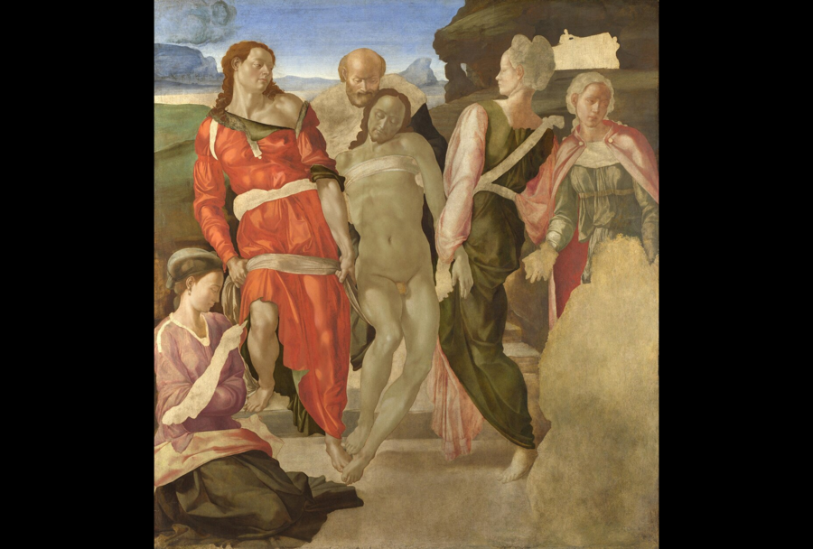
Michelangelo. «The Entombment,» c. 1500–1501. Wood, oil, 161,7 × 149.9 cm. National Gallery, London.
The value of blue can be seen even where it is absent. Michelangelo left «The Deposition» unfinished: the right lower corner is empty where the kneeling Madonna—the very figure intended for ultramarine—should be. Similarly, in the «Manchester Madonna, ” her cloak remained in a black underpainting. According to the National Gallery in London, the master saved his most expensive pigment for last, and obtaining it was not simple [4].
The common answer—that „the Madonna received the most expensive pigment”—is only partially true. In 1285, the patrons of the „Madonna of Lucchese“ requested that Duccio paint the Madonna’s cloak with ultramarine, but restorers found that a cheaper azurite was used [3]. Therefore, my hypothesis is more complex: ultramarine was first distributed according to the order specification, then according to the hierarchy of figures within the painting, and by the seventeenth century—it was dictated by the artist’s intent, at which point it became a hallmark of the painting’s luxury.
Method. I compare what is visible in the image (where the blue areas are located, what proportion they cover, and to whom they belong) with data from museum technical research. To the naked eye, ultramarine cannot be distinguished from azurite, so I only name the pigment where analysis confirms it. For each artwork, I place two details from the same painting side-by-side: where the most expensive blue pigment is located, and what was placed next to it—a cheap pigment or another expensive material. Finally, for all twelve paintings, I calculated what percentage of the image the blue areas occupy and summarized this in a single chronological diagram.Material — twelve works of European painting from the 13th–17th centuries, ranging from Duccio’s «Madonna of Rucellai» to Vermeer’s «Girl with a Pearl Earring.» I selected only those works whose pigments have been identified through technical study, and each one shows a different approach to distributing blue: by budget, by hierarchy, or by the artist’s intention. The sources were chosen on the same principle: a pigment cannot be identified from a reproduction, so the main sources are technical bulletins from the National Gallery in London, Caitlin Honeiger’s study of blue pigments in Sienese painting, and period documents, most notably the Girlandaio contract in Michael Baxandall’s publication. Michel Pastore’s «Blue: History of a Color» provides overall context.
Who got the most expensive blue on the painting—and why did it change?
Navigation Menu
- I. Blue by Budget (13th–14th Centuries) — the amount of ultramarine used in the painting is determined by the commission’s budget
- II. Blue by Hierarchy (15th–Early 16th Century) — the main figure within the painting is assigned the most expensive blue hue
- III. Blue for Luxury (16th–17th Centuries) — ultramarine is reserved for the sky and the maid
- Epilogue. Blue Without Price
- Conclusion
The chapters move through time, but they are divided not by date, but by the logic that determines the allocation of blue. Therefore, the boundaries are conditional: Sassoferrato in the 17th century externally reverts to the old scheme—all the blue is on the Virgin Mary, whereas Van Eyck in the 15th century leaves the Virgin Mary without blue. I analyze such exceptions separately; they test the hypothesis for its strength.
I. Blue by Estimate
XIII–XIV вв.
In the 13th–14th centuries, ultramarine was so expensive that the amount used in a painting was determined by the patron’s budget. Workshops utilized it in different ways: Duccio used it sparingly, reserving it only for the most significant commissions, while Simone Martini’s workshop used it on nearly all blue garments [3]. Five works in this chapter illustrate how the use of blue expands with the budget—from azurite used in place of promised ultramarine to a royal diptych where costly blue is applied everywhere.
Duccio di Buoninsegna. «Мадонна Ручеллаи, ” 1285. Wood, tempera, gold. Uffizi Gallery, Florence.
A massive image, approximately 4.5 meters high—the largest of the known painted panels from the 13th century [5]. It was commissioned by the Florentine brotherhood Laudezi for their chapel in the Santa Maria Novella Church. The contract from April 15, 1285, stipulated that the Virgin Mary’s mantle be painted with ultramarine and the background with actual gold. However, restorers in 1989 discovered that the mantle was painted with a cheaper azurite [3]. The gold is present, but the most expensive blue is not. This is the starting point for the study: even when ultramarine for the Virgin is specified in the contract, the cost estimate dictates the execution. This is immediately apparent in the details: the gold was executed according to the agreement, but the blue was not.
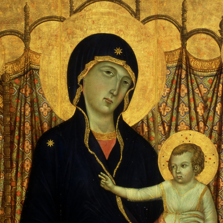
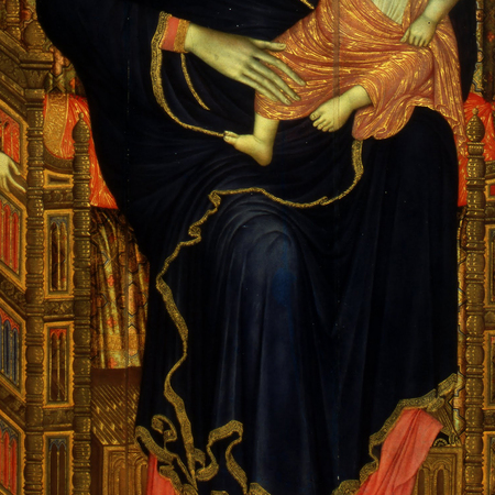
Duccio, «Madonna of the Rucellai, ” 1285. The halo and background on the left are gold, as stipulated in the agreement. The cloak on the right is ultramarine in the agreement, but azurite in reality.
The contract promised the Virgin Mary ultramarine, but she received azurite—even the budget dictated the treatment for the main figure.
Duccio di Buoninsegna. «Maestà, ” 1308–1311. Wood, tempera, gold. Museo dell’Opera del Duomo, Siena
The high altar of the Sienese Cathedral—the city’s most prestigious commission. Pigment analysis revealed that «Maestà» uses only ultramarine; no other blue pigment was found [3]. For both the same master, the expensive blue appears only when the commission’s status allows for it. The composition is strictly symmetrical: the Virgin Mary on the throne is at the center, flanked by rows of angels and saints, and the blue garments repeat on the left and right, like a mirror image. Here, blue signifies how much the city was willing to invest in the cathedral’s central image. The Virgin Mary has the most blue: her dark blue cloak is the largest blue patch in the center, while among the angels and saints on the sides, the blue is broken up into individual robes.
Duccio di Buoninsegna. «Madonna and Child with Saints Dominic and Aureae, ” c. 1312–1315. Wood, egg tempera. National Gallery, London.
Duccio’s Triptych—a small devotional piece: the central panel is only about 61 centimeters high. It is dominated by two colors: gold and the Virgin Mary’s blue mantle. The mantle is painted with high-quality natural ultramarine, and the shadows are rendered with black strokes [6]. In this small, precious object, the deep blue is reserved for the main figure—and here, humility and hierarchy align. Fragments reveal why this pigment cannot be judged by sight: in reproductions, both mantles appear dark blue, though the one on the «Madonna of Rucellai» is azurite, while this one is ultramarine. Only analysis confirms this difference [3; 6].
Simone Martini. Polyptych from the Santa Caterina Church in Pisa, 1319. Museo Nazionale di San Matteo, Pisa
Simone Martini handled ultramarine differently than Duccio. In the Pisan Polyptych, almost all the blue garments—even those of the small predelas figures—are painted using this pigment. The light shades were achieved not with a cheap pigment grade, but by adding white to a high-quality ultramarine [3].
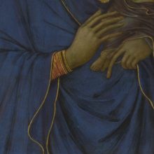
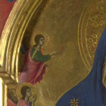
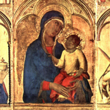
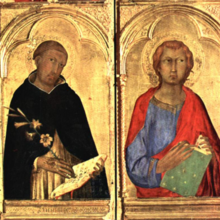
Two left panels—from Duccio’s triptych, «Madonna and Child with Saints Dominic and Aurelia» (c. 1312–1315)—feature blue only on the Virgin’s mantle; everything else is gold. Two right panels—from the Pisan polyptych by Simone Martini (1319)—show the Virgin’s mantle and the light, lead-white garments of Saint John rendered in ultramarine. The comparison reveals that in the early 14th century, the inclusion of expensive blue depended on the workshop and the commission, rather than a strict rule.
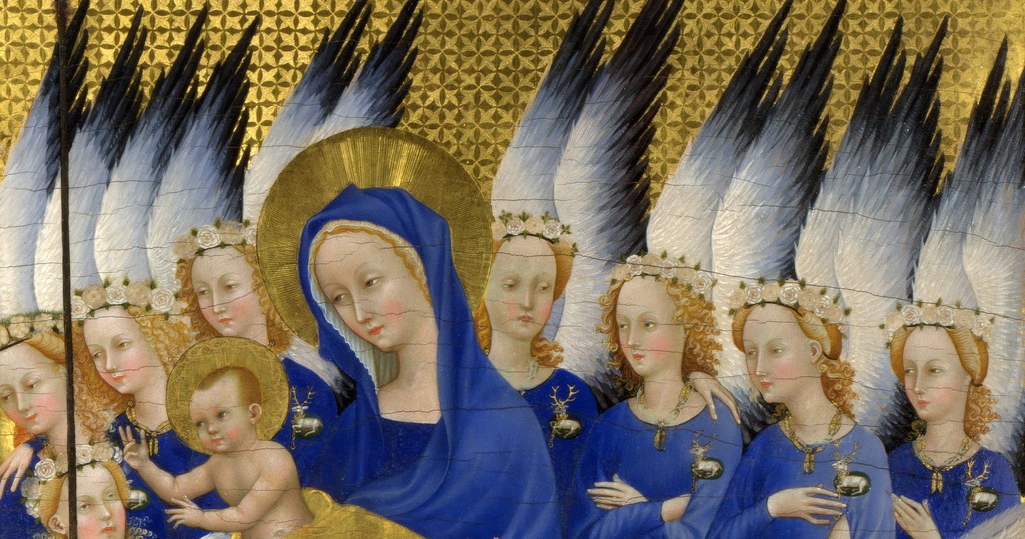
Unknown master (England or France). Wilton Diptych, c. 1395–1399. Wood, tempera, gold. National Gallery, London
Folding altar for the private prayer of King Richard II. On the left panel, the king kneels accompanied by three saints; on the right, the Virgin Mary with the Child and eleven angels dressed in natural ultramarine robes against a gold background [7]. The angels bear a badge on their chest—the white stag, Richard’s personal emblem: the heavenly retinue is dressed royally [7]. The right panel is dominated by blue and gold. This marks the climax of the first chapter: with the royal budget, ultramarine is allocated not only to the Virgin Mary but to her entire entourage.

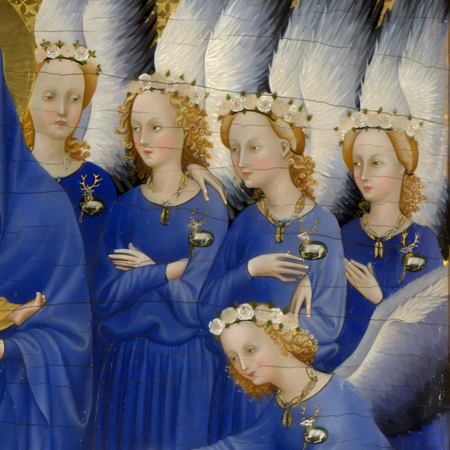
Unknown Master. Wilton Diptych, c. 1395–1399. On the left, Saint King Edward the Confessor with an earthly throne. On the right, angels with a heavenly one; ultramarine is used uniformly on all.
In the 13th–14th centuries, blue was allocated within the budget. The ultramarine promised in the contract might have been azurite, and with a royal budget, it dressed an entire retinue of angels. There is a hierarchy of sanctity, but it only functions within the scope permitted by the patron.
II. Blue in Hierarchy
XV — начало XVI в.