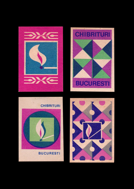
Contents:
- Concept
- Matchbox Label as a Trademark
- Matchbox Label as an Advertising Medium
- Matchbox Label as a Propaganda Tool
- Matchbox Label as a Reflection of National Culture
- Conclusion
Concept:
This visual study explores how matchbook labels can contain an entire visual narrative. These few square centimeters of printed surface, originally intended for product labeling, have gradually evolved into an independent platform for graphic experimentation. Different images have appeared on them—from charming and endearing animals to political slogans. While the original function of the everyday object remained unchanged, its visual presentation began to serve completely different purposes.
A matchbook label is a miniature graphic object where imagery and text can interact within extremely limited space.
Unlike a poster or other large-format media, a matchbox label offers significantly less space for conveying information. The composition must be simultaneously compact, expressive, and memorable.It is this formal limitation that makes this topic so compelling. The small area demands meticulous attention to the scale of imagery, typography, color contrast, and element placement. The composition’s center can be either a single mark or an entire grouping of illustrations and text. This diversity of approaches allows us to examine the ways in which graphic design addresses the need to deliver a message in a miniature format. Meanwhile, the matchbox itself remains a mass-produced and often transient object of everyday life.
The study is rooted in an interest in how such a small and familiar object can become a complete medium for visual communication.
The objective of this study is to determine which graphic and compositional techniques allow for the resolution of various communication tasks within a single, constrained format.
The main research question is: how did matchstick labels from the 20th century acquire such diverse visual forms, despite the similarity in their sizes?
The hypothesis posits that the graphic language of the object under consideration is shaped not only by the limitations of its form but also by the intended purpose of the communication itself. It is incorrect to assume that a matchbox is merely an object of daily life and routine. In reality, its design can carry multiple meanings, cultural references, and slogans.
The research structure is based on the typology of communication functions and the cultural significance of the matchstick label. This approach will allow for an examination of the diversity of its visual solutions and the determination of how the message content influences its graphic design.
This study examines this object through four primary lenses: as a trademark, an advertising medium, a tool of propaganda, and a reflection of national culture. Comparing different historical examples will reveal common compositional principles and variations in the visual language of matchstick labels.
A matchbook as a trademark:
Matches fall under those everyday goods whose primary function hardly changes from one manufacturer to the next. Therefore, under mass production conditions, factories were tasked not only with designating the product’s origin but also with making their own goods recognizable amidst countless similar boxes.
The matchbook label transformed from a simple logo marking into a standalone visual sign.
Artist unknown. «Three Stars» label. Sweden, 1920s.
The most common method for building a trademark is transforming the brand name into an image. On the «Three Stars» label, the three stars become the main compositional element. Its creator literally echoed the company’s name, thereby creating a link between the word and the sign. The symmetrical arrangement of the figures, the limited color palette, and the contrasting background also work to focus the viewer’s attention on the three core forms.
Einar Nerman. «Solstickan» label. Sweden, 1936 drawing.
Another principle can be observed on the «Solstickan» label, created after a design by Einar Nerman, a Swedish artist. The center of the composition is the silhouette of a child against the backdrop of the sun. The company’s name translates to «sun match,» which determined the main motif of the illustration.
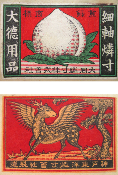
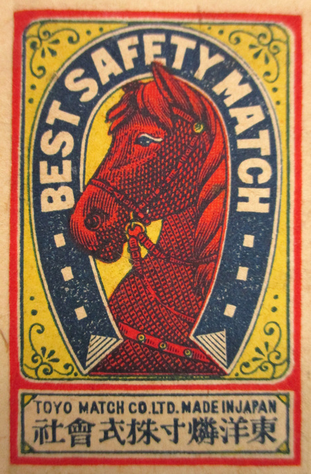
Artist unknown. Label «Peach»; Label «Deer»; Label «Horse». Japan. Date unknown.
Another equally common approach is using a single, recognizable object or animal as the primary image. In the Japanese collection of matchstick labels, there are brands whose identity is built solely around images of peaches, deer, and horses. Three main principles can be identified in these packages: the isolated object, the decorative illustration, or the drawing within a symbolic frame.
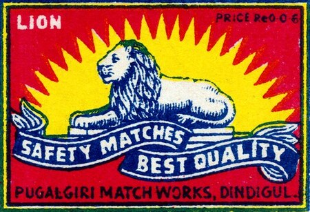
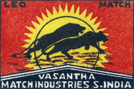
However, using a recognizable image by itself does not guarantee commercial success or brand recognition. For instance, «Royal Lion» and «Running Lions» both feature an image of a lion. In such a situation, designers have devised ways to convey the same idea through different language: in the first case, the animal is shown in a calm pose against a backdrop of radiating rays, whereas in the second, the focus shifts to the movement and dynamism of the predators. Nevertheless, the color palette, the compositional center, and their essential character remain similar.
Authors unknown. A collection of Japanese matchbox labels for the Chinese market. Date unknown.
Unknown authors. A collection of Japanese matchbox labels for the Indian market. Date unknown.
The design of labels held particular significance in international trade. Manufacturers needed to make their products comprehensible to consumers from different cultural backgrounds. For instance, the Tokyo Metropolitan Library features a series of boxes designed for export to China and India. Motifs associated with prosperity and good fortune were used for the Greater China market, while historical and mythological themes were employed for India. It is important to understand that these graphic solutions are driven by the familiar imagery and associations of the local buyers.
Matchstick label as a promotional medium:
In the first half of the 20th century, matchboxes began to be used not only to sell matches but also to promote entirely different goods and services. The small space afforded by the label acquired a completely new significance.
The advertising label was intended to draw attention to an external object: an establishment, product, service, or event.
Unknown artist. Advertising matchbox labels for dance halls. Japan, 20th century. Exact dates unknown.
One of the primary applications for the medium under consideration is the advertising of entertainment venues. On the labels of Japanese boxes from dance studios, you can see elaborately dressed dancing couples and female figures in luxurious gowns. Here, what is being sold is not just the item itself, but the experience the visitor can gain from attending the venue.
Unknown artist. Advertising matchstick labels for theaters and cinemas. Japan, 20th century. Exact dates unknown.
A similar principle can be traced in cinema advertising. The matchbox functions as a form of poster, drawing attention to a film or a recognizable image from the movie. These series of carriers were temporary and served to attract viewers during a specific screening period.
Unknown author. Promotional matchbox labels from barbershops. Japan, 20th century. Exact dates unknown.