Navigation
i. Introduction
ii. Color as Camp
iii. Costume as Camp
iv. Light and Mise-en-scène as Camp
v. «POP-CAMP» as a Statement
vi. Conclusion
vii. References
Introduction
The series «Shameless» (2015–2016) is a work centered entirely on aesthetics. This was a deliberate choice by Ryan Murphy, which the project announces from its very first frames. The university campus, girls in pastel attire, brutal murders, and an ironic tone create a space where the visual style becomes the primary statement, rather than mere «decoration» of the plot. The series consciously eschews realism—it is theatrical, exaggerated, and artificial. It is precisely this artificiality that makes it an interesting subject for visual research.The central concept for analysis is «camp,» first described by Susan Sontag in 1964 in «Notes on "Camp.» She defines camp as a love for the unnatural, the artificial, and the exaggerated. Camp is judged by its degree of artificiality and stylization, not by its degree of «beauty.» Camp is interested in surface, avoiding depth or moral judgment. It is this very quality that makes it particularly compelling for discussions about contemporary culture, where aesthetics is increasingly becoming a veiled way to talk about serious issues. Nevertheless, camp may be more complex than Susan Sontag described. Researcher Emily Rayalls, in her study of «Shameless,» introduces the concept of «pop camp”—a form of camp that, unlike the classical definition, may not mock, but rather encourage conservative structures through nostalgia and irony. This creates a contrast: the series' visual style can be simultaneously critical and complimentary to conservative ideas.
The research hypothesis is that the visual style of «Queer Eye"—its color, lighting, costumes, and staging—does not simply create camp aesthetics, but rather constructs it as an autonomous statement about contemporary culture. Through deliberate artificiality, superficiality, and theatricality, the series addresses themes of social inequality, overconsumption, and mass media hysteria. However, this dialogue is not conducted directly or through moral judgment; the themes are veiled, partially obscured, and are conveyed through the aesthetic pleasure the viewer derives from the series' visuals. Camp here functions as an ideological tool that operates through attractiveness, rather than didacticism.«Queer Eye» is one of the most striking examples of how a series' visual language articulates cultural and social issues. Studies on camp in media typically focus on the plot or dialogue, leaving visual parameters on the periphery. My visual study proposes a shift in perspective—an examination of precisely how formal techniques generate the camp effect and what statements about modernity they allow us to formulate.The research is built upon a theoretical framework—the concept of camp from Zontag and Ryall—followed by a sequential analysis of the series' visual techniques, moving from the most obvious elements, color and costume, to the more complex ones, light and staging. In the conclusion, I return to the question of whether this camp is critical or complementary, and what that implies about modes of expression in contemporary culture.
Color as Camp
Color in «Queen of Screams» is the most obvious level of this artificiality. Costume designer Lou Eirich mentioned in an interview that the palette was inspired by French macarons. This is a deliberate choice: the color here is not realistic; it is intentionally «sugary, ” „cloying, ” and occasionally vulgar. In camp, seriousness is presented through frivolity, and the brutality of the plot in „Queen of Screams“ exists alongside tender, sensual tones.
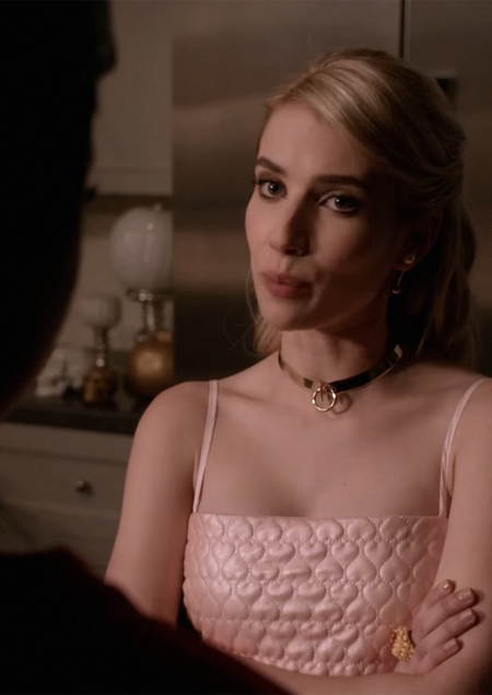
Pastel colors are constantly repeated in the series, becoming a signature feature of the entire environment. They can be found on the walls of the Kappa Kappa Tau dormitory, in the furniture, the bed linens, and even in the lighting. And this pink-mint palette has no equivalent in the „real“ world outside of the campus. This creates the effect of an environment devoid of naturalism. Camp functions here through excess: there is too much „beautiful“ color—it is too uniform, it is „over the top“ everywhere. The space surrounding the protagonists ceases to be a place of life, transforming instead into a display window or a theatrical stage.
Characters outside the main club membership, such as Grace and Zayde, are dressed in more neutral, «realistic» tones. In contrast, Chanel is always «dressed» in pastels. This contrast is significant: pastels are the color of the «insiders,» and all other colors signify the «outsiders.» In scenes where Grace is within the dorm walls among Chanel, her «detachment» from the palette is immediately read as a «detachment» from the group. Color becomes a tool for social stratification. Camp here marks boundaries through color, communicating who is «in» and who is «out.»
The red color of the blood, which frequently appears in the series, is also not realistic—it is rather stylized: it is excessively vivid and too high in contrast against the pastels. Here, red is primarily not the color of pain, but a color that disrupts the pastel harmony. It intrudes upon the pastel world as a signal that this pastel world is quite brutal. Aesthetics enters into conflict with ethics.
In the finale of the first season, as the Chanel sisters lose their status, their palette shifts: the pink fades, becoming nearly white, and the mint becomes duller. This is a visual statement that power is not eternal. But it is also a signal that the Chanel sisters are freeing themselves from the shackles of theatricality and artifice, finding their happiness in the sanatorium.