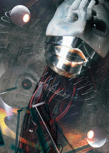
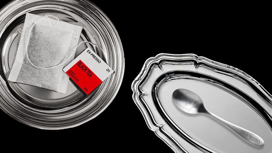
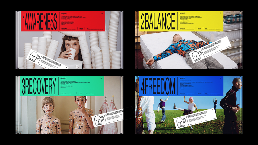
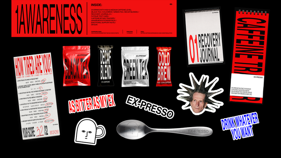
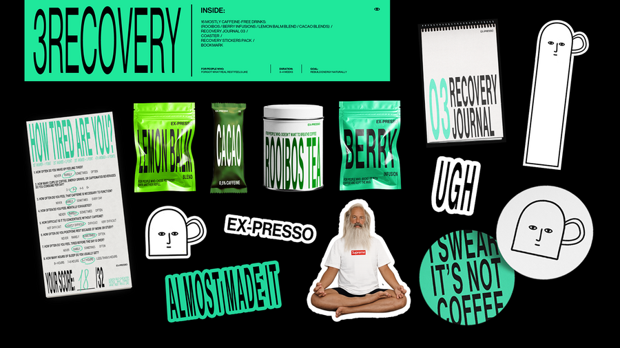
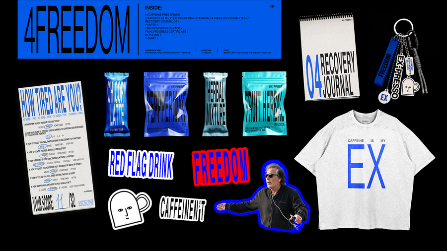
Первоначальная концепция EX-PRESSO
EX-PRESSO — проект о переосмыслении кофеиновой зависимости
и культуры постоянной продуктивности. Пользователь проходит тест на уровень усталости, получает рекомендации и знакомится с альтернативами кофе через специальные наборы напитков
без кофеина.
Серия боксов помогает постепенно отказаться от стимуляторов и восстановить естественный уровень энергии и сформировать более здоровые привычки.
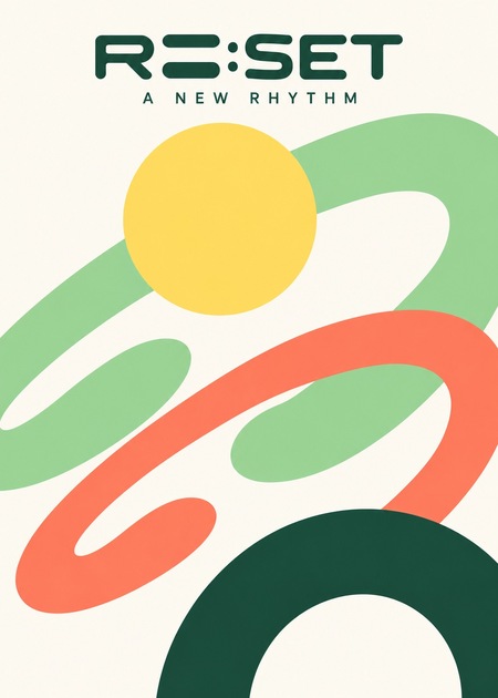
Ребрендиг с помощью ИИ — «RE: SET»
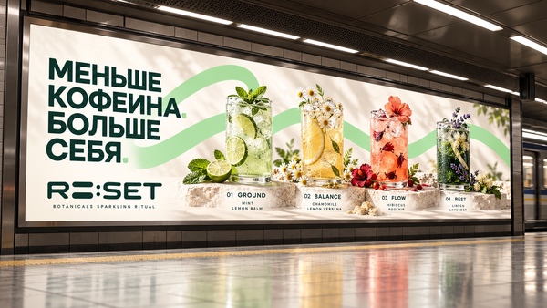
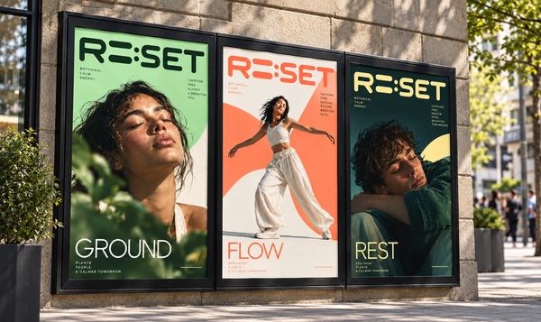
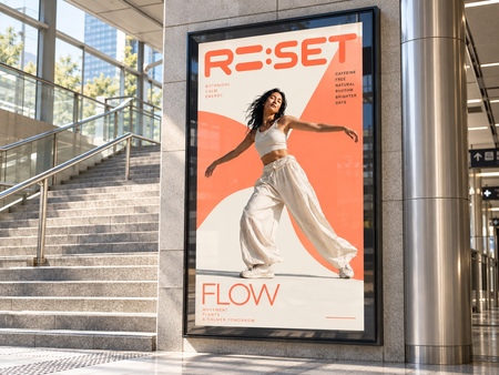
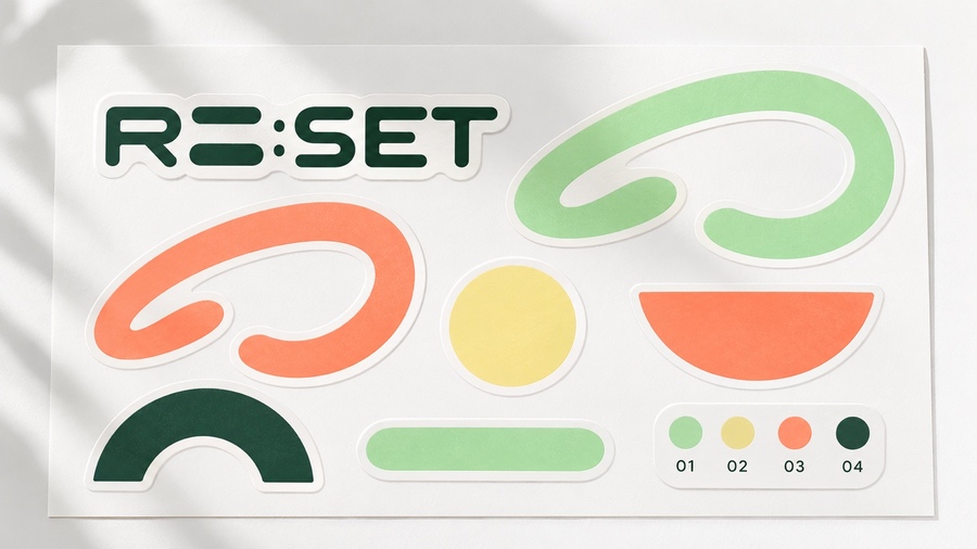
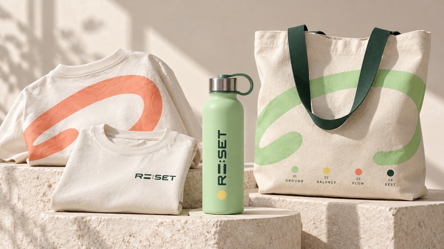
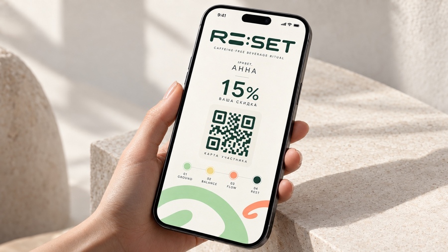
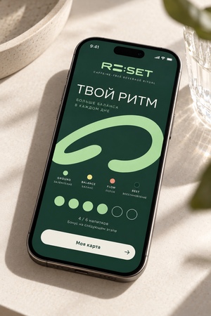
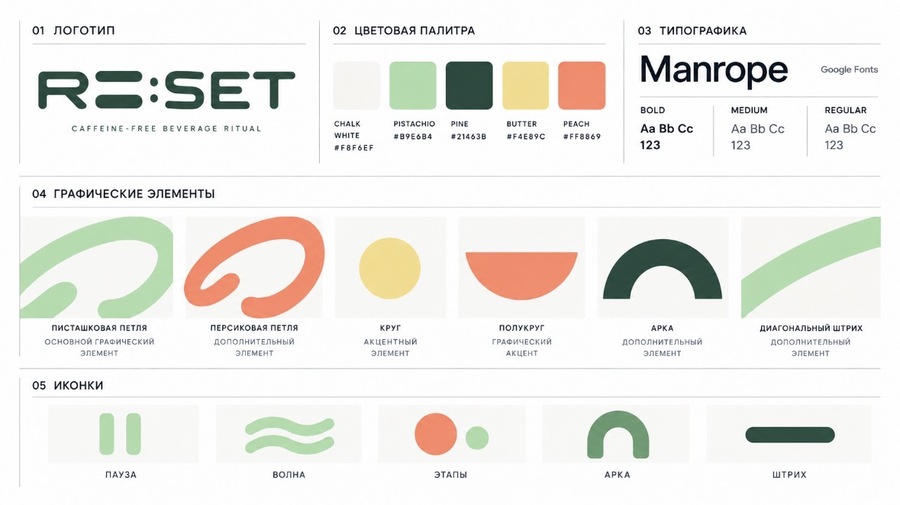
RE: SET — новое переосмысление исходного проекта с более спокойным, современным и минималистичным характером. Название отсылает к идее перезагрузки и постепенного изменения повседневных привычек. В основе бренда остаются четыре этапа — Ground, Balance, Flow и Rest, каждый из которых получил собственный цвет и графический образ.
Новая айдентика строится на мягких геометрических формах, округлой типографике.
RE: SET сохраняет первоначальную идею отказа от зависимости от кофеина, но превращает её в более цельный лайфстайл-бренд, в котором акцент сделан на индивидуальном ритме жизни, балансе и заботе о себе.
I have an old brand called EX-PRESSO, an anti-coffee club that helps people reduce caffeine through a self-awareness test, alternative drinks and four ritual boxes. I’m attaching its description and original designs. I want to completely rebrand it: change the name, logo, colors, fonts and graphics, and remove the cup mascot. Keep the idea of finding a calmer daily rhythm, but make it feel like a modern botanical startup. Let’s call it RE: SET, with four stages: GROUND, BALANCE, FLOW and REST. Create a horizontal identity board with a rounded geometric wordmark, Manrope typography, stage icons and simple shapes like loops, circles and arches. Use ivory F8F6EF, pistachio B9E6B4, dark green 21463B, yellow F4E89C and coral FF8869. For now, show only the new identity, without product mockups.
Apply the RE: SET identity to four closed ritual boxes on light travertine steps. Use pistachio and a loop for GROUND, yellow and a circle for BALANCE, coral and a loop for FLOW, and ivory with a dark-green arch for REST. Keep the approved logo, stage numbers and matte packaging.
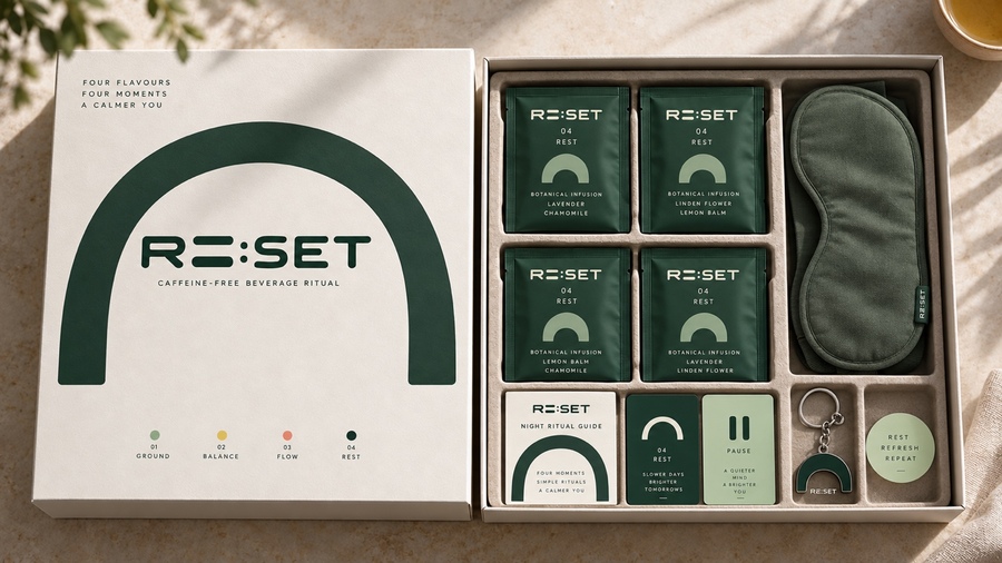
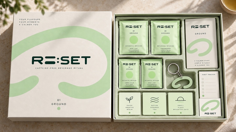
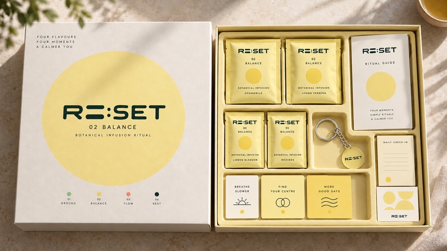
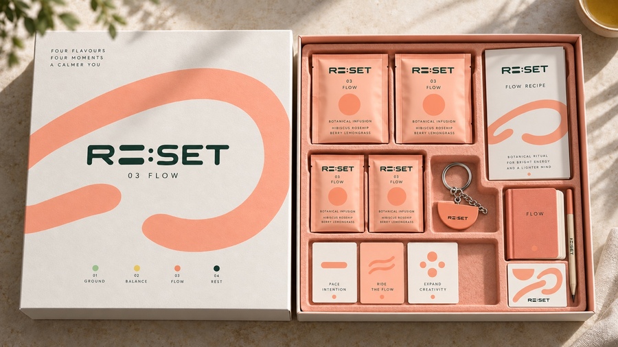
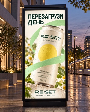
Create four aluminum cans for the RE: SET botanical drinks. Give each can its stage color and symbol: green loop, yellow circle, coral loop and dark-green arch. Place them on travertine steps with herbs nearby and a little condensation on the cans.
Show the same four drinks in clear glass bottles with simple RE: SET labels. Add one short glass with ice next to each. Use pale green, golden, ruby-red and amber liquids, with botanical details and the same warm stone setting.
Let’s make five key visuals for RE: SET. Start with a large billboard on a sunlit city street. Put a calm portrait with closed eyes, the green loop and RE: SET logo on the ad. Add 'RESET YOUR RHYTHM' and 'BOTANICAL ENERGY. ZERO CAFFEINE.'
For the second key visual, place the campaign on the side of a white city bus. Use a large green loop, the RE: SET logo and four stage dots. Add the Russian headline 'ЧЕТЫРЕ ЭТАПА. ОДИН РИТМ.' and keep it readable across the bus windows.