I’m a multidisciplinary designer interested in visual communication, branding and visual identity.
I combine research, conceptual thinking and visual experimentation to create distinctive design solutions. My process is rooted in finding a strong idea
and translating it into a coherent visual language.
Why work with me?
01. Research-driven approach
I look beyond the surface, exploring context, references and ideas to create meaningful design solutions.
02. Conceptual thinking
I focus on developing a strong central idea
and translating it into a distinctive and coherent
visual language.
03. Attention to detail
I carefully consider every element, from typography
and composition to the smallest visual details,
ensuring a thoughtful and consistent result.
What I do?
Brand Identity Development of visual identities and brand systems.Packaging & Merchandise Design of packaging, branded products and merchandise.3D Design Creation of 3D objects, models and visual compositions.Photoshoot Production Concept development, creative direction and production of photoshoots.Jewellery Design Concept development and design of original jewellery pieces.
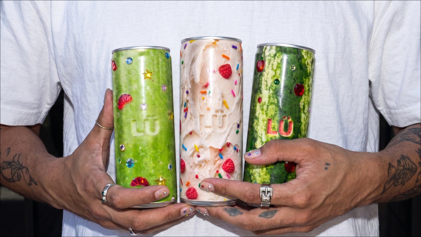
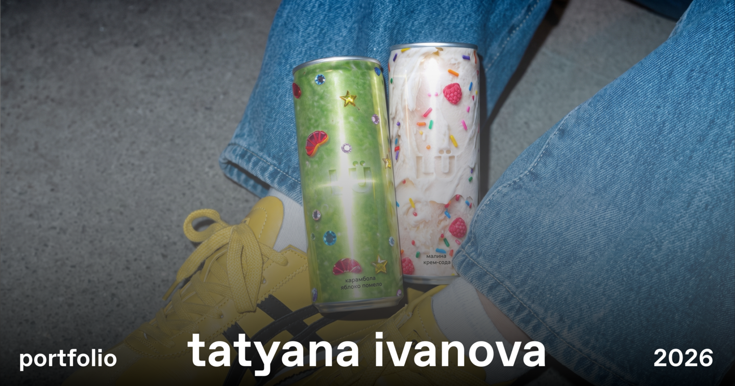
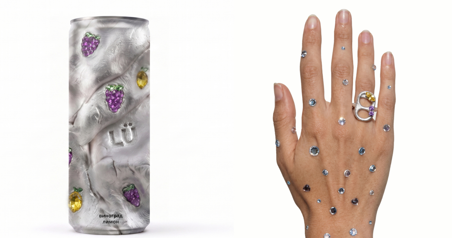
LÜ — A Lemonade Brand for Gen Z
About the Brand
LÜ is a next-generation lemonade brand created
for Gen Z. The sugar-free drink combines unconventional flavour combinations with bold,
eye-catching packaging.
The brand is designed for young consumers who want to refresh themselves while enjoying something sweet and exciting.
Target Audience
The primary audience is Gen Z — young people who value self-expression, individuality and brands that reflect their lifestyle.LÜ aims to build a connection with its audience by sharing their interests, embracing their visual culture and becoming a natural part of their everyday lives.Design Concept
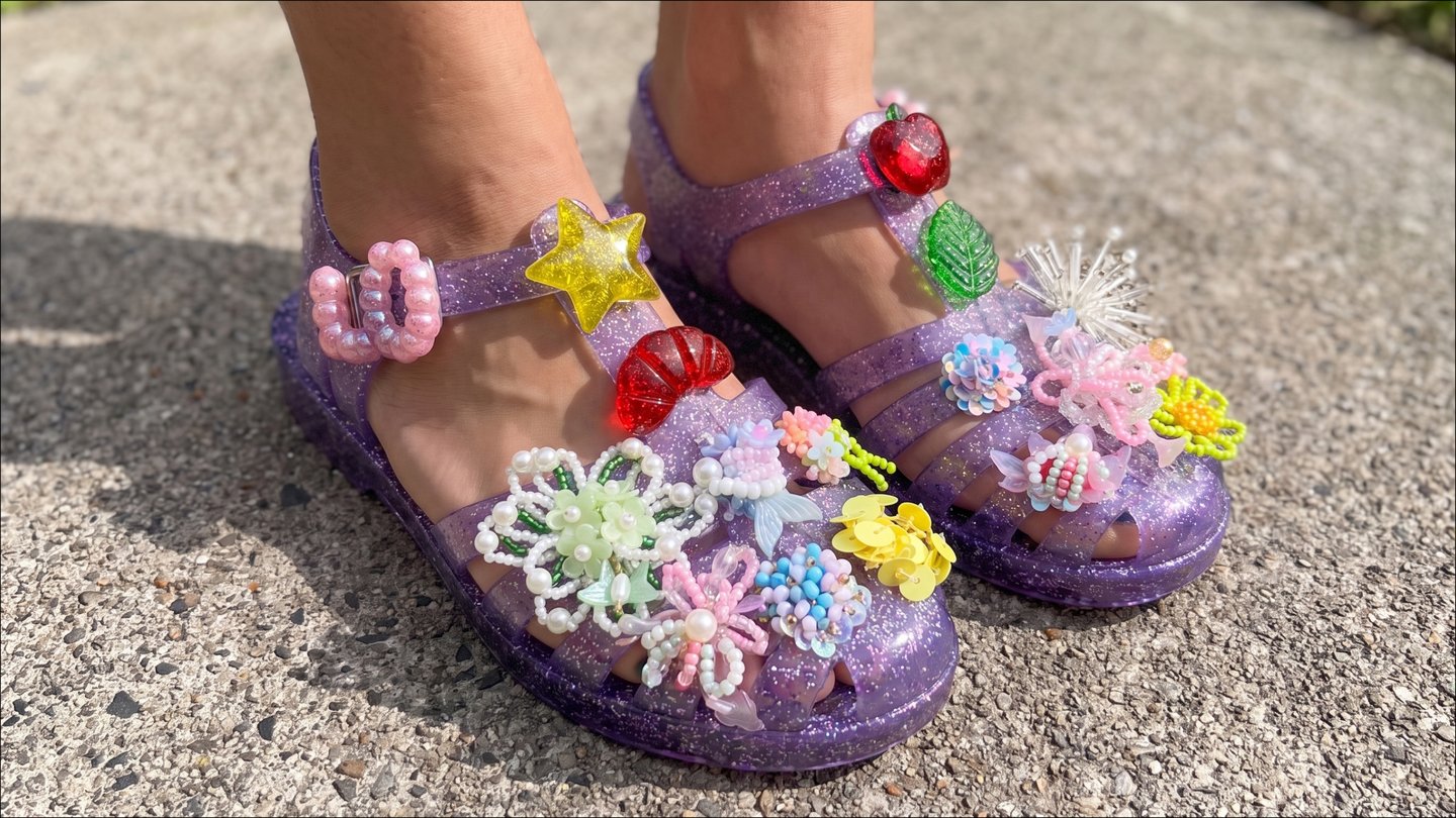
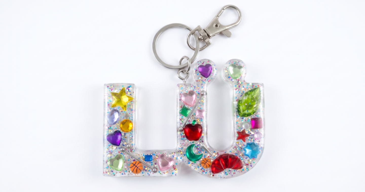
Stickers as a Form of Self-Expression
Gen Z loves personalizing everyday objects with stickers — from laptops and phone cases to clothing
and even makeup.
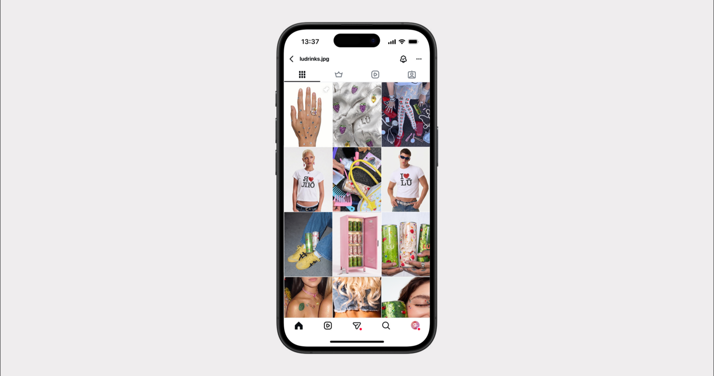
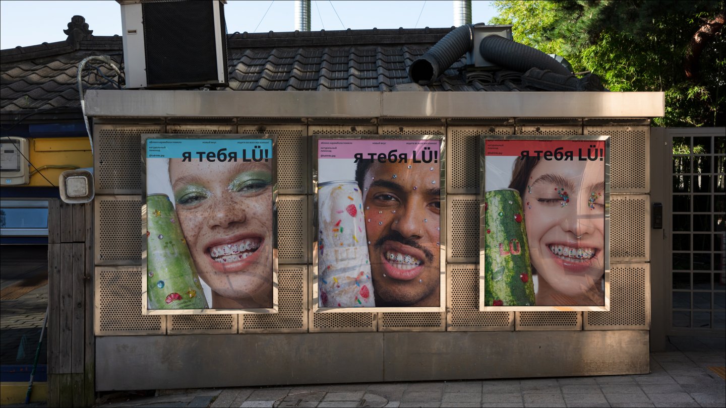
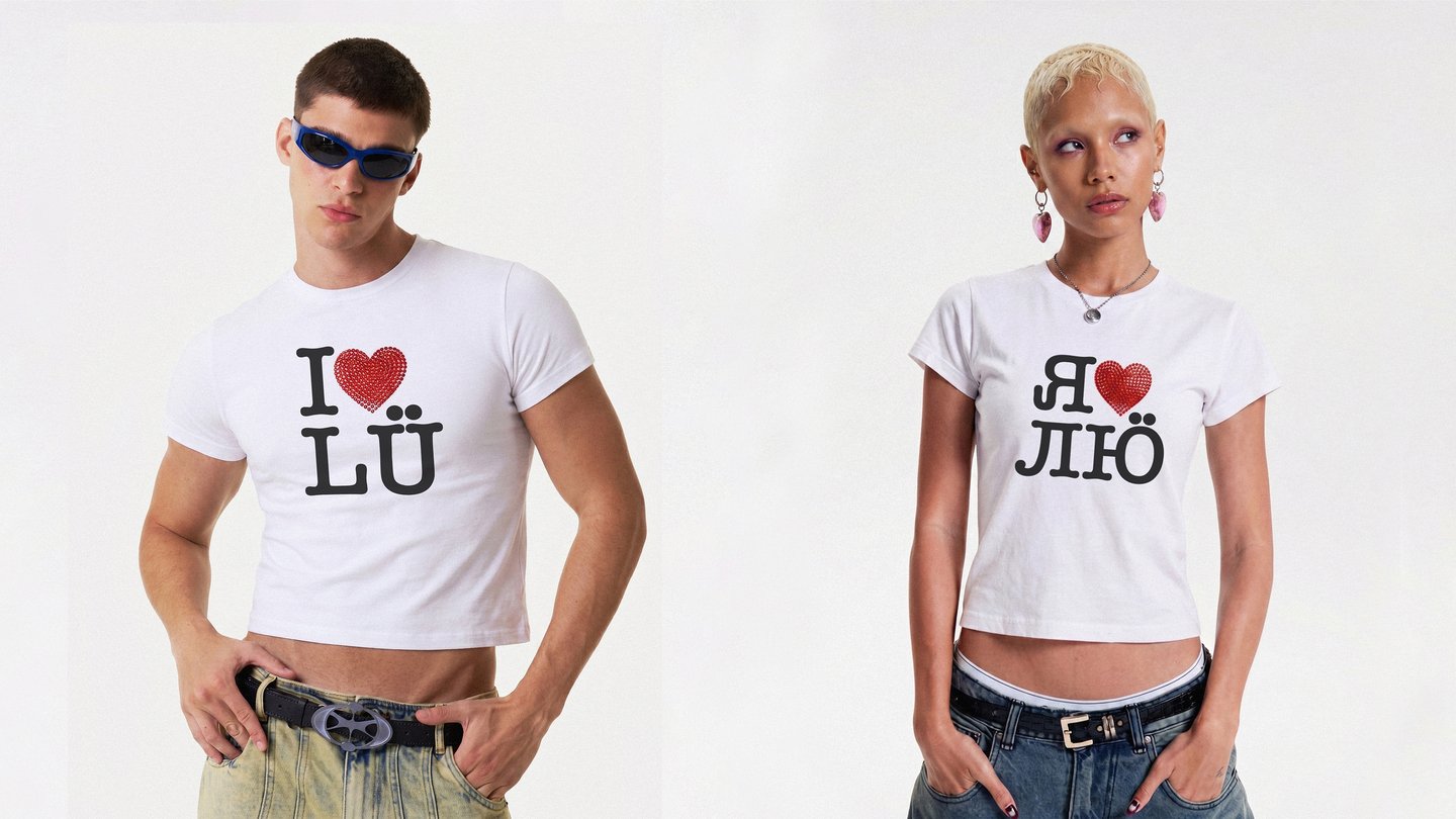
This habit became the foundation of LÜ's visual identity. Inspired by sticker culture, the design uses playful graphics and bold visual elements to create a flexible, expressive brand language that encourages personalization and self-expression.
Kamyshin Watermelon Festival
About the Festival
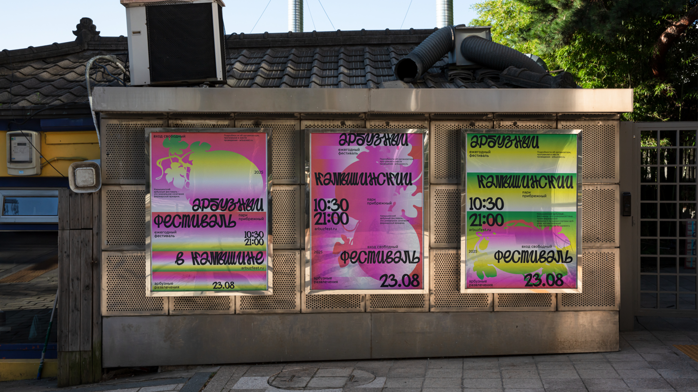
The Kamyshin Watermelon Festival is an annual event held in the city of Kamyshin, Volgograd Region, Russia. Celebrated in late August or early September as part of the city’s birthday festivities, the festival is dedicated to watermelons and local culture.
The Challenge
Despite its long-standing tradition, the festival faces several challenges:01. Low Awareness The festival remains relatively unknown beyond its local audience.02. Outdated Visual Identity Its existing visual presentation lacks a contemporary and recognizable design language.03. Limited Youth Engagement The festival struggles to attract a younger audience and remain relevant to new generations.04. Lack of Visual Consistency The absence of a unified design system creates a sense of visual disorder across festival materials.The Solution
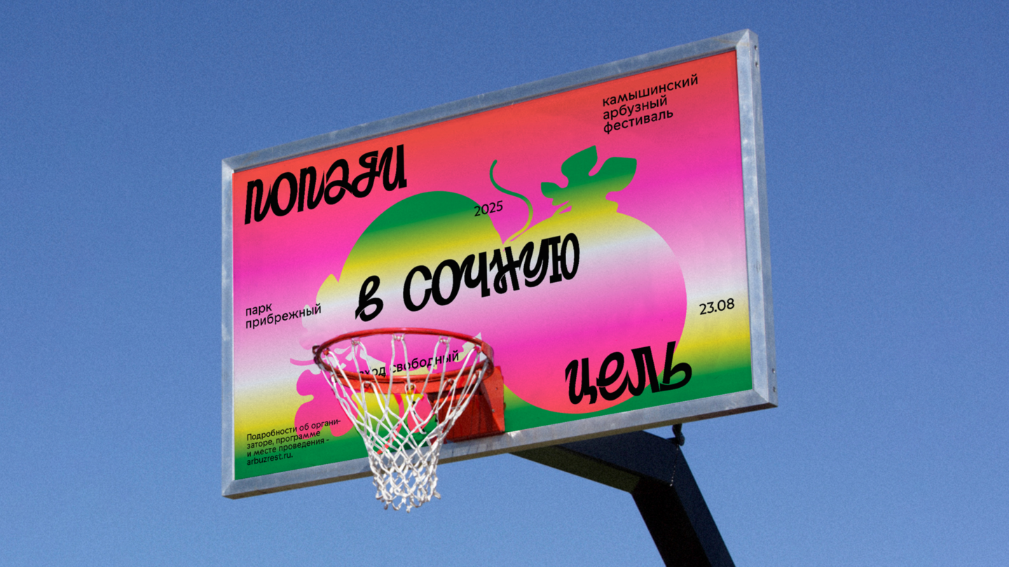
Develop a new visual identity that revitalizes the festival’s image, establishes a consistent communication system and attracts a younger, broader audience.Design Concept
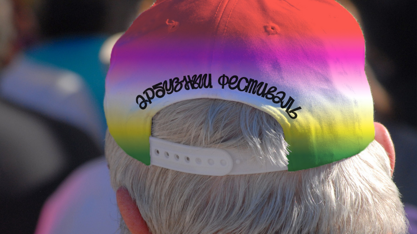
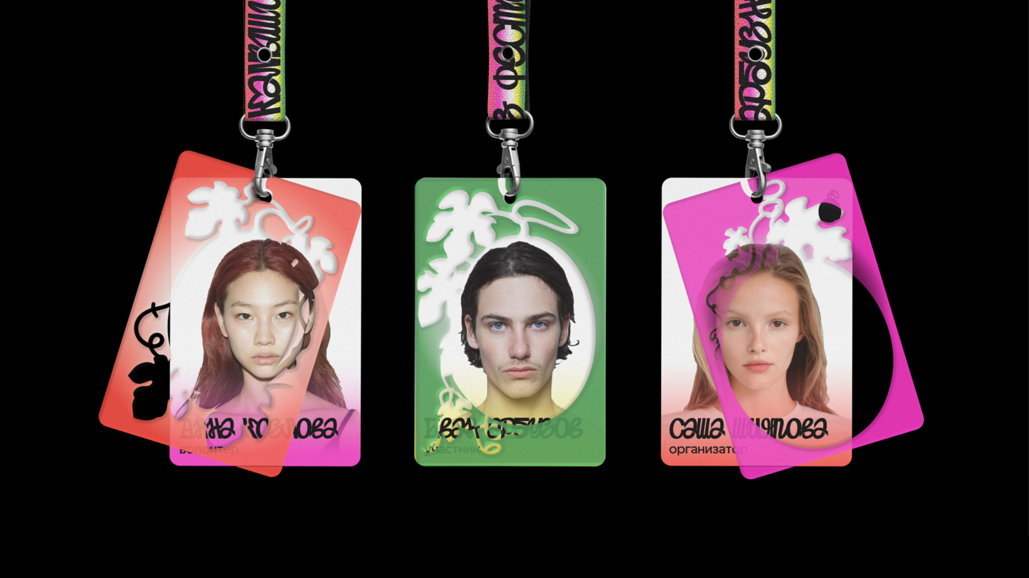
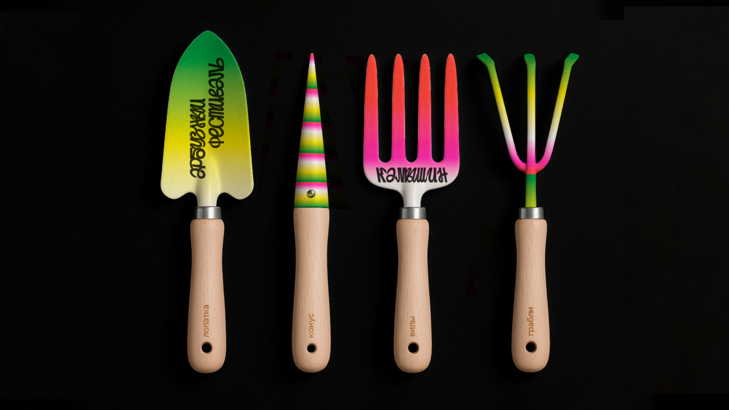
The Stages of Watermelon Ripening
The central design metaphor is based on the natural stages of watermelon ripening. This process becomes the foundation of the visual identity, translating
the transformation of the fruit into a dynamic
visual language.
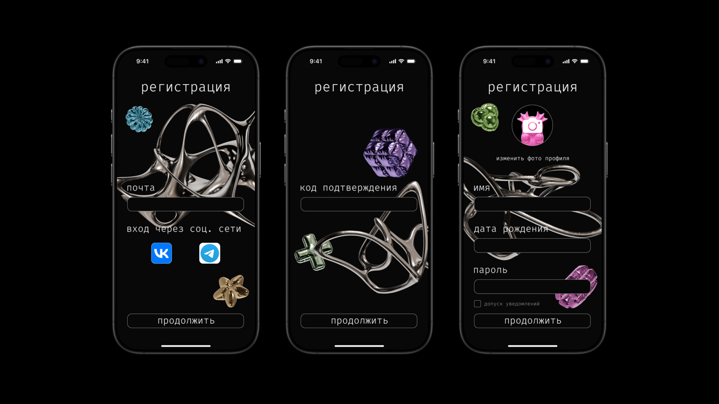
Wishie — A Wishlist Creation App
About the App
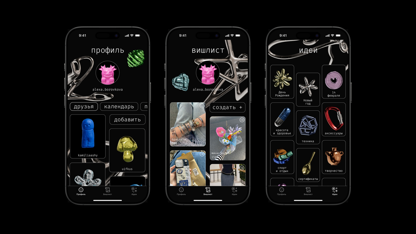
Wishie is a wishlist creation app that brings all your dreams and desires together in one place. It allows users to create and share wishlists with friends and family, making it easier to discover gift ideas and find
the perfect present for any occasion.
The Problem
Finding the right gift can be challenging. It is not always easy to come up with an original idea, especially when you are unfamiliar with someone’s interests, preferences or wishes.The Solution
Create an app where users can collect things they would love to receive for birthdays, holidays and other special occasions. By sharing their wishlists with others, they can make gift-giving more personal and effortless.Design Concept
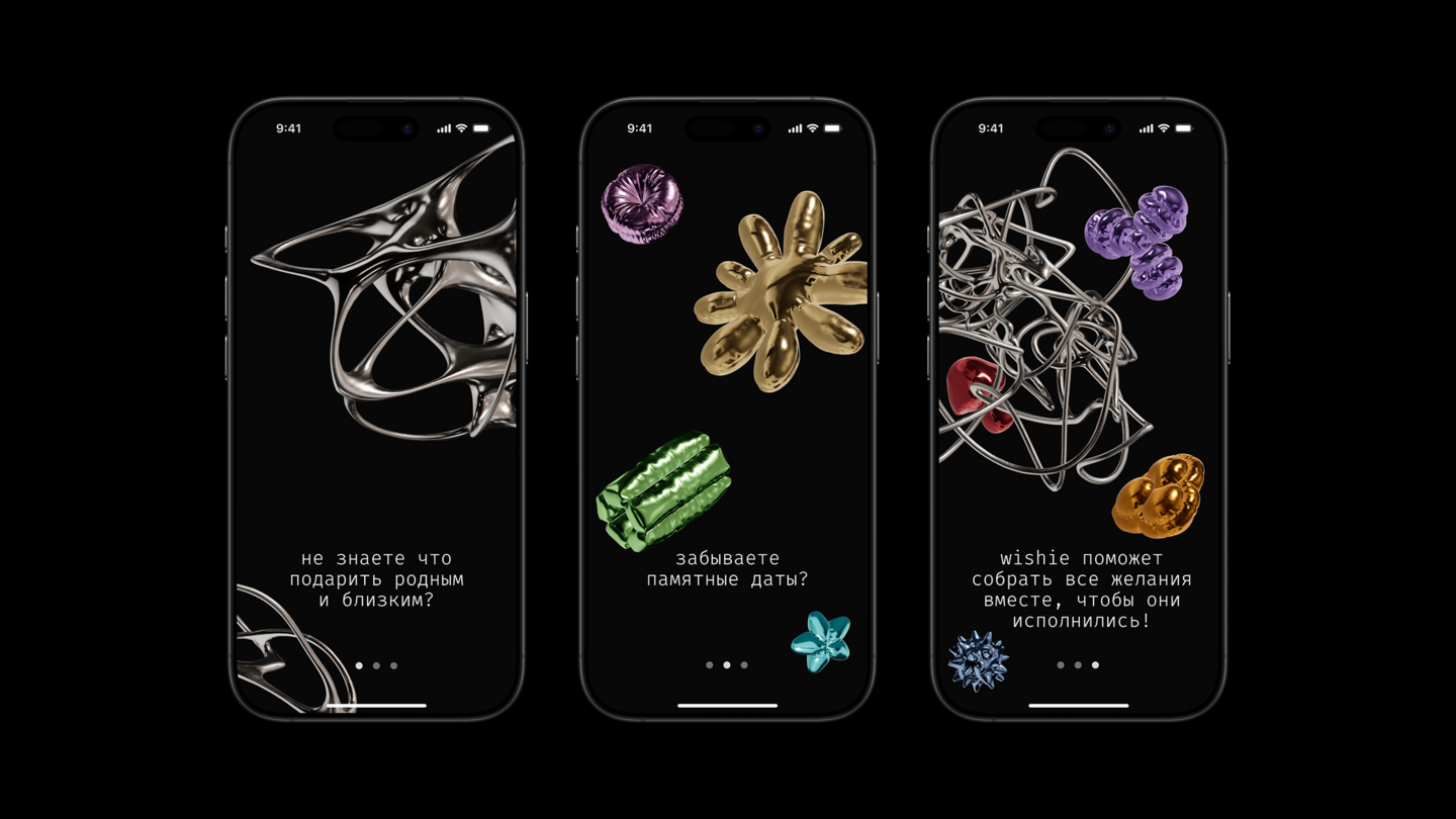
From Overthinking to Inspiration
The visual identity combines two contrasting states: prolonged contemplation, represented by tangled thoughts and uncertainty,
and the sudden emergence of a clear idea.
This contrast reflects the process of searching for the perfect gift —
from confusion and endless possibilities to that one moment when inspiration strikes.
The name Wishie is derived from the English word *wish*, meaning a desire or something one hopes to receive.
Let’s work together!
My contacts:
Email: taevivanova@edu.hse.ru
Telegram: @zha6aklava