INTRODUCTION
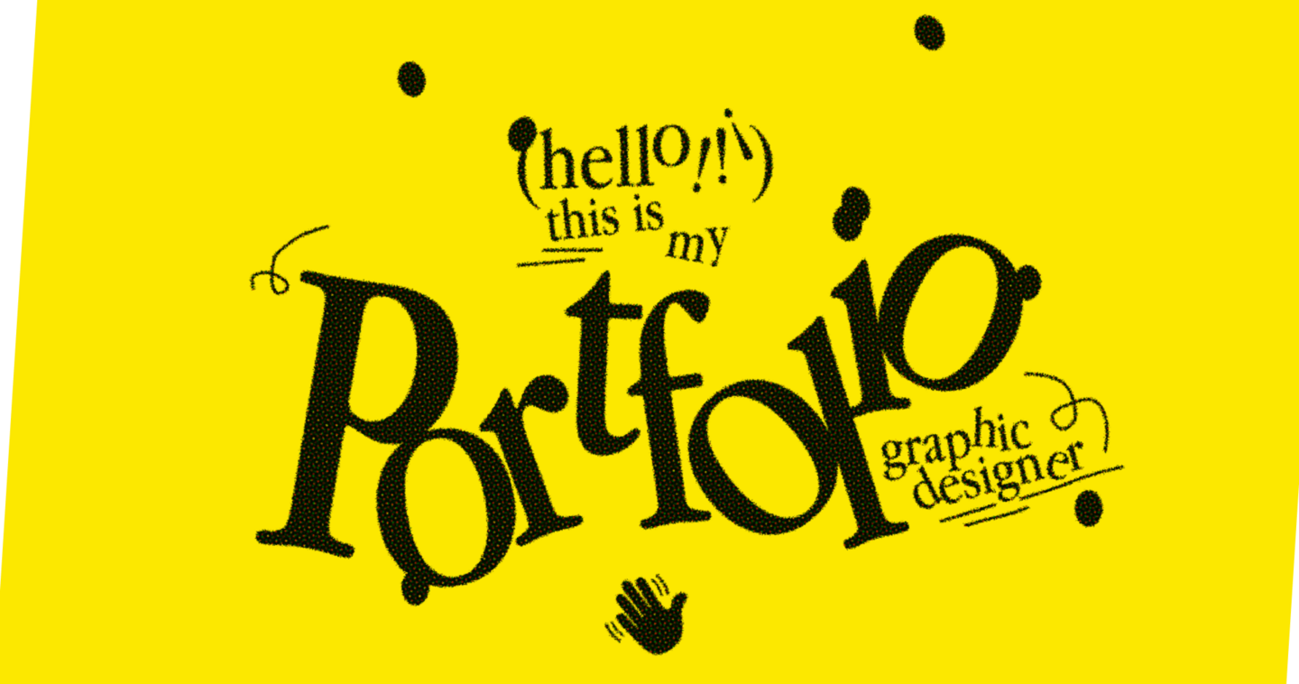
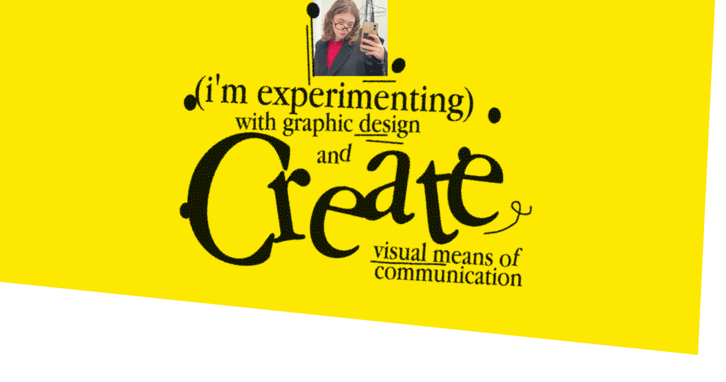
I’m Darya, a 4th-year communication design student at HSE.
For over a year, I’ve been working as part of a multidisciplinary team, creating graphics for exhibitions, forums, and large-scale events.My work includes visual materials for digital media and physical spaces. I adapt designs to different formats, balancing the creative concept with technical requirements and the specific needs of each project.
MY APPROACH
For me, design is a balance between creative exploration and practical thinking.Professional projects have taught me to work within real constraints, collaborate with a team, and pay attention to detail. Academic projects give me the freedom to experiment with typography, materials, and visual ideas.I value both approaches: exploring new possibilities and finding ways to turn ideas into practical solutions.
PROFESSIONAL PROJECTS
Exhibition Graphics · Digital & Multimedia
(1) Forum on Future Technologies ● 2026
Moscow Stand
THE BRIEF
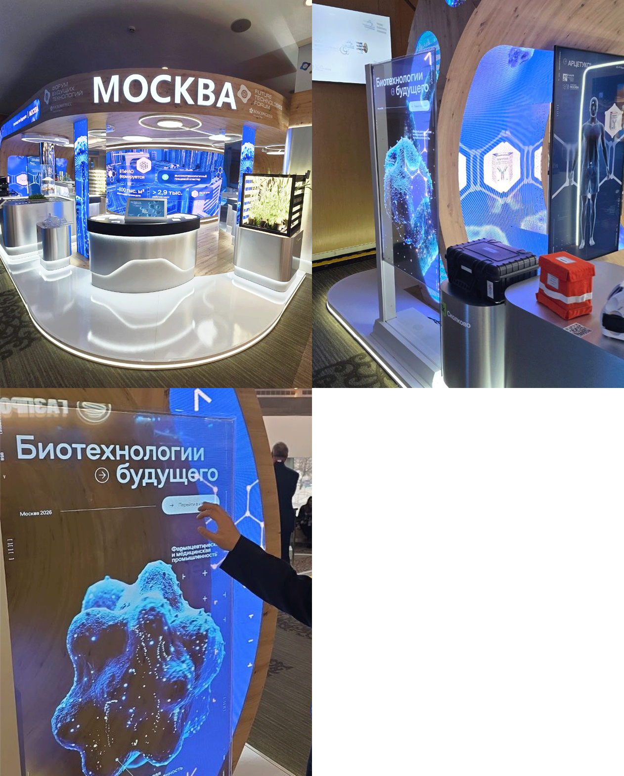
Moscow’s booth at the Future Technologies Forum showcased biotechnology developments from participating companies. The goal was to make complex technologies accessible and engaging for visitors.THE CONCEPT
The exhibition combined multimedia content and interactive installations to make complex technologies easier to explore and understand.MY ROLE
Working under the art director, I developed graphic materials for the exhibition, including a client presentation, catalogue cards, and still frames for video content.THE OUTCOME
The completed exhibition presented biotechnology through interactive and multimedia installations.
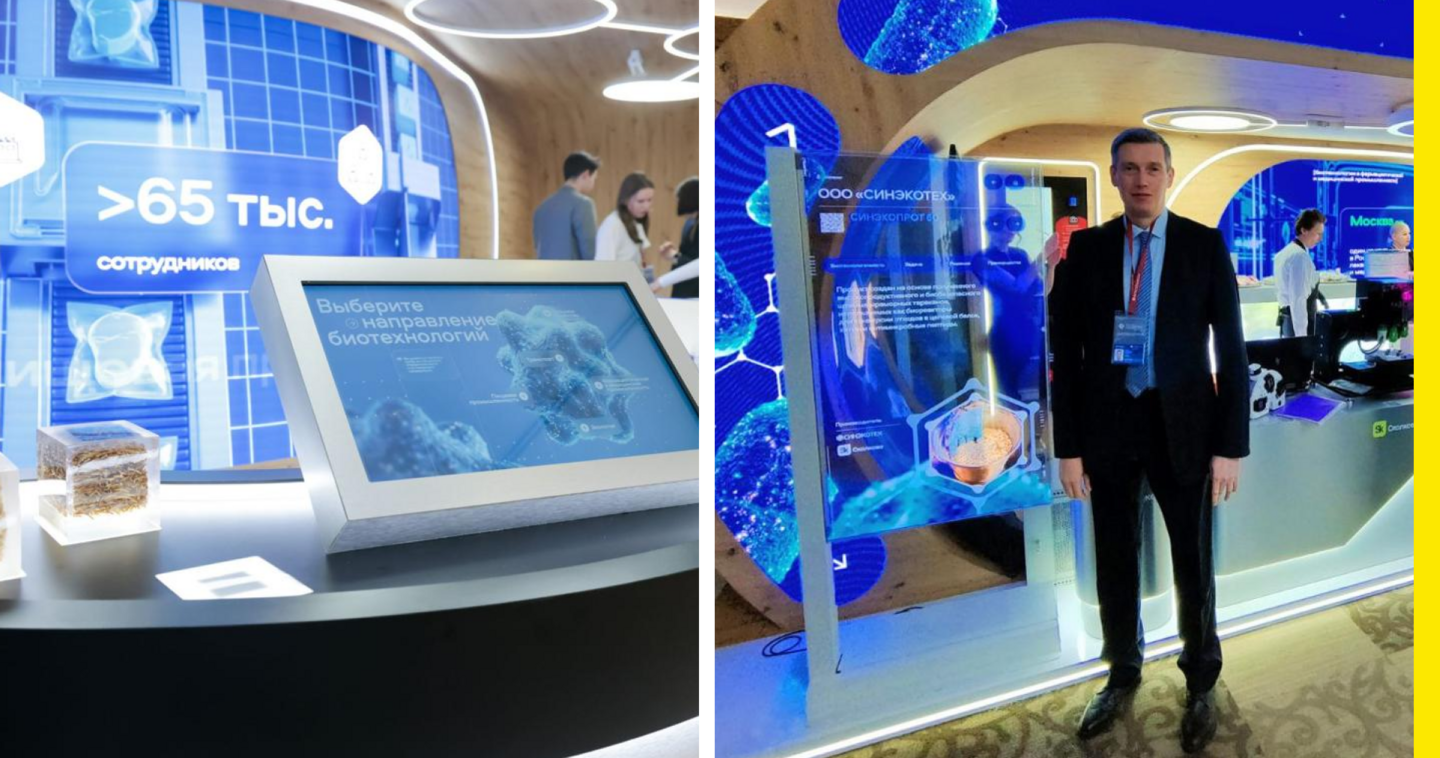
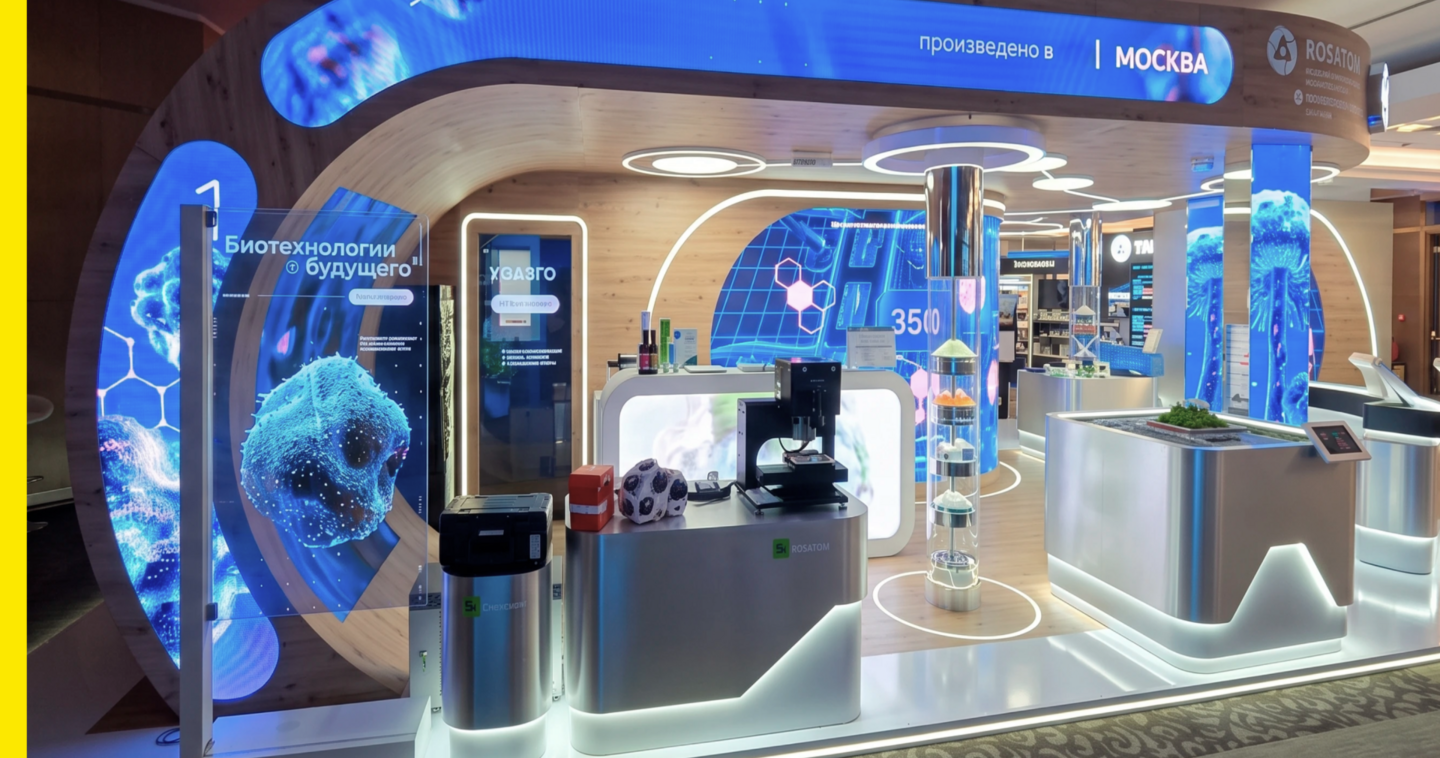
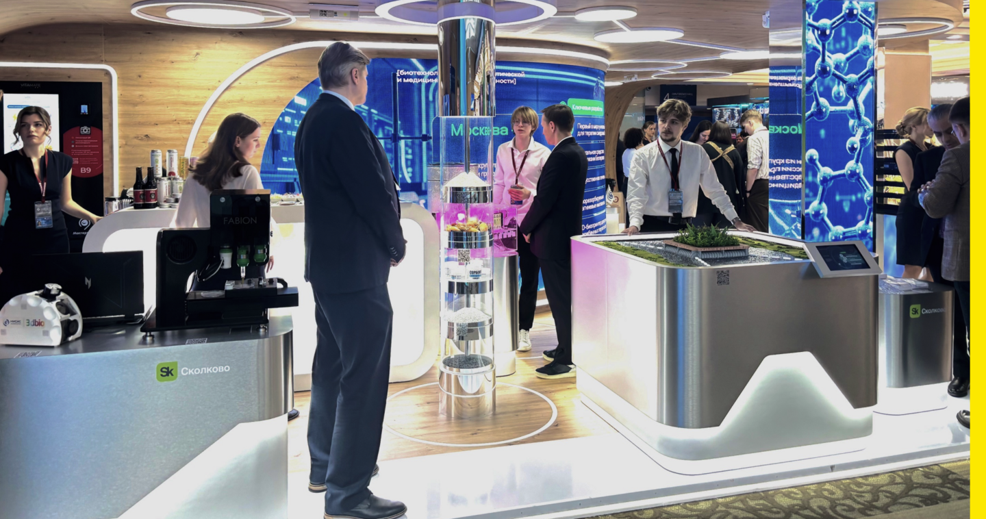
Project photographs shared by the team
Event Graphics · Digital & Multimedia
(2) Bee Techno ● 2026
Beeline Business × Vedomosti
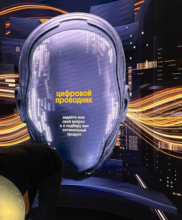
THE BRIEF
Bee Techno 2026 brought together business and technology professionals to discuss digital innovation. The task was to create consistent visual communication across the event space and digital formats.THE CONCEPT
The event’s visual design was based on Beeline’s existing brand identity, adapted for the conference through graphic elements, patterns, and multimedia content.MY ROLE
Working under the art director, I designed speaker cards, created still frames for video content, and developed a linear graphic pattern for the event’s walls.THE OUTCOME
The event’s brand identity was adapted across digital content and the physical venue.
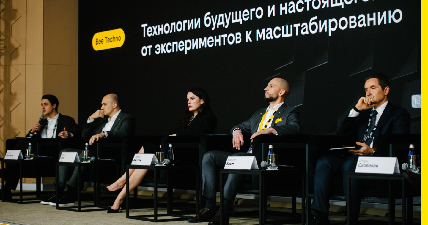
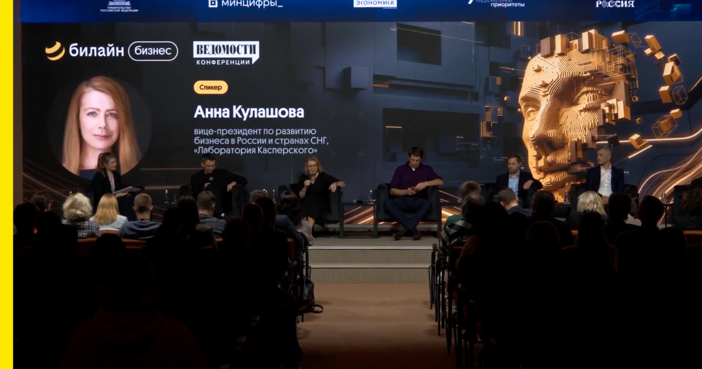
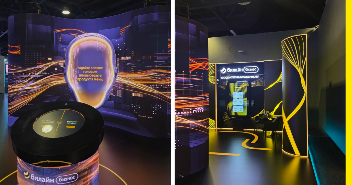
Project photographs shared by the team
Exhibition Graphics · Digital & Multimedia
(3) SPIEF ● 2026
Republic of Tatarstan Stand
THE BRIEF
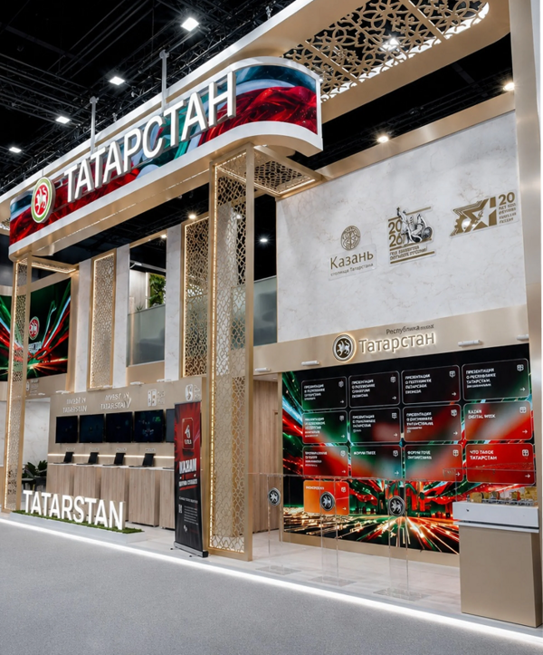
Tatarstan’s stand at SPIEF 2026 presented the region’s economic, industrial, and cultural achievements to an international business audience.THE CONCEPT
The exhibition combined traditional Tatar ornaments with contemporary technology, highlighting the connection between cultural heritage and innovation.MY ROLE
Working under the art director, I created graphics for official signing ceremonies and designed multilingual presentations, adapting layouts for different languages.THE OUTCOME
The completed stand presented the region through exhibitions, multimedia displays, and business events.
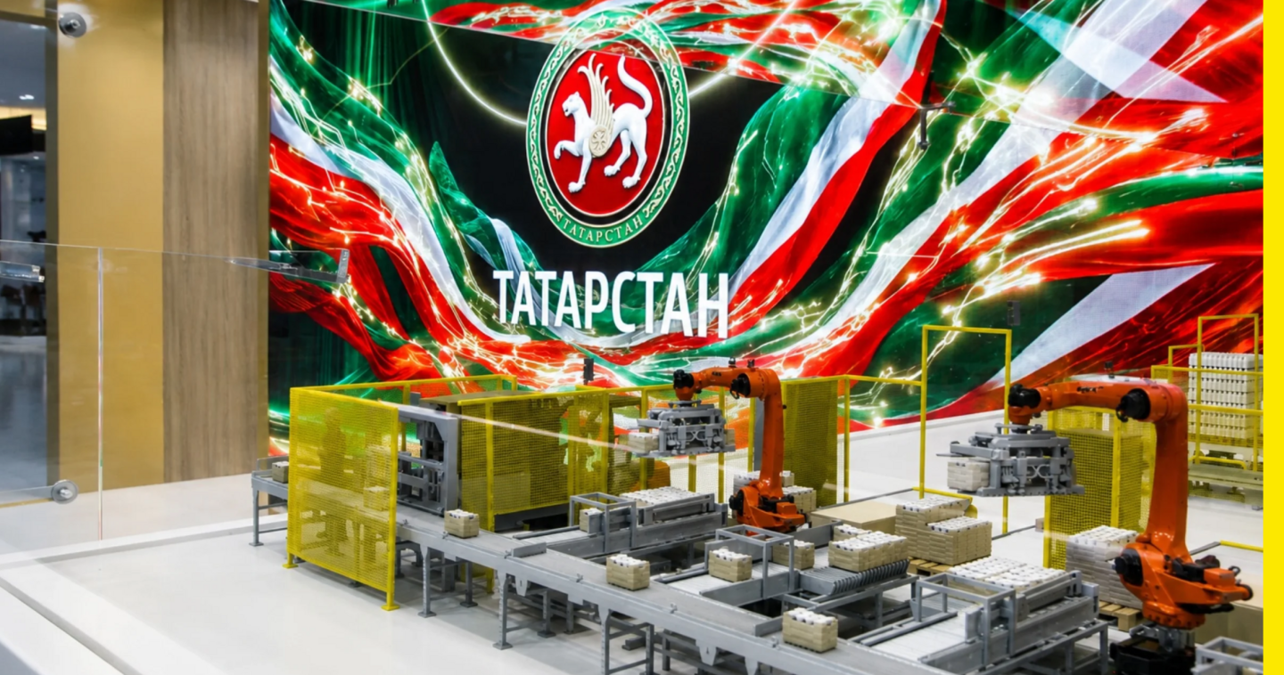
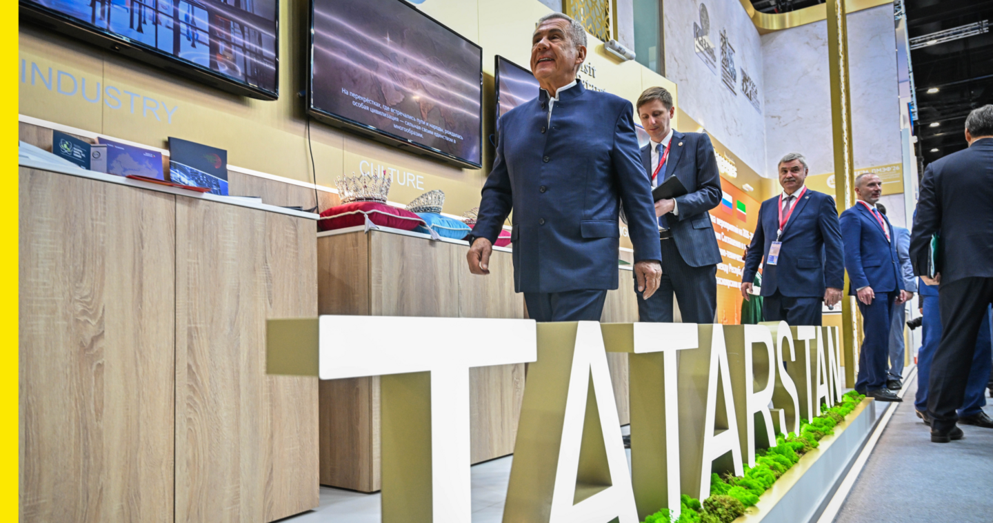
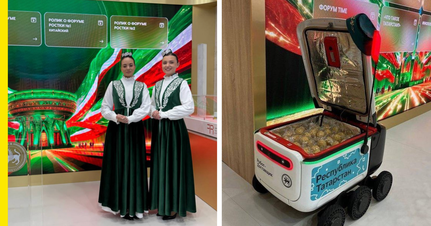
Project photographs shared by the team
ACADEMIC PROJECTS
Brand Identity · Digital Design
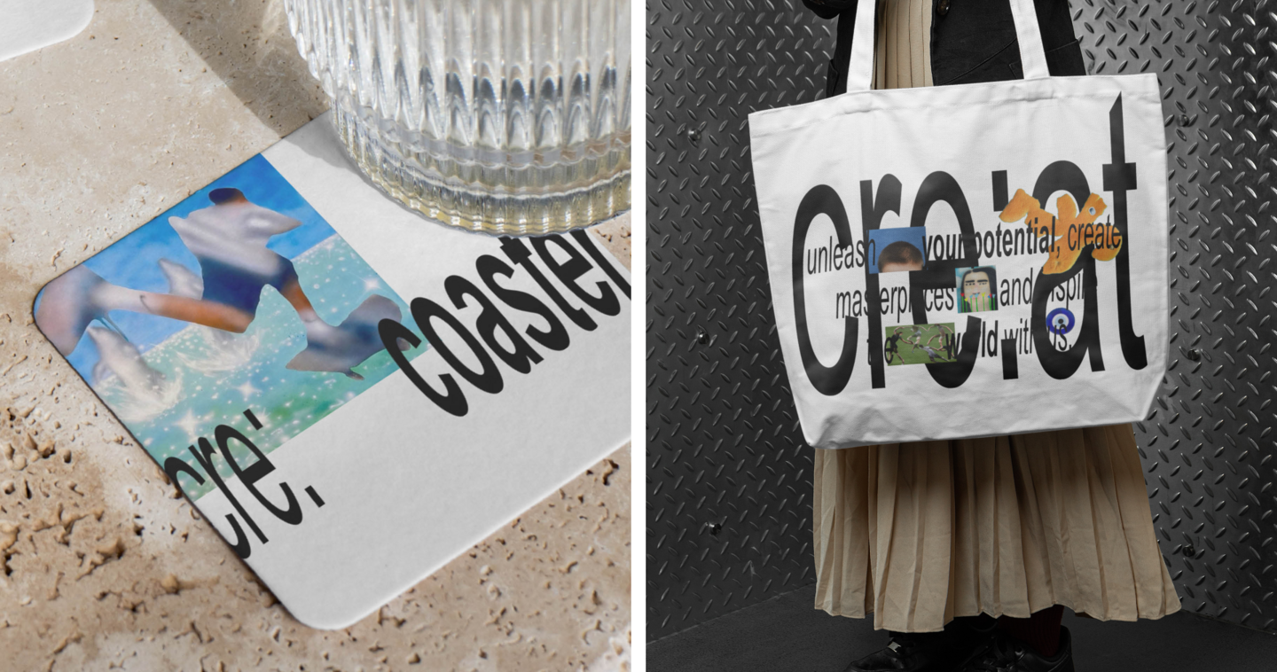
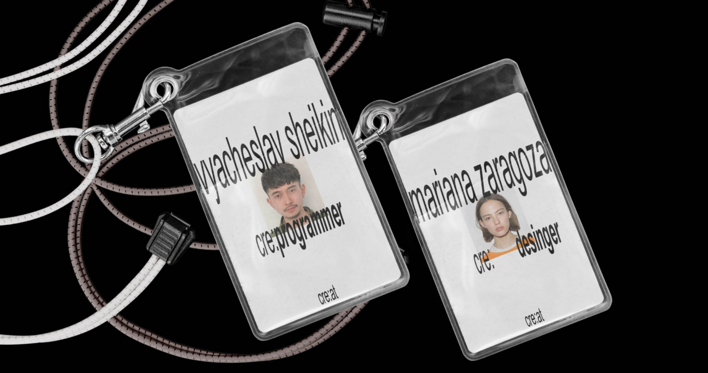
(1) Cre: at ● 2023
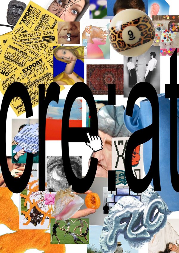
THE BRIEF
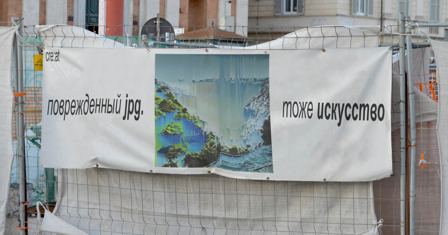
The task was to develop a visual identity for a creative platform that helps people share ideas, find inspiration, and connect with like-minded individuals.THE CONCEPT
The identity reflects the spontaneous and experimental nature of creativity through expressive typography, playful compositions, and a flexible graphic system.MY ROLE
I developed the brand identity, designed its applications across different media, and created a platform prototype to demonstrate the visual system in a digital environment.THE OUTCOME
A cohesive visual identity applied across digital and physical formats, including a prototype of the platform.
Packaging Design · Illustration
(2) Aquarium ● 2026
THE BRIEF
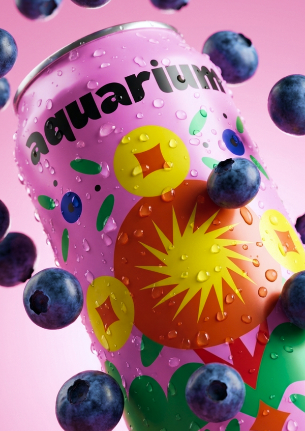
The task was to develop a distinctive packaging identity for a conceptual craft beer brand from Nizhny Novgorod, drawing on the region’s cultural heritage.THE CONCEPT
Inspired by traditional Gorodets painting, the packaging reinterprets decorative motifs through bold colours, symmetrical compositions, and contemporary illustrations.MY ROLE
I developed the brand concept, created the illustrations, and designed a series of beer cans, adapting the visual identity to six different flavours.THE OUTCOME
A cohesive packaging collection featuring six variations, each with its own colour palette and visual character.
Typography · Type Design · Cyrillic & Latin
(3) Shapito typeface ● 2025

THE BRIEF
The task was to develop an expressive display typeface with a distinctive character for headlines and large-scale typographic compositions.THE CONCEPT
Inspired by the expressive movements of street theatre, Shapito is a playful, slightly rebellious display sans-serif that captures its lively and open spirit.MY ROLE
I designed the typeface, developing its letterforms, proportions, and character sets for both Cyrillic and Latin alphabets.THE OUTCOME
A display sans-serif typeface with uppercase and lowercase characters, applied across posters and graphic compositions.