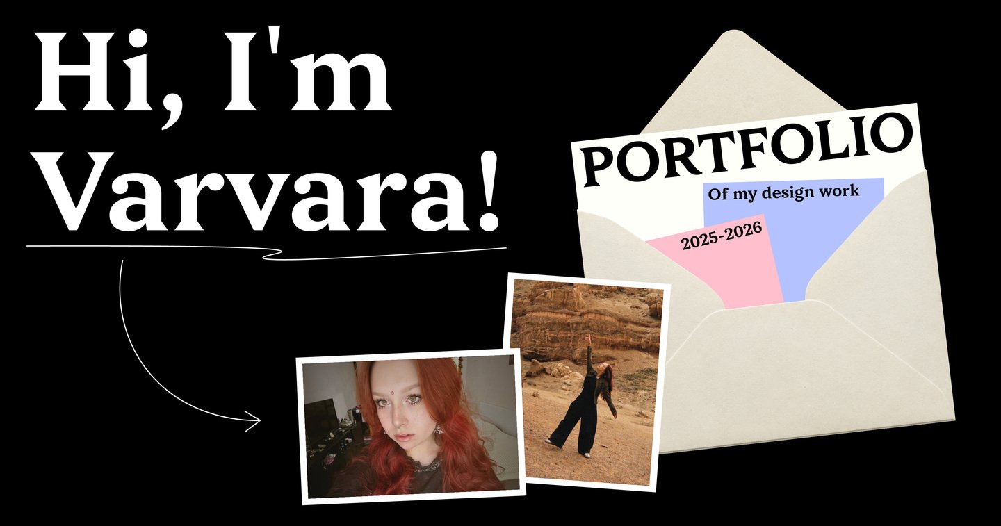
I’m a communication designer in my final year at the HSE Art and Design School.
I create brand identities, typefaces, books, motion and anything else that helps ideas take visual form.
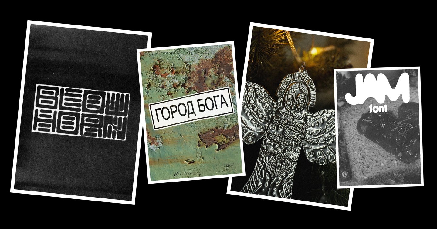
Most of my projects don’t start from a blank page. They start from personal stories: trips, chance finds, photographs and questions I can’t stop thinking about.
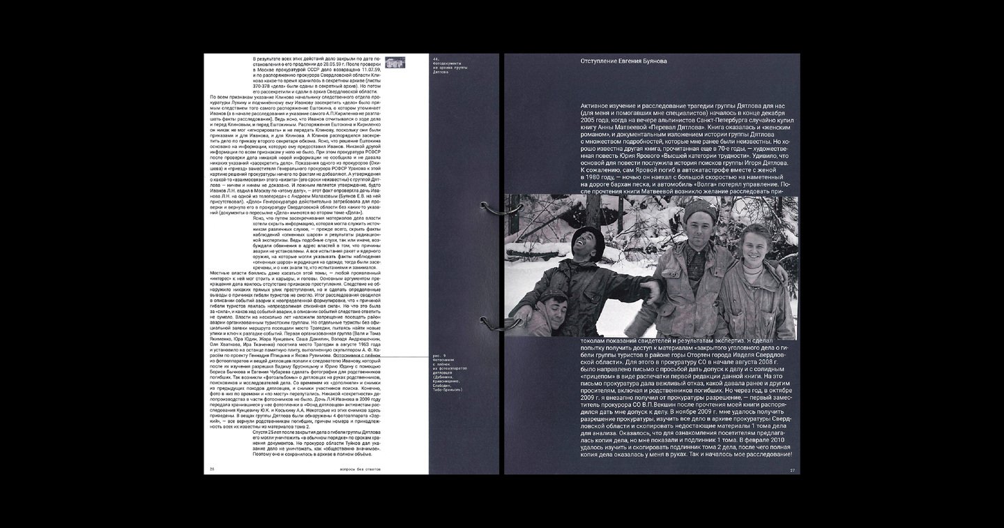
What I value most in design is sincerity.
I don’t just want to make things look good. I want to find what’s real behind every story and put it into visual language.
Tools: Figma, Illustrator, InDesign, Photoshop, After Effects, Blender, FontLab, Media Encoder.
I’m drawn to projects in travel, culture, media and events. I especially love brands with character, a story of their own, and people who truly care about what they do.
I can design a brand identity, a typeface, a book, merch or motion graphics. I love diving into context, experimenting with formats and finding solutions that don’t just look good but actually work.
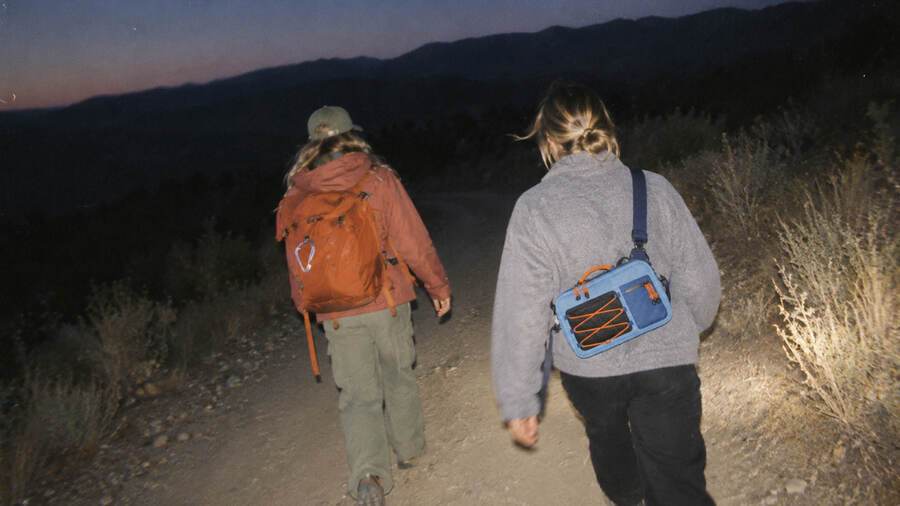
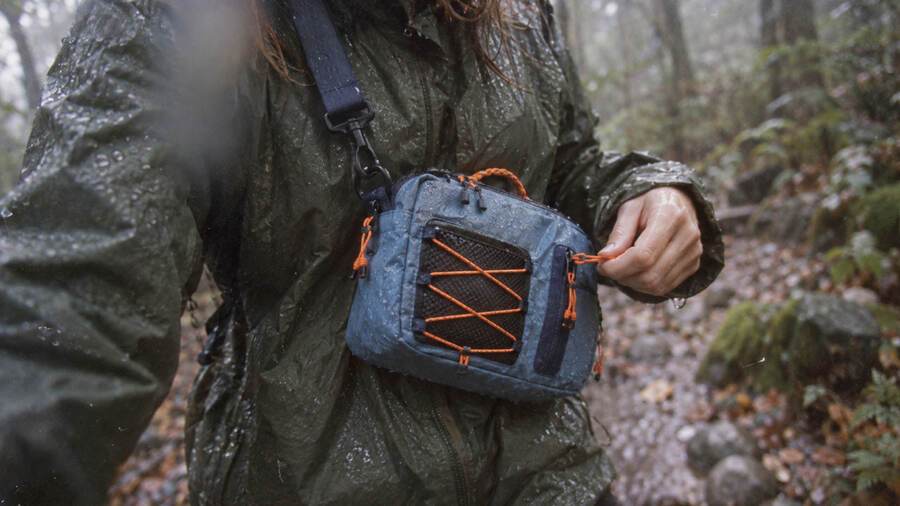
A travel organizer bag designed for the «Well, Just Stay Home» project
Brand identity for a travel company
When a brand feels personal
I’ve travelled with Fat Bus several times myself, and I know the people behind it. Their approach, the atmosphere of their trips and their love of adventure are close to me. So when I got the chance to choose a brand to rebrand, I thought of them right away.
I wanted to move away from the usual visual language of travel companies — mountains, planes and picture-perfect postcards — and capture the character of the journey itself.
The journey as part of the logo
I designed a logo whose letters are built from the outlines of natural landscapes: rivers, coastlines and fields that look like satellite images.
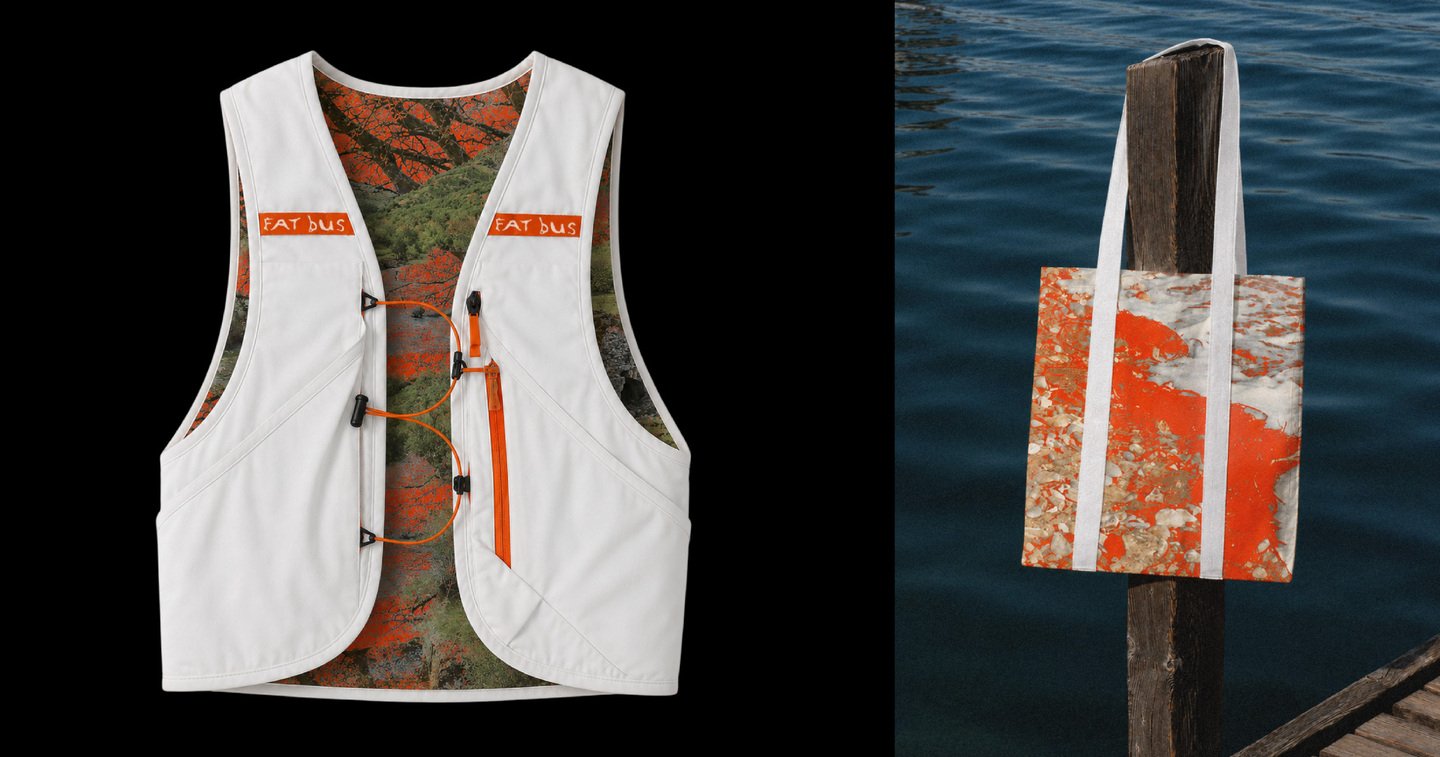
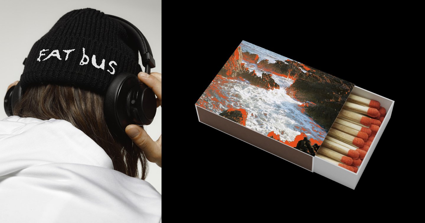
This idea became the foundation of the identity, which I developed across destination posters, tour schedules, promotional materials and merch.