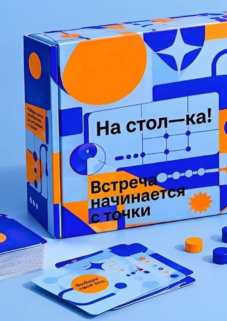
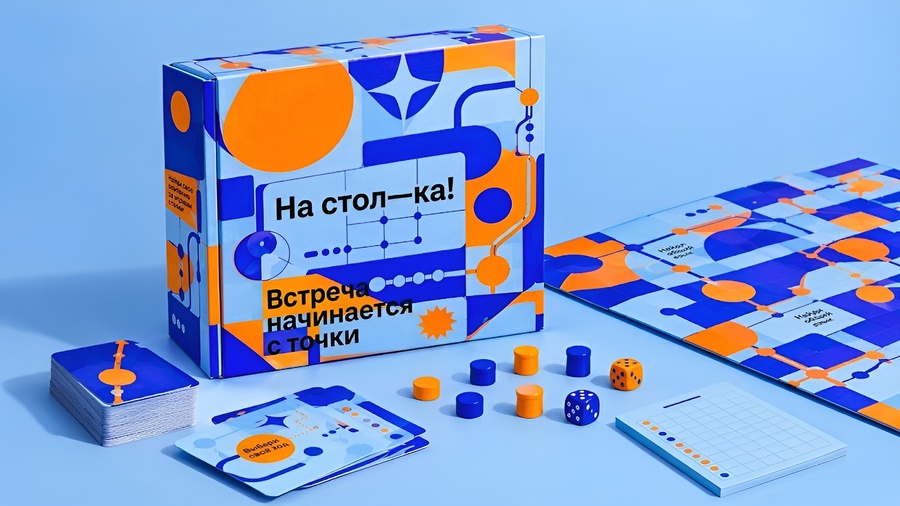
(1)
продукт
было: «На стол—ка!» —летний фестиваль настольных игр. Место для тех, кто хочет отдохнуть от обыденности. Учит быстро находить людей по интересам в большом городе, осуществлять фантазии и мыслить шире.стало: «На стол—ка!» — сеть городских игровых пространств, в которых люди могут играть в настольные игры, знакомиться и проводить время вместе.
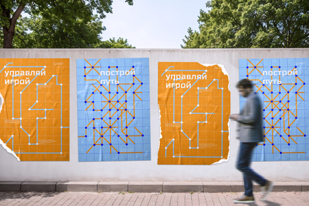
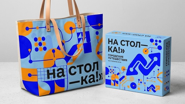
Слева — фирменный стиль старого проекта Справа — новый продукт (2)
кейвизы
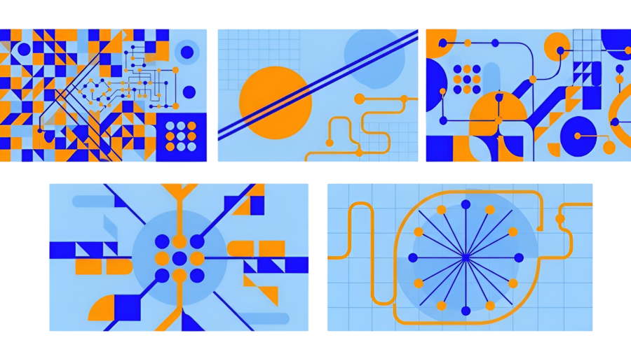
геометрические паттерны, игровые схемы, маршруты, сетки и точки, абстрактные фигуры, (3-7)
мерч
(8)
(9-10)
(11)
пространство
(12)
промо-материалы
(13)
айдентика
(14)
описание процессов производства изображений
(1) (TYPOGRAPHY AND TEXT — CRITICAL REQUIREMENT:
Text is an essential part of the design, not an optional detail. Do not omit typography, leave blank spaces, or create packaging covered only with abstract graphics. The final image must contain clearly visible, readable Russian text integrated into the graphic identity.
Use the original «На стол—ка!» poster series as the main reference for typography, text placement, visual rhythm, and graphic composition. Preserve the established visual language: bold geometric layouts, oversized headings, contrasting text blocks, bright sky blue (
9FCFFF), saturated orange (
FF9700), and electric blue (#0605FF). Use a bold, condensed, contemporary sans-serif typeface similar in character to TT Supermolot Neue Trl. Typography should feel like a natural continuation of the original posters, not a generic commercial font treatment.EXACT BRAND NAME: «На стол—ка!» — write it in Russian, with the exact spelling and punctuation. Make the brand name clearly visible on the front of the box.
USE THESE EXACT RUSSIAN HEADLINES AND SUPPORTING TEXT AS DESIGN REFERENCES:
1. «Встреча начинается с точки»
2. Supporting text: «Найди свою компанию за игровым столом»
3. «Собери свою компанию»
4. Supporting text: «Здесь легко найти общий язык»
5. «Выбери свой ход»
6. Supporting text: «Твой следующий ход может изменить вечер»
7. «Выйди из привычного»
8. Supporting text: «Поменяй привычный сценарий вечера»
9. «Город становится игровым полем»
10. Supporting text: «Открывай новые места. Знакомься. Играй»
Choose one headline and its matching supporting text for the main packaging design. You may distribute short phrases across the cards and other game components, but do not crowd every surface with text. Maintain a clear hierarchy: a prominent headline, the brand name, and a smaller supporting line. The text should be large enough to read at a glance.
TEXT PLACEMENT: Integrate the typography directly into the printed packaging and game components. Use oversized headlines on the front panel, smaller supporting text on the side panel, and short phrases on selected cards. Let text interact with the grid, lines, circles, routes, and dots, just as it would in a well-designed event poster. Preserve readable letterforms, sufficient contrast, clean spacing, and deliberate alignment.
LANGUAGE AND ACCURAC: All visible wording must be in Russian. Reproduce the provided phrases exactly. Do not translate them into English, invent additional slogans, use random characters, or generate pseudo-text. Do not replace typography with empty rectangles or abstract symbols. Prioritize legibility over decorative effects. If necessary, use fewer words but reproduce the selected headline and brand name correctly.(2) Create a bold, large-scale brand identity showcase for «На стол—ка!» using the established logo, graphic style, and colors: sky blue
9FCFFF, orange
FF9700, and electric blue #0605FF.Focus on one or two statement merchandise items, such as an oversized tote bag and a board-game box. Make them visually striking and distinctive, with large-scale typography, geometric shapes, playful routes, circles, grids, and contrasting color blocks. Use the brand graphics boldly across the surfaces, experimenting with scale, cropping, and composition.
The objects should feel like collectible design products, not generic promotional merchandise. Create a strong visual concept with expressive graphics, interesting material details, and confident use of negative space. Keep the identity consistent and recognizable.
Present the items in a realistic editorial product photograph with dramatic composition, clean lighting, and a simple background that complements the brand palette. Make the merchandise the main focus, filling most of the frame.
Professional art direction, contemporary urban aesthetic, high-quality materials, crisp graphic details. No extra objects, no crowded layouts, no unrelated graphics, no invented logos. Preserve the existing brand identity.
(3-7) Create 5 distinct graphic key visuals for the brand «На стол—ка!», inspired by the attached reference image. Each visual must have a different composition, not five variations of the same layout.
Preserve the palette: sky blue
9FCFFF, orange
FF9700, electric blue #0605FF. Experiment with color proportions, scale, placement, and contrast. Combine oversized circles, geometric blocks, grids, intersecting lines, playful routes, connected dots, and modular shapes inspired by board games and urban navigation.Make each composition visually unique: vary the dominant color, use different scales of shapes, explore dense and spacious layouts, asymmetry, cropping, and overlapping forms. Keep all five visually cohesive as one brand identity.
Flat vector style, crisp edges, bold geometry, high contrast, modern playful urban aesthetic.
Output: 5 separate horizontal visuals, 1920 × 1080 px each. No text, letters, numbers, logos, typography, mockups, photographs, 3D, gradients, or unnecessary decoration.
(8) Create a stylish merchandise collection for the brand «На стол—ка!». Arrange four items together in a single composition: a T-shirt, a baseball cap, colorful wristbands, and a pair of socks.
Use the brand’s established visual identity and color palette: sky blue
9FCFFF, orange
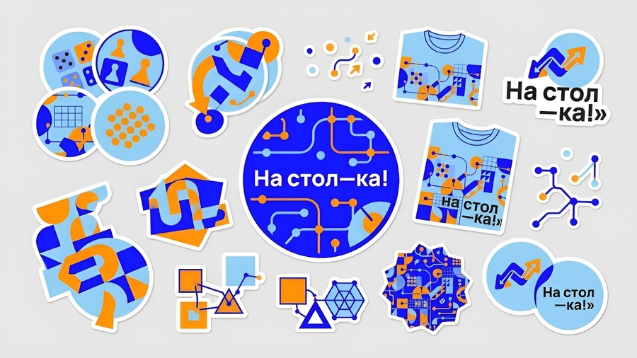
FF9700, and electric blue #0605FF. Apply bold geometric graphics, playful routes, circles, grids, and modular shapes inspired by board games and urban navigation.(9) Create a collection of branded stickers for «На стол—ка!» using the established visual identity and color palette: sky blue9FCFFF, orange
FF9700, and electric blue #0605FF.Design a variety of bold, playful stickers in different shapes and sizes: circles, irregular cut-out shapes, geometric symbols, connected dots, route lines, grids, abstract board-game elements, and expressive graphic patterns. Include a few stickers featuring the brand name «На стол—ка!» in bold, distinctive typography.
Experiment with scale, color combinations, overlapping shapes, and asymmetrical compositions. Make each sticker unique while keeping the entire collection visually cohesive, modern, youthful, and urban.
Arrange the stickers together as a neat, visually striking collection on a clean, light background. Show every sticker clearly, with realistic die-cut edges, a subtle white border, and a matte vinyl finish.
Top-down product photography, crisp details, professional graphic design, vibrant colors, high-quality merchandise presentation. No unnecessary objects, no clutter, no unrelated graphics. Preserve the brand identity.
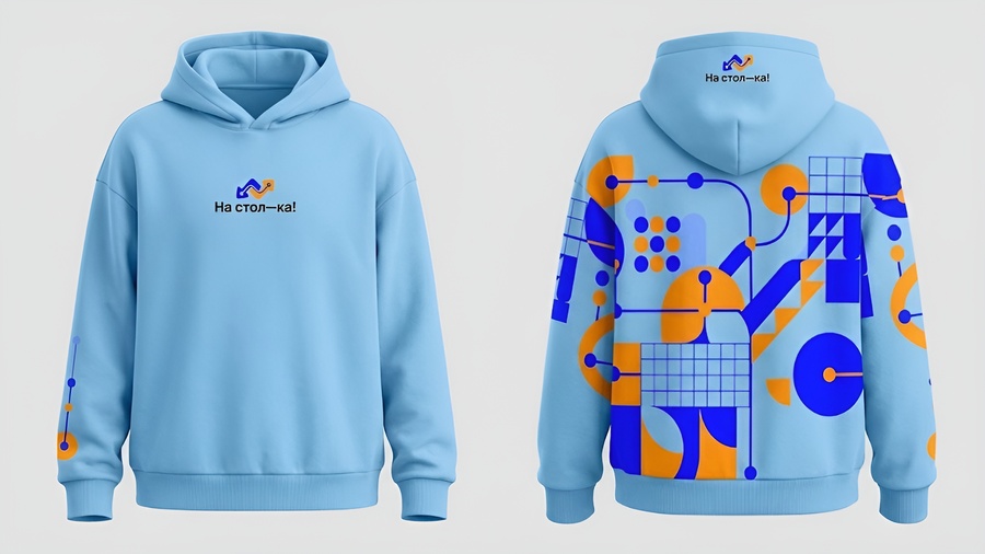
(10) Create a stylish oversized hoodie design for the brand «На стол—ка!», showing both the front and back of the same hoodie side by side.
Use the established brand identity: sky blue
9FCFFF, orange
FF9700, and electric blue #0605FF. Incorporate bold geometric graphics, playful routes, circles, grids, connected dots, and modular shapes inspired by board games and urban navigation.Front: a clean, minimal design with a small logo on the chest and a few distinctive geometric details.
Back: a large, expressive graphic composition using oversized shapes, contrasting colors, dynamic lines, and playful patterns. Make the back the main visual statement of the design.
Use a contemporary streetwear aesthetic with an oversized fit, dropped shoulders, thick cotton fabric, ribbed cuffs, and a spacious hood. The hoodie should feel like a limited-edition piece of merchandise from a creative urban brand.
Present both views clearly on a neutral background, with realistic fabric texture, accurate garment proportions, soft studio lighting, and professional product photography. Keep the graphics sharp and consistent with the brand identity. No additional clothing items, no unnecessary props, no alternative designs, and no extra text beyond the brand name.
(11) Create a standalone social media mockup for the brand «На стол—ка!» — a network of urban board-game spaces.
Show a smartphone screen with a cohesive Instagram-style profile and several visible posts, including square feed graphics, vertical stories, and promotional content. Focus entirely on the digital identity, without other merchandise or unrelated objects.
Use the established brand palette: sky blue (
9FCFFF), orange (
FF9700), and electric blue (#0605FF). Apply bold geometric shapes, circles, grids, playful routes, connected dots, and modular patterns inspired by board games and urban navigation.Make the posts varied in composition but consistent in visual style. Include bold Russian headlines about playing board games, meeting friends, and spending time together. Use the brand name «На стол—ка!» accurately, with clean, legible typography.
Present the smartphone in a clean, professional product mockup, viewed from the front or at a slight angle against a simple background that complements the brand colors. The screen content should be the main focus and clearly visible.
Contemporary digital branding, polished art direction, realistic smartphone materials, crisp graphics, balanced composition. Horizontal 1920 × 1080 px. No additional devices, no excessive props, no unrelated branding, no distorted lettering.
(12) Create a realistic interior visualization of «На стол—ка!» — a modern urban space dedicated to board games, meeting friends, and socializing.
Design a spacious, welcoming interior with large communal tables, comfortable chairs, shelves filled with board games, cozy seating areas, and warm ambient lighting. The space should feel lively, creative, youthful, and accessible, like a contemporary café combined with a board-game club.
Integrate the brand identity throughout the interior using sky blue (
9FCFFF), orange (
FF9700), and electric blue (#0605FF). Use bold geometric graphics, circles, grids, playful routes, and modular patterns on walls, furniture, partitions, and signage. Make the branding feel integrated into the architecture rather than simply applied as decoration.Include a few groups of young adults playing board games, chatting, and enjoying the space. Show realistic furniture, natural materials, thoughtful lighting, and functional interior design.
Camera: wide-angle view from inside the room, showing the main gaming area, tables, seating, shelves, and branded interior details. The building exterior must not be visible.
Professional interior photography, realistic materials, natural daylight mixed with warm lighting, high detail, contemporary urban atmosphere. Horizontal 1920 × 1080 composition. No futuristic architecture, no clutter, no excessive decoration. If the brand name appears, spell «На стол—ка!» correctly.
(13) Create three separate vertical advertising poster designs for the brand «На стол—ка!» — a network of urban board-game spaces.
Use the established brand identity: sky blue (
9FCFFF), orange (
FF9700), and electric blue (#0605FF). Incorporate bold geometric shapes, oversized circles, grids, intersecting lines, playful routes, connected dots, and modular forms inspired by board games and urban navigation.Each poster must have a unique composition, headline, color balance, and graphic rhythm, while all three remain visually cohesive. Use short, expressive Russian headlines about playing together, meeting friends, and taking a break from everyday routines. Include the brand name «На стол—ка!» accurately.
Show only the three finished posters side by side on a plain, neutral background. No wall, no street, no environmental mockup, no frames, and no surrounding objects.
Bold typography, flat vector graphics, strong contrast, crisp edges, playful contemporary design, professional art direction. Each poster is vertical A2 format. Overall image: horizontal 1920 × 1080 px. Ensure all three posters are fully visible, equally sized, and clearly distinguishable.
(14) Create a complete visual identity presentation for «На стол—ка!» — a network of urban board-game spaces where people meet, play, and socialize.
Use the attached reference as inspiration and develop a cohesive, original identity. The brand palette is sky blue (
9FCFFF), orange (
FF9700), and electric blue (#0605FF).Show the following elements in one composition:
— A prominent, clearly readable logo with the exact name «На стол—ка!»
— Brand color palette with separate color swatches
— Typography and font hierarchy
— Graphic elements: geometric shapes, circles, grids, playful routes, connected dots, and modular patterns inspired by board games and urban navigation
— A seamless brand pattern
— Two or three applications, such as a poster, sticker sheet, and tote bag
Arrange the elements in a top-down flat-lay composition, viewed directly from above on a clean surface. Keep the logo and core identity elements visually dominant, with applications arranged around them.
Use bold geometry, expressive scale, contrasting colors, asymmetry, and clean layouts. The identity should feel playful, modern, urban, energetic, and recognizable across physical and digital media.
Professional branding studio presentation, crisp vector graphics, realistic material details on mockups, polished art direction. Horizontal 1920 × 1080 px.
Keep all elements consistent with the same visual system. No unrelated graphics, no clutter, no unnecessary decorations. Ensure the logo is spelled correctly and legible.