Navigator
- Concept
- Chapter 1. «From Photograph to Magazine Cover»
- Chapter 2. «Fragment Instead of Whole»
- Chapter 3. «The Face Behind the Barrier»
- Chapter 4. «Color and Plane»
- Chapter 5. «Face, Type, and Cover Space»
- Chapter 6. «Where the Portrait Ends and the Sign Begins»
- Conclusion
- Bibliography
- Image Sources
Concept
I chose this topic because I am interested in fashion and magazines, particularly how photography becomes integrated into cover design. In the works of Erwin Blumenfeld, the depiction of the face drew my attention: sometimes it retains volume and detail, while at other times it is perceived as a combination of separate spots and lines. I want to understand what creates this effect and what role it plays in the magazine’s composition.The research is based on twelve covers of American Vogue from 1945–1954. This period allows for a comparison of various design solutions within a mid-20th-century publication. Materials are selected based on confirmed dates and authorship, the availability of a legible reproduction, and their relevance to the research question. The selection includes covers featuring facial fragmentation and overlay, pronounced color accents, as well as examples where the face is incorporated into a narrative scene with figures and objects. The latter will help test the boundaries of my hypothesis. The conclusions will pertain to the selected examples within this period.The study is structured around visual techniques. First, I will examine the transition from photography to the magazine cover, followed by facial fragmentation, overlays, color usage, and the relationship between the image and typography. The final chapter will dedicate itself to comparing these techniques and testing the hypothesis. I will compare complete covers, highlight significant details, and create diagrams showing the arrangement of elements. For each pair, it is crucial to explain precisely what changes and how that affects the perception of the face.
Chapter 1. «From Photograph to Magazine Cover»
On the cover of Vogue from January 1, 1950, I see a face, even though one cannot trace the contour of the cheek or chin. The eye occupies the upper right section of the page, and the lips are shifted to the left and down. There is so much empty space between them that several more features could fit there. It is this negative space that compels me to view the page as a whole. If you cut out the eye separately, you have a photo of an eye. Within the boundaries of the magazine, the same detail occupies a well-defined spot beneath the final letters of the title. Blumenfeld approached color fashion photography with experience gained from black-and-white shooting experiments. For design history, the moment when a photograph adopts a magazine format is particularly interesting. It gains neighbors on the page, including the year of publication and announcements. The scale of familiar objects also changes. A small mole can become one of the most prominent points on the cover if there is enough light paper surrounding it.
1. Erwin Blumenfeld, Vogue cover, 1945 2. Erwin Blumenfeld, Vogue cover, 1950 3. Erwin Blumenfeld, Vogue cover, 1954
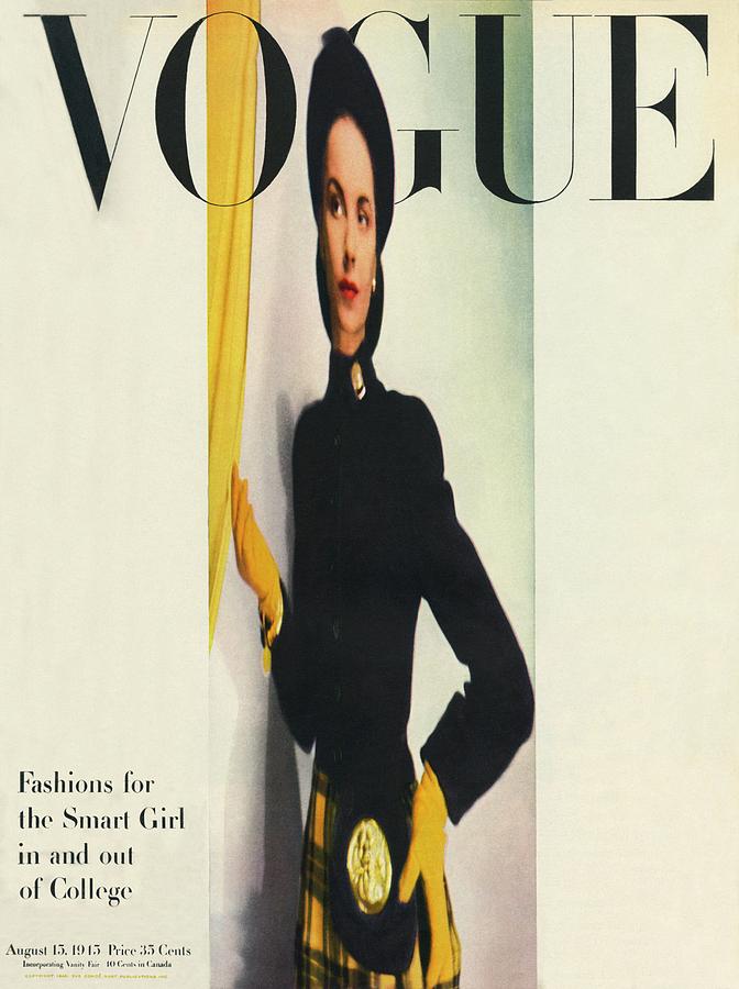
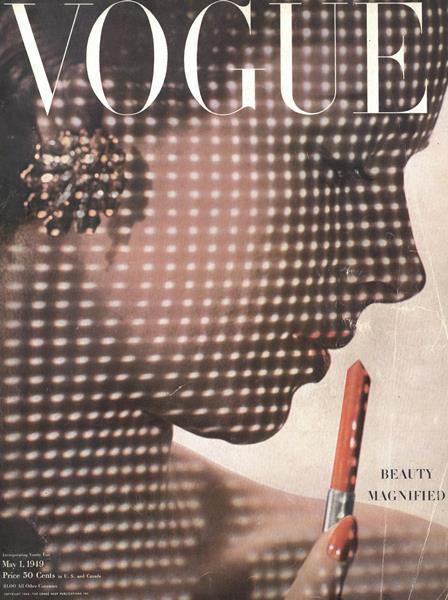
1. Erwin Blumenfeld, Vogue cover, 1945 2. Erwin Blumenfeld, Vogue cover, 1949
In May 1945, a hat, the shadow beneath its brim, and vivid lips segment the face into distinct areas. In April 1954, the face occupies nearly the entire page, bisected down its center by a small figure dressed in black. Even when viewed from afar, the distinction remains. In the first, the eye moves from one fragment to the next. In the second, two human scales are visible simultaneously. Between these designs is the January 1950 issue, where only a few details help define the face.
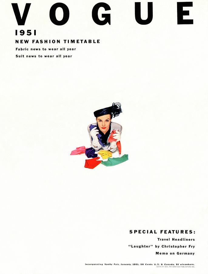
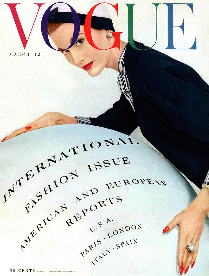
1. Erwin Blumenfeld, Vogue cover, 1951. 2. Erwin Blumenfeld, Vogue cover, 1953.
On the cover of January 1951, the model in a hat occupies so little space that at first, I notice the distance between the Vogue title and her figure. The year is in the upper left, and there are a few lines in the lower right; only then does the gaze find her face. In the March 1953 issue, a single object connects the model’s hand and the inscription. Mary Jane Russell leans on a large light sphere, and the words «International Fashion Issue» are already legible on it. Thus, the announcement becomes part of what is happening in the frame.
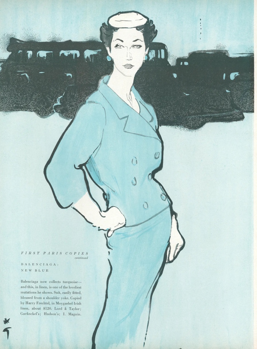
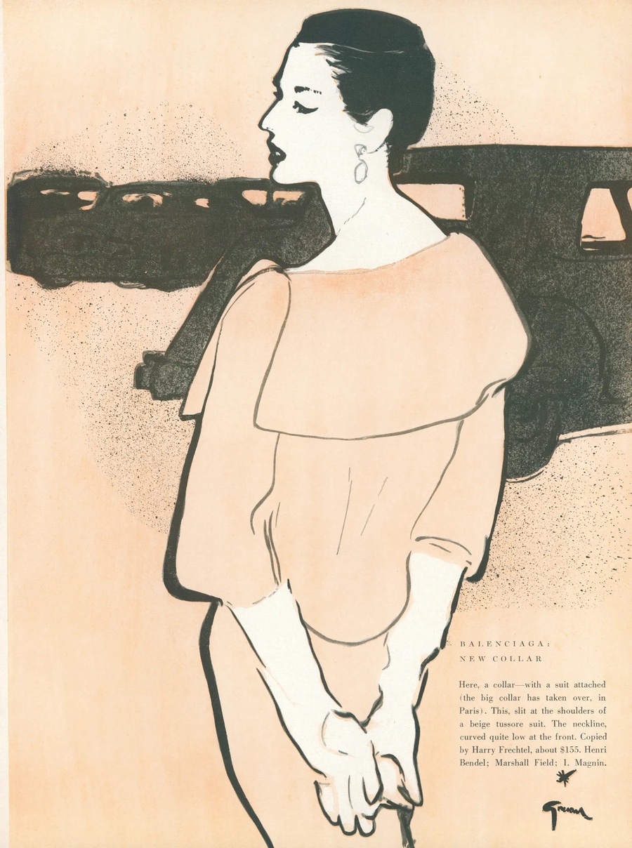
1. René Gruau, «First Copies of Parisian Models. Balenciaga: A New Shade of Blue, ” 1954. 2. René Gruau, „First Copies of Parisian Models. Balenciaga: A New Collar, ” 1954.
In April 1954, Griou uses the same techniques to render the collar in the illustration for the Balenciaga feature. He also drew the figure on the cover of that issue. It is now clearer where the difference between the two faces on the previously viewed page originates. One is conveyed through a photograph, the other through a few lines.
Chapter 2: «Fragment Over Whole»
In this chapter, it is important to distinguish several ways to leave a portion of the face visible. One detail might disappear against a light background, another might extend past the edge of the photograph, and a third could be covered by an object. In a reduction, the result can look similar, especially if only one eye remains visible. Closer comparison shows that in each case, both the fragment’s boundary and the role of the magazine itself differ. The edge of the page can act as a distinct line, abruptly cutting off the image.
Erwin Blumenfeld, Vogue cover, 1952.
On the October 1952 cover, one can precisely point out why the eyes have disappeared: they are cut off by the top edge of the page. The folds of the gray fabric remain quite distinct. In the portrait featuring a hat, the boundary passes within the frame. The adjacent areas of reflection diverge slightly, and the gaze seems to encounter a single line several times. In the piece «Line on the Face, ” my attention also lingers within the portrait. The line proposes its own path across the skin, compelling the viewer to look closely at where it crosses the face.
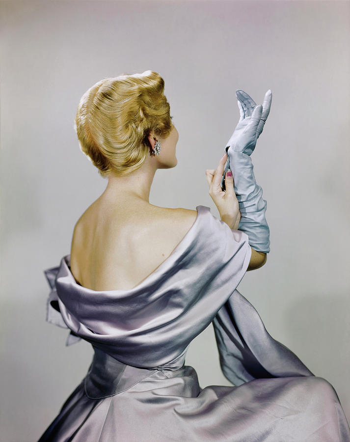
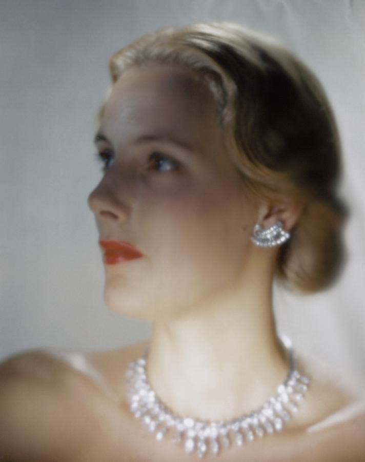
1. Erwin Blumenfeld, «Model in Dress and Shawl by Marc Murin, ” 1948. 2. Erwin Blumenfeld, „Defocused Portrait of a Model with a Diamond Necklace, ” 1946.
In the photo of the Mark Mooring dress, almost everything one can say about the model’s face depends on how she is turned. Her hair, earring, and a small section of her cheek are visible; the rest is hidden behind her shoulder. In the portrait with the diamond necklace, the model is turned noticeably more toward us. The forehead, nose, and chin are successfully connected into a single contour, although the details are softened by the defocus. Comparing the two helps to differentiate two things that are easily confused: how much of the face is in the frame versus how clearly its features are visible.
Chapter 3. «The Face Behind the Barrier»
When an object covers part of the face in a photograph, its edge becomes another line in the portrait. This is especially evident on the February 1953 cover. Along the edge of the green rose, you can trace how much space was afforded to the skin, the eye, and the lips. The section of the face is limited by the petal on one side and by the page itself on the other. To understand how such an overlap is structured, I compare it to three other scenarios. In one shot, fabric is gathered around the neck; in another, the figure is visible through glass; and in the third, rows of light dots intersect the profile.Each of these obstructions has its own boundary. The fabric forms a fold, the glass shows a more noticeable change in sharpness, and the rows of dots can be traced even within the silhouette.
Erwin Blumenfeld, Vogue cover, 1953
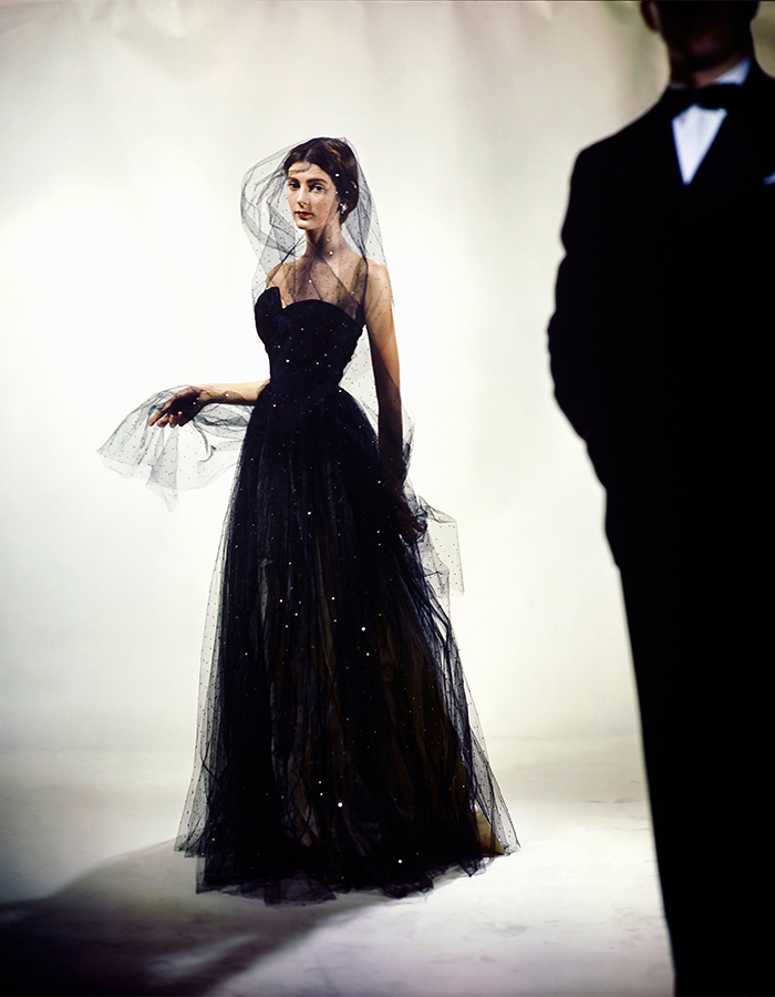
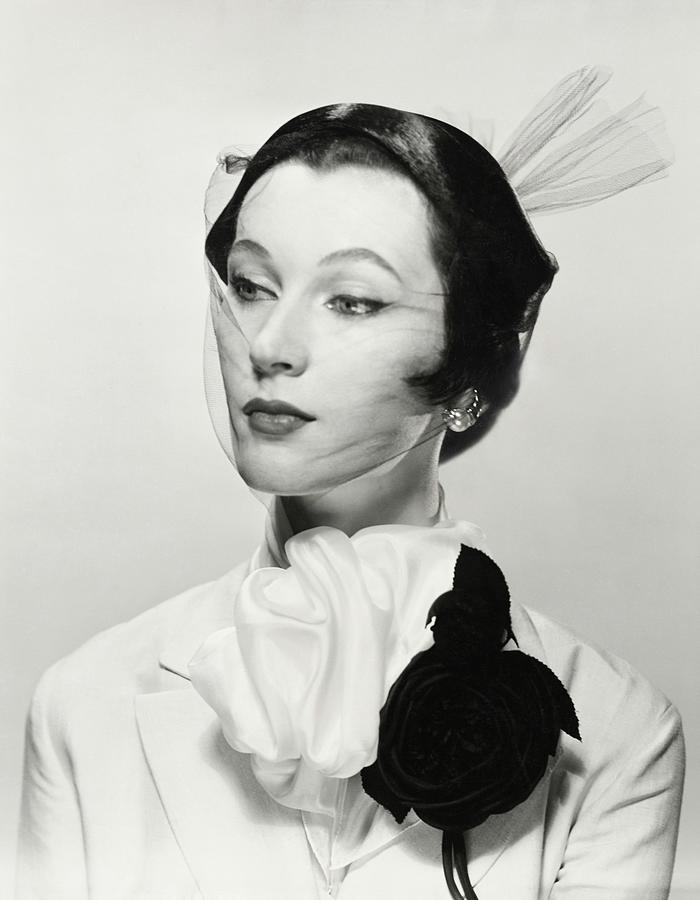
1. Erwin Blumenfeld, «Carmen Dell’Orefice in a Jay Thorpe Dress for Vogue, ” 1946. 2. Erwin Blumenfeld, „Little Diamond with Veil, ” 1950.
On the green rose cover from February 1953, the petal comes very close to the eye. Because of this, it seems as if the flower cut a narrow strip of face out of the page. A similar-sized rose with a veil on a black-and-white photograph is attached below, on the lapel. It draws the eye, while the face remains uncovered. Carmen Dell’Orefice has a thin, glittering veil again positioned near her head. One can discern her features through it, so the viewer sees both the model and the material’s edge immediately.
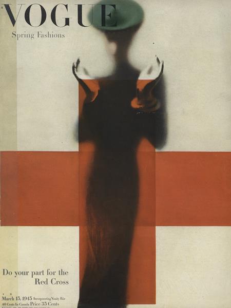
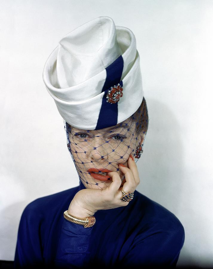
1. Erwin Blumenfeld, Vogue cover, 1945. 2. Erwin Blumenfeld, «Muriel Maxwell in a Two-Tier Hat,» 1945.
The yellow curtain closes off part of the figure and ends with a sharp vertical edge. If you trace it with your finger, it immediately becomes clear where the model ceases to be visible. Muriel Maxwell’s blue veil has many such boundaries—each cell leaves a small patch of skin exposed. In a comparative table, I documented exactly what remains visible under each material. Thus, the difference between glass and mesh is expressed more concretely than by the words «face obscured» or «face visible.»
Chapter 4. «Color and Plane»
Chapter 5. «The Face, Letters, and Cover Space»
Chapter 6. «Where the Portrait Ends and the Sign Begins»
Conclusion