One designer for your event
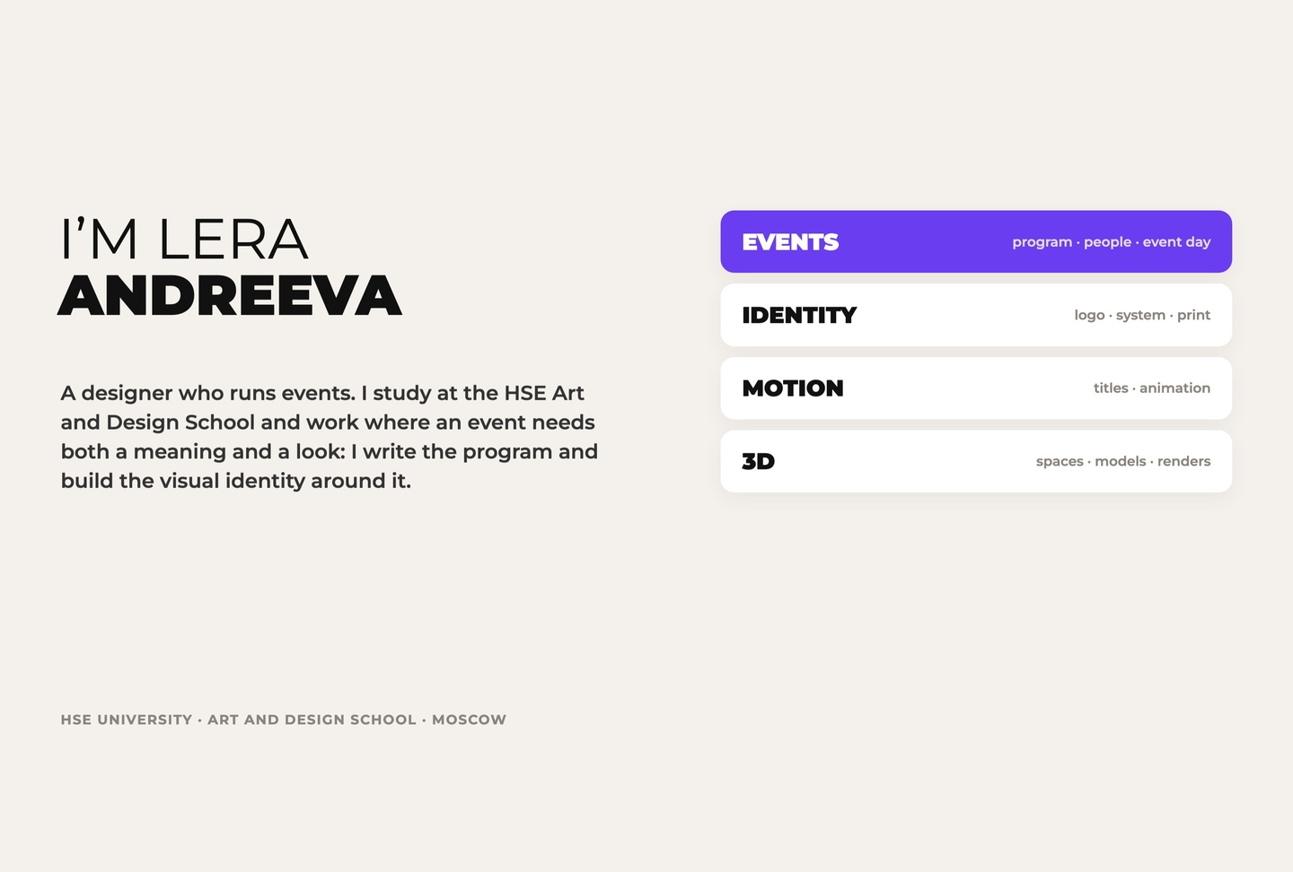
I study at the HSE Art and Design School. I work where an event needs both a meaning and a look: I write the program and build the visual identity around it. My tools: event programs and work with people, identity and print, motion and titles, 3D spaces, illustration.
For art directors and brands that need an event
Events need two things at once: a program people remember and visuals that hold it together. Usually two teams make them. I make both — so the idea doesn’t get lost on the way from the first draft to the event day.
The problem:
An event is two jobs — usually done by two teams
A program team thinks in actions and people: concept, scenario, participants, timing. A visual team thinks in images and formats: identity, print, screens, merch. Between them sit briefs, edits and «that’s not what we meant» — and the art director spends budget and nerves keeping both teams on one line.
My approach:
One author, from idea to event day
The event program — concept and meaning, scenario of the day, work with participants and artists, invitations, posts, labels and navigation. And the visual positioning — identity, motion and titles, 3D spaces, print and merch — so the event looks the way it feels.
How I work?
Every project goes the same way: meaning → program → visual system → event day. And every case below is told the same way: challenge, idea, solution, result.
Twelve projects in three parts. Events: So-bytiyo festival and its book, the Native Fields performance, the Russian Square exhibition. Identity: MIG film festival, ZELOM, CTRL+ME, a media book and a Tim Burton longread. Motion & 3D: Dípsa casino, «Tenet» titles, an animated legend and a 3D scene.
So-bytiyo festival · festival of new traditions · identity · May 2027 · in development
Challenge: young artists want to turn to the roots of Russian culture through the relationship between people and nature — without making another museum show.
Format: one day and one night in May 2027 — an exhibition, a festival and a research lab where the viewer lives the experience together with the artists.
My role: art director and producer in a team of four — identity, graphic design, motion.
Forest, Field, River and Sky — four nature images through which the festival explores people and nature. Each direction opens on three levels: natural roots, cultural reflections and a modern statement. In the identity each direction is a separate module with its own frame and character.
The visual system: logotype, typography, graphics, colour and photo style. From it come the documents, ads, social media, navigation on site and merch. Day and night are part of the drama: practices, exhibition and a shared table by day — cinema, mapping and a rave at night.
In Russian «so-» means «together». It became the project’s vocabulary — co-creators, co-advisors, co-comrades — and a hand-written logotype that unites everyone who makes the festival.