Concept
Topic Selection
The Olympic Games bring together athletes and spectators from different countries, and thanks to broadcasts, people watch the same competitions beyond the host city. Design helps this audience navigate the program and sporting venues, while it gives the host country an opportunity to present its culture. Over time, the scope of Olympic design has expanded: in addition to posters, medals, tickets, diplomas, and uniforms, it now includes the design of the urban environment, the scenography of ceremonies, and visual communication systems.
One element of these systems was the sports pictogram—a conventional graphic symbol representing a sport or discipline in the Games' program.
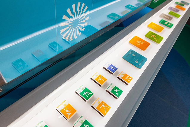
Olympic Games sport pictograms in Munich, 1972
In Tokyo 1964, these signs were developed as series with common construction rules. This is why they are so interesting to compare: the task of designating the sport remains the same across all Olympics, but the method of its depiction changes from one series to another.
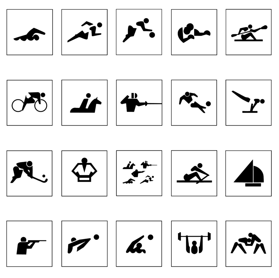
Olympic Games of Tokyo, 1964 athletic pictograms
Principles for Selecting Visual Material
My research included twenty pictograms from the official handbook of the Olympic Research Center. These images relate to five Olympic Games held in different countries between 1968 and 2024. When selecting the Games, I considered what principles of sign construction could be traced in each series. For comparison, I chose four sports featured in all five Games—sailing, volleyball, gymnastics, and shooting. These examples allow for a comparison of how designers convey movement on the water, ball play, acrobatic exercises, and aiming.
Rubrication Principle
The main body consists of five chapters arranged chronologically:
1. Mexico City — 1968
2. Munich — 1972
3. Sydney — 2000
4. Athens — 2004
5. Paris — 2024
Each chapter begins by examining the circumstances surrounding the series’ creation and its general construction principle; it then breaks down, using four pictograms, how this principle functions when illustrating different sports.
Principles of Selecting and Analyzing Textual Sources
The textual materials were curated based on both the general history of Olympic design and the history of individual Games. In the official publications, I sought information on the development of the series—what challenges the designers faced, what visual sources they referenced, and how they justified their choices. The research into design history helped clarify the role graphics play in representing the host country. When analyzing the imagery, information from these sources helps confirm that specific features of the artwork can be linked to the local culture.
Key Question
How is the cultural identity of the host country reflected in the visual language of sports pictograms?
Hypothesis
The cultural and visual characteristics of the Olympic Games host venue define the individual character of the sports pictograms, manifesting in the plasticity of the figures, the nature of the lines, the composition, and the color solutions.
1. Mexico City — 1968
The Mexico City Pictograms—developed in 1968 by the urban design team for the Olympic Games committee, where Lance Wyman worked—represented a sport by «focusing on a part of the athlete’s body, sports equipment, or a combination of both.» The resulting design depended entirely on the detail chosen.Its connection to Mexico’s visual culture is evident in the vibrant colors that reference the nation’s culture and in the very method of representation. One source for the series was pre-Hispanic glyphs, where an image is constructed from several characteristic elements. On a stone relief, the profile is recognizable by the round eye, the serrated mouth, and the swirl.
Mexico, Tlatelolco. Day glyph «13 Death» on the facade of the Calendar Temple; second half of the 15th century.
Volleyball; Rhythmic Gymnastics
Sport Shooting; Sailing
The figure does not appear in the Mexico pictograms in its entirety. In the volleyball icon, the ball above the net conveys a moment of play, and in artistic gymnastics, the athlete on the apparatus can be imagined by the hand gripping the ring. Much like in the pre-Hispanic glyph on the relief, a few characteristic details allow the viewer to complete the full image. In the shooting icon, the target replaces the entire scene, its white rings directing the gaze toward the center, and in sailing, two sails remain above the waves from the boat.
2. Munich — 1972
Gerhard Eichler and Otl Axer worked on the Munich Olympic pictograms for the 1972 Games, with Eichler leading the project. The figures were constructed on a square grid using lines of uniform thickness and incorporating 45° and 90° angles. These guidelines ensured that different athletic poses appeared as part of a cohesive series. The connection to the host city is evident through the practice of West German design. Eichler was a founder of the Ulm School of Design and, concurrently with the Olympic series, developed navigation for Frankfurt Airport. The silhouettes of a suitcase and an airplane in the photograph help passengers orient themselves, even without reading the signage. In Munich, the signs served a similar purpose—guiding spectators from various countries during the Games.
Frankfurt am Main. Airport signage designed by Ottla Eicher. 1972.
Frankfurt am Main. Airport signage from the Odel Aire navigation system. 1972.
Artistic Gymnastics