Design is not just about making things look good.
It’s about making them make sense. From the grey rhythms of panel-block neighborhoods to the tension of information threats, I turn abstract ideas and everyday routines into visual systems that communicate.This is a story of how I think, structured in five acts.Ksenia Zakhozhaya
Communication Designer Branding · Identity · Book · Packaging · Illustration Selected Works / 2023–2026 22 y.o. · HSE Art and Design School, 2026
THE ACTS.
Five projects. One logic: task → idea → solution → result.
ACT I — PANELKI
YOU SEE CONCRETE.
I SEE RHYTHM.
Panel-block neighborhoods are usually seen as dull and faceless. But they have a strict geometry and an aesthetic of their own. I started with a series of illustrations about life among high-rises — about the moments that get lost in the rush.
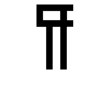
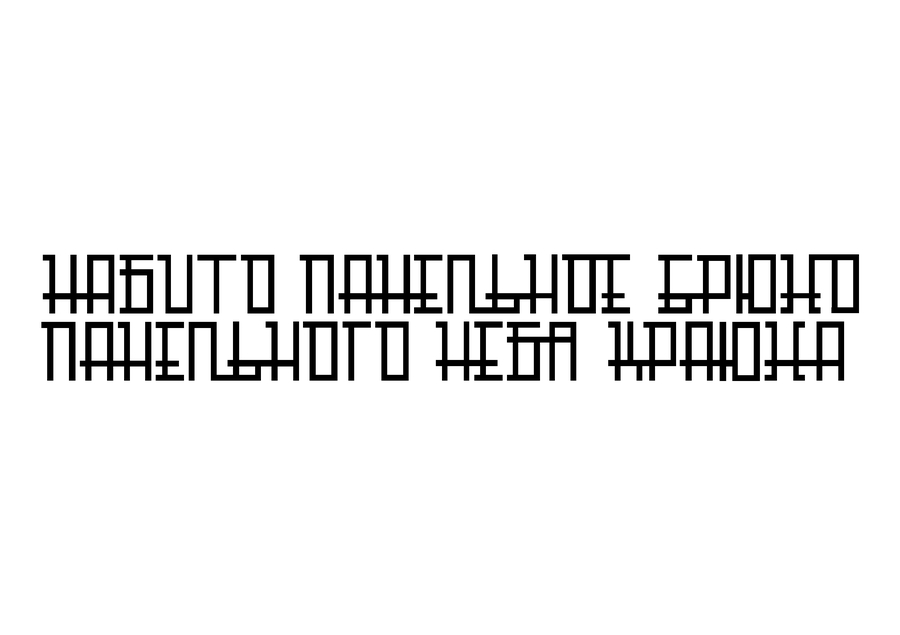
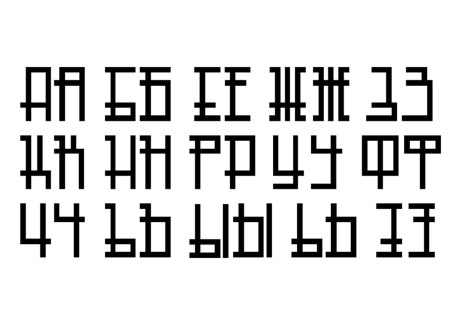
This visual code became a language. I translated the silhouettes of buildings into a typeface, a zine, and a physical object.The zine is a quiet story about how a moment slips away. The PANELKI typeface translates the city’s straight lines into typography. The stained-glass lamp turns a cold fасade into a warm interior object.One visual code — three different media.
Panel-block neighborhoods are usually seen as dull and faceless. But they have a strict geometry and an aesthetic of their own. I translated this urban code into a variable typeface. Horizontal bars of the letters connect to each other, forming silhouettes of panel houses, windows, and balconies when viewed from a distance.
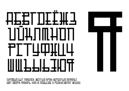
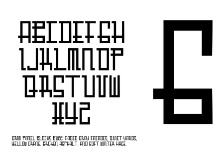
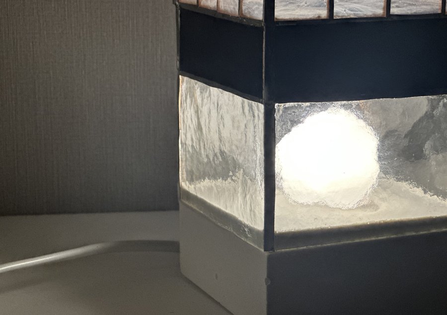
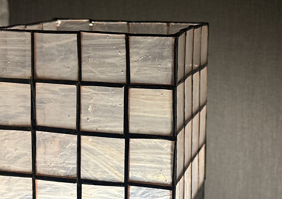
The code goes beyond flat graphics. The stained-glass lamp turns a cold facade into a warm interior object. Its structure mimics a panel house, while the glass parts imitate glowing windows.
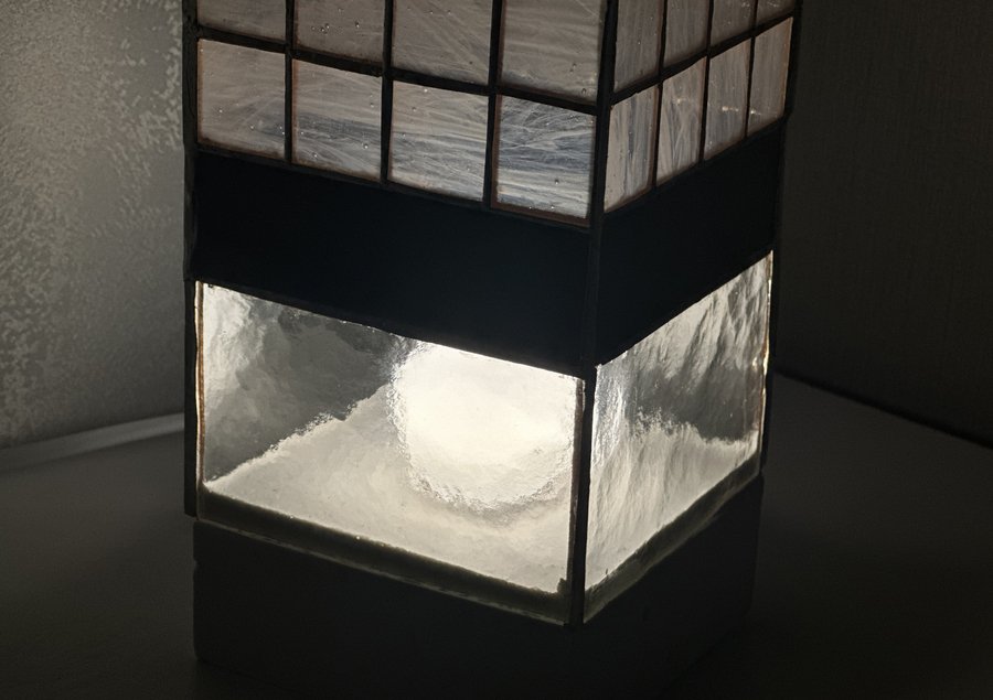
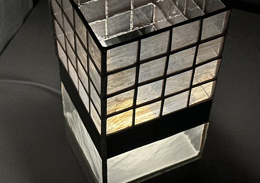
The zine «Residential district» is a quiet story about life among endless high-rises. People rush to work, missing bright moments in their grey lives. But sometimes you just need to pause and enjoy the fleeting moment.
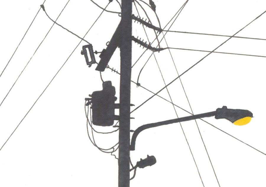
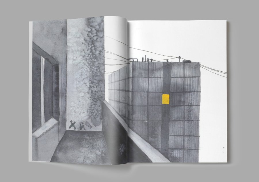
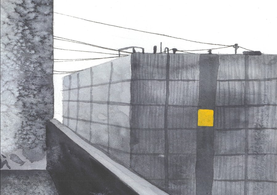
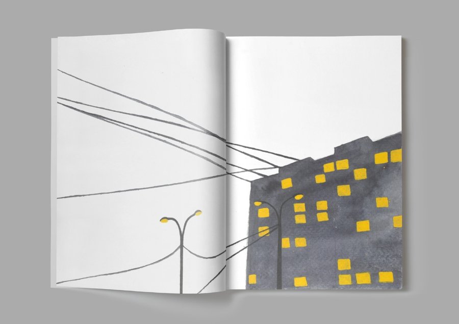
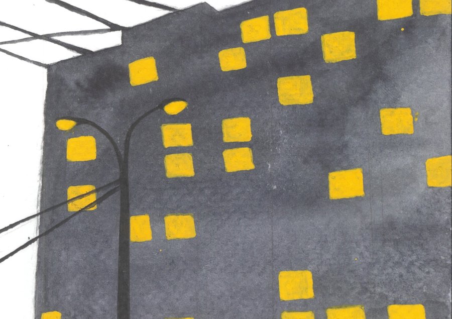
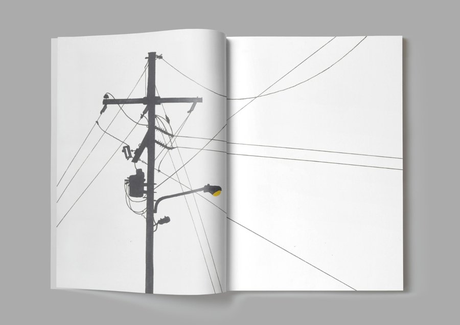
What this proves: I can take one concept and unfold it into a system — from a flat image to a physical object.
ACT II — CHEERS
YOU ORDER A DRINK.
I BUILD A RITUAL.
A bar is not just about drinks. It’s a ritual of choice. CHEERS invites visitors to create individual cocktails by choosing ingredients. For those who prefer ready-made solutions, there is a curated menu. The task was to convey the ease of mixing and the feeling of «I decided this myself.»
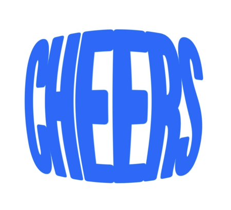
The visual language is built on modularity: elements come together like ingredients. The packaging continues the idea: two simple flavors in small cans make one big mix. The identity lives across touchpoints — from the menu to social media.
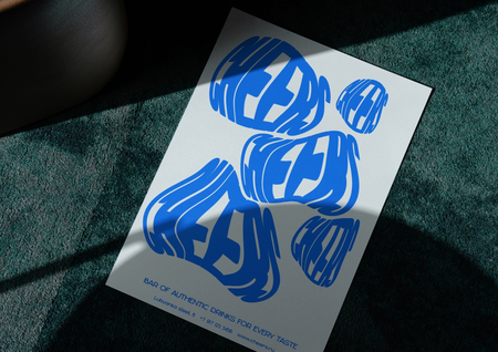
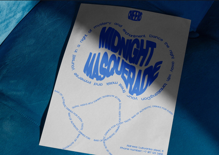
The visual language is built on modularity. The packaging continues the idea: three small cans with different flavors are mixed to create three big mixes. Two simple flavors make one big mix.
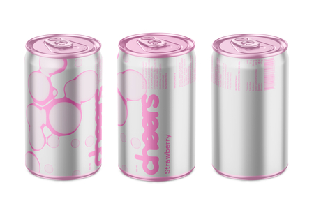
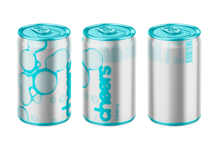
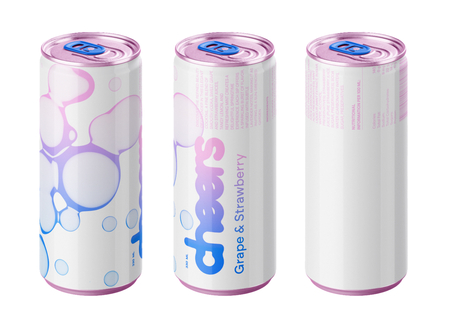
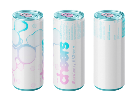
What this proves: I think of a brand not as a logo, but as a system of rules that works on any touchpoint.
ACT III — BOOK DESIGN
YOU READ TEXT.
I DESIGN EXPERIENCE.