Table of Contents:
Introduction — Why did the letter become a picture?
Chapter 1 — The Labyrinth of Faith: The Irish Initial (7th–9th centuries)
Chapter 2 — The Empire of Order: The Carolingian Initial (8th–9th centuries)
Chapter 3 — The Beast Letter: The Romanesque Initial (11th–12th centuries)
Chapter 4 — Theater and Prestige: The Gothic Initial (13th–14th centuries)
Chapter 5 — The Decline of the Hand-Letter: From Gutenberg to Mass Production (15th century)
Chapter 6 — Comparative Analysis: From Chaos to Order
Chapter 7 — Conclusion. Three Lives of the Initial
During the Middle Ages, the letter was far more than just a sign to denote a sound. This is particularly evident in manuscripts from the 7th to 15th centuries. The first letter of the text—the initial—gradually evolved from a standard element of writing into a self-contained image.
The capital letter immediately stood out on the page and drew attention. It could be surrounded by ornaments, plants, and animals, and sometimes entire scenes appeared within the letter itself. Consequently, reading began not with the word, but literally with the image.
Over time, artists began to use the space of the letter with increasing boldness. The initial transformed into a miniature painting where text and image coexisted. The letter no longer merely opened the text—it narrated its own story, created a mood, and conveyed symbolic meaning.
The color red was also significant here. It helped to separate the beginning of the text from the rest while simultaneously creating a sense of importance. A red letter could signify the start of a new chapter, an important thought, or a religious passage.
This is especially interesting to me because it clearly shows how a simple graphic element can acquire an entirely new meaning. The letter stops being just a part of a word and becomes an image that can be viewed just like a painting.
Chapter 1 — Labyrinth of Faith: Irish Initial (7th–9th Centuries)
In the early Middle Ages, Ireland was never conquered by Rome, which allowed a unique culture to survive there. In monasteries (Kells, Lindisfarne), monks created manuscripts that were not merely intended to transmit text, but to serve as instruments for prayer and contemplation.
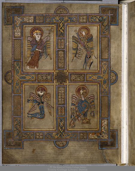
A carpet page from the Book of Kells. There is no text here, only ornamentation. Spirals, knots, and zoomorphic motifs create a visual labyrinth. The monk, looking at this page, would pause and prepare himself for reading the sacred text.
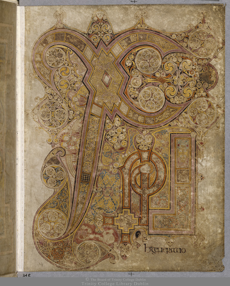
Christ’s Monogram from the Book of Kells (fol. 34r). The letters X and P expand to the size of an entire painting. Within them are angels, cats, and mice. The letter ceases to be a sign and becomes a sacred space into which the reader’s gaze plunges.
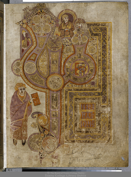
The initial letter on the page of the Gospel. The massive letter sets the scale. The viewer’s eye first falls upon it, and only then moves to the finer text. The letter here serves as an «entry point» into the sacred word.
The Irish initial is not mere decoration; it is theology in miniature. It demands time and attention from the viewer. It is the art of meditation, where the letter dissolves into infinite ornamentation.
Chapter 2 — The Empire of Order: The Carolingian Initial (8th–9th Centuries)
In the late 8th century, Charlemagne created a massive empire and launched a cultural reform (the Carolingian Renaissance). To manage this empire, the need arose for literate people and standardized texts. The chaotic script of the Irish gave way to strict clarity and geometry.
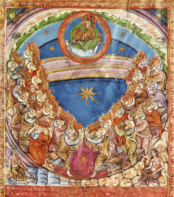
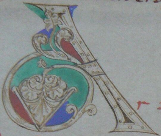
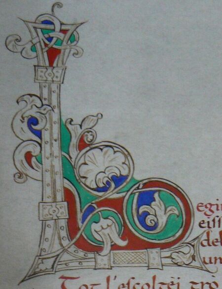
The Carolingian reform of education and script (8th–9th centuries) demanded legibility. The initial letter stopped being a labyrinth (as it was with the Irish) and became a precise geometric form. The gold on purple was not merely decorative—it was a symbol of imperial grandeur.
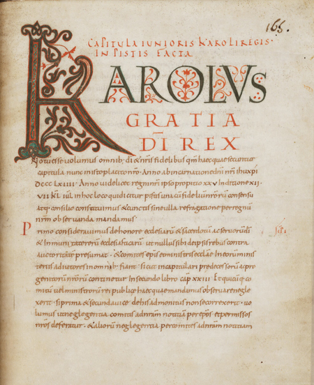
The initial «K» at the beginning of the text (Karolus Gratia Dei Rex). This letter directly connects the sacred text to the figure of the emperor. Art becomes a tool of politics: whoever controls the word, controls the world.
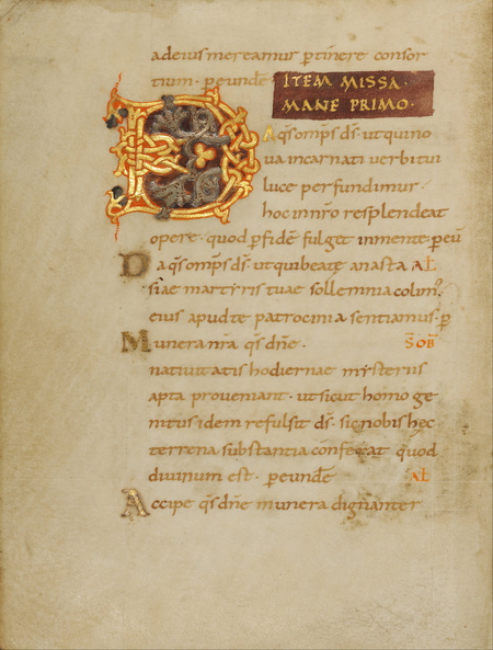
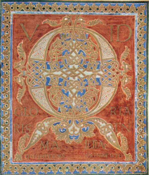
Letter as an Instrument of Imperial Power and the Reform of Writing
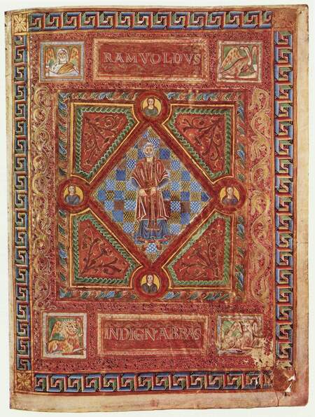
Letter as a Tool of Imperial Power and the Reform of Writing
Unlike Irish labyrinths, the Carolingian initial strives for clear form. It is often inscribed within a square or rectangle, and its lines are straight and rhythmic. The letter brings order to the page, subjecting the text to a rigorous structure.
The Carolingian initial is an empire in miniature. It is clear, opulent, and authoritative. The letter ceases to be a place for meditation and instead becomes a marker of order, education, and state power.
Chapter 3 — The Beast Letter: Romanesque Initial (11th–12th Centuries)
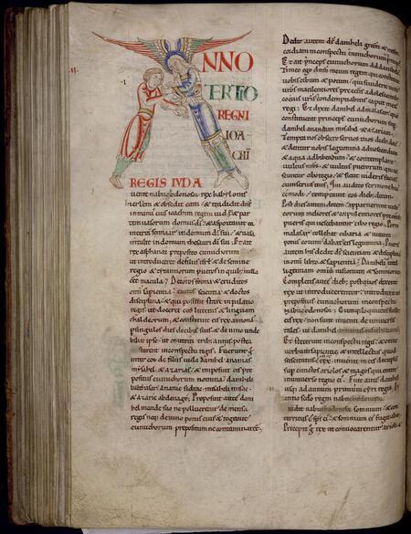
During the Romanesque period and at the dawn of Gothic architecture (12th–13th centuries), the initial letter sheds its abstract quality. Within the letter, scenes of violence, battles, and executions unfold. This is no accident: the letter becomes a moral lesson. The reader perceives that the word of God is surrounded by chaos, sin, and death—and only the text can impose order.
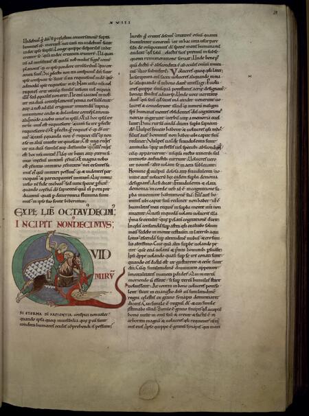
The Letter as a Battleground: Grotesque and Morality
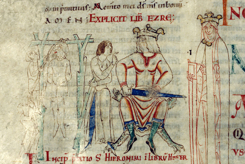
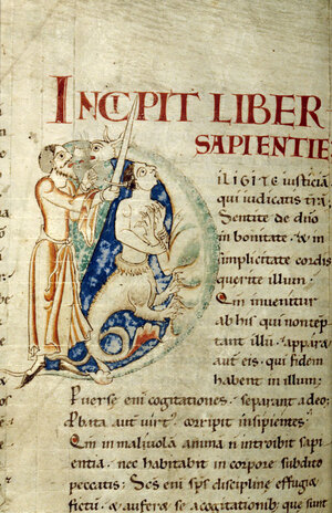
In summary, the Romanesque initial represents the anxieties and imagination of the era. It is both frightening and formative. The letter here serves as a moral compass, reminding us of the fragility of the human soul through grotesque imagery.
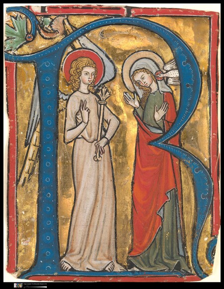
In the late Romanesque and the dawn of the Gothic (13th–14th centuries), the initial letter ceases to be an abstract monster. It transforms into an architectural or ornamental frame within which a biblical scene unfolds. The letter becomes not only a moral lesson but also a theatrical stage where the viewer can examine the details of the Resurrection or the Annunciation.
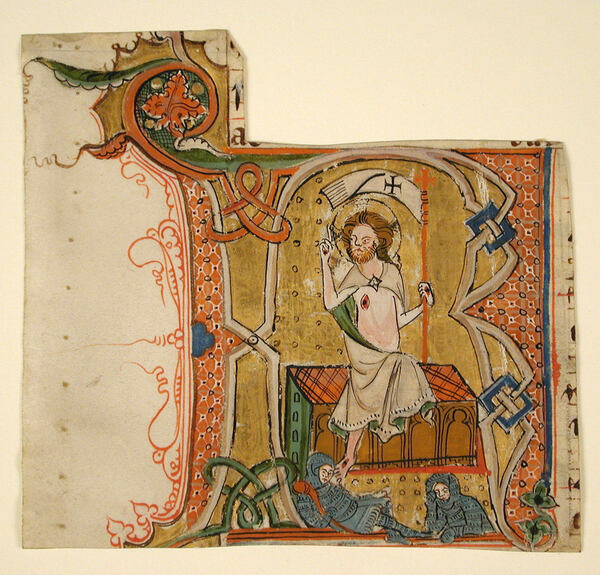
[No text was provided for translation.]
Chapter 4 — Theater and Prestige: The Gothic Initial (13th–14th Centuries)
In the Gothic era (13th–14th centuries), books became objects of luxury. Horologiums—pocket books for the personal prayer of the nobility—emerged. The initial no longer simply decorated the text; it demonstrated the owner’s status.
Jane d'Évre’s Hourglass (c. 1324). A book the size of a palm. The minuscule format demanded jewel-like precision: the miniatures within the letters were viewed up close, holding the book in one’s hands.
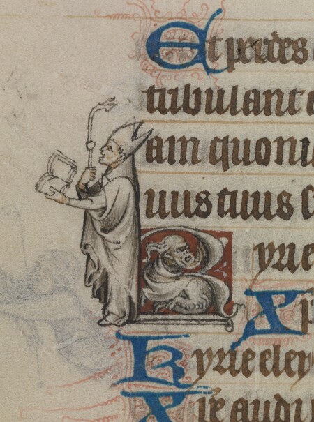
The initial «E» (Exaudi) features a supplicant figure. An entire scene unfolds inside the letter. The letter itself becomes a theatrical frame, and its contents form a narrative. The viewer is no longer simply reading; they are «watching» the story. In a Gothic initial, the figure of a saint or patron literally «emerges» from the letter, making the text vibrant and tangible.
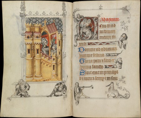
Architectural initial with a tower. A Gothic letter often mimics cathedral architecture—arches, columns, and spires. It creates the impression that the text is a sacred building into which the reader is entering.
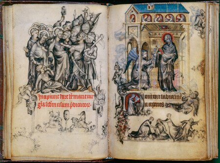
Even in serious timepieces, on the dials and within the letters, grotesque creatures appear (dragons, mice). This is not an artist’s mistake, but a medieval play on meaning—a reminder of the world’s fragility and human failings.
A Gothic initial is the pinnacle of decorative art. It transforms reading into a spectacle and a book into a piece of jewelry. The letter here serves as a marker of earthly wealth and personal piety.