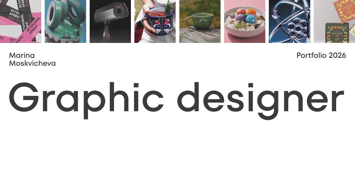
Building Visual Identities with Purpose
Hi, I’m Marina Moskvicheva. I am a communication designer specializing in brand identity.
As an emerging specialist, I focus on building a strong foundation through academic practice and thoughtful concept development. I believe that good design starts with a clear strategy and a deep understanding of the business, rather than just chasing trends. While I am at the beginning of my professional path, I am highly motivated, open to feedback, and ready to apply my skills to real-world challenges. I learn fast, value systematic thinking, and am eager to bring fresh energy to a team or a brand that is ready to grow.My Approach
01.
Immersion & Research I study the business and the task at hand. → I explore the brand’s history. → I identify core brand values. → I analyze the target audience. → I search for unique visual details.02.
Concept Development I formulate the main idea. → I search for visual metaphors. → I create initial sketches.03.
Visual Crafting I select typography. → I build the color palette. → I design graphic elements.04.
Implementation & DeliveryI assemble the final corporate identity. → I create physical/digital mockups. → I present and defend the project.01. DUSHNO
The Perfectionism Police
Исходный размер 1920x1350
01.
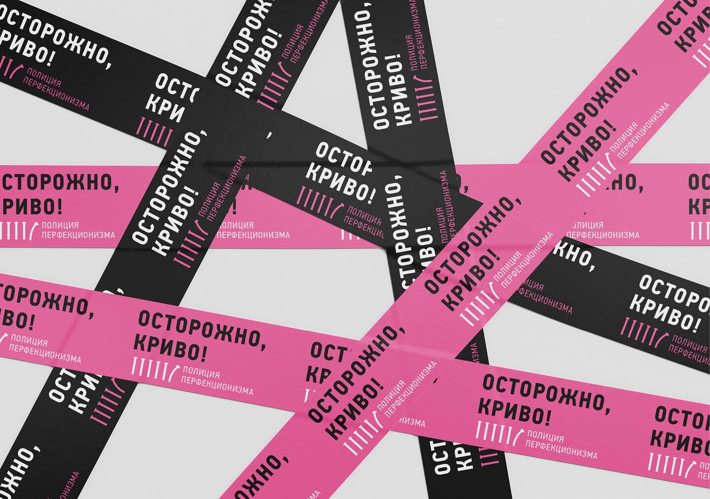
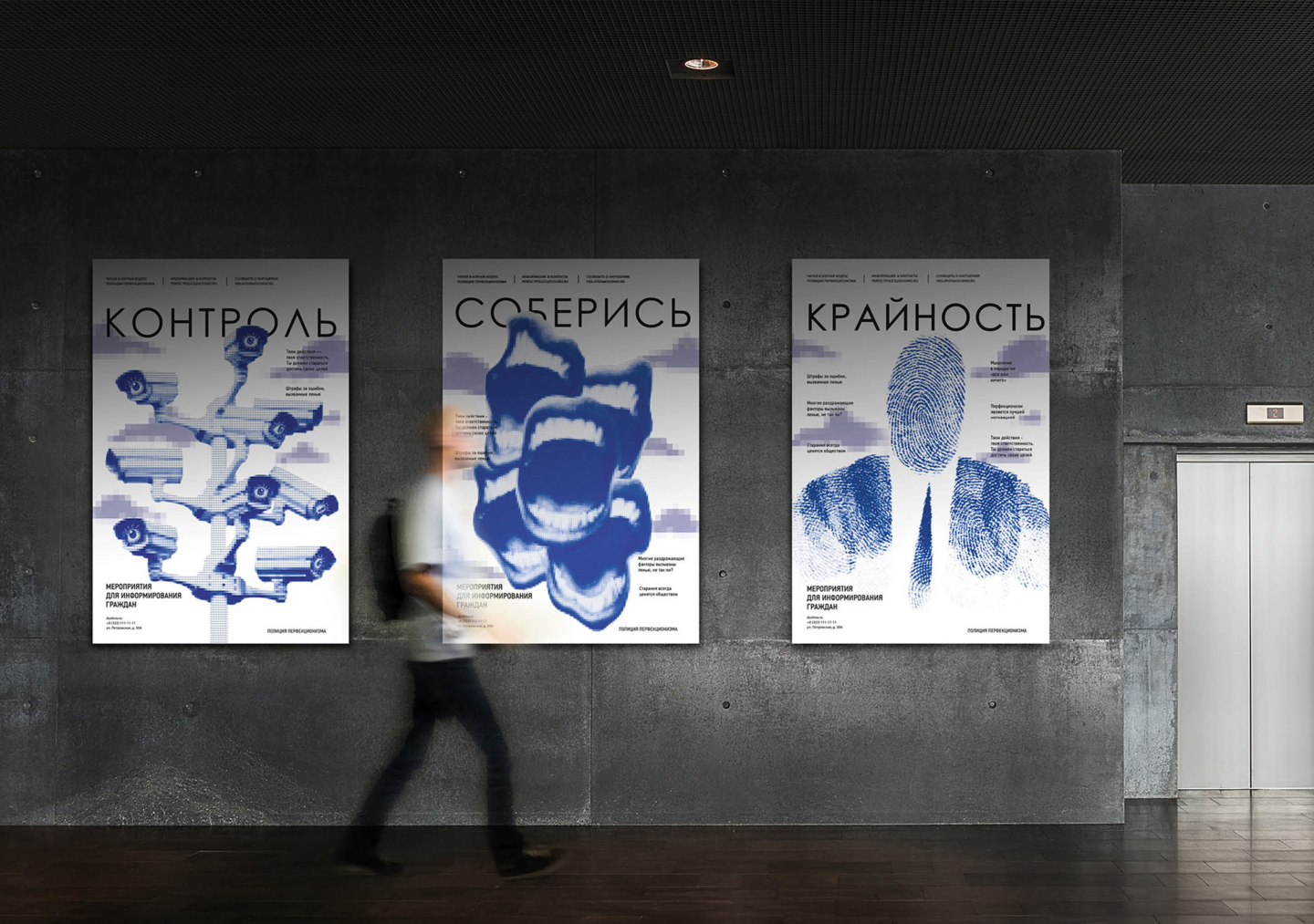
ConceptThe project explores the theme of societal pressure through a satirical brand. «DUSHNO» is a fictional organization designed as a metaphorical «police» that monitors and eliminates any visual or physical flaws in everyday environments.02.
Visual SystemThe identity is built on a high-contrast color palette of black and vibrant pink. The graphic system includes a bold geometric sans-serif for authority, alongside custom elements like broken lines and target marks. The layout relies on strict grids with intentional disruptions to create visual tension.03.
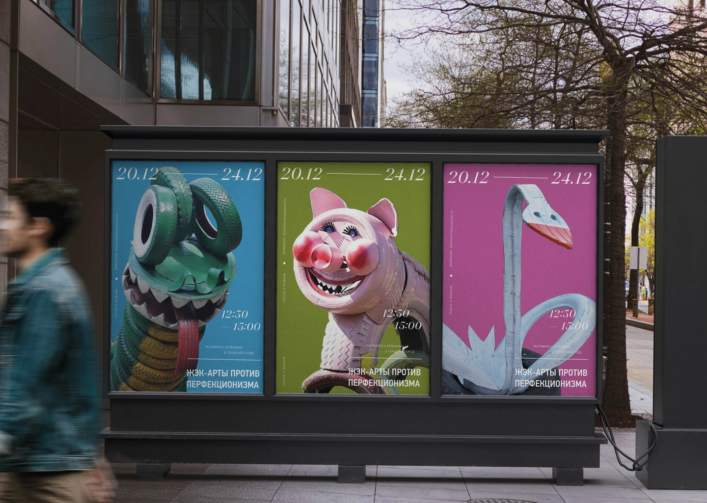
Application The system is adapted for urban media and physical objects. It includes a series of posters where the core idea is tested across different scales and compositions. The identity extends to physical touchpoints: warning tape used for «isolating» flaws and branded stationery with warning messages.Исходный размер 1920x1350
Исходный размер 1920x1350
Исходный размер 1920x1350
04.
Experimentation Through a series of posters, I explored how a single core idea can be expressed in multiple visual ways — experimenting with scale, contrast, and composition to keep the message fresh while maintaining strict brand consistency.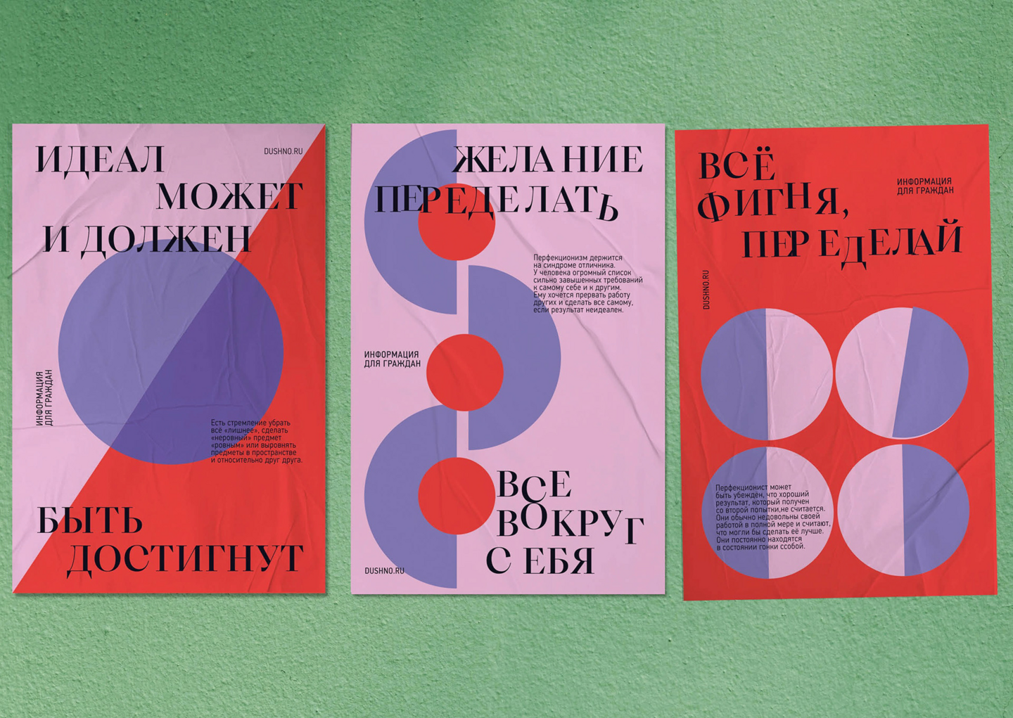
1/3
02. KRASNYY YAR
A brand identity for herbal tea tablets
Исходный размер 1920x1350
01.
ConceptThe project adapts traditional Russian herbal tea into a new format — compressed tea tablets. The visual identity connects local botanical history of the Nizhny Novgorod region with a modern lifestyle format.02.
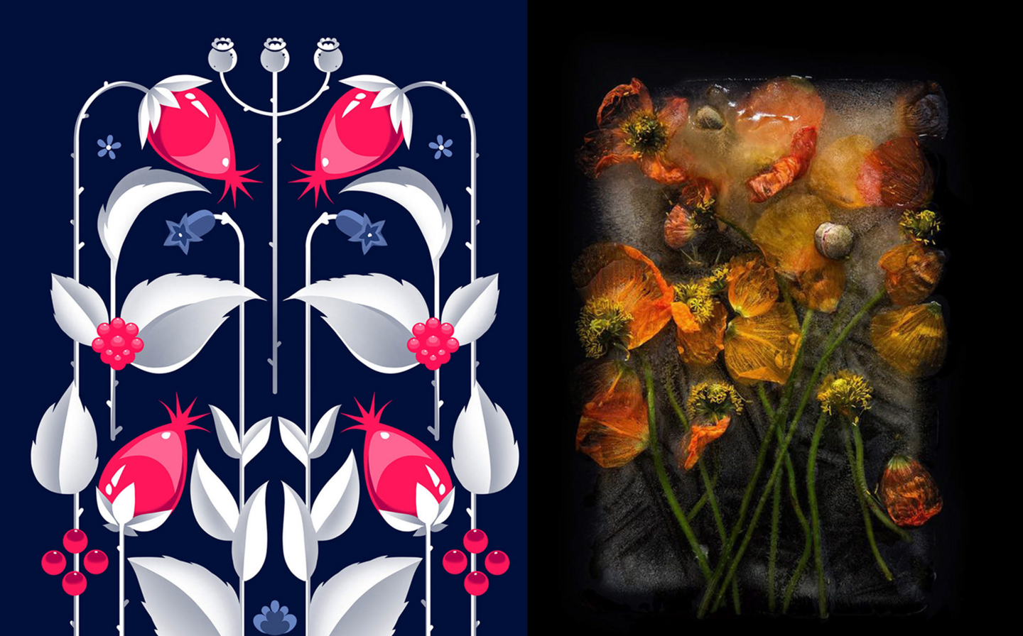
Visual SystemThe graphic language is based on a geometric vector interpretation of traditional floral patterns. The system combines a high-contrast serif typography for brand communication with custom botanical illustrations. The design process focuses on the physical experience: the tablets feature an engraved texture to crack with a specific sound when dropped into hot water.03.
Application The identity is integrated into packaging, individual tablet wraps, and branded tableware. Custom ceramic mugs and business cards use the visual system to translate the brand’s folklore aesthetic into physical touchpoints.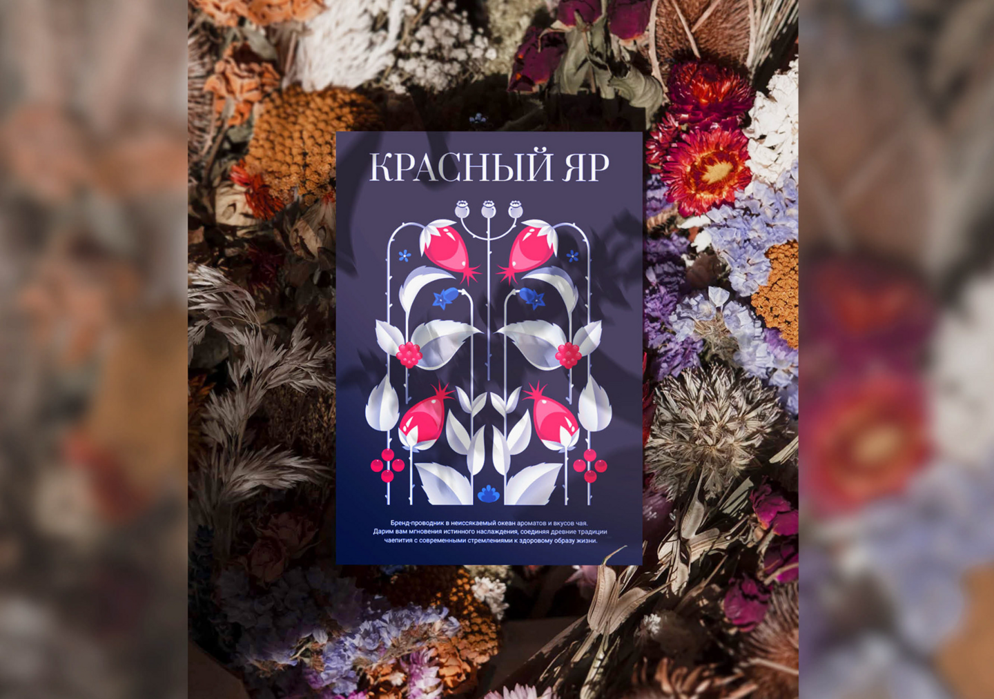
1/2
Исходный размер 1920x1350
03. ATOM & IMAGE
A visual identity and event concept for the Rosatom Student Community
01.
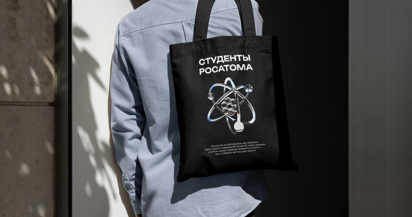
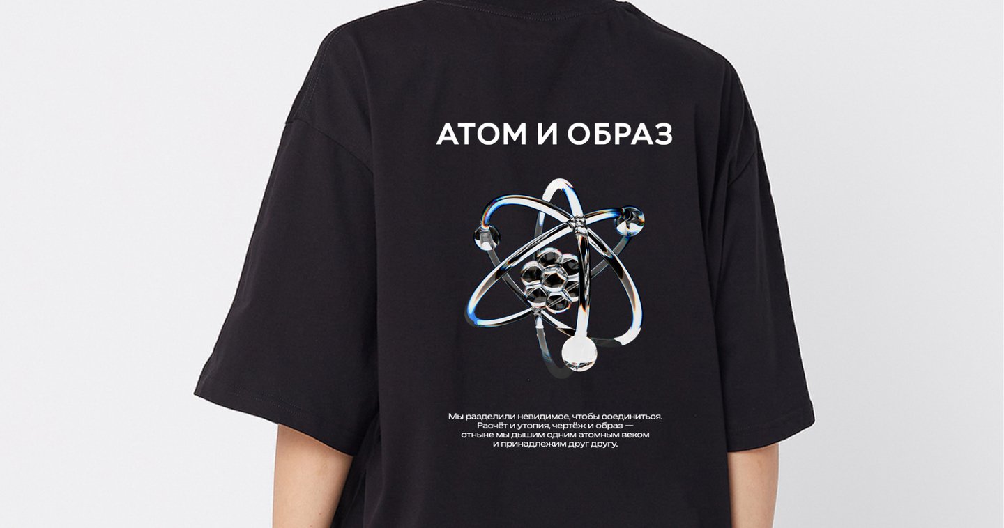
ConceptA competitive proposal for the Rosatom Student Community. The project explores the intersection of nuclear energy and visual culture, translating invisible atomic processes into a modern graphic language.02.
Visual SystemBuilt on high-contrast black and dark blue backgrounds. The central element is a custom 3D-rendered chrome atom with chromatic aberration effects. Typography uses a bold, modular sans-serif to convey technological precision.03.
Application Adapted for physical and digital event environments: a poster series, branded merchandise, and functional accessories. The system maintains a consistent technological aesthetic across all touchpoints.Исходный размер 1920x1010
1/2
04. HSE × BEYOND
A brand collaboration and menu design for a gastrobistro
Исходный размер 1920x1010
01.
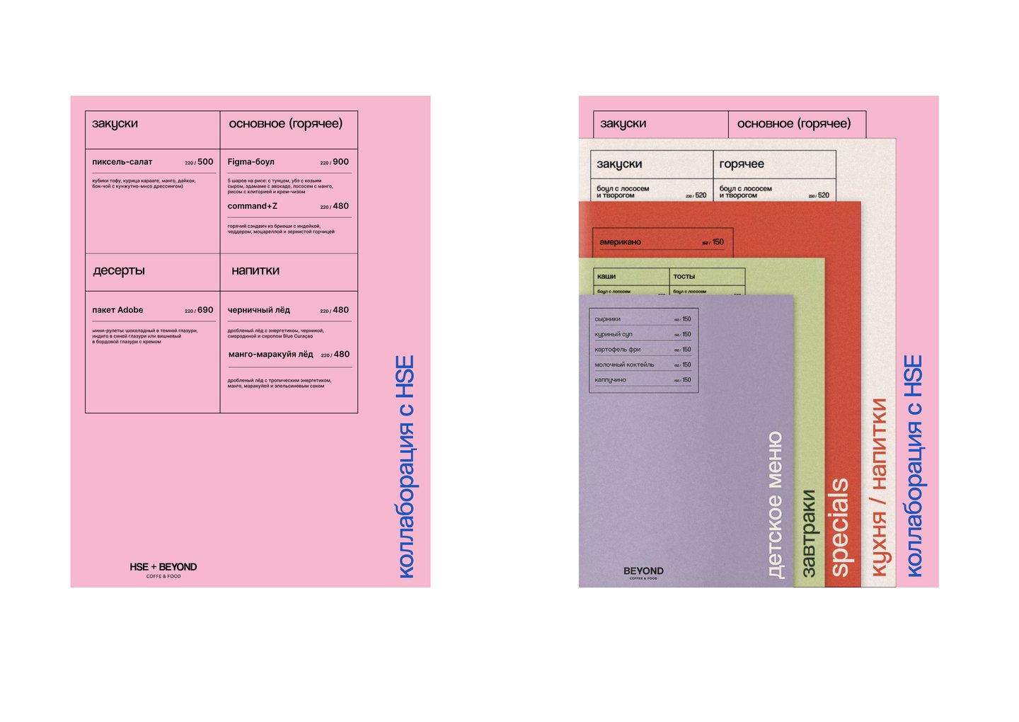
ConceptThe project explores the intersection of digital design and gastronomy. The core metaphor is «Designer = Chef»: both professionals combine raw ingredients into a structured, functional system. The collaboration adapts the HSE design language into the physical environment of the BEYOND restaurant.02.
Visual SystemThe graphic identity uses a limited color palette and custom UI-inspired iconography. The menu layout mimics a software interface, using strict grids to organize food categories. The naming strategy integrates design terminology into the dishes.03.
Application The system is applied to physical and digital touchpoints: printed menu layouts, branded staff uniforms, custom food packaging, and social media grids. All elements maintain the visual connection between the design studio and the restaurant’s daily routine.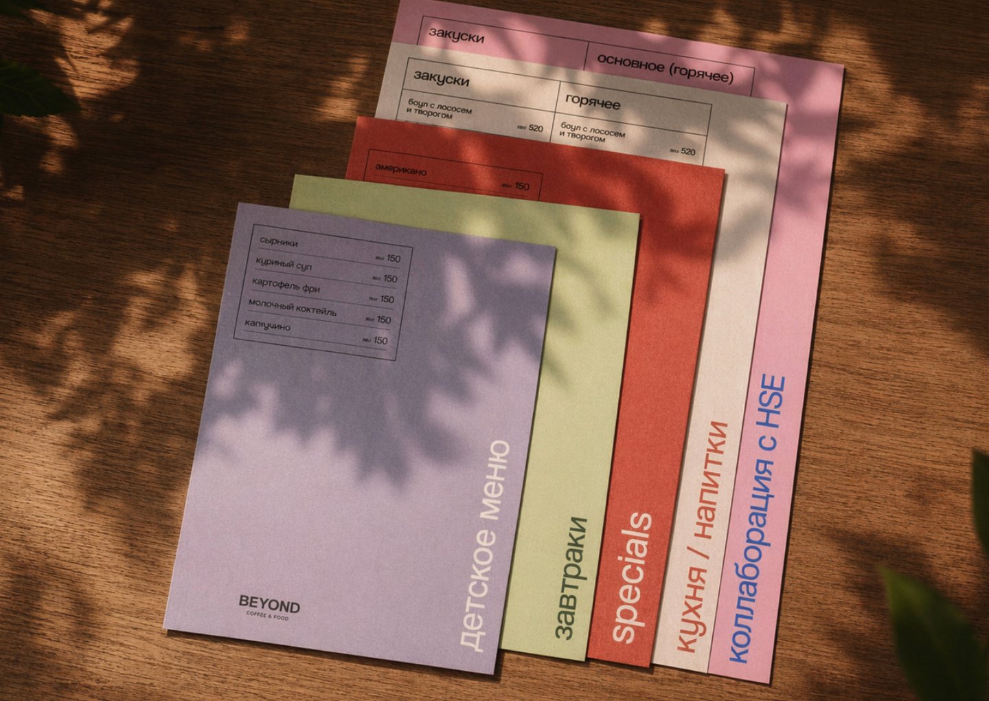
1/2
Исходный размер 3500x2480
Исходный размер 1920x1010
Исходный размер 1920x1010
Get in Touch
Marina Moskvicheva — designer & illustrator
email: marilegran888@gmail.com
telegram: @rinlegran