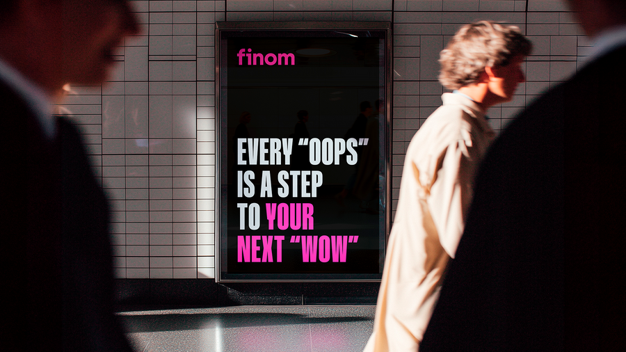
Created by Dubai based Border zero creative and branding agency, Finom’s new brand identity revolves around light — a spotlight on what matters most. Pink symbolizes energy and vitality. Light is not just a visual — it guides entrepreneurs, highlighting their victories, their focus, and the moments that define their journey. The new visual identity transforms Finom from a purely functional service into a bold, expressive brand with a clear emotional point of view.
The team was primarily focused on building the product, but as the brand grew and investment came in, the need for self-definition became clear. Once the company’s mission and values were articulated, it became obvious that the existing identity no longer reflected them. Finom needed a new visual metaphor and a bolder, more distinctive style to stand out in an increasingly saturated competitive landscape.
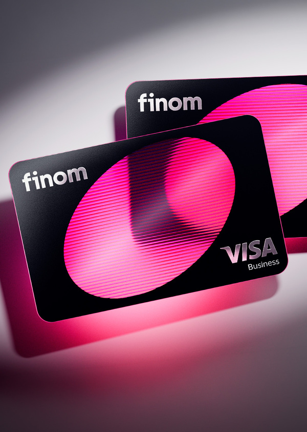
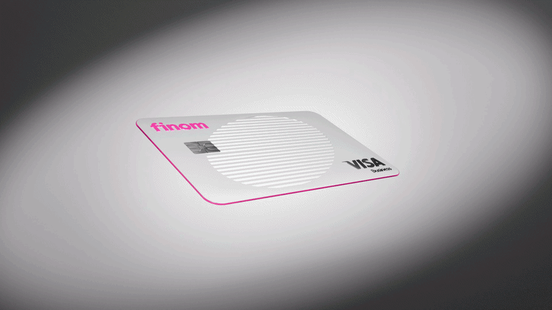
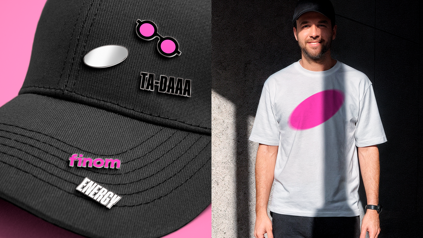
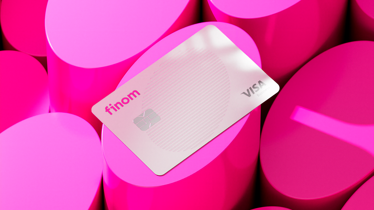
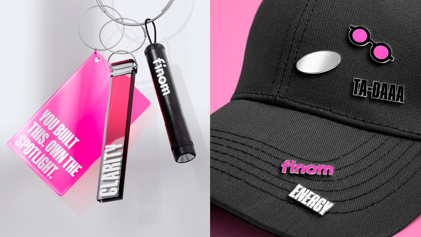
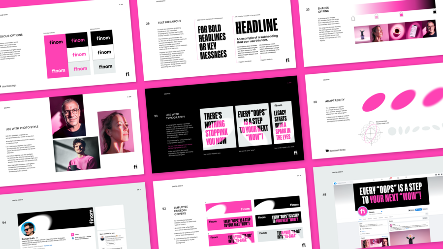
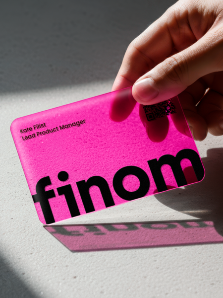
«We developed a brand identity and packaged it into a comprehensive brand book. As part of the brand book, we created and designed key brand assets, including outdoor advertising and digital banners templates, social media materials and website, — Lidia Kapysh, design director in Border Zero agency emphasises. — We also worked on the design of plastic cards and developed an extensive merchandise line for both corporate use and customers».
Brand idea and positioning
Business is a source of strength when your energy isn’t drained by paperwork and routine. Finom is an all-in-one banking account for entrepreneurs, freelancers, and small businesses that automates accounting and keeps everything effortlessly under control. It helps clients reclaim time, energy, and focus.
Finom — the bank that highlights what truly matters. The company’s mission is to bring back energy and focus to entrepreneurs, helping them reclaim what truly matters: their time, their clarity, and their drive.
Background
Finom is a fintech startup founded in 2019 from a team of successful modern serial entrepreneurs with vast experience in creating best-in-class IT solutions. The challenge for Finom is to demonstrate how easily a business can, and should be managed in the modern world, by offering to freelancers and SMEs an all-in-one financial product.
Finom is a product that merges more traditional banking services with the latest technologies in terms of financial needs. Currently, service is live in France, Germany, Italy, The Netherlands, Belgium, Spain and several other European countries. Finom has secured over €300 million in funding through multiple investment rounds.

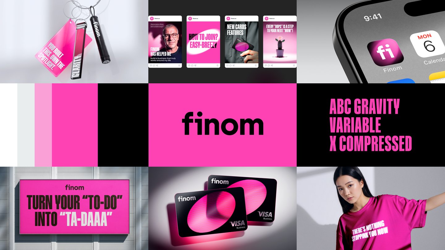

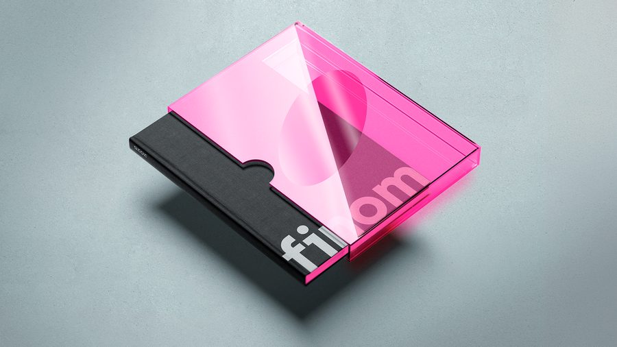
The design system
The rebrand transforms Finom from a purely functional service into a bold, expressive brand with a clear emotional point of view.
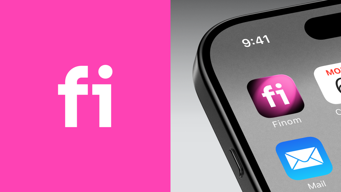
At its core is the metaphor of light — a spotlight that reveals what truly matters. It stands for clarity, focus, and forward momentum, while celebrating small wins and meaningful progress.
We built a flexible visual system around this idea. Light is expressed through directional photography that isolates key elements and creates strong focal points. Graphic elements use spotlight effects to guide attention. The palette combines deep black for structure and clarity with vibrant pink for energy and drive.
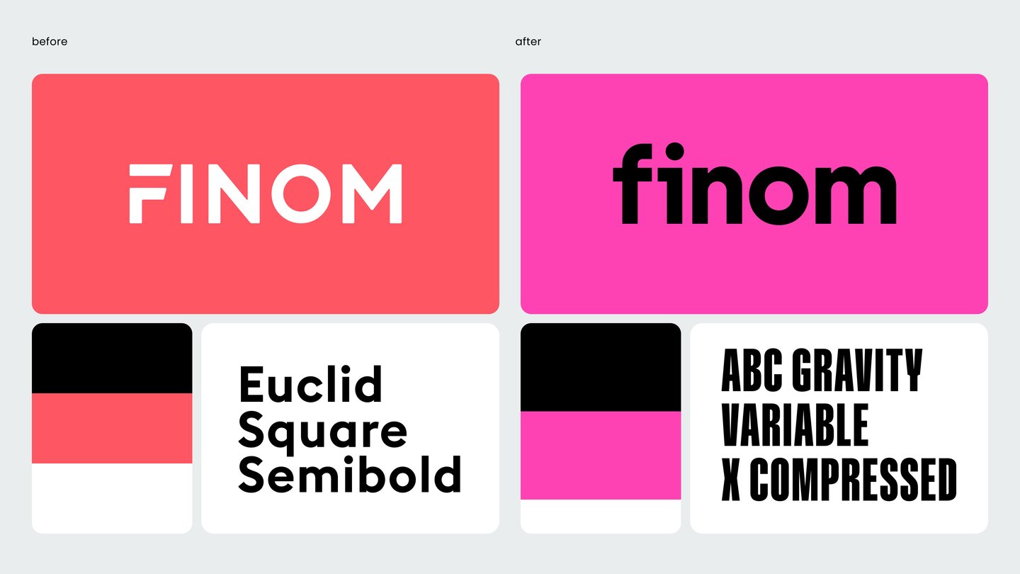
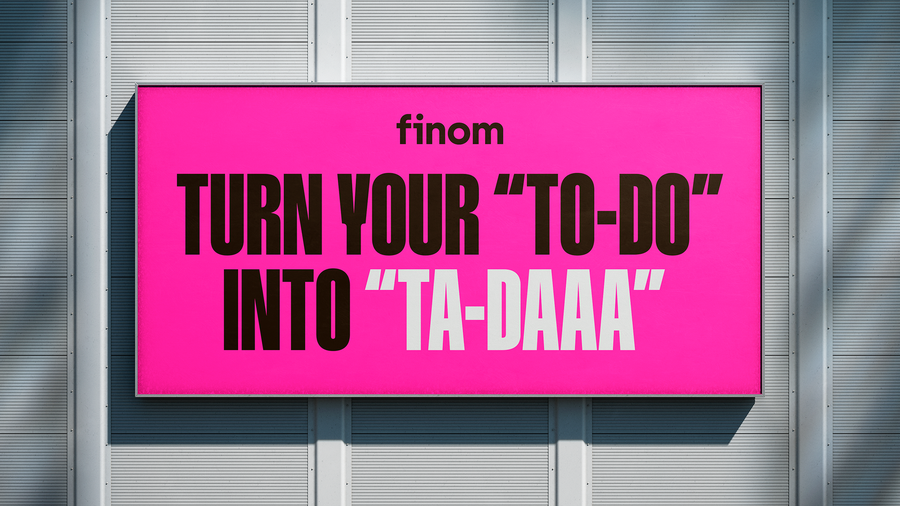
Bold, contemporary typography reinforces rhythm and precision, while the lowercase logo feels more fluid and human. The result is a distinctive, scalable identity across product, campaigns, social, and environments — empowering entrepreneurs to cut through noise and focus on what matters most.
Border Zero team
Lidia Kapysh, Design Director
Lera Gennadyeva, Project manager
Elena Kostyrina, Art director
Ivan Belov, Graphic designer
Evgeniy Nikitin, Motion designer
Ekaterina Kolyhalova, 3D and motion designer
Finom
Roman Bukh, Brand Director
Maxim Berg, Head of Marketing
Dinar Galimov, Head of Design
Iryna Pivashenka, Digital Designer
Valeriia Dadaian, Senior Motion Designer
Anna Aleksanina, 3D Designer
Kirill Kolesnikov, Digital Designer
Anna Shevchenko, Marketing Manager


